
Priyaanka Arora
March 27, 2025
How to Build Real-Time Python Data Apps With AI
Data apps make business impact impossible to ignore. Static reports get read and forgotten. Dashboards fade into the background. But a well-built data app pulls people in, lets them test assumptions, and forces real engagement with the numbers.
Now, AI is stripping away the friction of building these apps. What once took weeks of coding can now be done in hours, even by those without deep engineering backgrounds.
At a recent workshop, Mingo Sanchez, Sales Engineer at Plotly, demonstrated how to build data apps using AI. The session focused on practical steps for turning data insights into interactive data apps — tools that let users explore data, run models, and generate visualizations in real time.
Here's a recap of the main points shared during the workshop. You can watch the full video recording for more.
Building a Python data app with AI and Plotly App Studio
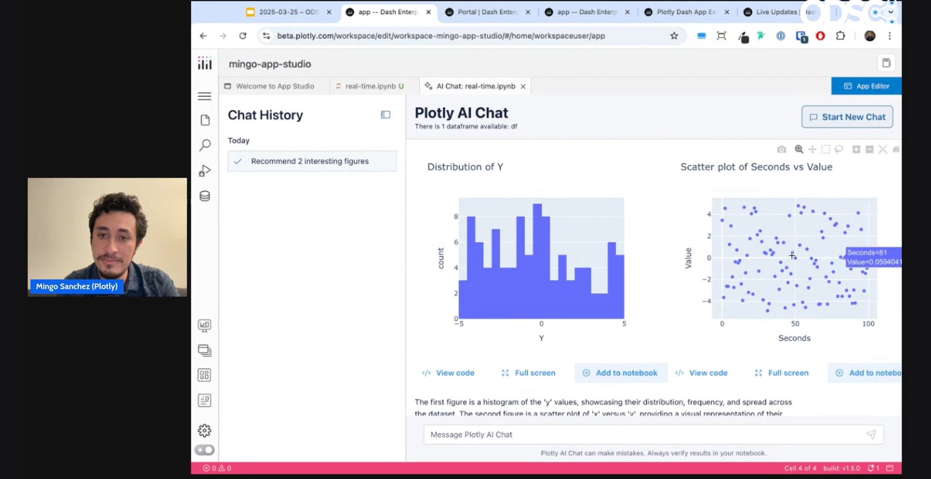
Mingo walked through creating a Python data app using App Studio, a feature designed to ease building and deploying data apps without front-end code. The feature includes Plotly AI for prompt-based, conversational data app creation.
App Studio simplifies the development process by automating common steps:
- Start with Data: Begin in a Jupyter Notebook by selecting a dataset. App Studio autogenerates Python code to display your data in a table.
- Explore & Visualize: Use the "Explore" tool to create custom filters, build analytics, and generate interactive visualizations like line charts, scatter plots, and bar charts.
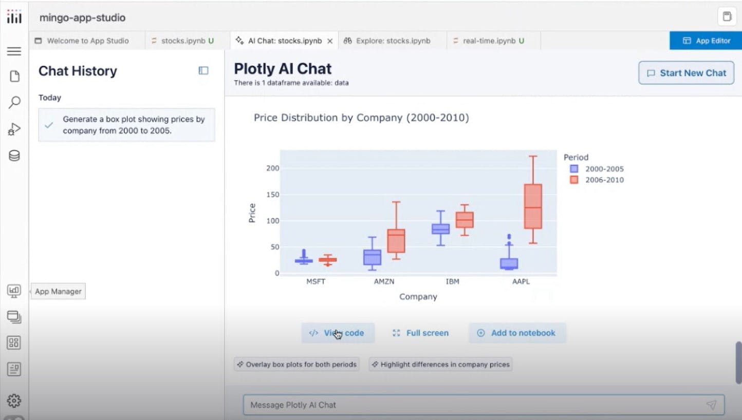
- AI Chat Integration: The "AI Chat" feature allows you to request complex visualizations directly from an LLM. For instance, asking for a box plot generates both the chart and the underlying code, which you can refine as needed. For example, asking, "Create a line chart showing sales trends by quarter, with a shaded region for uncertainty bounds" will produce both a clear visualization and editable Python code for fine-tuning.
Moving to an interactive data app
Once your visualizations are set, App Studio converts your Python notebook's content into an interactive data application. Users can:
- Rearrange layouts
- Add themes
- Import additional interactive components like dropdowns, checkboxes, and sliders
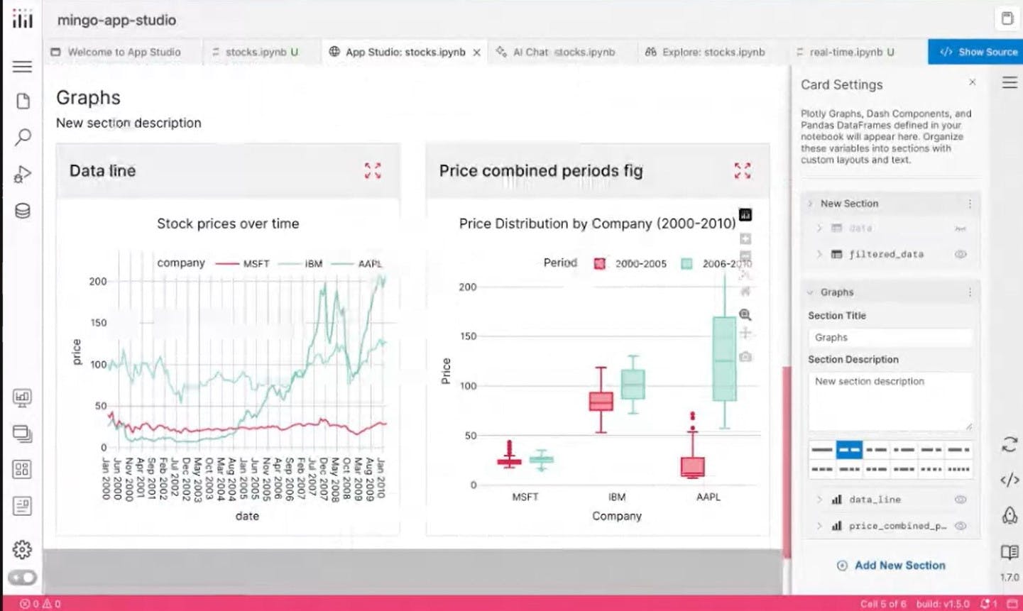
Any code added in the notebook can sync directly with the data app via a simple click, keeping your app interactive and up to date. This integration makes it easy to iterate quickly and ensure your app remains flexible as your data or business needs change.
Real-time data with Dash
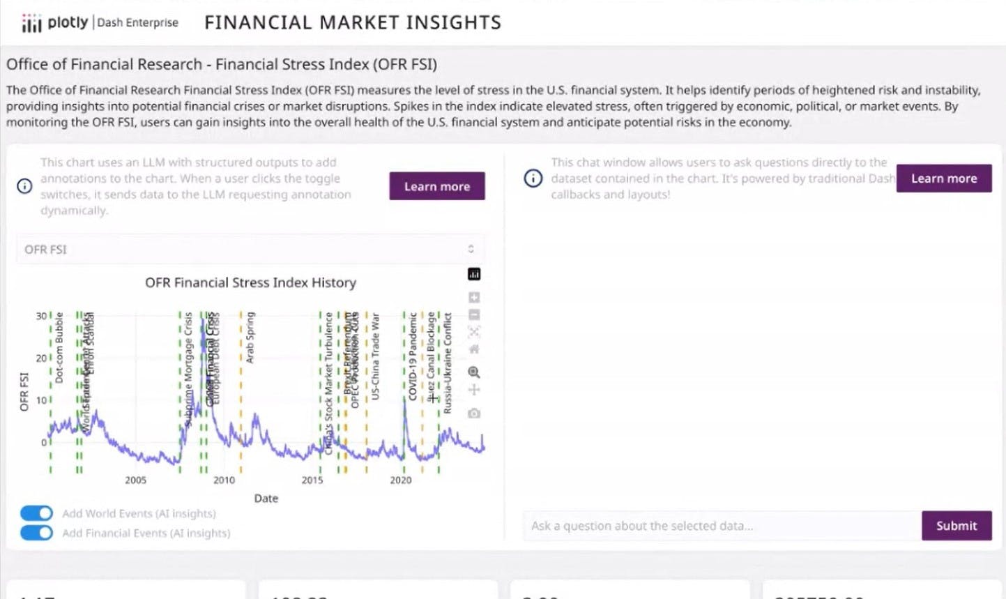
For real-time data updates, Dash's interval component lets you define recurring actions, such as updating a variable every second. This enables live data visualizations that refresh automatically, ideal for financial models, monitoring tools, and other time-sensitive insights. For example, a real-time dashboard could track currency exchange rates and overlay key economic events as they unfold.
Enhancing apps with AI
Beyond building data visualizations, Mingo shared several ways to integrate AI directly into data apps:
- Smart Insights: Generate text summaries of visualizations, then interact with the summary for deeper insights. This is useful for explaining patterns, outliers, or key takeaways directly within the app interface.
- Contextual Overlays: In dashboards like financial market trackers, AI can overlay relevant world events directly onto time-series graphs, helping viewers connect data trends to real-world context.
- Custom Chatbots: Train LLMs on your internal knowledge base to provide tailored insights for your end users. For example, a company dashboard could feature a chatbot that answers questions about sales performance, customer trends, or operational metrics.
Code flexibility and advanced development
Dash's code mode offers full control for developers. It allows you to define inputs, outputs, and callback functions to create logic flows that respond to user actions. For example, you can build a data filtering tool where selecting a date range automatically updates a connected chart.
By defining inputs, outputs, and callback functions, developers can create powerful logic flows that enhance app interactivity. This could look like a manufacturing dashboard that includes a logic flow where adjusting a temperature setting automatically recalculates optimal pressure levels, ensuring safe and efficient operation.
LLMs can assist in writing these callbacks faster, and AI can even generate documentation for complex Python code blocks. For example, asking an LLM, "Write a callback that updates a scatter plot's points based on a dropdown selection of product categories" can return a working code snippet with explanations.
Key prompt engineering tips for better data visualizations
When working with LLMs for data visualization, Mingo advised giving as much context as possible. For example, instead of asking, "Create a chart of sales data," try, "Create a bar chart showing monthly sales data for 2023, grouped by product category and sorted in descending order." Detailed prompts lead to better results.
Another useful strategy is to specify design details, such as axis labels, color schemes, or annotations, in the prompt. For example, "Show sales by region as a stacked bar chart with labels for each total" can produce a more refined chart on the first attempt.
Why build data apps with Plotly?
Plotly has been a trusted solution for data visualization for over a decade. With the open source Dash framework, millions of monthly users build interactive data applications — web-based tools that allow users to explore data, run models, and interact with visualizations in real time.
Unlike static dashboards, interactive apps let users trigger actions directly from the front end, such as running financial models or filtering data on the fly. Dash handles the complex front-end development, making it easier for teams to act on insights in real time.
For organizations that need enterprise-grade security, scalability, and advanced features, Dash Enterprise offers a commercial solution. Industries like finance, healthcare, and manufacturing rely on it to meet strict regulatory requirements while enabling apps to scale to tens of thousands of users. It also supports SSO, reporting packages, and app embedding.
Many teams use Dash Enterprise alongside integrations like Databricks and Snowflake. Databricks has recognized Plotly as one of its most widely used data and AI partners.
Attend the webinar to learn more
For a step-by-step guide to get started building data apps for free, explore the Dash documentation. You can also connect with the community forum for insights and support.
Like what you see here? For a deeper dive into Dash Enterprise's data app development and AI capabilities, check out the webinar: Elevate Your Analytics.