
Cléa Aumont
August 29, 2023
Deep Dive on Sankey Diagrams
A Sankey Diagram is a powerful data visualization tool when used correctly. These visuals represent the flow of values from one stage to another using nodes and links, but can often be misused. This article aims to provide guidance on best practices for choosing a Sankey diagram, offering diverse examples to illustrate its potential. This article will guide the reader in choosing an appropriate dataset to create an effective Sankey Diagram by looking at the nature and the structure of the data. This article also provides starter code that enables the transformation of a dataframe into usable Sankey data for visualization using Plotly Express. By following these best practices and leveraging the provided code, readers can effectively use Sankey Diagrams to gain valuable insights from their data.
What is a Sankey & Use Case
Sankey diagrams can be compared to those of flow networks, with a tendency to be acyclic and directed, where the links and nodes are proportional to the flow they carry. The three parameters that make up a Sankey are the nodes, the links, and the link weights. In this article, I will be referring to a set of nodes on the same level as a tier, where a tier can be a column in a dataframe for example, representing a stage in the Sankey.
Tip: with Plotly Studio, you can easily generate apps that include a great Sankey visualization. We're showcased how in a series of live demos - join us.
As a member of the Professional Services team, I first came across the Sankey Diagram on a client project that required a way to visualize the flow of a specific resource on a global scale. The goal was to see where a specific resource came from, where it was converted, and where it was shipped off. Supply chain is a great example of when to use a Sankey diagram as it naturally contains a set of stages to visualize. The complexity of coding this Sankey diagram came with allowing the user to select which columns of a pandas dataframe were to be used in the Sankey, meaning the Sankey could have anywhere from 2 to 8 tiers. The user was also able to filter the Sankey by node, change the link weights, which would vary by year, and group the tiers to only display a fixed number of nodes and aggregate the remaining ones into a single node. The following recording shows this particular Dash app in action.
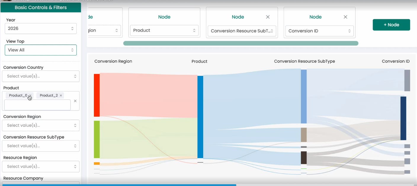
Screen recording of Dash app displaying Sankey chart
This was difficult to accomplish because the parameters to code a Sankey Diagram are complex. The outcome of this project was a highly generalized code for generating Sankey diagrams, empowering users to customize every aspect of the Sankey, making this code reusable for any other project.
Useful Sankey Diagrams
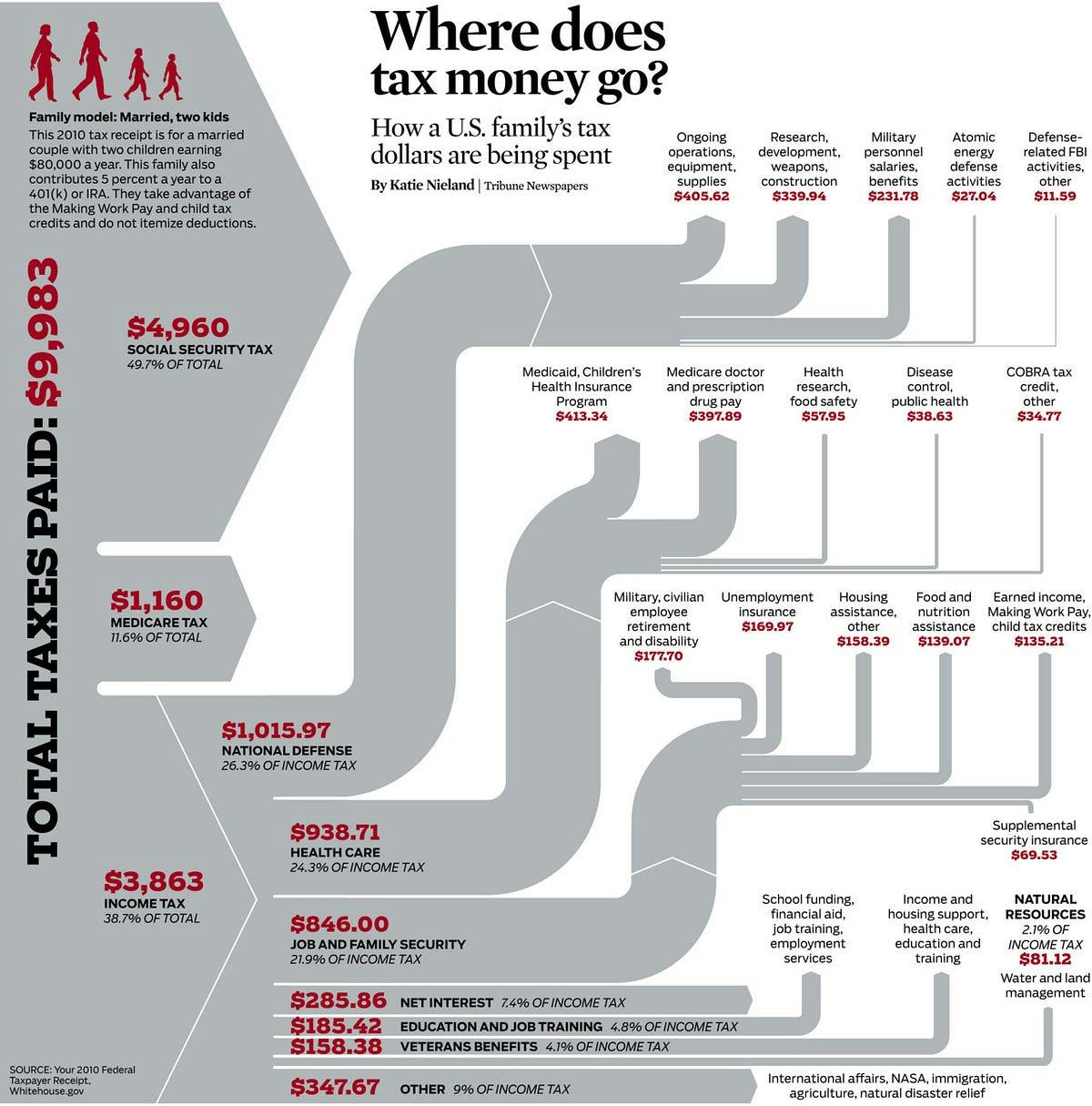
Sankeys are best used to visualize the flow of data from one stage to another, but more specifically, to represent how that flow is subdivided at each stage. For example, this could be the flow of resources, money, energy, or information and how it circulates within a country, business, company, or network, respectively. This type of visualization can help highlight bottlenecks, or identify areas of high significance. For instance, consider the example below which demonstrates the distribution of a country’s tax resources. The diagram portrays each sector of the distribution along with its respective subcategories, showcasing the movement of money across different stages. This visual example offers readers a clear understanding of the intricate flow of funds with a simple glance at the diagram. For example, one can quickly see how little is spent on Education compared to other categories, or how much is spent on national defense in comparison to veterans benefits.
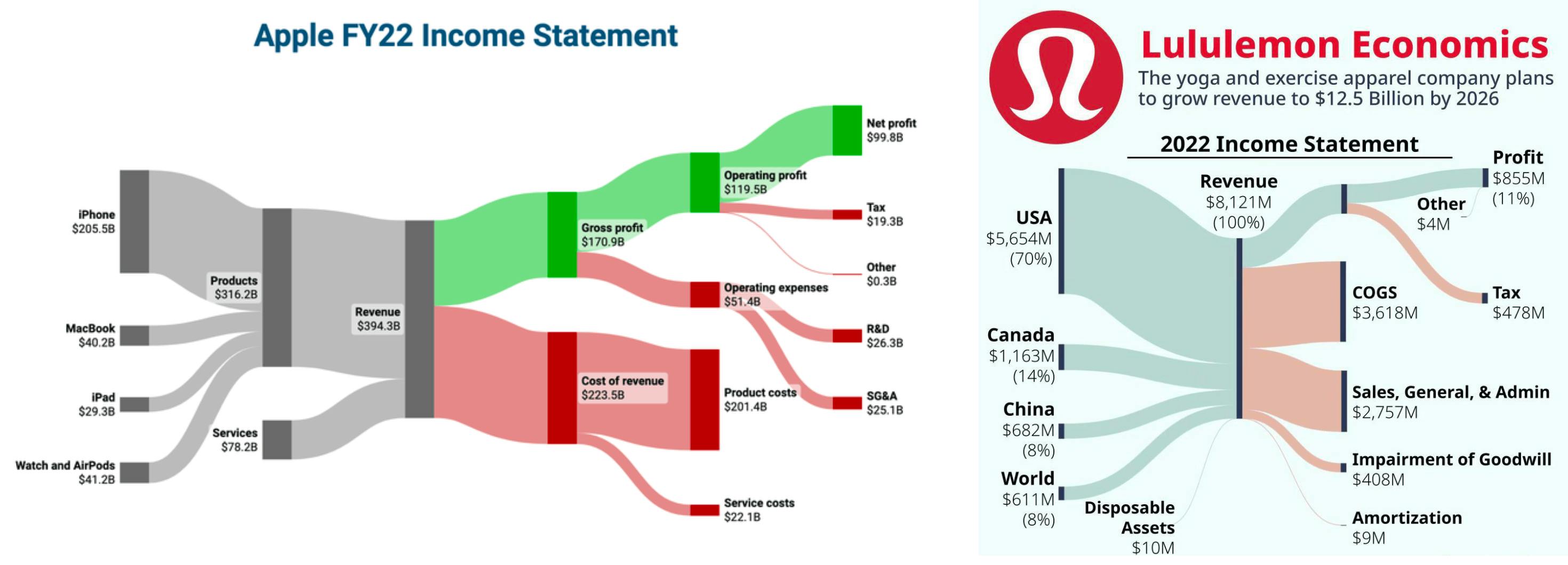
Another example of a useful Sankey Diagram is Apple’s or Lululemon’s Income Statement. Here, we can easily identify which are the major sources of income for Apple or Lululemon, the proportion of income allocated to expenses, and how the gross profit compares to expenses. Even a quick glance at these diagrams provide a remarkably insightful overview.
When to avoid Sankeys
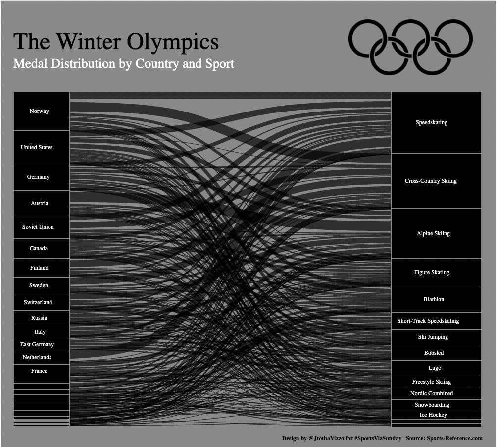
Sankeys should be avoided in a number of cases. For one, if there isn’t a natural flow of data, a Sankey is probably not the best visualization. As an example, the following Sankey shows a mapping of countries to Olympic medal distribution. This isn’t ideal as the more data there is the more convoluted this chart will be. It's fairly difficult to gain insightful information from this diagram, other than which countries won the most medals and which sport awarded the most medals. In this particular case, a histogram may be more efficient to represent the distribution of medals.
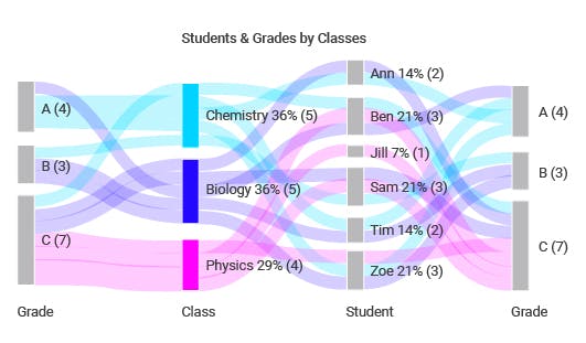
The following example shows another Sankey that doesn’t tell much of a story. Again, a mapping of students to grades to classes to grades does not represent a natural flow of data and gets increasingly complex with the number of data points. Also, every student takes every class, which creates a link between every single one of these combinations. There is not much use for a Sankey if all of the nodes are connected.
Sankeys should also be avoided for any kind of continuous data, such as time data, unless this has been turned into categorical or discrete data, such as years, or specific time periods. Any dataset that is too large or too sparse should also be avoided.
Natural Structure of Data
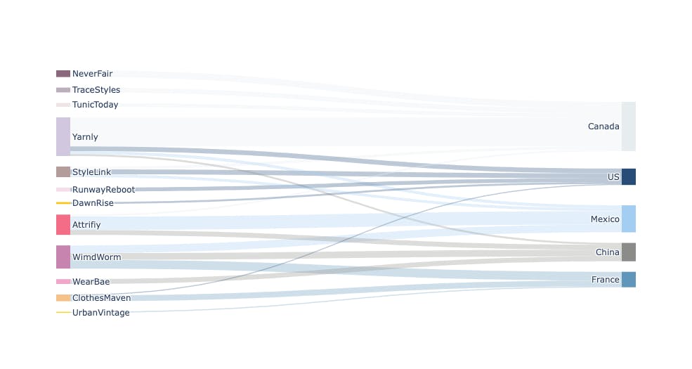
Now, having data that represents a natural set of stages between data points, this doesn't necessarily mean that a Sankey Diagram is always the best visual to use. A reason could be that there are too many data points, which would create a convoluted diagram, or too little. Also, there could just be no natural grouping of data points resulting in a diagram with links from every source node to every target node, creating too much cross over. In the following example, there is a sufficient amount of data to make a decent Sankey Diagram. However, once generated, it seems like all of the stores ship to all of the listed countries. This Diagram does not provide much information even though there are sufficient data points and the data has a natural flow.
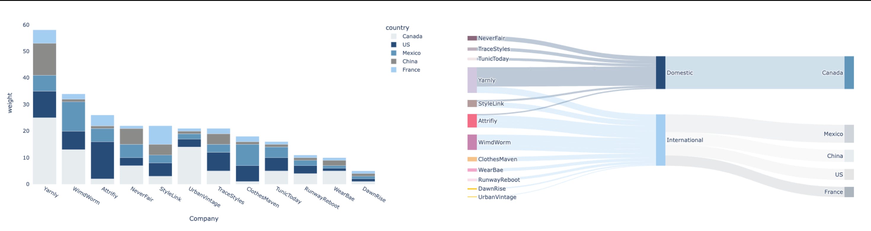
Instead, it may make more sense to have a stacked bar chart to display the breakdown of each company and the countries it ships to. Alternatively, a Sankey could still be used by adding an intermediary group, or a second layer of grouping. By breaking down the data in this fashion we can already start to get more insights on the companies and where they ship to. This way, we can easily see the distinction between domestic and international sales, and their respective breakdowns.
Creating a Sankey Diagram in Plotly
To create a Sankey diagram using Plotly Express, you can use the graph_objects.Sankey function. The function accepts 4 critical arguments to define the diagram:
- The label which in actuality are the nodes (i.e: in the previous example a node is “Canada”)
- The sources, a list of numbers that indicate the starting point of a link
- The targets, a list of numbers that indicate the endpoint of a link
- The values, a list of numbers that indicate the line thickness of each link. If this is left blank, no links will show up.
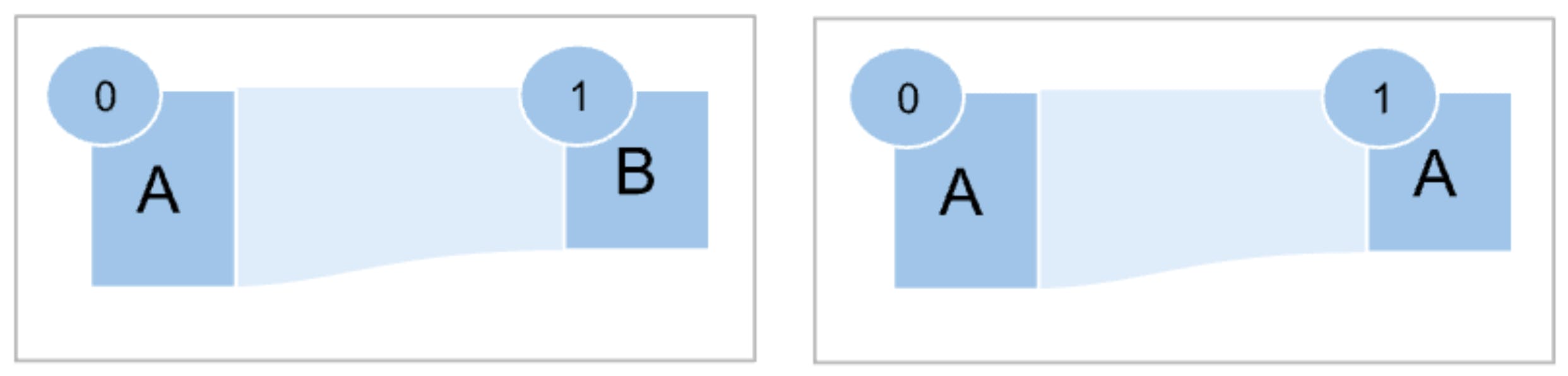
Each node is identified by a unique number, and the link between each node is defined with the source and target properties. As an example, the Sankey diagram on the left with two nodes ‘A’ and ‘B’ with one link connecting the two will require the following properties:
- label must be [‘A’, ’B’], this will automatically assign a number value to each node; 0 for A and 1 for B.
- To add the link between those 2 nodes, one must supply [0] to the source property
- And [1] to the target property.
- The value in this case needs to be a list of the same length as the sources and targets and can be any positive number.
Common Issues
This can be a little bit tricky to implement with larger datasets, but this is code that chat GPT can generate. The tricky part comes with the case where duplicate nodes must be viewed as distinct nodes, which is fairly common, as seen on the right. If not specifically accounted for, this will result in a node looping around itself, instead of creating a direct link.
Getting Started: Code Sample
def generate_sankey_chart_data(df: pd.Dataframe, columns: list, sankey_link_weight: str):# list of list: each list are the set of nodes in each tier/columncolumn_values = [df[col] for col in columns]# this generates the labels for the sankey by taking all the unique valueslabels = sum([list(node_values.unique()) for node_values in column_values],[])# initializes a dict of dicts (one dict per tier)link_mappings = {col: {} for col in columns}# each dict maps a node to unique number value (same node in different tiers# will have different nubmer valuesi = 0for col, nodes in zip(columns, column_values):for node in nodes.unique():link_mappings[col][node] = ii = i + 1# specifying which coluns are serving as sources and which as sources# ie: given 3 df columns (col1 is a source to col2, col2 is target to col1 and# a source to col 3 and col3 is a target to col2source_nodes = column_values[: len(columns) - 1]target_nodes = column_values[1:]source_cols = columns[: len(columns) - 1]target_cols = columns[1:]links = []# loop to create a list of links in the format [((src,tgt),wt),(),()...]for source, target, source_col, target_col in zip(source_nodes, target_nodes, source_cols, target_cols):for val1, val2, link_weight in zip(source, target, df[sankey_link_weight]):links.append(((link_mappings[source_col][val1],link_mappings[target_col][val2]),link_weight,))# creating a dataframe with 2 columns: for the links (src, tgt) and weightsdf_links = pd.DataFrame(links, columns=["link", "weight"])# aggregating the same links into a single link (by weight)df_links = df_links.groupby(by=["link"], as_index=False).agg({"weight": sum})# generating three lists needed for the sankey visualsources = [val[0] for val in df_links["link"]]targets = [val[1] for val in df_links["link"]]weights = df_links["weight"]return labels, sources, targets, weights
Conclusion
Sankey diagrams are a powerful data visualization tool used to represent the flow of values between stages, offering valuable insights into the flow of data. When used with well-structured data, they can help identify patterns, bottlenecks, and significant resource allocation trends. It is important to consider the nature of the dataset and whether it naturally lends itself to a Sankey diagram. With the right data, Sankey diagrams can be a valuable asset in data representation by facilitating the understanding of complex processes and distributions. With the sample Sankey code provided I hope this helps in better understanding how to code a Sankey Diagram as well as when to use a Sankey Diagram.