
Hannah Ker
June 6, 2023 - 10 min read
Performance Optimizations for Geospatial Dash Apps
Introduction
Many geospatial Dash applications rely on large polygon datasets to visualize how a certain variable changes over space. We’ve all seen our fair share of choropleth maps that represent things like election results or aggregated demographic information. Creating these kinds of maps on the web can be straightforward if our data is small. Maybe we only have a handful of boundaries or maybe these boundaries have very simple geometries. But what if we want to visualize our data across hundreds/thousands of small postcodes? What if our boundaries are complex and need to be represented as shapes with hundreds of vertices?
As part of my work with Plotly’s Professional Services team, I’ve helped many of our clients build fast Dash applications. Coming from a background in geospatial data science, I’m also passionate about helping the Dash community achieve their goals in building out geospatial applications. For more background on this, check out my previous blog post on 5 Awesome Tools to Power your Geospatial Dash app and my webinar on Unlocking the Power of Geospatial Data with Dash.
In this blog post, we’ll walk through a number of strategies that you can use to effectively visualize large geospatial datasets in a Dash application, focusing specifically on vector, polygon data. This kind of data is commonly used in geospatial visualizations for representing area boundaries, such as those between countries, provinces, or states. We’ll walk through one specific example, but the techniques here can be generalized to many Dash use cases.
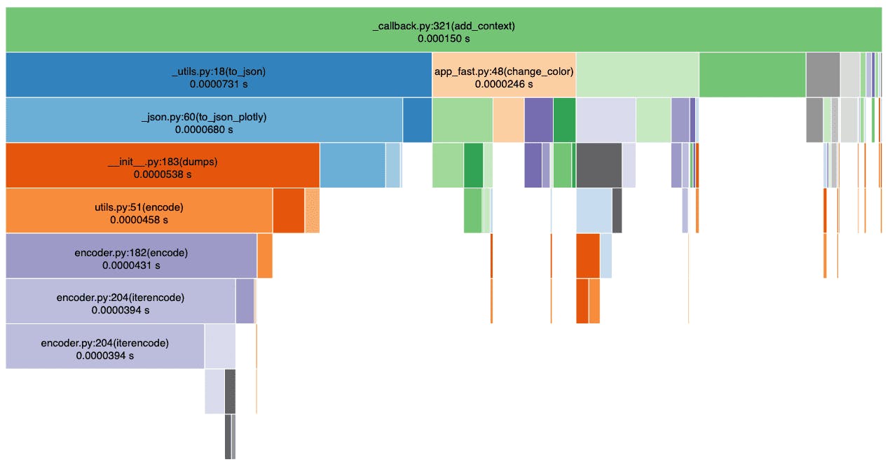
You can also follow along with this blog post for a hands-on example of how to profile and measure the performance of a Dash application.
A Starting Point
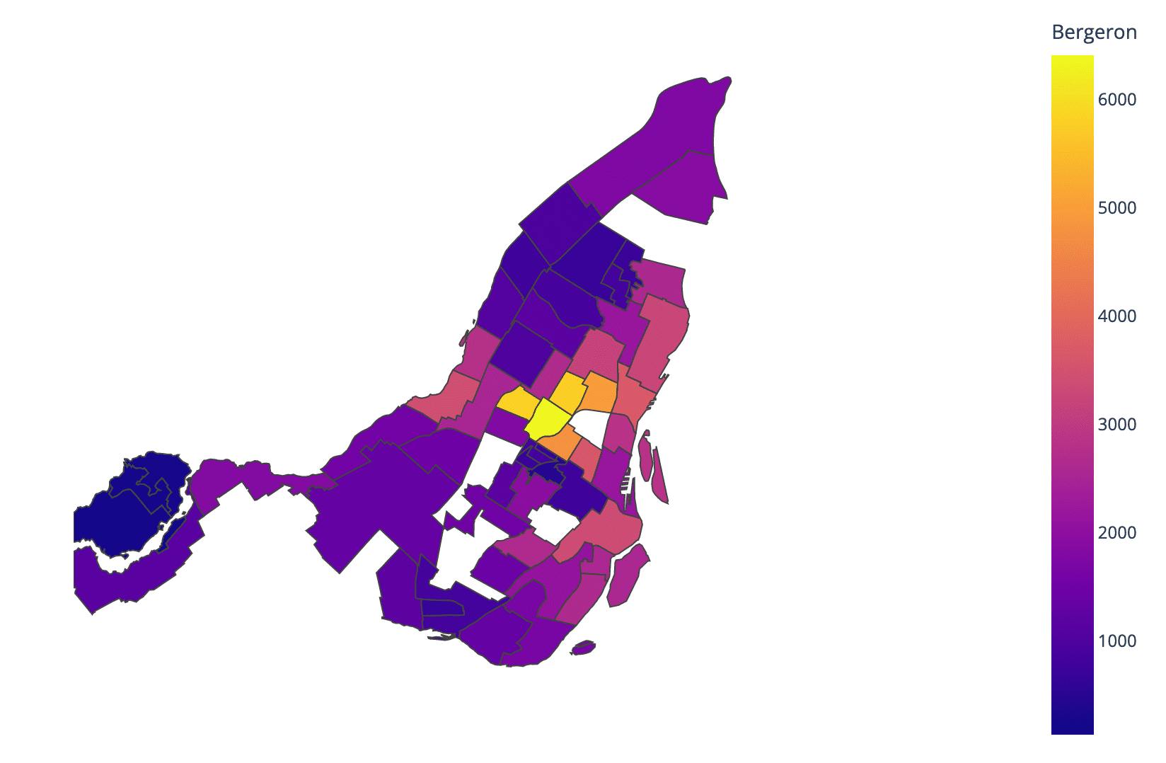
Let’s start by looking at this election map of Montreal with voting statistics per borough. The geospatial data underlying this map is a 100KB json file. This can easily be rendered in our browser and is small enough to quickly be transferred from the server where it is hosted. This means that if we embed this map into a Dash application then the page should load quickly (as the data is transferred) and should give us snappy user interactions. You can reproduce this example yourself by taking a look at our Plotly.express docs. However, as I’ve seen from many of our clients, it’s likely we’ll want to visualize datasets that are much larger.
What about larger datasets?
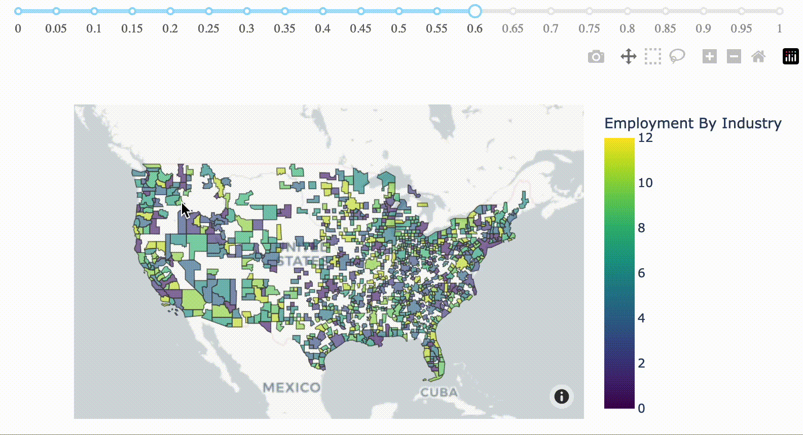
We can look at a contrasting example below, which shows randomly generated values across urban areas throughout the entire United States. This dataset represents core-based statistical areas in the US from 2020. It can be downloaded as a Shapefile from the US Census Bureau here and converted to GeoJSON format using mapshaper, a free, online tool. The underlying geospatial data is just over 90MB, which is roughly 900x larger than our example above. We also have a simple slider that allows our user to change the opacity of the polygon layer on our map.
You’ll notice that in the code below we’ve put our map generation inside of a background callback, as it takes long enough to exceed the timeout threshold for most web servers.
from dash import Dash, html, dcc, Input, Outputfrom dash import DiskcacheManagerimport plotly.express as pximport pandas as pdimport jsonimport diskcachecache = diskcache.Cache("./cache")background_callback_manager = DiskcacheManager(cache)with open("assets/tl_2020_us_cbsa.json", "r") as fp:MSA_json = json.load(fp)MSA_json["features"] = MSA_json["features"]df = pd.DataFrame()df["GEOID"] = [i["properties"]["GEOID"] for i in MSA_json["features"]]df["dummy_values"] = (pd.Series(range(1, 12)).sample(int(len(df)), replace=True).array)app = Dash()app.layout = html.Div([dcc.Slider(0, 1, 0.05, value=0.5, id="opacity"),dcc.Loading(dcc.Graph(id="graph"),),],)@app.callback(Output("graph", "figure"),Input("opacity", "value"),background=True,manager=background_callback_manager,)def create_fig(opacity):fig = px.choropleth_mapbox(df,geojson=MSA_json,locations=df["GEOID"],featureidkey="properties.GEOID",color=df["dummy_values"],color_continuous_scale="Viridis",range_color=(0, 12),mapbox_style="carto-positron",zoom=3,center={"lat": 37.0902, "lon": -95.7129},opacity=opacity,labels={"dummy_values": "Employment By Industry"},)return figif __name__ == "__main__":app.run_server(debug=True)
When we zoom in closely, we can see that this data is incredibly granular in its delineation of boundaries. Trying to serve this data from a Dash application, view it in the browser, and allow our user to interact with it can be incredibly slow. Luckily, there are a number of strategies that we can use to solve this problem and improve the performance of our Dash application.
Shapefile vs GeoJSON?
You might be most familiar working with spatial data in Shapefile format, particularly those coming from traditional GIS backgrounds. GeoJSON is a standard format for working with vector data on the web. As GeoJSON data is well supported by most web mapping tools (such as Mapbox or Leaflet), we’d recommend converting any Shapefiles to GeoJSON format before visualizing in a Dash app. This module from a course on open web mapping has more information on the GeoJSON specification.
Step 1. Understand the problem
The first step to improve the performance of any application is to measure it. It takes over 90 seconds for the full map to display and load in our browser. What’s taking so long?
We’ll want to investigate performance both server-side (where our Python code runs to create our figure JSON representation) and client-side (where this data is rendered in the browser). This post will walk you through getting the Werkzeug profiler set up to look at performance server-side. You can look at client-side performance by inspecting the network activity in your browser. Most browsers have handy developer tools such as those detailed in this tutorial for Chrome.
After running the profiling, we can see that loading a basic Dash layout with this map takes a whopping 57 seconds! Our map drawing takes place inside the diskcache_manager.py script, which is taking up 36.4s itself. Our other 20.5s is occupied by the JSON serialization required to deliver our Dash layout to the browser. The 17.4s spent inside basevalidators.py is particularly interesting. As is highlighted in a couple GitHub issues (Performance Regression and validate=False), the Plotly.py library spends time validating the figure data under the hood. Usually we don’t notice the time spent doing this, but it becomes consequential when we pass large datasets to the API.
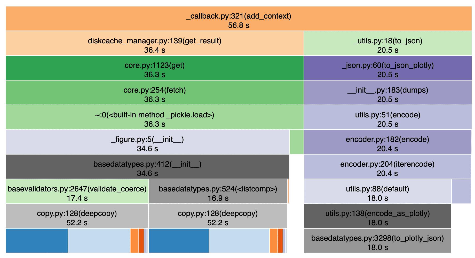
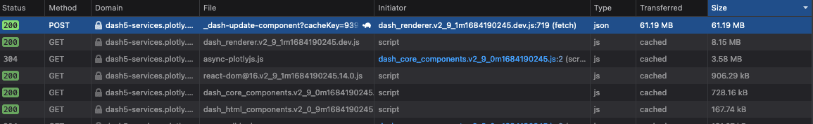
We can also see the results of this profiling when we inspect the “Network” tab in our browser. We can select the specific POST request that updates our map (easily findable as it’ll likely be the request with the most amount of data transferred) to see more details. Not only does our map creation on the server take nearly a minute, but the actual transfer of the geojson data to the browser takes an additional 30 seconds. This takes a long time because of the large volume of data that needs to get across the network.
In addition to this slow page load on app start, the map will take a similar amount of time to update every time the user adjusts the slider to change the opacity of our polygon layer. This is because the entire figure has to be generated and loaded in the browser from scratch. It’s worth noting that the profiling results here are indicative and may depend on specific factors such as geographic server location and network speed. You should also be aware that your app may perform differently when you run it locally vs when it is deployed. For example, you’ll see negligible network transfer time when running the app locally.
The results detailed here are from running the app in a Dash Enterprise Workspace environment, which is an excellent tool for debugging your app and mimicking similar performance to what you would see when it’s deployed.
Step 2. Show less data
Before we begin exploring technical solutions, we first want to think about whether we really need all this data in our application. This will very much depend on your given use case and goal for the app. Perhaps there are ways that you can aggregate or simplify the data and still provide your user with the same functionality and insights. Reducing the size of your dataset will often be the most effective and straightforward solution to improve performance.
There are a number of strategies that we can consider in the context of GeoJSON polygon data:
Simplify the geometry: If we’re looking at the map across a large scale then it’s likely we don’t need precise geometries. Mapshaper is a useful browser tool for manually simplifying the geometry of GeoJSON and Shapefile data. Using this tool, we can apply the Douglas-Peucker algorithm for polyline simplification (among others). You can also use Python implementations of simplification algorithms.
Reduce coordinate precision: Many GeoJSON files have unnecessary coordinate precision (often up to 15 decimal places). As is documented in the Github repo, 6 decimal places provides roughly 10cm of precision, which is more than enough for most applications. You can use command line tools such as geojson-precision to programmatically reduce coordinate precision across your entire dataset.
Remove unneeded attributes: You may not need all of the attributes encoded in your dataset (eg. see the various properties for each feature in a GeoJSON FeatureCollection). Remove any that are unneeded to further reduce the size of your dataset.
After applying each of these strategies (even with a very conservative geometric simplification), we can bring the size of our dataset from 90MB down to 60MB.
3. Browser caching
The most efficient way to display this large GeoJSON data in the browser is to serve it as a static asset. Not only will this avoid bottlenecks in processing this large data from within the Plotly graphing API, but this will also enable the user’s browser to automatically cache this file. This caching of static assets is done automatically by most browsers in an attempt to reduce network traffic and improve browsing performance.
Referencing this data as an asset will also dramatically reduce the amount of data that needs to be serialized and validated by the graphing API and Dash back end.
This change will significantly improve the performance of redrawing the map on page reload. We need to place our GeoJSON file inside an assets/ directory and reference its relative location from within our Python code. We can update our figure declaration in the code above to look like this:
fig = px.choropleth_mapbox(df,geojson="assets/tl_2020_us_cbsa.json",featureidkey="properties.GEOID",locations=df["GEOID"],color="dummy_values",color_continuous_scale="Viridis",range_color=(0, 12),mapbox_style="carto-positron",zoom=3,center={"lat": 37.0902, "lon": -95.7129},opacity=opacity,labels={"dummy_values": "Employment By Industry"},)
Making this one-line change to the geojson parameter of our figure should now give us negligible server processing time in loading the page. However, on first page load, we may still see a bottleneck in transferring the large GeoJSON file over the network. Our figure will need to be redrawn each time the user updates the opacity using the slider, but this can happen quickly as the GeoJSON file is cached in the browser.
4. Use partial property updates in Dash 2.9
We can address the final inefficiency in our code using the new partial property updates feature. Instead of updating the entire figure each time a user interacts with our slider, we can update just the opacity property.
The create_fig() callback in our previous example could be updated as follows:
@app.callback(Output("graph", "figure"),Input("opacity", "value"),)def change_color(opacity):patched_figure = Patch()patched_figure["data"][0]["marker"]["opacity"] = opacityreturn patched_figure
Let’s run our profiler again to measure how the performance of our application has improved. We have reduced the server time for the initial page load from 57s to a fraction of a second. This performance improvement required minimal code changes and did not require us to significantly alter the input data.
5. Additional tips
If the performance suggestions above haven’t addressed your needs, you might consider some of the following techniques for improving performance.
1. Switch to clientside callbacks for snappy user interactions
In addition to partial property updates, clientside callbacks can be a great way to improve the performance of callbacks with high overhead. Clientside callbacks can work well in geospatial applications when you want certain user interactions, such as click or hover events, to trigger certain styling changes in a map.
2. Bypass figure validation when creating your charts with the graphing library APIs
As we saw from our initial profiling above, over 20s are spent validating the data passed to the Plotly graphing API. We can speed this up significantly by modifying the figure dict directly, rather than going through the API (as a workaround while we implement a solution from within the API). There are times where validating the data going into the figure may be important, but in this case we can assume that we trust the input data. You can see more details on this GitHub issue.
3. Consider serving your dataset in a tiled format
The performance strategies detailed so far won’t be sufficient when you want to visualize gigabytes of data on your map (and particularly raster data). Your web browser won’t be able to handle this much data in a format such as GeoJSON. Most modern web maps use a tiled approach to dynamically render map content depending on a user’s panning and zooming behavior. This page has more details on the technology and justification behind tiled maps. This GitHub repository also contains a sample Dash app to visualize large GeoTIFF files using a Terracotta tile server.
Conclusion
Improving the performance of your geospatial Dash app can unlock the value behind large location-based datasets. The strategies discussed in this post can be applied to significantly improve the speed and efficiency of your application. This post also walks you through strategies for measuring performance using server-side and client-side tools. Questions or comments? We'd love to hear from you!