
Adam Schroeder
June 22, 2023 - 15 min read
Creating an Interactive Web App with Matplotlib, Python, and Dash
Matplotlib has long been favored for its ability to create static plots and charts in data visualization. However, when it comes to building interactive web applications, Dash, a powerful Python framework from Plotly, simplifies the process of creating interactive visualizations.
Through the incorporation of interactive components like dropdown menus, sliders, and buttons, users can dynamically modify data and observe real-time updates in Matplotlib. The combined potential of Matplotlib, Python, and Dash empowers developers to build engaging web apps, such as data dashboards, scientific visualizations, or business intelligence tools.
(Prefer a video walk-through? Check out the YouTube video.)
Overview
This step-by-step tutorial will guide you in building interactive web apps using Matplotlib, Python, and Dash. We'll begin by setting up the environment and installing the necessary libraries. Then, we'll delve into the core concepts of Dash app development.
Throughout the tutorial, we'll focus on integrating Matplotlib figures into Dash apps, enabling dynamic visualizations like bar charts. We'll leverage interactive components such as dropdown menus and images to enhance user experience.
Additionally, we'll cover the use of callback functions to update visualizations and apply conditional styling to tabular data based on user interactions. You'll also learn how to save Matplotlib figures as temporary buffers and embed them as HTML outputs within the app.
By the end of this tutorial, you'll have a solid understanding of creating an interactive web app that harnesses the power of Matplotlib, Python, and Dash. Armed with this knowledge, you'll be able to build engaging data experiences, whether it's developing data dashboards, scientific visualizations, or business intelligence tools.
Feel free to explore and tailor the app to suit your needs as you follow along with the tutorial. If you have any questions or need further assistance, don't hesitate to reach out.
Code and Library Installation
To follow along with this tutorial, use the code provided to access and install the required libraries. Make sure you have Dash, Dash Bootstrap Components, Pandas, and Matplotlib installed in your Python environment. Once installed, you can run the app by clicking the play or run button and clicking the link that appears in the terminal. This will open the app in your browser.
Open these assets before you get started:
Incorporating the CSV Data
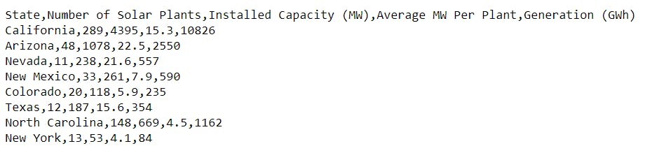
The code incorporates a small CSV sheet into a Pandas DataFrame. The CSV data is read online, and we assign it to the variable DF. This DataFrame will serve as the data source for our app.
High-Level Steps
- Set up the Development Environment
- Import the required libraries
- Load the CSV file
- Create the app layout
- Define the interactions with the callback
- Construct the Matplotlib figure
- Display the Matplotlib figure
- Create a Plotly Express figure and style Dash AG Grid
- Launch the app
Tutorial
Step 1: Set up the Development Environment
Before we start, let's make sure we have all the necessary tools installed. Copy the code below and put it inside your Python IDE.
from dash import Dash, html, dcc, Input, Output # pip install dashimport plotly.express as pximport dash_ag_grid as dagimport dash_bootstrap_components as dbc # pip install dash-bootstrap-componentsimport pandas as pd # pip install pandasimport matplotlib # pip install matplotlibmatplotlib.use('agg')import matplotlib.pyplot as pltimport base64from io import BytesIOdf = pd.read_csv("https://raw.githubusercontent.com/plotly/datasets/master/solar.csv")app = Dash(__name__, external_stylesheets=[dbc.themes.BOOTSTRAP])app.layout = dbc.Container([html.H1("Interactive Matplotlib with Dash", className='mb-2', style={'textAlign':'center'}),dbc.Row([dbc.Col([dcc.Dropdown(id='category',value='Number of Solar Plants',clearable=False,options=df.columns[1:])], width=4)]),dbc.Row([dbc.Col([html.Img(id='bar-graph-matplotlib')], width=12)]),dbc.Row([dbc.Col([dcc.Graph(id='bar-graph-plotly', figure={})], width=12, md=6),dbc.Col([dag.AgGrid(id='grid',rowData=df.to_dict("records"),columnDefs=[{"field": i} for i in df.columns],columnSize="sizeToFit",)], width=12, md=6),], className='mt-4'),])# Create interactivity between dropdown component and graph@app.callback(Output(component_id='bar-graph-matplotlib', component_property='src'),Output('bar-graph-plotly', 'figure'),Output('grid', 'defaultColDef'),Input('category', 'value'),)def plot_data(selected_yaxis):# Build the matplotlib figurefig = plt.figure(figsize=(14, 5))plt.bar(df['State'], df[selected_yaxis])plt.ylabel(selected_yaxis)plt.xticks(rotation=30)# Save it to a temporary buffer.buf = BytesIO()fig.savefig(buf, format="png")# Embed the result in the html output.fig_data = base64.b64encode(buf.getbuffer()).decode("ascii")fig_bar_matplotlib = f'data:image/png;base64,{fig_data}'# Build the Plotly figurefig_bar_plotly = px.bar(df, x='State', y=selected_yaxis).update_xaxes(tickangle=330)my_cellStyle = {"styleConditions": [{"condition": f"params.colDef.field == '{selected_yaxis}'","style": {"backgroundColor": "#d3d3d3"},},{ "condition": f"params.colDef.field != '{selected_yaxis}'","style": {"color": "black"}},]}return fig_bar_matplotlib, fig_bar_plotly, {'cellStyle': my_cellStyle}if __name__ == '__main__':app.run_server(debug=False, port=8002)
Step 2: Install the Required Libraries and Dash Bootstrap Components
Install the necessary libraries by running the following commands in your terminal:
- pip install dash
- pip install dash-bootstrap-components
- pip install dash-ag-grid
- pip install pandas
- pip install matplotlib
Step 3: Load the CSV Data
For this tutorial, we will use a small CSV dataset that contains the data we want to visualize.
df = pd.read_csv("https://raw.githubusercontent.com/plotly/datasets/master/solar.csv")
The code above will load this data into a Pandas DataFrame, which will serve as the basis for our app.
Step 4: Create App Layout
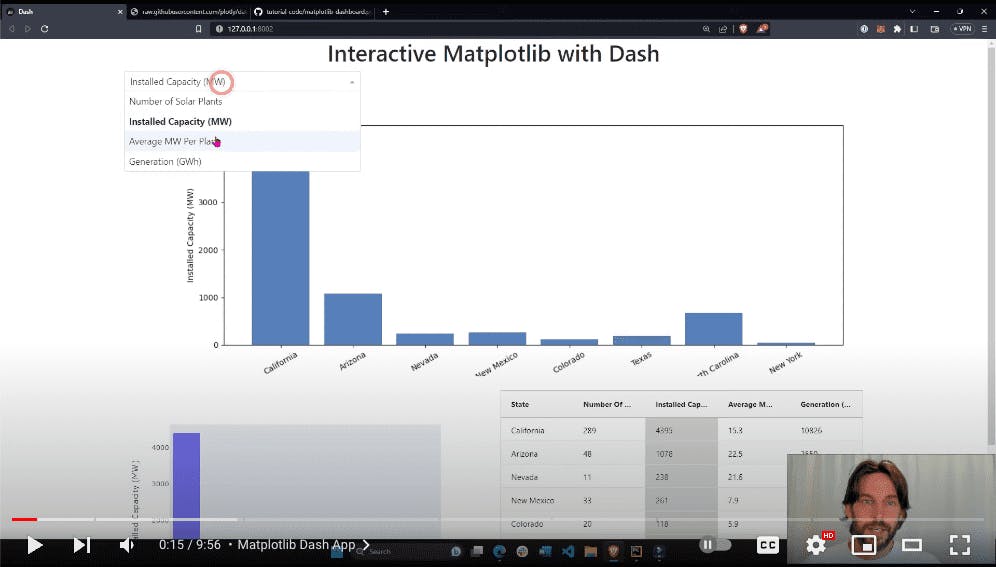
Now it's time to define the layout of our Dash app. We will create a title, a dropdown menu, an image container, a Matplotlib graph, and a Dash AG grid to display the data.
The app layout can be broken down like so:
Header and Dropdown
- The app starts with an HTML H1 header, which serves as the title.
- Below the header, we have a DCC (Dash Core Components) dropdown, which occupies four columns on the left side of the page. The initial value of the dropdown is "Number of Solar Plants," and the other options correspond to the remaining columns in the DataFrame.
Image and Graphs
- In the second row, we have an empty HTML image element. Currently, it does not display anything, but we will modify it later using app callbacks to display the Matplotlib figure.
- Finally, in the last row, we have an empty DCC graph on the left side and a Dash AG grid (tabular data) on the right side. The data from the DataFrame is assigned to the row data property, and the column headers are defined.
Step 5: Create Callback Functions
To add interactivity to our app, we need to create callback functions that handle user interactions. In this step, we will create a callback function that updates the visualizations and cell styling based on the selected option from the dropdown menu.
@app.callback(Output(component_id='bar-graph-matplotlib', component_property='src'),Output('bar-graph-plotly', 'figure'),Output('grid', 'defaultColDef'),Input('category', 'value'),)def plot_data(selected_yaxis):# Build the matplotlib figurefig = plt.figure(figsize=(14, 5))plt.bar(df['State'], df[selected_yaxis])plt.ylabel(selected_yaxis)plt.xticks(rotation=30)# Save it to a temporary buffer.buf = BytesIO()fig.savefig(buf, format="png")# Embed the result in the html output.fig_data = base64.b64encode(buf.getbuffer()).decode("ascii")fig_bar_matplotlib = f'data:image/png;base64,{fig_data}'# Build the Plotly figurefig_bar_plotly = px.bar(df, x='State', y=selected_yaxis).update_xaxes(tickangle=330)my_cellStyle = {"styleConditions": [{"condition": f"params.colDef.field == '{selected_yaxis}'","style": {"backgroundColor": "#d3d3d3"},},{ "condition": f"params.colDef.field != '{selected_yaxis}'","style": {"color": "black"}},]}return fig_bar_matplotlib, fig_bar_plotly, {'cellStyle': my_cellStyle}
Within the callback function we build the Matplotlib figure, Plotly Express figure, and apply conditional cell styling. We then take the value of the dropdown (selected_yaxis) as an input and use it to define the y-axis data of the Matplotlib and Plotly figures.
Step 6: Build Matplotlib Figure
The Matplotlib bar chart is constructed using the DataFrame's "State" column as the x-axis and the selected dropdown option as the y-axis.
# Build the matplotlib figurefig = plt.figure(figsize=(14, 5))plt.bar(df['State'], df[selected_yaxis])plt.ylabel(selected_yaxis)plt.xticks(rotation=30)
We start by constructing the bar chart using the Matplotlib library. The x-axis of the chart corresponds to the 'State' column of the DataFrame, as shown in the code snippet. The height of each bar is determined by the selected y-axis, which is obtained from the dropdown option.
To enhance the visualization, we set the y-label to match the selected y-axis and rotate the x-axis tick labels for improved readability.
An important aspect is saving the Matplotlib figure as a temporary buffer. This is done to embed the resulting image data in the HTML output, allowing it to be displayed appropriately.
# Save it to a temporary buffer.buf = BytesIO()fig.savefig(buf, format="png")# Embed the result in the html output.fig_data = base64.b64encode(buf.getbuffer()).decode("ascii")fig_bar_matplotlib = f'data:image/png;base64,{fig_data}'
Step 7: Display Matplotlib Figure
Once the Matplotlib figure, fig_bar_matplotlib, is generated, it can be returned from the callback function. In Dash, any object returned from a callback function is assigned to the component property of the corresponding output.
return fig_bar_matplotlib, fig_bar_plotly, {'cellStyle': my_cellStyle}
In this case, we return fig_bar_matplotlib as the first object in the callback function. It will be assigned to the src (source) property of the component with the specified ID, which is responsible for displaying the Matplotlib figure.
By assigning fig_bar_matplotlib to the src property of an html.img component, the Matplotlib figure is integrated into the row layout. This allows the figure to be displayed just below the dropdown menu and above other components within the row.
Following the same process, you can create different visualizations using Matplotlib, like scatter plots or any desired figure. By saving the figure to a temporary buffer and converting it into an HTML output, you can easily display it on the web page as the source of an HTML image component. This process allows for direct rendering of the Matplotlib figure on the page.
Step 8: Build Plotly Figure and Style Dash AG Grid
fig_bar_plotly = px.bar(df, x='State', y=selected_yaxis).update_xaxes(tickangle=330)my_cellStyle = {"styleConditions": [{"condition": f"params.colDef.field == '{selected_yaxis}'","style": {"backgroundColor": "#d3d3d3"},},{ "condition": f"params.colDef.field != '{selected_yaxis}'","style": {"color": "black"}},]}
Next, we create a Plotly Express bar chart using the DataFrame. The x-axis is set as the 'State' column, and the y-axis is determined by the selected option from the dropdown menu, representing one of the columns in the data.
We return this bar chart as the second object in the callback function, assigned to the “figure” property of the specified ID in the output. In Dash, you can return any Plotly Express figure, such as scatter plots or pie charts, and assign it to the figure property of a DCC graph component. This is how you display figures on a page within a Dash app.
return fig_bar_matplotlib, fig_bar_plotly, {'cellStyle': my_cellStyle}
Lastly, the callback function applies conditional styling to the cells in the AG Grid. The selected columns are given a gray background.
The conditional styling is returned as the third output object in the callback function, assigned to the component property of the output, named “defaultColDef”.
Step 9: Run App and Interact with Visualizations
Now that our app is complete, we can run it and interact with the visualizations. Launch the app, open it in a browser and explore the dropdown menu options. As we select different options, we will see the visualizations and cell stylings update in real time.
Feel free to experiment here and customize the app to fit your needs.
Conclusion
There you have it! We've created a simple yet interactive Dash Python app that incorporates Matplotlib figures. With this app, you can easily generate and connect any type of figure you desire to different components.
Remember to keep exploring the documentation and examples provided by Matplotlib and Dash communities. They offer a wealth of resources, tutorials, and code snippets that can inspire you and help you solve specific challenges you may encounter along the way.
- Matplotlib forum: https://discourse.matplotlib.org/
- Plotly Dash forum: https://community.plotly.com/
- Matplotlib Docs: https://matplotlib.org/stable/index.html
- Dash Docs: https://dash.plotly.com/tutorial
- Full YouTube walk-through