
Adam Schroeder
July 25, 2023
Build Python Web Apps for scikit-learn Models with Plotly Dash
Scikit-learn is a simple and efficient machine learning library for Python, enabling you to quickly scale your machine learning models without complex code or algorithms.
In this article, we’ll provide a step-by-step tutorial on how to build your very own interactive Python web app for your scikit-learn models with Plotly Dash.
(Check out this video for a live walk through.)
How Plotly Dash simplifies visualizing and interacting with machine learning models
Machine learning models rapidly process data to detect patterns and data discrepancies, provide accurate predictions, and ultimately enable robust and informed decision-making. However, the output of a machine learning model requires visual representation to ease understanding and highlight actionable insights.
Plotly Dash simplifies this process by allowing you to create an interactive dashboard and tune your scikit-learn machine learning model parameters directly on the web.
In this tutorial, you’ll learn how to:
- Build a Python web app incorporating scikit-learn
- Tune the parameters of your scikit-learn model directly on the web
- Visualize your data with graphs and datatables
We’ll cover a breakdown of the app code, including the libraries you’ll need to import, data preparation, and most importantly, the app layout code.
Let’s get started.
Step-by-step tutorial: How to build a Python web app for your scikit-learn models with Plotly Dash
In this tutorial, we’ll use a sample wine quality dataset to learn how to create interactive input fields to recalculate scikit-learn model parameters, flexible tables to display our dataset in a grid format, and Plotly graphs to visualize wine pH and acidity distribution.
Over the course of the tutorial, we’ll follow these high-level steps:
- Set up the development environment
- Import the required libraries
- Load the CSV dataset undefined
- Create the app layout
- Create the app callback
- Launch the app
To successfully follow this tutorial, access this code and dataset:
You can also follow along with the video tutorial.
Step 1: Set up the development environment
For fast and easy execution, set up your environment by pasting the following code into your Python IDE, VS Code, or other preferred IDE:
from dash import Dash, dcc, html, callback, Input, Outputimport dash_bootstrap_components as dbcimport plotly.express as pximport dash_ag_grid as dagimport pandas as pdfrom sklearn.ensemble import RandomForestClassifierfrom sklearn.preprocessing import StandardScaler, LabelEncoderfrom sklearn.model_selection import train_test_splitfrom sklearn.metrics import accuracy_scorewine = pd.read_csv('https://raw.githubusercontent.com/plotly/datasets/master/winequality-red.csv')quality_label = LabelEncoder()wine['quality'] = quality_label.fit_transform(wine['quality'])X = wine.drop('quality', axis = 1)y = wine['quality']print(wine.columns)app = Dash(__name__, external_stylesheets=[dbc.themes.BOOTSTRAP])app.layout = dbc.Container([html.H1('Scikit-Learn with Dash', style={'textAlign': 'center'}),dbc.Row([dbc.Col([html.Div("Select Test Size:"),dcc.Input(value=0.2, type='number', debounce=True, id='test-size', min=0.1, max=0.9, step=0.1)], width=3),dbc.Col([html.Div("Select RandomForest n_estimators:"),dcc.Input(value=150, type='number', debounce=True, id='nestimator-size', min=10, max=200, step=1)], width=3),dbc.Col([html.Div("Accuracy Score:"),html.Div(id='placeholder', style={'color':'blue'}, children="")], width=3)], className='mb-3'),dag.AgGrid(id="grid",rowData=wine.to_dict("records"),columnDefs=[{"field": i} for i in wine.columns],columnSize="sizeToFit",style={"height": "310px"},dashGridOptions={"pagination": True, "paginationPageSize":5},),dbc.Row([dbc.Col([dcc.Graph(figure=px.histogram(wine, 'fixed acidity', histfunc='avg')),], width=6),dbc.Col([dcc.Graph(figure=px.histogram(wine, 'pH', histfunc='avg')),], width=6)]),])@callback(Output('placeholder', 'children'),Input('test-size', 'value'),Input('nestimator-size', 'value'))def update_testing(test_size_value, nestimator_value):# Train and TestX_train, X_test, y_train, y_test = train_test_split(X, y, test_size=test_size_value, random_state=2)# Apply Standard scalingsc = StandardScaler()X_train = sc.fit_transform(X_train)X_test = sc.fit_transform(X_test)# Random Forest Classifierrfc = RandomForestClassifier(n_estimators=nestimator_value)rfc.fit(X_train, y_train)pred_rfc = rfc.predict(X_test)score = accuracy_score(y_test, pred_rfc)return scoreif __name__=='__main__':app.run_server()
Step 2: Import the required libraries
Run this code to install the required libraries for the application:
from dash import Dash, dcc, html, callback, Input, Outputimport dash_bootstrap_components as dbcimport plotly.express as pximport dash_ag_grid as dagimport pandas as pdfrom sklearn.ensemble import RandomForestClassifierfrom sklearn.preprocessing import StandardScaler, LabelEncoderfrom sklearn.model_selection import train_test_splitfrom sklearn.metrics import accuracy_score
Step 3: Load the CSV dataset
As mentioned earlier, this tutorial uses a small sample dataset containing wine quality data, stored as a CSV file. Run the code below to read the data into a pandas DataFrame:
wine = pd.read_csv('https://raw.githubusercontent.com/plotly/datasets/master/winequality-red.csv')
Prepare the data
The next block of code prepares the data set for testing and training, as well as printing out the column names in case you’d like to view them in your working environment.
quality_label = LabelEncoder()wine['quality'] = quality_label.fit_transform(wine['quality'])X = wine.drop('quality', axis = 1)y = wine['quality']print(wine.columns)
Step 4: Create the app layout
First, instantiate the Dash app:
app = Dash(__name__, external_stylesheets=[dbc.themes.BOOTSTRAP])
The following will be the longest section of the code, where you’ll create the interactive app layout to be displayed on your web app. Here’s how it works:
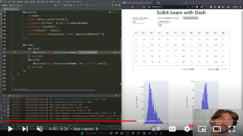
The app layout starts with the header, “Scikit-Learn with Dash”, followed by three column components, each with a width of 3, placed within the first row of the app:
- The first column component is an input text field allowing the user to select the test size. We feed it an initial value, as well as a minimum and maximum value to ensure users stay in the range required by the model.
- The second column component is another text input field where users can select the RandomForest n_estimators.
- The third column component is the accuracy score, which acts as a placeholder and initially passes an empty string in the children argument, to be replaced by the accuracy score calculated in the callback function of the app.
dbc.Container([html.H1('Scikit-Learn with Dash', style={'textAlign': 'center'}),dbc.Row([dbc.Col([html.Div("Select Test Size:"),dcc.Input(value=0.2, type='number', debounce=True, id='test-size', min=0.1, max=0.9, step=0.1)], width=3),dbc.Col([html.Div("Select RandomForest n_estimators:"),dcc.Input(value=150, type='number', debounce=True, id='nestimator-size', min=10, max=200, step=1)], width=3),dbc.Col([html.Div("Accuracy Score:"),html.Div(id='placeholder', style={'color':'blue'}, children="")], width=3)], className='mb-3')
Under the first row, the Dash AG grid displays the data from our wine quality dataset. This grid allows the user to play with the way data is displayed, by moving columns or increasing the numbers of records displayed at a time.
dag.AgGrid(id="grid",rowData=wine.to_dict("records"),columnDefs=[{"field": i} for i in wine.columns],columnSize="sizeToFit",style={"height": "310px"},dashGridOptions={"pagination": True, "paginationPageSize":5},)
Two Plotly histogram graphs make up the final section of the app layout. The first histogram represents the distribution of the fixed acidity of wines in our dataset, while the second histogram displays the distribution of pH levels.
dbc.Row([dbc.Col([dcc.Graph(figure=px.histogram(wine, 'fixed acidity', histfunc='avg')),], width=6),dbc.Col([dcc.Graph(figure=px.histogram(wine, 'pH', histfunc='avg')),], width=6)])
Step 5: Create the app callback
The callback section of the code is responsible for making the app interactive. The app callback function generates a recalculated accuracy score whenever a user changes the parameters of the model through the input text fields that we added in the layout.
The callback is divided into two sections:
- Callback decorator
- Callback function
@callback(Output('placeholder', 'children'),Input('test-size', 'value'),Input('nestimator-size', 'value'))
The callback decorator passes these two dynamic values to the callback function, which is triggered any time an input text field is modified in the app layout.
def update_testing(test_size_value, nestimator_value):# Train and TestX_train, X_test, y_train, y_test = train_test_split(X, y, test_size=test_size_value, random_state=2)# Apply Standard scalingsc = StandardScaler()X_train = sc.fit_transform(X_train)X_test = sc.fit_transform(X_test)# Random Forest Classifierrfc = RandomForestClassifier(n_estimators=nestimator_value)rfc.fit(X_train, y_train)pred_rfc = rfc.predict(X_test)score = accuracy_score(y_test, pred_rfc)return score
The callback function then trains and tests the model based on the dynamic values passed to the function, applying the standard scaling common to scikit-learn.
This is followed by the Random Forest Classifier algorithm, which we’ll use to calculate the new accuracy score with the inputs provided by the user each time the callback function is triggered.
The callback function returns the accuracy score, which is then assigned to the component property of the callback output — the children of the html.Div — and passed to the app layout to be displayed.
Step 6: Launch the app
To run the code and launch the app, execute the following code:
if __name__=='__main__':app.run_server()
Click on the http://127.0.0.1:8050/ link generated by the code to launch your Python web app. You can now interact with the app to see its functionality every time you modify an input field.
Remember, you can always customize the app by adding additional visualizations, input fields, and more.
Additional resources for creating interactive Dash Python web apps
With that, you’ve successfully created your first interactive Dash Python web app incorporating scikit-learn! This app is a simple example of how you can utilize the powerful libraries of Dash and Plotly to build interactive machine learning web apps.
Make sure you continue to explore the documentation and tutorials created by scikit-learn and Dash communities. They provide hundreds of tools, guides, and code samples that can help you accelerate your learning.
scikit-learn tutorials: https://scikit-learn.org/stable/tutorial/index.html
Plotly Dash forum: https://community.plotly.com/
scikit-learn Docs: https://scikit-learn.org/0.21/documentation.html
Dash Docs: https://dash.plotly.com/tutorial