
Moeen Ul Islam
April 21, 2023 - 15 min read
Why Automate Excel Reports Using Python?
Generating Excel reports can be tedious & time-consuming, but there’s a solution. Automating your reports using Python.
Have you ever been stuck with repetitive data processing tasks, wasting your precious time and energy on fetching, storing, generating reports, and performing calculations? Well, I certainly have! Recently, I was assigned an Excel automation project that had me spinning my wheels for days. That is until I discovered the amazing trio of Python, Dash, and Plotly. With their help, I was able to streamline my work and free up my time for more productive pursuits.
Automation is the ultimate solution to break free from the tedium of repetitive data processing tasks. Your life becomes much easier with improved efficiency, accuracy, and less human-prone error. With a plethora of tools to automate almost all the possible operations related to Excel, this tutorial will explore the capabilities of Python that makes it a powerful tool when working with Excel files or data in general. Trust me, you don't want to miss out on these tools! if you are in the same boat!
A brief overview of Python
Developed by Guido Von Rossum and first released in 1991, Python is a high-level, general-purpose programming language that gained popularity in recent years because of its simplicity, readability, and versatility, making it a good choice for a major chunk of work that comes under the domain of Software development, research & analysis, AI and Machine learning, Scripting & automation.
Some of the highlights and key features of Python:
- Simple syntax that is easy to understand: making it an excellent option for novices.
- Extensive collection of libraries and packages: Python comes with a vast library of pre-built modules that can be used for practically everything from web development to data analysis, and scientific computing, so no "building the wheel from scratch" as they say.
- Cross-platform: Python code can be run on various platforms/operating systems, including Windows, macOS, and Linux. So no matter what machine you are using it is covered by Python.
- Free and open-source: Python is free to use for each and every person on the planet, it is easy to download and install. You can download Python from its official download page.
Is there a way to automate Excel reports?
Excel reports can be automated using a variety of tools, including Power Query, Macros, and Microsoft Power Automate. While each of the aforementioned tools is quite capable of automating, formatting, computations, data extraction, and purification, they all have limitations when it comes to carrying out sophisticated operations or generally interacting with additional applications. This is where Python comes into play. Python is a great choice for automating Excel and performing in-depth data analysis due to its flexibility as a general-purpose programming language and its large ecosystem of external modules for data analysis and visualization. The abundance of libraries it offers, such as Pandas, Matplotlib, Plotly, and others, enables users to create unique, accurate, and consistent reports that incorporate data analysis and visualizations as well as other important information.
How can I automate Excel spreadsheets and reports using Python?
There is a huge list of libraries that we can use for generating the reports from the Excel files in Python e.g., xlrd, openpyxl, pandas, numpy, xlsxwriter, matplotlib, plotly.
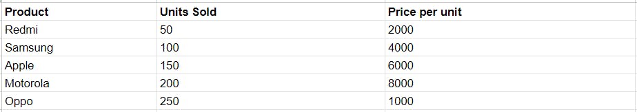
Let's take an example of a small dataset stored in a file data.xlsx to demonstrate automating the calculation of total sales.
In this example we will be using:
1. Plotly is an interactive, open-source plotting library for Python, covering over 40 different chart types for a variety of statistical, financial, geographic, scientific, and three-dimensional use cases. Access the PyPI package.
2. Pandas is a popular choice to work with Excel files in Python, offering a broad variety of functionality for reporting, data analysis, and manipulation e.g., filtering, grouping, reshaping data, etc. Additionally, a couple of other data analysis tools e.g., matplotlib, scikit-learn, plotly integrate and work well with Pandas.
Install packages
Let's install all the required packages and libraries using Python's inbuilt package manager called pip.
#Installing pandas and plotlypip install pandaspip install plotly
Install packages
Importing the required packages.
#import libraries and give them an alias for ease of useimport pandas as pdimport plotly.express as pximport plotly.io as pio
Read the dataset
Let's use read_excel() function provided by the Pandas library to read data from an Excel file and create a Pandas DataFrame, which is a table-like data structure with labelled columns and rows.
Note: Make sure the script and the excel file is located in the same folder.
#reading the dataset and storing in a variable dfdf = pd.read_excel('data.xlsx')
Perform the operations
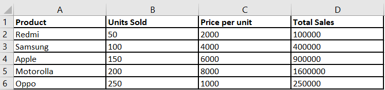
To get the total sales for each row in our dataframe, we will multiply values from the column 'Units Sold' with its corresponding values in the column 'Price per unit'. The resulting values will be stored in the newly created column 'Total Sales'.
# calculating the total sales and adding a new column for the samedf['Total Sales'] = df['Units Sold'] * df['Price per unit']
Result:

Plot the Charts
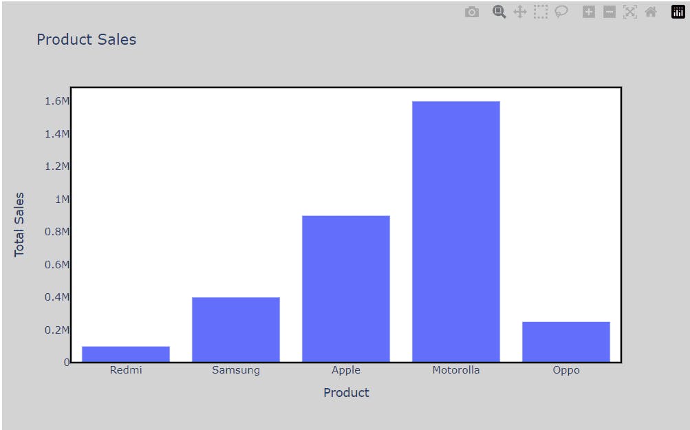
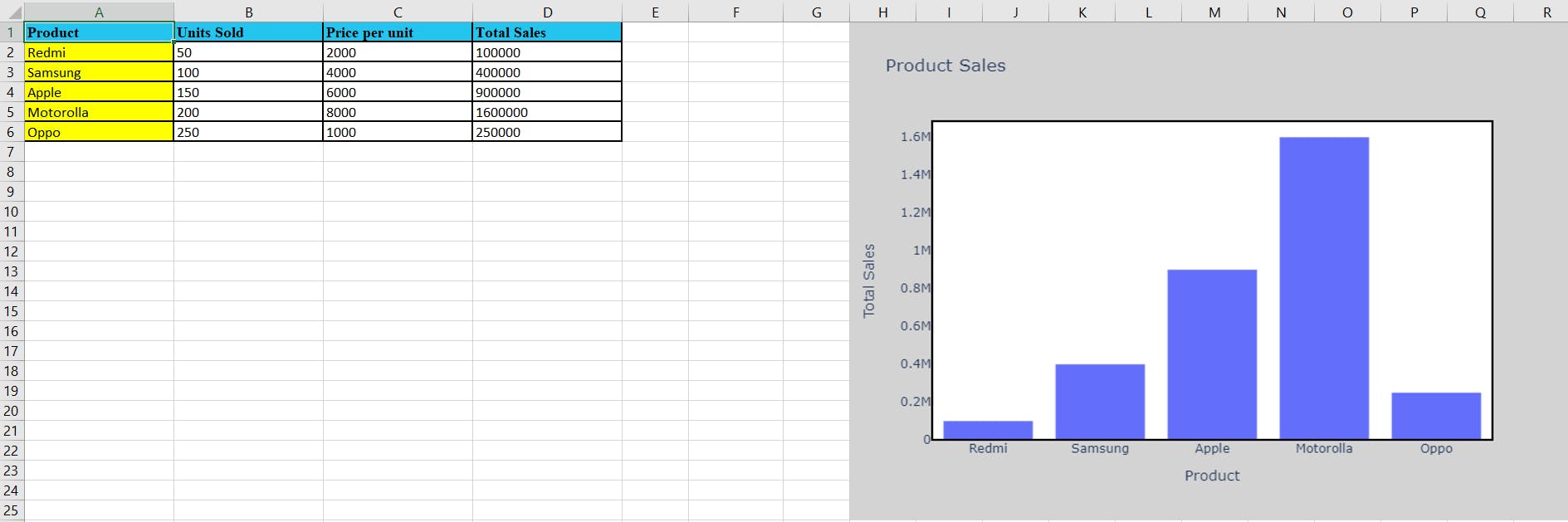
Let's learn how we can pictorially represent our calculations by plotting a bar chart with Plotly Express's bar() function. We will also need this chart in our report, so let's save it as a png file using Plotly's write_image() function.
# Create a bar chart of Product vs Total Salesfig = px.bar(df, x='Product', y='Total Sales', title='Product Sales')# set the border and background color of the chart areafig.update_layout(plot_bgcolor='white',paper_bgcolor='lightgray',width=800,height=500,shapes=[dict(type='rect', xref='paper',yref='paper',x0=0,y0=0,x1=1,y1=1,line=dict(color='black',width=2,),)])#display the graphfig.show()# Alternatively you can save the bar graph to an image using below line of codepio.write_image(fig, 'bar_graph.png')
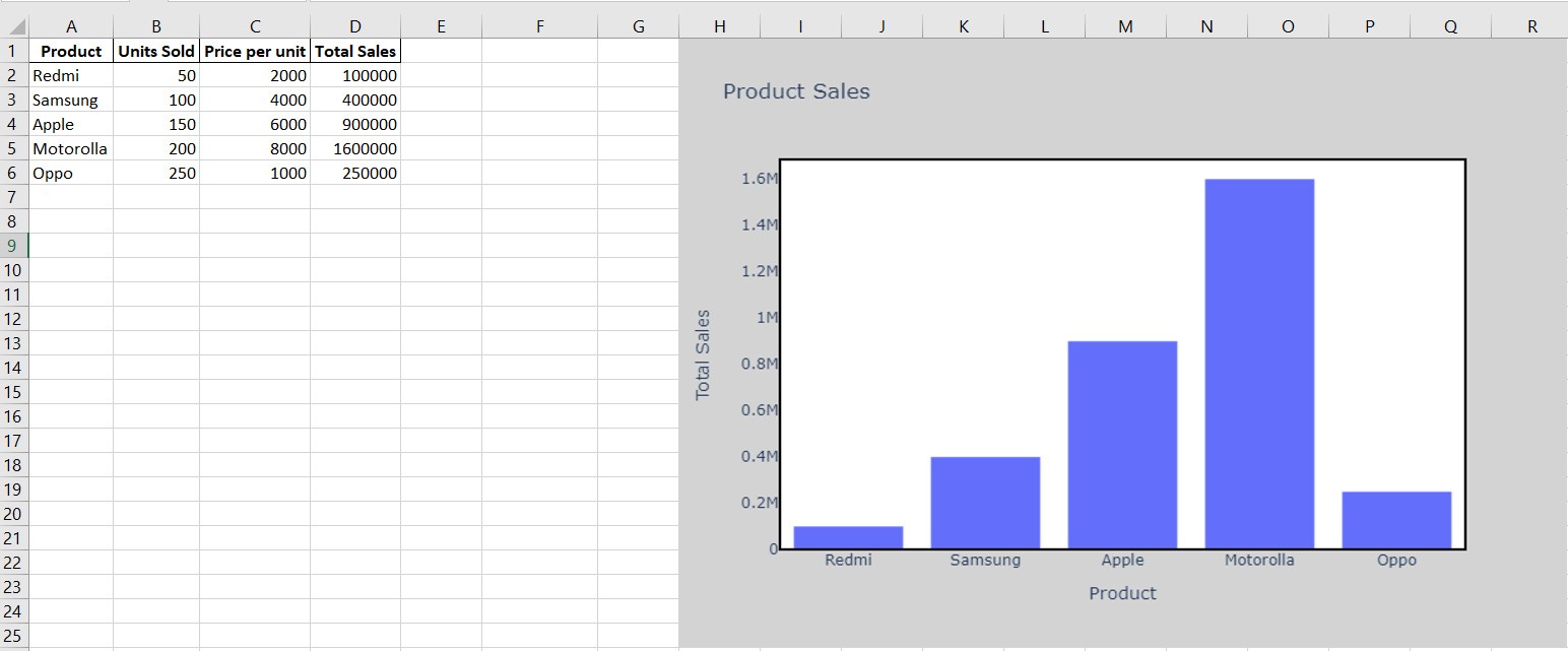
Generate the report
Now that we've completed the calculations and plotting chart, let's make a new Excel file to store the report. To prevent data loss, I recommend that you also create a new Excel file instead of storing them in the original one.
NOTE:
Some optional dependencies that you should install before running the below code.
1. openpyxl: pip install openpyxl
2. kaleido: pip install -U kaleido
3. xlsxwriter: pip install xlsxwriter
4. Pillow: pip install Pillow
#creating a new excel file named 'report.xlsx' to avoid data loss incasewriter = pd.ExcelWriter('report.xlsx', engine='xlsxwriter')#save the updated data to an excel file with sheet name 'Sales Data'df.to_excel(writer, index=False, sheet_name='Sales Data')#creating a worksheet object named 'worksheet' within the Excel file that was created earlier using the 'ExcelWriter' function.worksheet = writer.sheets['Sales Data']# add the chart to the newly created Excel fileworksheet.insert_image('H1', 'bar_graph.png')#Finally save the filewriter.save()
The result will look something like this:
Formatting the Excel report
When presenting reports to a client or customer, or for future use, formatting your Excel sheets plays a vital role. It improves the readability and visual appeal of data, allowing for more effective interpretation and sharing of insights. We will use openpyxl to demonstrate different formatting styles in our newly generated report.
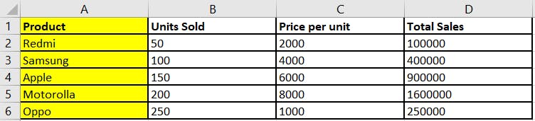
This is how our Excel file looks before formatting:
Let's import the required packages and our Excel reports file:
from openpyxl import load_workbookfrom openpyxl.styles import Alignment, Border, Side, PatternFill# load the existing workbook and select the active worksheetwb = load_workbook('report.xlsx')ws = wb.active
1. Alignment:
# set the width of all columns to 20for col in ws.columns:ws.column_dimensions[col[0].column_letter].width = 20# Set the text in cells left-alignedfor row in ws.iter_rows(min_row=1, max_row=6, min_col=1, max_col=ws.max_column):for cell in row:cell.alignment = Alignment(horizontal='left')# save the modified workbookwb.save('report.xlsx')
2. Adding borders:
# create a new workbook and select the active worksheetwb = load_workbook('report.xlsx')ws = wb.active# set a border around a specific range of cellsrrange_border = Border(left=Side(style='medium'),right=Side(style='medium'),top=Side(style='medium'),bottom=Side(style='medium'))for row in ws.iter_rows(min_row=1, max_row=6, min_col=1, max_col=ws.max_column):for cell in row:cell.border = range_border# save the workbook to a new filewb.save('report.xlsx')
3. Highlighting the columns:
# define the fill pattern to highlight the columnfill = PatternFill(start_color='FFFF00', end_color='FFFF00', fill_type='solid')# highlight the first column of the sheetfor cell in ws[ws.max_column]:cell.fill = fill# save the modified workbook to a new Excel filewb.save('report.xlsx')
4. Adding font styles:
# set font styles for first rowfont = Font(name='Times New Roman', bold=True)# set background color for the first rowfill = PatternFill(start_color='23C4ED', end_color='23C4ED', fill_type='solid')for row in ws.iter_rows(min_row=1, max_row=1):if row[0].row == 1:for cell in row:cell.fill = fillcell.font = font# save the workbookwb.save('report.xlsx')
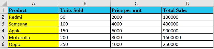
This is how the Excel file looks after the formatting:
Pivot Tables
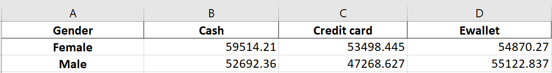
Additionally, we can generate pivot tables to summarize and analyze large amounts of data by grouping, filtering, or sorting this data by any particular criteria we want. Dataset used in this example:
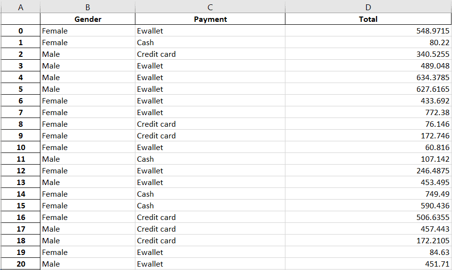
#import the required packagesimport pandas as pdimport plotly.express as px# Load the Excel file into a pandas DataFramedf = pd.read_excel("pivot_dataset.xlsx")# Create a pivot tablepivot_df = pd.pivot_table(df, values='Total', index='Gender', columns='Payment', aggfunc='sum')# Export the pivot table to an Excel filepivot_df.to_excel('output_file.xlsx', sheet_name='Sheet1', index=True)
Result:
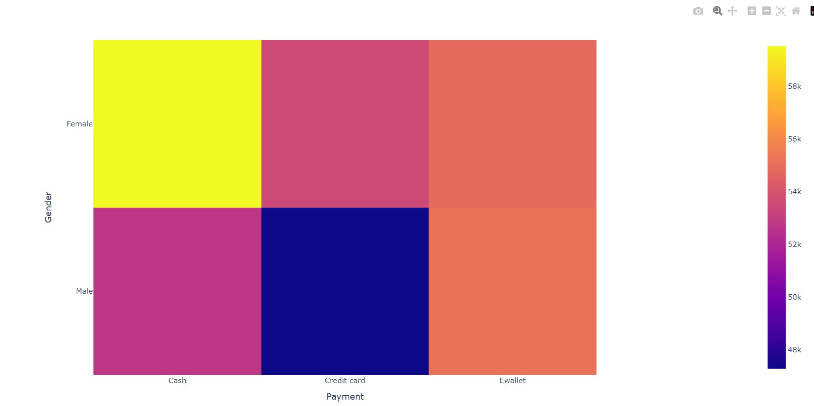
Additionally, you can create a Plotly figure for the same to visualize things graphically:
# Create a Plotly figurefig = px.imshow(pivot_df)# Show the figurefig.show()
Now, all that is left is to schedule the above script to run daily, weekly, monthly, or whatever your use case is. Depending on your needs and scenario, you can use the Crontab, Task Scheduler, Automator, or Anacron.
Wrapping everything into Python functions
Let's wrap all the code into respective Python functions so that the code not only becomes easy to handle but also reusable, and more readable.
import pandas as pdimport plotly.express as pximport plotly.io as piofrom openpyxl import load_workbookfrom openpyxl.styles import PatternFill, Border, Side, Alignment, Font#Function for automating the spreadsheetdef automate_excel_report(inputFilename, outputFilename):df = pd.read_excel(inputFilename)# Add a new column for Total Salesdf['Total Sales'] = df['Units Sold'] * df['Price per unit']# Create a bar graph of units sold using Plotlyfig = px.bar(df, x='Product', y='Total Sales', title='Product Sales')# set the border and background color of the chart areafig.update_layout(plot_bgcolor='white',paper_bgcolor='lightgray',shapes=[dict(type='rect',xref='paper',yref='paper',x0=0,y0=0,x1=1,y1=1,line=dict(color='black', width=2))])# Save the bar graph as an image filepio.write_image(fig, 'bar_graph.png')writer = pd.ExcelWriter(outputFilename, engine='xlsxwriter')df.to_excel(writer, index=False, sheet_name='Sales Data')worksheet = writer.sheets['Sales Data']worksheet.set_column('F:F', 12)worksheet.insert_image('H1', 'bar_graph.png')# save the filewriter.close()#Function for automating the reportsdef automate_excel_formatting(inputFilename, outputFilename):# # load the Excel filewb = load_workbook(inputFilename)ws = wb.active# # define the fill pattern to highlight the columnfill = PatternFill(start_color='FFFF00', end_color='FFFF00', fill_type='solid')# highlight the 'Product' column of the sheetfor cell in ws['A:A']:cell.fill = fill# =========================Borders======================# set a border around a specific range of cellsrange_border = Border(left=Side(style='medium'),right=Side(style='medium'),top=Side(style='medium'),bottom=Side(style='medium'))for row in ws.iter_rows(min_row=1, max_row=6, min_col=1, max_col=ws.max_column):for cell in row:cell.border = range_border# =====================column alignmnet====================# # set the width of all columns to 20for col in ws.columns:ws.column_dimensions[col[0].column_letter].width = 20# add some text to the worksheet and set it left-alignedfor row in ws.iter_rows(min_row=1, max_row=6, min_col=1, max_col=ws.max_column):for cell in row:# cell.value = f'Text {cell.column}{cell.row}'cell.alignment = Alignment(horizontal='left')#=======================font styles===============# set font styles for different rowsfont_name = Font(name='Times New Roman', bold=True)# set background color for the first rowfill = PatternFill(start_color='23C4ED', end_color='23C4ED', fill_type='solid')for row in ws.iter_rows(min_row=1, max_row=1):if row[0].row == 1:for cell in row:cell.fill = fillcell.font = font_name# save the workbookwb.close(outputFilename)#Function for automating the pivot tabledef automate_excel_pivot_table(inputFilename, outputFilename):# Load the Excel file into a pandas DataFrame# df = pd.read_excel("pivot_dataset.xlsx")df = pd.read_excel(inputFilename)# Create a pivot tablepivot_df = pd.pivot_table(df, values='Total',index='Gender', columns='Payment', aggfunc='sum')# Export the pivot table to an Excel filepivot_df.to_excel(outputFilename, sheet_name='Sheet1', index=True)# Create a Plotly figurefig = px.imshow(pivot_df)# Show the figurefig.write_image('fig.png')
Now you just need to call the Python functions and pass the filename to it. Example:
#passing my file named 'data.xlsx' as an input will create a new file named 'report.xlsx' as an outputautomate_excel_report('data.xlsx', 'report.xlsx')#passing the 'report.xlsx' file generated using the above function will create a new formatted excel file named 'formattedReport.xlsx'automate_excel_formatting('report.xlsx', 'formattedReport.xlsx')#passing the file named 'pivot_dataset.xlsx' will create a new file named pivotTable.xlsxautomate_excel_pivot_table('pivot_dataset.xlsx', 'pivotTable.xlsx')
Viola! Everything is done for you.
Now, the only remaining task is to set a schedule for the script mentioned above, whether it's on a daily, weekly, or monthly basis, depending on your specific needs. You can use tools such as Crontab, Task Scheduler, Automator, or Anacron as per your use case.
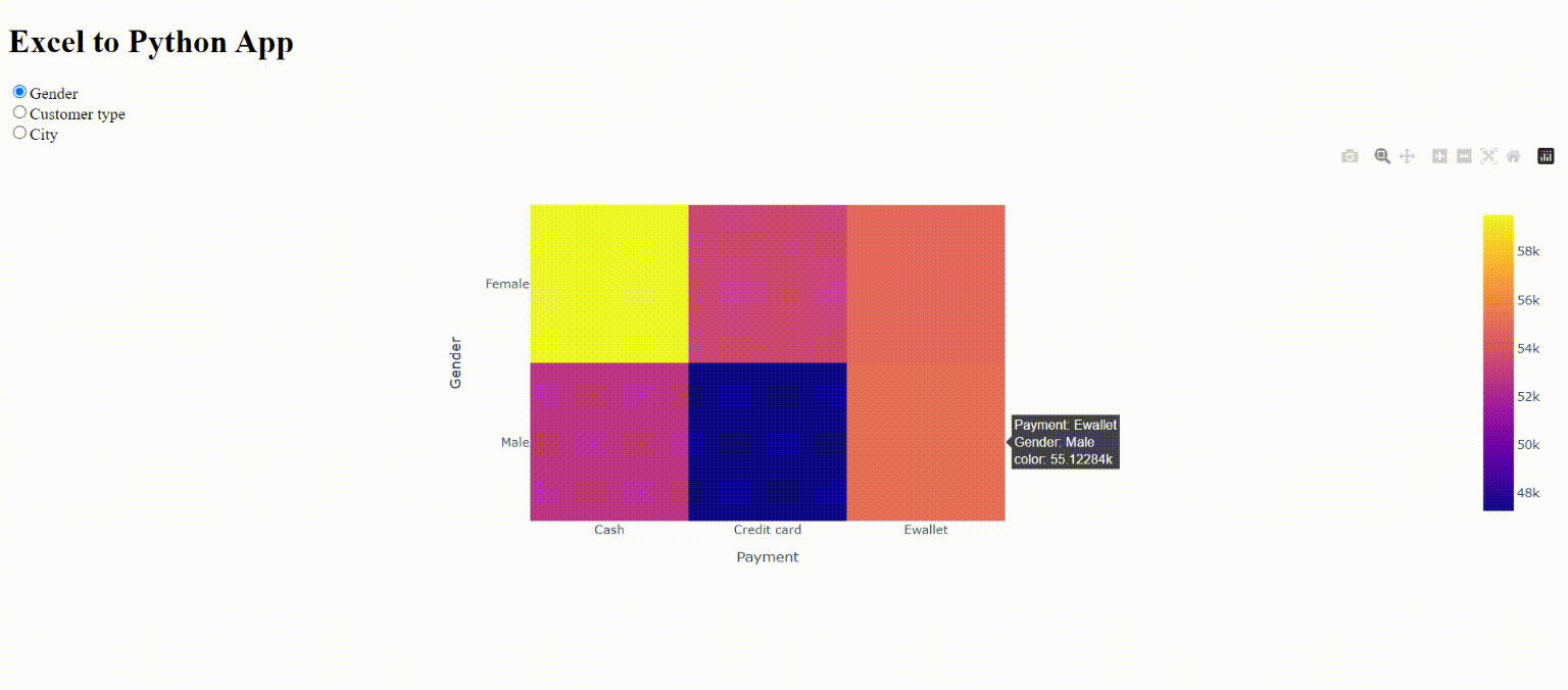
Live Dash app showing automated Excel reports
Are you searching for a more efficient and streamlined approach to managing your reporting process? If so, you may want to consider Dash, which can help you manage your Excel reports and streamline your workflow. With a Dash application, you can examine your reports in real-time and make data-driven decisions effortlessly. By utilizing this powerful framework, you can save time and improve the quality of your reporting process.
Let's take the dataset that we used to learn about the pivot tables earlier. We will create a simple dash application that summarizes the data between a selected column and the Payment column. Accordingly, we will generate a heatmap and load it on our dashboard. Surprisingly, accomplishing all of this can be done with just 21 lines of code.
Import all the required packages and datasetfrom dash import Dash, html, dcc, Output, Inputimport plotly.express as pximport pandas as pdimport openpyxldf = pd.read_excel("supermarket_sales.xlsx")
Create a Dash application instance and define the layout using HTML and Dash code components.
#instantiating Dashapp = Dash(__name__)#Defining the web layoutapp.layout=html.Div([html.H1("Excel to Python App"),dcc.RadioItems(id='col-choice', options=['Gender','Customer type','City'], value='Gender'),dcc.Graph(id='our-graph', figure={}),])
Define a callback function called update_graphs() using the @app.callback decorator. The function takes a single input parameter, which corresponds to the value of the radio button group that the user selects.
Inside the function, it creates a pivot table using the pandas to summarize the data by the selected column and Payment column. It then creates a heatmap visualization using plotly.express function and returns the figure object.
@app.callback(Output('our-graph', 'figure'),Input('col-choice', 'value'))def update_graphs(column_selected):pivot_df = pd.pivot_table(df, values='Total', index=column_selected, columns='Payment', aggfunc='sum')fig = px.imshow(pivot_df)return fig
Run the application which starts the Flask server and renders the application on a web page.
if __name__=='__main__':app.run_server()
Viola! In just 21 lines of code, your dashboard is ready. Live Demo.
Conclusion
Automating Excel reports with Python can significantly enhance data processing and reporting tasks, such as generating and formatting reports, creating pivot tables, and developing interactive dashboards with tools like Dash and Plotly. Python, being a user-friendly and versatile programming language, can be easily learned and used by individuals of all skill levels. By following the step-by-step approach outlined in this article, anyone can create reports quickly and accurately, saving valuable time and resources. With the ability to make informed decisions based on current data, individuals can achieve better outcomes. Overall, Python offers a dependable and efficient solution for automating Excel reports and presents a remarkable opportunity for individuals and organizations seeking to optimize their data processing and reporting workflows.