
Jeff Butler
September 09, 2024
Exploring Data Science’s Impact on Portfolio Management in Finance
Data science has specialized roles in finance, shaping how risk is managed and data is visualized. Jeff Butler, Executive Director - XVA Trading at CIBC, has transitioned from an engineering and math background to managing complex credit and funding risks for derivatives. At CIBC, Jeff’s role on the XVA trading desk involves complex analytics on big data to assess risk.
In his interview with Plotly’s Community Manager, Adam Schroeder, Jeff discusses his journey from traditional tools like Excel to advanced data science technology such as Jupyter Notebooks and Plotly Dash. He also touches on the integration of AI and cloud computing, sharing how these tools enhance data management and visualization in finance.
Read excerpts from Adam’s conversation with Jeff to gain insights into how data science and visualization evolve within a major financial institution.
Watch the full interview video here.

Adam Schroeder, Community Manager at Plotly, interviewed Jeff Butler, Executive Director - XVA Trading at CIBC.
Q&A with Jeff Butler: applying data science in financial services
Jeff Butler, a seasoned professional in finance and data science, has dedicated his career to managing credit and funding risk at CIBC. With 18 years of experience and a background in engineering, math, and analytics, Jeff has seen the evolution of data science tools firsthand.
His team’s work on the XVA trading desk involves Jupyter Notebooks, Databricks, and Plotly Dash. Jeff’s approach to integrating these technologies into financial risk management highlights his commitment to leveraging data science for practical and impactful solutions.
Can you tell us more about your role at CIBC?
I started in credit risk management right around the financial crisis in 2008-09. At the time, credit valuation adjustment (CVA) was calculated only in the credit risk department. After two and a half years, I had the opportunity to build a desk and management function on the business side.

In 2009, I moved to the Resource Management Group, and we built out a Monte Carlo computational engine and risk reporting frameworks. Over the years, I’ve managed various projects, including technology mandates and expanding our data science capabilities.
Currently, I’m on the XVA trading desk, which sits within our Resource Management Group. Our team is primarily responsible for managing credit and funding risk on over-the-counter derivatives.
What do you think are the advantages of working at the same company for a long time?
You get a depth of understanding of the institution, build relationships across the firm, and really know the ins and outs of the products. That knowledge is valuable, and it allows you to take on in-depth roles and see things through their lifecycle.
It’s specialized knowledge. For example, in the XVA space, it’s niche, but the underlying concepts, like derivatives and trade pricing, are transferable across industries. Similarly, data science skills are highly transferable.
For those unfamiliar with financial services, can you clarify what derivatives are?
Sure. A derivative is essentially a contract between two entities to achieve some purpose. For example, we might have a corporate client that wants to hedge their interest rate or foreign exchange risk.
My team sits at the center of the trading floor, managing the credit and funding risk associated with those derivatives. You can think of credit risk like home insurance. If you own a home, you pay an insurance premium, and in the unfortunate event of a fire, the insurance company covers your loss.
In a similar way, a trading desk would pay us the market cost of credit risk, and if the client defaults or goes bankrupt, we cover the loss.
Does managing credit risk require visualizing a lot of data?
Absolutely, there’s a lot of data involved. We run the Monte Carlo engine nightly that performs around eight trillion calculations. We don’t save all of it, but we deal with various asset classes like commodities, foreign exchange, and interest rates. On top of that, we layer in client attributes to understand the risk profile of each client.
What should a data science project include to break into finance — data engineering, modeling, or AI utilization?
It really depends on where you want to focus. Are you more interested in data engineering or data science? If you can do a project, that’s great, but tailor it to your interest and make sure it has a clear business objective. It’s one thing to summarize data, but if you're interested in machine learning, for example, a stock prediction or classification project could work well. Just ensure it ties back to a relevant industry need and demonstrates business value.
Simplicity is key too. Wherever you can simplify a concept, do that. It helps you get your message across more effectively.
In terms of business objectives those projects should meet, it could range from summarizing our cost information for internal teams to working on market data prediction models. We’re also building out frameworks for language models within the bank, and part of my role is helping operationalize that. We’re aiming to expand AI and analytics capabilities in specific, focused areas.
Can you talk about how tools have evolved during your time at the bank?
When I started, Excel was everywhere, and it still is. But as data gets larger and needs to be processed faster, we’ve adopted tools like Jupyter Notebooks and Databricks. Excel is great for many use cases, but at times you need to scale with Spark, cloud computing, and the like.
Excel has limitations, so when datasets grow, we move to more structured tools like Databricks and Python. For larger datasets, we use cloud solutions to handle the processing load.
We’re integrating AI more and more, although the banking industry has a reputation for being somewhat slow on adopting new technology. We’ve recently launched an enterprise version of ChatGPT and use Databricks for many of our data science efforts. We’re cautious, though, because of security and regulatory concerns.
Can you give us an example of how you use Plotly Dash data apps at CIBC?
Sure, we use Dash to build internal apps that provide insights into portfolio management. For example, we created an app to track funding charges across the trade floor. It lets users drill down into their specific needs, and they can even customize the app to show only the data relevant to them. That level of customization saves time and improves user experience.
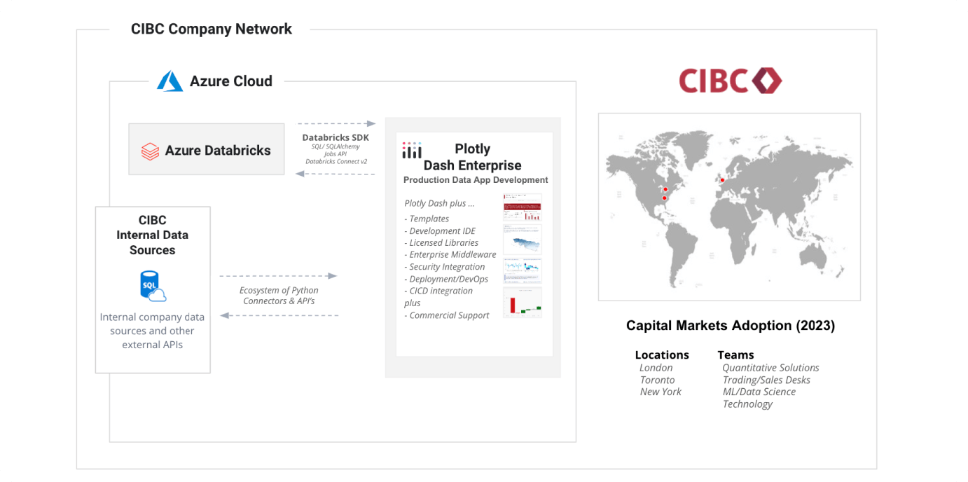
CIBC's data application architecture
Are you integrating any AI or large language models into those Dash apps?
Not yet, but it's a journey. Last summer, I started experimenting with Databricks' Dolly language model. It fell on the back burner due to performance and accuracy issues. Earlier this year, when DBRX was announced, I revisited it for document summarization and question answering based on documents. We recently got access to ChatGPT, and new tools like Strawberry and Orion are emerging. The AI landscape evolves quickly; if you can't do something now, wait six or nine months, and it might be feasible.
“AI integration is coming. We need to figure out how to leverage these developments as they occur. The goal is to set ourselves up to use these tools effectively, even if we don't know exactly what will be available in the future.”
Jeff Butler, Executive Director - XVA Trading at CIBC
My point is that AI integration is coming. We need to figure out how to leverage these developments as they occur. The goal is to set ourselves up to use these tools effectively, even if we don't know exactly what will be available in the future. We're currently working on integrating tools and building architectures to support these advancements.
We now have access to enterprise ChatGPT across the bank, not just in capital markets. We're also developing tailored language models for specific tasks.
Is a significant part of your role creating Dash applications?
Yes, it has been. Personally, I've developed around 20 to 30 different apps. Our architecture with Databricks and Plotly is available for everyone to use, and many people across the team are building apps.
Plotly Dash Enterprise version has been in use for nearly two years. I remember getting the green light just before Christmas and quickly starting to learn and build apps. We did some work with the open-source version in an experimental phase but moved to Dash Enterprise as we knew it was coming. I’ve also used the open-source version for a personal project, but primarily use the Enterprise version at work.
I started with Plotly and Python around the same time, which complicated my learning curve a bit. Many in the community have mentioned that their use of Plotly led them to learn Python, as they wanted to build interactive web applications.
“Previously, our dashboards were Excel files or used tools like Tableau. Plotly Dash offers a higher level of customization and integration with Python. This integration allows for rapid functionality and customization, which is a significant advantage. Also, if the tool is user-friendly, people are more likely to adopt it. The ease of sharing through a customizable web link also helps with adoption.”
Jeff Butler, Executive Director - XVA Trading at CIBC
Previously, our dashboards were Excel files or used tools like Tableau. Plotly Dash offers a higher level of customization and integration with Python. This integration allows for rapid functionality and customization, which is a significant advantage. Also, if the tool is user-friendly, people are more likely to adopt it. The ease of sharing through a customizable web link also helps with adoption.
Adding that for an interest rate desk, I can have a general app but then customize its functionality based on the user, which is very neat. The fact that it's just a web link means we can see it on our phones too. So, you have the capability for someone to be sitting in a meeting and see something on their phone, instead of having to go back to their desk and ask, "Hey, can you send me this?" They can have it right there, at their fingertips all the time. The capability with tools like this is huge.
What’s the benefit of creating specific app variants for different needs?
So, one app we have is for funding charges across the entire trade floor. We have dozens, if not hundreds, of permutations for each trading desk. Within that, there are different levels, so you can cut the data in several ways.
If an equity person comes to this app and wants to see their data, they have to click through and wait for six data refreshes. What we've built allows them to go in once, select the level they want to see, and copy a web link to that specific instance. When they click on the web link, it populates the app with their specific level of data. Instead of a general app, it's just there for them.
An equity person probably doesn't want to see the interest rate desk stuff, so they can go straight to their own data. It sounds simple, but saving those six button clicks makes the app experience richer.
Another thing is that as you deal with more data and higher cardinality data, rendering graphics can add up and diminish the user experience. I've had success with caching the app layout so users view a cached version of the page instead of rebuilding all the plots each time. With Python, you can build in schedulers and caching, and once you get the hang of it, it's quite straightforward.
How do you integrate Plotly into your quantitative analytics workflow?
For me specifically, we have one app that builds parameters for a pricing model. These need to be calibrated, and within the app, it performs principal component analysis (PCA), refreshes, and shows the history of parameters over time.
We leveraged Dash Enterprise’s features like connections to databases. Originally, the app was doing PCA on the fly, but if it ran for too long, it would lose connection. So, we built a background task to perform the analytics, save the results, and pull them in when the app is opened.
Another example involves Databricks. You can write Spark code and parallelize tasks better. For instance, we built a regression model, saved it in Azure Blob, and then pulled that model into Plotly for serving.
How did you lift and shift your code when moving to Dash Enterprise from open source?
Everything you can do in open source, you can do in Dash Enterprise. The main advantages of Dash Enterprise are access to additional functions, tools like Dash Design Kit that make coding cleaner, and a dedicated IDE for coding with real-time updates. You can attach databases like Postgres and Redis.
“The main advantages of Dash Enterprise are access to additional functions, tools like Dash Design Kit that make coding cleaner, and a dedicated IDE for coding with real-time updates.”
Jeff Butler, Executive Director - XVA Trading at CIBC
The community support is also a huge advantage. Most issues are solved through Google searches or Stack Overflow. For tougher cases, the helpline responds quickly. So yes, it’s essentially a lift-and-shift process.
Could you please share a demo of your Dash apps?
Note: Please watch the recording for the demo. The following paragraphs transcribe Jeff’s explanation of his apps while he shares his screen.
When financial institutions deal with each other, notably big banks, they typically have a collateral arrangement between them. Adam, if you and I are banks and we do a trade valued at $100, each day I would give you $100 of collateral to protect you from credit risk. The challenge is that $100 might not be worth $100 the next day. If it becomes $150, it’s worth more to you, or if it drops to $50, it’s worth less.
In the first case, giving you $100 to protect you is called variation margin. There's also initial margin, which protects against worst-case swings. Recent regulatory frameworks require financial institutions to post this margin to safeguard against large value changes.
This Dash app summarizes that process. I've masked and randomized the data for privacy. The graph at the top shows where securities are pledged and where they are received. The quantum of market value is significant, often in the billions.
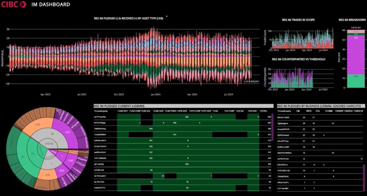
Risk management Dash app by the CIBC team.
The data app allows you to track how assets are moving over time and ask questions about minimizing exposure. You can filter data by asset types, counterparties, or underlying business. For example, you can see the number of trades and the business mix, though some data is randomized here.
The layout is updated regularly. Previously, this information was shared via a PDF on a quarterly basis, which lacked interactivity. Now, this dashboard provides daily, on-demand updates, improving visibility and allowing for better management of asset postings.
“The app is one of our more frequently used tools, summarizing balances and associated economics in one place. It helps in understanding trends and optimizing costs.”
Jeff Butler, Executive Director - XVA Trading at CIBC
I don’t have specific usage statistics, but it’s used regularly across multiple departments. Tracking user statistics is a feature I'm exploring. The app is one of our more frequently used tools, summarizing balances and associated economics in one place. It helps in understanding trends and optimizing costs.
Here is another app I've built. It's essentially an app store for all our apps. Instead of a user remembering 20 or 30 different links, they can go to this page and bookmark it, then click into what they want to see.
Clicking on this "XVA RISKS VIEWER" at the bottom takes you to this page where you can see four apps across the top. Each tab does its own thing. The rightmost one is attempting to do some risk prediction. This talks to the framework I mentioned earlier, where we sit in the middle of the trading floor exposed to various risks — foreign exchange, commodity, credit, funding, interest rate, etc.
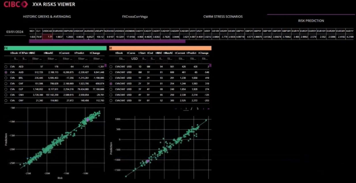
CIBC risk prediction app in action.
It would be great to predict how these risks change over time. The app uses Databricks to run hundreds of regressions on these risk factors, saves them to Azure blob storage, and then pulls them into Plotly Dash. A user can see predictions versus actual risks and adjust market data to see the impact from the regression model and associated risks.
This is not a production-ready app; it’s more of a proof of concept showing the potential of combining Databricks, cloud, and Dash.
Do you use mathematical optimization, such as integer programming with binary decision variables?
Yes, we do use mathematical optimization. One of our vendor products has an optimization algorithm based on Simplex. We're working on integrating it into production. There is also a Plotly app ready to display optimization results, helping to identify which counterparties and assets to target.
To illustrate it further, here’s an example. You have various options for posting collateral, such as USD cash, Chilean pesos, or Venezuelan government bonds. Each option has different utility and cost. USD cash is highly valuable due to its liquidity, but it's costly for me to provide. Conversely, Venezuelan bonds might be less expensive for me but less valuable to you.
I take that USD cash and I go use it for something else. Each of those has an associated cost, so you want to deploy your resources as optimally as possible, using your higher-value assets for higher-value tasks, if that makes sense.
How do customers respond to the apps, and how much support is needed after release?
Good questions. My customers are other sales and trading desks within Capital Markets or Global Markets. We don’t have anything facing externally, which means everything is on CIBC's internal network. The response has been great. People appreciate the interactivity and customization. I often get requests from my boss in the morning, and by the afternoon, it’s done, which is powerful.
“The response has been great. People appreciate the interactivity and customization. I often get requests from my boss in the morning, and by the afternoon, it’s done, which is powerful.”
Jeff Butler, Executive Director - XVA Trading at CIBC
The support required isn’t very time-consuming. Adding new features takes time, but stability has been good. Occasionally, there might be network issues, but they’re rare. If data issues arise, it’s typically not an app issue but a data issue, which we can address quickly. So overall, the apps have been great in terms of support and usability.
There are also a few ways to optimize your dashboard. One approach is to query your data on demand every time if your data is small; this works well and ensures you’re getting live data. Another option is to use something like a Redis database, where you do the data load or complex operations on a schedule and then have that data ready on the server side. This way, you can pull it in quickly.
The approach I've had the most success with is caching. You can cache your expensive data operations by running them on a schedule using a package like APScheduler, and then using Flask-Caching. There's a page in the Plotly help section about caching that can get you started. I've even managed to cache the layout, which greatly improves the user experience. For example, with a chart that previously took 8 to 10 seconds to load, caching significantly speeds up the load time, making the app much faster.
Do you have any words of wisdom to share with the community?
My advice is simple: just start. As Jensen Huang (founder of Nvidia) mentioned at the Data + AI Summit, starting is key. There’s a lot of interesting stuff in data science. Get an understanding of SQL, Python, Spark, and the algorithmic side of machine learning. You don't need to be an expert in all of these areas, but they are all valuable.
Work on telling your story, and remember that there’s a learning curve. You’ll face challenges, but you’ll find support in the community. Doing a little each day will help you get more comfortable and advance to more complex topics. Start with something manageable, like a Python course, and build from there.

Jeff shares parting words of advice for data scientists looking to break into finance.
It’s easiest to work with data related to your job or interests because you’ll understand it better and tell the story more effectively. So, just start, take it one step at a time, and you’ll see yourself growing.
Sign up to attend next month’s Plotly Hangouts with data science experts.