
Priyaanka Arora
December 23, 2024
Holidays treats, presents, and wishes from the Plotly peregrine!
The peregrine falcon can dive at a speed faster than 186 miles per hour, making it the fastest bird — and animal — in the world. This year, we introduced the adorable Plotly peregrine as our mascot, to symbolize just how fast data apps are transforming the way data science influences real-time business decisions.
All this to say: The end of the year is upon us at the speed of the Plotly peregrine dive-bombing you with product updates, community spotlights, and fresh perspectives on data science in 2025.
Read our special Plotly holiday recap of the product releases, customer achievements, and community wisdom that made 2024 so special.
Inspiration from the Plotly community
To kick off the warm, cozy vibes, here are nuggets of wisdom from members of the Plotly community, a millions-strong group of data scientists, data app developers, and data visualization enthusiasts.
Anastasis Stamatis of Dataphoria shared how to go from data scientist to the CEO
…and it was a masterclass. His advice was to aspiring CEOs was to get involved in as many different and varied initiatives as you can, while you’re a data scientist:
“Different initiatives put us in a position to work with other people, to create teams, inspire teams, and deliver results. They can really contextualize what it feels like working with people and build the empathy you would need as a CEO, as well as the strategic thinking required.”
Anastasis Stamatis, Dataphoria co-founder and CEO

An example of a data app to visualize climate change.
In his parting message, he asked us to apply our knowledge, philosophy, and technology to contribute to a more sustainable world.
We peeked into the life of a data science consultant building Dash apps
Arne Petter, a data science and analytics consultant at a Nordic power company, shared his insider tips as a data science expert.
He started off as an enthusiast, eventually climbing to become one of the top contributors to Plotly-related questions on Stack Overflow.
In his current role, he helps data teams transition from BI and other solutions to flexible, powerful data apps built with Dash Enterprise. Killer quote from Arne, comparing BI to Dash:
“PowerBI is like a shovel while Plotly Dash is highly specialized like a scalpel would be to a surgeon.” - Arne Petter, Data Science Consultant
Plotly ships: AI, AI, captain!
Amongst the standout moments of the year were the exciting updates to Plotly Dash Enterprise that our team shipped. We hope you were excited by the updates too, but in case you missed our summer and fall launch events, here’s a mini recap.
Summer release
Our summer launch of Dash Enterprise 5.4 placed the focus on ease — the ease of creating data apps, filling them with user-friendly controls, and collaborating cross-functionally with data apps.
A key highlight was our integration of App Studio with the Dash Enterprise development environment for smooth, smooth workflows; as well as some nifty themes for stunning data apps without a line of CSS.
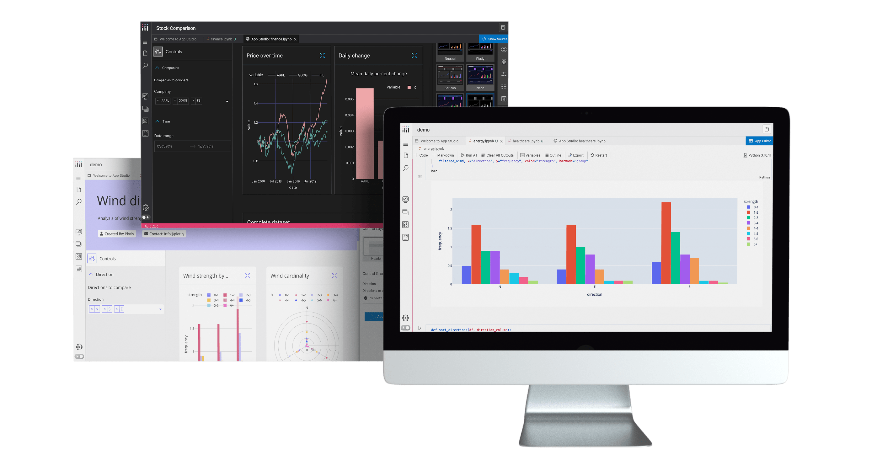
Stunning data apps, brought to you by Plotly App Studio.
Fall release
The name of the game in our fall launch of Dash Enterprise 5.5 was data connectivity. Even with the rise of AI, data teams are still struggling to get models into production partly due to difficulty in securing access to the right data sources. So we added connectors to Databricks, Snowflake, AWS S3, Redshift, and BigQuery, and added in other helpful improvements to callbacks, customizable maps, and more.

Winter release
The winter Dash Enterprise 5.6 launch brought you a smarter way to build data apps, with Plotly AI! Can you imagine chatting with your data? App Studio features multiple ways for you to do just that — with an AI chat mode to prompt your data and generate the perfect charts for your data apps. Of course, you can then tweak the code to your heart’s content to get the look-and-feel just right.
Pro tip: our team discussed this winter release in detail at the official launch event, so watch the recording now to learn more.
Celebrating major releases of Plotly and Dash
As an open-core company, we’re rooted in our incredible open-source community, and are thrilled to share major updates to Plotly, our graphing library, and Dash, our open-source data app framework.
Universal dataframe support
In collaboration with the team at Narwhals, Plotly now offers universal dataframe support via Narwhals. Plotly has been tested to support Pandas, Polars, and PyArrow, with provisional support for cuDF and Modin. DuckDB, Ibis, and other dataframes supporting the dataframe interchange protocol can be used by converting to PyArrow, while PySpark is supported via conversion to Pandas.
For our users, this means a significant boost in performance when working with large data sets!
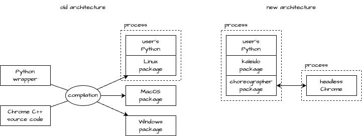
Major overhaul of Kaleido for static image rendering
The Kaleido library converts interactive charts into static images, perfect to embed within presentations and pdf reports. Thanks to community contributor Andrew Pikul, we’ve re-architectured this library into a simpler, easier-to-maintain version for much better stability.
Last but not least: stories of success from Plotly customers
Our customers achieve incredible feats with our products, in ways we could never imagine possible. But seeing is believing. Here are three outstanding data science applications shared by Plotly Dash Enterprise customers.
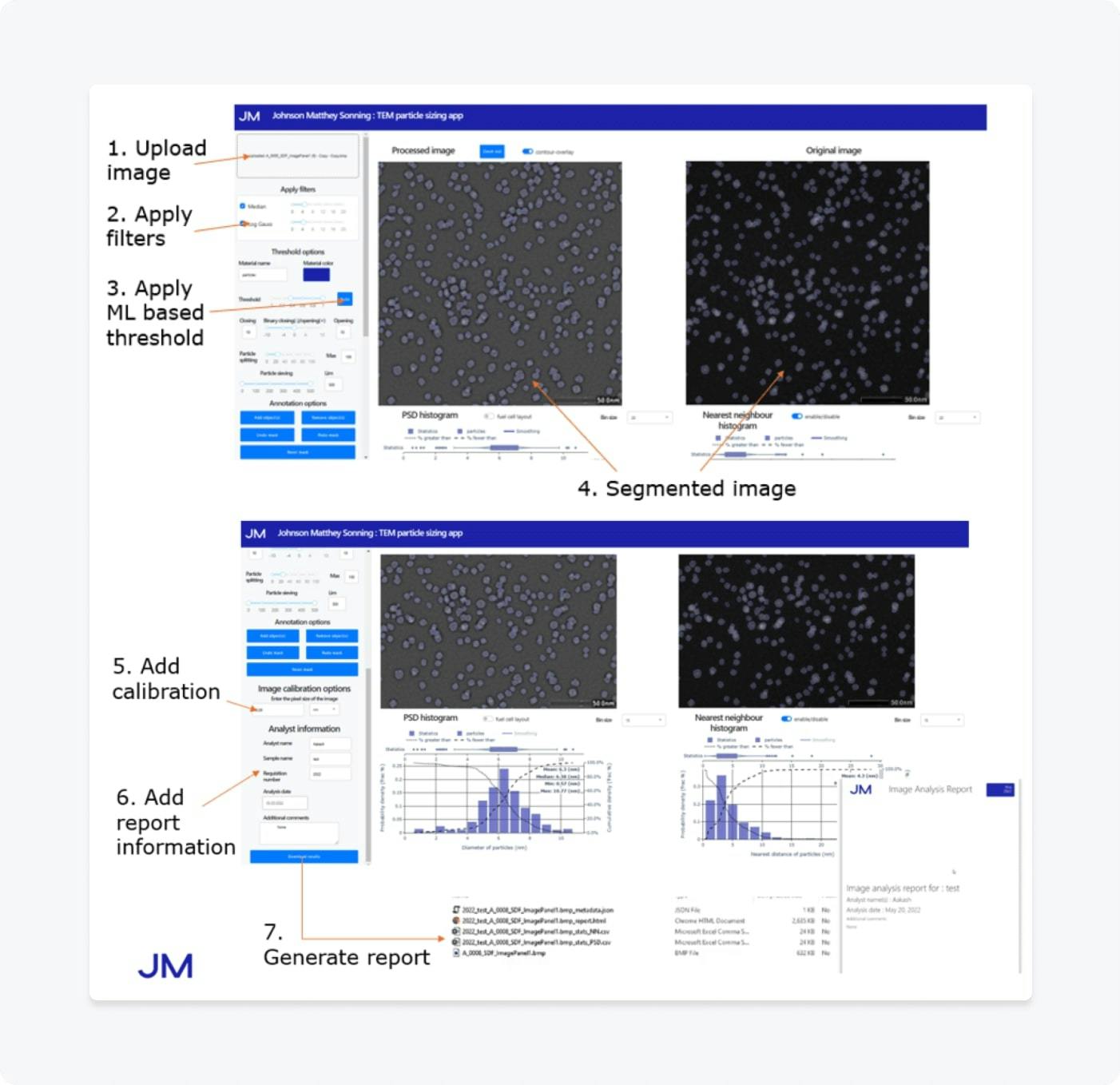
Johnson Matthey scales commercial scientific app platform
The Johnson Matthey R&D data science team researches catalysts for academic and commercial usage with advanced electron microscopy. They built and scaled a commercial platform that shares data apps for tailored analysis of high-volume scientific imaging data — over 30 apps for image analysis and machine learning!
Kansas City Chiefs champion digital transformation in business and operations
The three-time Super Bowl champions, Kansas City Chiefs, face massive operational challenges such as maneuvering 70,000+ people into parking lots and stadiums. The Chief’s Finance, Strategy, and Analytics team built a unified data apps platform with live data to manage game day and stadium operations, social media marketing, and ticket pricing.
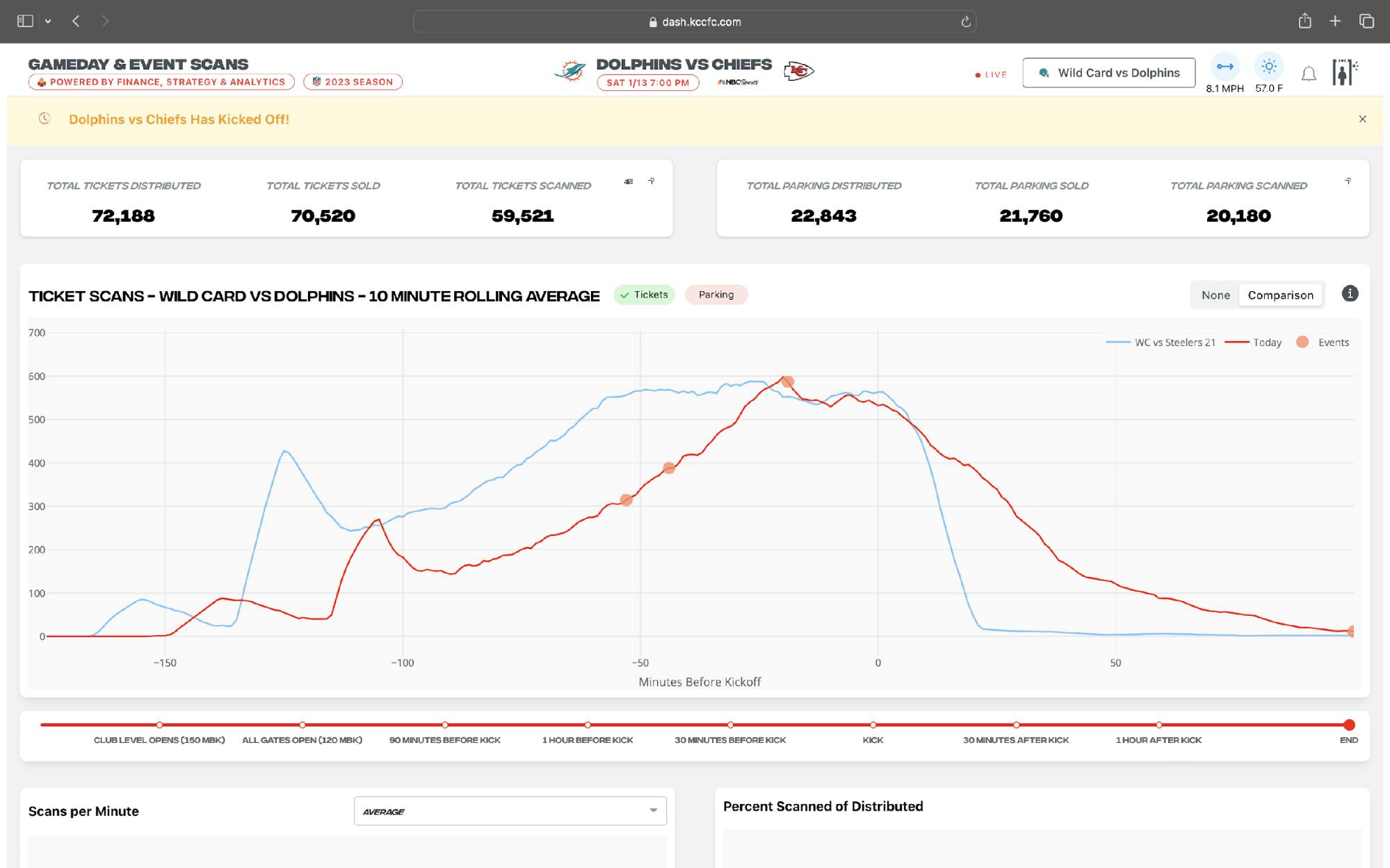
A Dash app (that turned into three) to display people analytics, ticket sales, and gameday scans including metrics such as total tickets scanned, total tickets distributed, and total parking scans.
NHS Foundation Trust realizes AI healthcare potential with Dash Enterprise
The UK’s Somerset NHS Foundation Trust utilizes machine learning, open-source technologies, and data app development for improved health care outcomes with operational efficiency. Their Data Science & Operational Research team delivered advanced predictive analytics for causal impact analysis, statistics process charts, simulated waiting lists, real time inpatient anomaly detection, operational forecasts, and call center modeling.
Happy holidays from Plotly — more to come in 2025
The Plotly peregrine had a great 2024 and hopes you did too! Stay tuned for more updates in 2025. We’re kicking it off with our Dash Enterprise 5.6 launch event, jam-packed with product demos, Plotly AI features, industry commentary and more. Register for the webinar here.