
Nathan Drezner
November 27, 2024
Range Charts in Plotly
Last week, MinutePhysics (a YouTube channel that we love here at Plotly) called out a handful of common data applications, including Excel, Numbers, Sheets, and Mathematica, for missing a range chart.
MinutePhysics also highlighted Plotly’s lack of native range chart support! It’s true: Plotly doesn’t provide a named range chart type. But: Does that mean it’s impossible to construct a range chart in Plotly? We do provide plenty of controls beyond the basics… Challenge accepted!

If you want to take range charts in Python for a test drive, here’s the source for the examples in this blog post: https://github.com/plotly/range-charts-demo
First: What the heck is a range chart? It's a bar chart where the bottom of the bar (typically set at zero) is used to represent a second value. This allows it to represent two related values — such as minimum and maximum — and reflect the difference between the two in the bar's size. Since the two values the bar represents are often statistical values from the same distribution, they can be used as simplified violin or box plots.
It’s a trace type that’s best served when comparing maximum and minimum values across several discrete categories. For example: Climate differences, latitude ranges of different continents, daylight hours, or student grade percentiles.
The fantastic example MinutePhysics uses is showing climate differences in London, Ontario, London, England, and London, Kentucky — after watching the video (and some healthy discussion in our Slack channel) we were quickly nerd-sniped into taking up the challenge of recreating these charts using Plotly graphs.

Plotly offers many chart types out-of-the-box for visualizing ranges of data: Violin plots, box plots, and area charts are all bundled directly. We also include bar charts with a handful of render methods: Grouped, overlaid, and stacked.
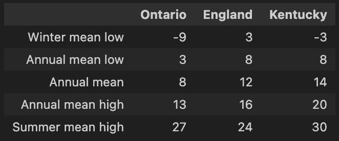
An example dataset that’s pretty well suited for a range plot.
The tricky part is ensuring the boxes don’t always start at zero, or stack — which will happen if we use the default px.bar, with the overlay rendering method? This will give us the set of bars we want with all values visible:
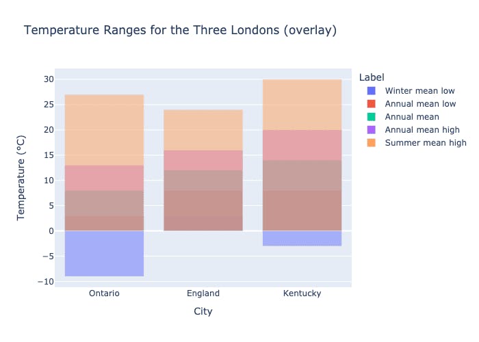
In an overlaid bar plot, the y-axis values are correct, but all of our boxes start at the zero axis instead of starting at the true base value.
We can stack, which might look right, but in a stacked bar plot, our chart will end up with the sum of each value, which shows not the difference between temperatures, but the total of all temperatures: A result that doesn’t really make sense for this kind of dataset.
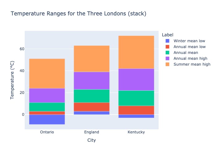
At first glance, a stacked bar plot looks right, but notice that we end up with the sum of temperatures… not quite it!
Luckily, Plotly offers a base attribute for bar plots. base allows developers to set where each drawn bar starts, and we can use our y-axis value to represent where it ends. To give us the flexibility we need, we can use Graph Objects rather than Plotly Express for this chart type: This gives us better control over how each trace is drawn and allows us to build up the chart more explicitly.
Graph Objects is a lower-level library than Plotly Express, but the granularity of control over how each trace is drawn is very useful for building chart types that aren’t bundled in the standard Plotly Express library using more basic structures.
We need to do a bit of data transformation to make this work: Luckily, we’re working in Python, so we can handle this pretty easily, by creating a set of base values given the previous value in our bar. For example, the base for England in winter mean low is 3, and the height is 8. A simple list comprehension later and we’ve got our data pivoted into place.
Boom: We’re in business!
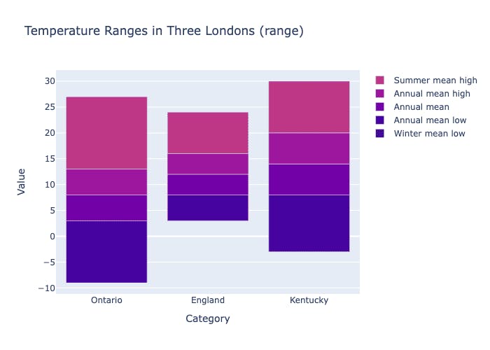
A range chart! We also added a continuous colorscale, because we’re showing a spread for each category. A divergent colorscale might make more sense as this dataset has positive and negative values, but with temperatures, we really just care about hot and cold.
We can pretty easily generalize the range chart data transforms into a helper function so we can re-use it and build a few more:
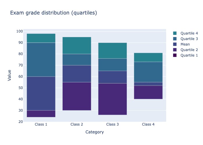
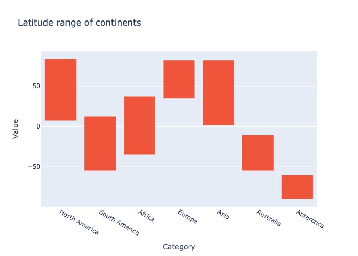
Now that we can build range charts, though, it’s worth mentioning: Range charts aren’t always the right solution to visualize a data range! Box plots and violin plots are great ways to provide information about a distribution, and Plotly’s built-in violin and box plots also compute quartiles, fences, medians, and extremes automatically.
This extra information might be overkill for certain datasets, but in the case of comparing temperature ranges, it works well and communicates the central story here: London, England has a more mild climate than London, Ontario or London, Kentucky.
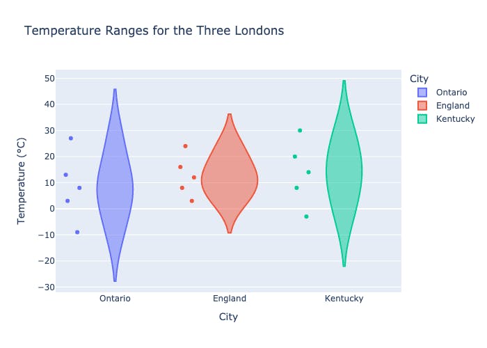
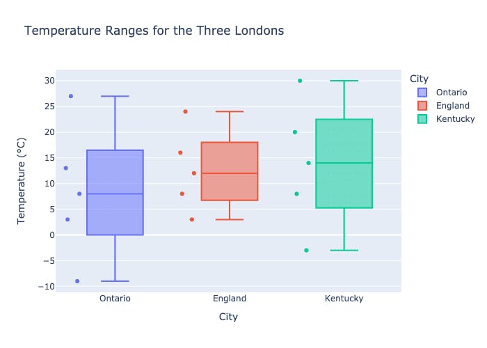
The violin plot calculates the KDE to avoid binning, which means that the maximum and minimum extend slightly beyond the actual values of the dataset. The box plot calculates quartiles and fences, but does not show the KDE.
Plotly also allows manually defining different quartiles, so we can show the exact values from our dataset — this looks a lot like the range plot, albeit with a slightly different shape. The hover data also matches our original data identically.
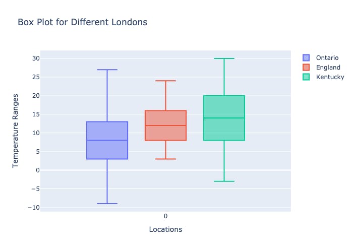
Box plot with custom bins specified.
Because range plots show pre-aggregated results, it can be a bit misleading, and drop useful information. Violin and box plots preserve this kind of information in a great way.
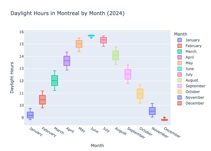
Box plots are a fabulous chart type to compare ranges!
But — our goal is high-quality charts, and letting users pick how to visualize their data (we have had more debates about pie charts than we’d like to admit). Making range charts easier to build with Plotly seems like a great improvement to our libraries. We’re tracking the feature request in our open-source JavaScript library (https://github.com/plotly/plotly.js/issues/7288) and even considering first-class support for range charts in our Python API, Plotly Express.
If all of this is too much work, you can always fall back to the old reliable scatter plot: At the end of the day, aren’t most charts just scatter plots with different shapes?
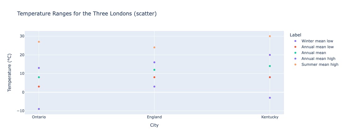
A scatter plot is pretty similar to the range chart, but doesn’t highlight the area between each point.
For now, to range chart lovers everywhere: Go wild with Plotly’s Graph Objects, and construct charts to your heart’s content, and of course, if you’re interested in a new trace type in our libraries, don’t hesitate to open an issue in GithHub or even contribute the new trace yourself 💃 📊 📈