
My-Tien Nguyen
August 23, 2024
How Autotickangles Improves Axis Label Readability
I’m My-Tien, currently part of a small team building a chart creator web app that uses Plotly as its plotting engine.
When I first contributed to Plotly, I introduced the autotickangles property for the Cartesian axis. This feature optimizes tick label angles automatically, ensuring clear and readable axis labels.
Tick label angles are used to adjust the orientation of axis labels in charts or graphs. It especially helps prevent overlap of dense data points, improving readability significantly.
In this blog post, I’ll explain how autotickangles works and the steps involved. Join me as I break down the detection of label overlap, angle calculation, and application of the optimal rotation.
Introduction to autotickangles
My first pull request for Plotly introduced the Cartesian axis property autotickangles. Here’s its description:
When `tickangle` is set to "auto", it will be set to the first angle in this array that is large enough to prevent label overlap.
Basically, this feature requires the following steps:
- Detection of label overlap
- Calculation of the angle alpha that prevents overlap
- With help of alpha, selection of the first autotickangle that prevents overlap
For step 1, Plotly calculates the SVG node bounding boxes of the individual ticklabels and determines their overlap. Roughly speaking, this translates to: select the DOM node with d3.select and read out its top, bottom, left, and right properties, then see if adjacent bounding boxes are closer to one another than the minimum allowed gap.
The next step follows once we know that at least two labels would overlap, signaling the need for rotation. We can use a bit of trigonometry to determine how much the labels need to be rotated:
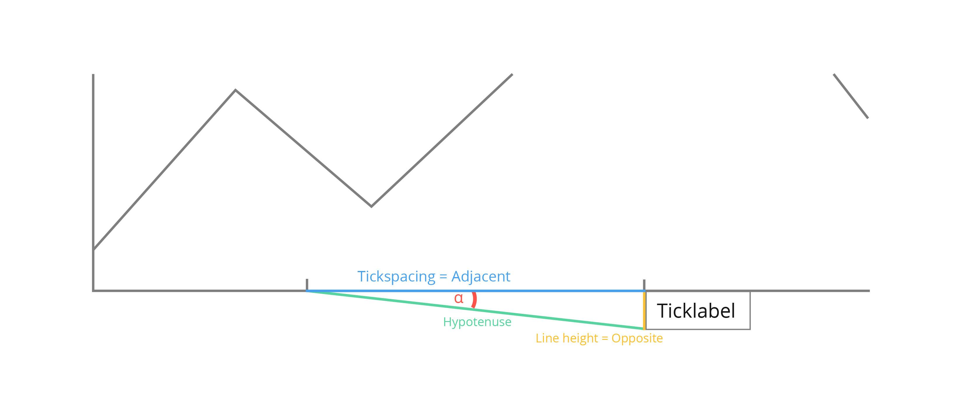
cos(alpha) = adjacent / hypotenuse
hypotenuse = √(adjacent² + opposite²)
In our case, we take the adjacent to be the distance between the starting points of the labels and the opposite to be the height of the labels. How do we obtain those?
Adjacent: While an unrotated label is centered around its tick, rotated labels will begin at their tick, so we can say that the tickspacing is the distance between the labels.
Opposite: We can simply take the height of the bounding boxes from step 1 as the label height. Since we want to prevent any label overlap, we pick the “tallest” label as the opposite.
With this, cos(alpha) is the largest cosine to prevent label overlap.
The autotickangles property optimizes tick label angles automatically, ensuring clear and readable axis labels.
In step 3, we simply find the first autotickangle beta with cos(beta) < cos(alpha) (or if there is none, the autotickangle with smallest cosine).
Note that we compare the angle cosines instead of the angles directly to account for angles beyond [-90°, 90°]. For example, if an angle of 15° causes overlap, an angle of 165° would cause overlap as well.
Contributing to Plotly.js
Between November 2023 and now, I’ve created 12 pull requests at Plotly.js, eight of which are merged, two are still being reviewed, and two are closed. The feature in question was worked on extensively before I came up with a solution that satisfied the team.
I opened my first feature PR within hours of deciding to contribute, which should illustrate how easy it is to do. The sections below describe my setup and contribution workflow:
Setup development environment
- Install node.js
- Install npm
- Fork Plotly.js on github
- Clone the forked repository
git clone --depth 1 git@github.com:<your-GitHub-username>/plotly.js.git - Setup the original Plotly.js repository as second remote:
git remote add origin-plotly https://github.com/plotly/plotly.js.git - Inside the repository, install the dependencies
cd plotly.js
npm install
npm run pretest - Check that everything works
npm run start
This should open your browser at localhost:3000/devtools/test_dashboard/index.html to show the Plotly.js Devtools. You can enter any name that exists in src/test/image/mocks to view a baseline image:
Start developing
- Ensure that you are up to date with the remote master branch
git pull --rebase - Create a development branch and ensure it tracks the remote branch in your fork:
git checkout -b my-contribution
git push -u origin my-contribution - Work on your feature:
Now that you are in a feature branch, you can start implementing your change. Open the Plotly devtools in the background (npm run start) so that you can test your code quickly by viewing one of the existing plots about which you know that they should trigger your code. For instance, when implementing something for a scatter trace, try viewing scatter mocks.
Or when implementing a new property, simply add the property to one of the mocks or create your own mock. Note that when you add new mocks, you need to restart the Plotly devtools so that your new mocks are found. Also have the browser development tools open to see errors in the console.
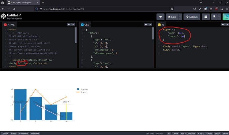
One thing I found helpful was to have a codepen where I could quickly double check the expected output in the current Plotly version. Each time, I simply insert the current Plotly version and replace the figure with my test figure:
Another general bit of advice: make meaningful, granular commits with commit messages that explain what the change does and why it does so if it’s not obvious. This tip will be helpful when you receive feedback for your PR a week later, requiring you to remember what you did and why. It is harder to remember the context when you’re working on an unfamiliar codebase!
- Once you are ready, open your PR.
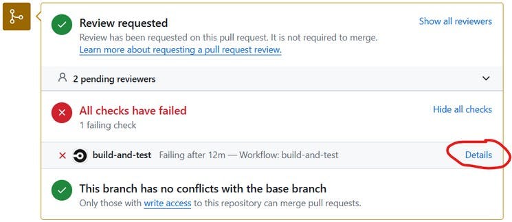
It will automatically receive a PR number. Use that number to create a draftlog following the guide in draftlogs/README.md. Note that according to Plotly policy, once your PR is open, you should not force-push anymore. - CircleCI tests will run automatically on your PR and most probably, something will fail. In that case you can simply check out the details to hunt down the issue:
One small note on new mocks: With my described environment setup you won’t be able to generate the test image for the new mock that you’ve created. I simply commit the mock and let the CircleCI pipeline generate the image for me, then I download it from the artifacts of the failed test “test-baselines”.
You can do this too
A little about me: I’m a senior software developer at HMS Analytical Software GmbH based in Heidelberg, Germany. Our company’s motto is “Turning Data into Value”, and we architect infrastructure, workflows and applications for our customers to help them gain insights into their business data.
I contributed to Plotly code, and so can you! The community is very welcoming and would be happy to support your contribution journey.
There are a few places where you can start. If you would like to do library development work, just like me, you can visit any of the Plotly repositories and search for the good-first-issue label. Here’s an example of the Dash repository.
If you prefer to do non-development work, you can look at the Contributor tab of the Plotly forum and select the one that interests you the most. Take care and hope to see you in the Plotly-verse soon!