Gavin Huttley
November 21, 2024
Decoding genomes with cogent3 + Plotly
Imagine writing a manual using only four characters to make up the words, white space, and punctuation. This, quite literally, describes how a genome encodes life. Decoding the manual, decoding the genome, is a grand scientific challenge that genome biologists and bioinformaticians are trying to solve. The cogent3 Python package and Plotly are providing critical capabilities to accelerate these efforts.
A genome is the set of DNA (RNA for some viruses) that encodes everything needed to construct an organism. A genetic variant is a location within a genome where species members can have a different character. For many of us, reports of new genetic variants of the SARS-COV-2 (coronavirus) virus trigger concerns about whether the vaccines will still protect us. These concerns are greatest when those reports indicate the new variants affect the spike protein that allows the virus to penetrate host cells and cause infection. Such reactions reflect both knowledge and uncertainty — we know the spike protein is important but we don’t know how new changes to its gene will affect vaccine efficacy.
The COVID-19 pandemic provides an excellent example of the practical significance of genome science and bioinformatics. Large-scale genome sequencing of viral isolates and data sharing have been key features of the global response to the pandemic. Making sense of this volume of genomic data remains non-trivial and critical, with ramifications extending beyond just the pandemic.
Challenges Faced by Genome Scientists
Genomic data presents exciting challenges, starting with variability in the scale of genomes. The number of characters in a genome can range from ~10^3 for a virus like SARS-COV-2 to ~10^6 for bacteria like E. coli and ~10^9 for organisms like us. Genome analysis software has to cope with these radical changes in scale.
A second challenge is the rate at which new data is being produced. Sequencing the first human genome took over a decade and required factories of DNA sequencing machines.
Today, you can get a DNA sequencer powered by your laptop’s USB to generate a human genome’s worth of genetic data in ~72 hours. What a virus genome lacks in size is more than compensated for by their abundance — we now have millions of SARS-COV-2 genome sequences due to their collection from thousands of locations across the globe.
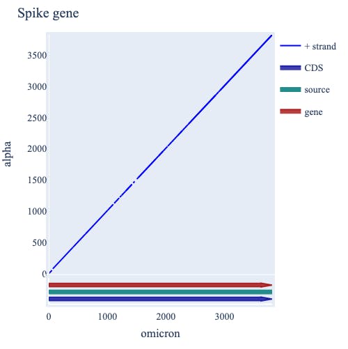
A third challenge is making sense of this volume of sequence data. The scientific community shares progress in developing insights into genome decoding via “annotations”. These are like post-it notes in the genome margin, which report an assignment of function to a specific series of characters. These annotations are themselves structured data that can be integrated into subsequent analyses. Genome analysis software must be able to integrate this critical data type. For example, displaying all the annotated genes of SARS-COV-2 helps us establish where the S gene (which encodes the Spike protein, seethe figure with the SARS genome annotations, has Plotly hover text annotations) is in the context of the entire virus genome. Integrating these annotations and the underlying sequence they represent is just one of the places where cogent3 and Plotly come into play.

cogent3 and Plotly provide a rich user experience for exploratory analyses of genomic data
cogent3 is a toolkit for “making sense from sequence”. It includes capabilities for accessing genomic data and its annotations, visualizing the annotations, and directly interrogating and manipulating the genomic data by them. cogent3 employs Plotly for all its visualizations. The interactive graphics capabilities of Plotly ensure a rich user experience for genomic data exploration.
We can, for instance, evaluate where the SARS-COV-2 genome has changed between the original Wuhan isolate of SARS-COV-2 compared to a more recent isolate belonging to the Omicron group. cogent3 does this by placing the virus gene annotations onto a sequence comparison display called a “dotplot”. The diagonal line represents stretches of identity between the two strains. Where this diagonal is broken indicates sequence differences. There are multiple such breaks within the S gene (see figure). So cogent3’s representation of biological concepts with Plotly’s interactive graphics combine to support the statement — most differences between SARS virus isolates occur within the S gene.

Decoding the genome using cogent3 statistical tests for detecting natural selection
Biological sequence data presents an interesting statistical challenge. When you sample genetic data from individuals belonging to a species, you no longer have independent observations because of descent from a common ancestor — thank Charles Darwin for pointing this out. As statisticians know, this sort of dependence can be quite problematic. cogent3 provides a suite of analysis methods to interrogate data with these properties.
Continuing with the SARS case, we know enough about this novel human pathogen to realize that variation in its spike protein could degrade vaccine performance, but not enough to be sure which variants matter. What features of its genome allowed it to jump to humans? What genetic changes drive the spread of new strains? Existing knowledge of virus biochemistry, accompanied by population genetic theory, tells us that not all genetic variants will be important. So, how can we identify the most critical ones? In short, while we may not understand how a variant “works”, we can identify the variants essential to virus success by looking for the signature of natural selection — thanks to Charles Darwin for this one too!
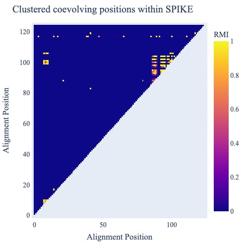
In the analysis below (Check out this GitHub repo for the code to produce these figures), we display the results of a statistical examination of coevolution — evolutionary change that occurs between pairs of sequence characters that interact with each other — from a publicly available selection of SARS-COV-2 genomes. We’ve looked at coevolution because the information content of an individual character in a genome arises through its association with other characters, typically the ones immediately adjacent to it. A signature of coevolution tells us much more. It indicates two positions at which genetic differences are co-occurring more often than expected by chance. This suggests the co-occurrence represents an important virus adaptation. Combining cogent3’s coevolution analysis with a Plotly heatmap reveals two clusters of coevolving sites and evidence for coevolution between the clusters (in the Figure, bright yellow is striking evidence for coevolution). So if a new virus variant has multiple changes within these clusters, they’re likely of concern to us. Note: this is a hypothesis whose merits depend on whether natural selection is the origin of the signal of coevolution. There are alternate mechanisms which we don’t have space to cover here.

cogent3 has extensive capabilities for analyzing genomic data
cogent3 provides many more statistical analyses than this. It particularly emphasizes probabilistic models of sequence evolution. For the math nerds, we provide novel algorithms for specifying, applying, and drawing inferences from non-stationary Markov processes.
At a more user-experience level, cogent3 aims to make it easier to do reproducible science by providing a system to simplify defining genomic data sampling and analysis routines. The goal is to hide all the structural programming logic so users can focus on the concepts. This “composable app” system exploits Python’s type-hinting to allow connecting separate analysis modules into a single app. The resulting app provides key capabilities for scientific computation, including making it straightforward to apply the app to a data collection in parallel, automatically tracking the provenance of generated results.
The cogent3 and Plotly Future
We are building an ecosystem of data analysis routines around the cogent3 plugin system. Thanks to funding from the Chan-Zuckerberg Initiative, we have made significant progress towards this goal and have recruited other key players, such as the developers of IQ-TREE2 and GraphBin, to the effort.
Beyond that work, cogent3 and Plotly provide a powerful opportunity to integrate genomic data analyses and visualizations. We feel that we have only just touched on the potential of integrating Plotly into genomics. One thing we see as really important is empowering users to visualize large scale genomic data on their own hardware. This is particularly critical for scientists who are geographically remote from major bioinformatics resources.
How to Get Involved or Contribute
The cogent3 team is an open and inclusive community that mentors newcomers in making contributions. If you are a biologist, we want to help you use cogent3, contribute to the plugin ecosystem, or to the development of cogent3 itself. But you don’t have to be a biologist to contribute! If you’re a visualization expert with experience in representing large-scale data, interested in algorithms that deal with data too large for memory, or just want to get started contributing to open source software, contact us on our GitHub discussions and let’s work together!