Anna Riley
June 16, 2023 - 12 min read
Reflections from an Athlete — Dash feat. Strava
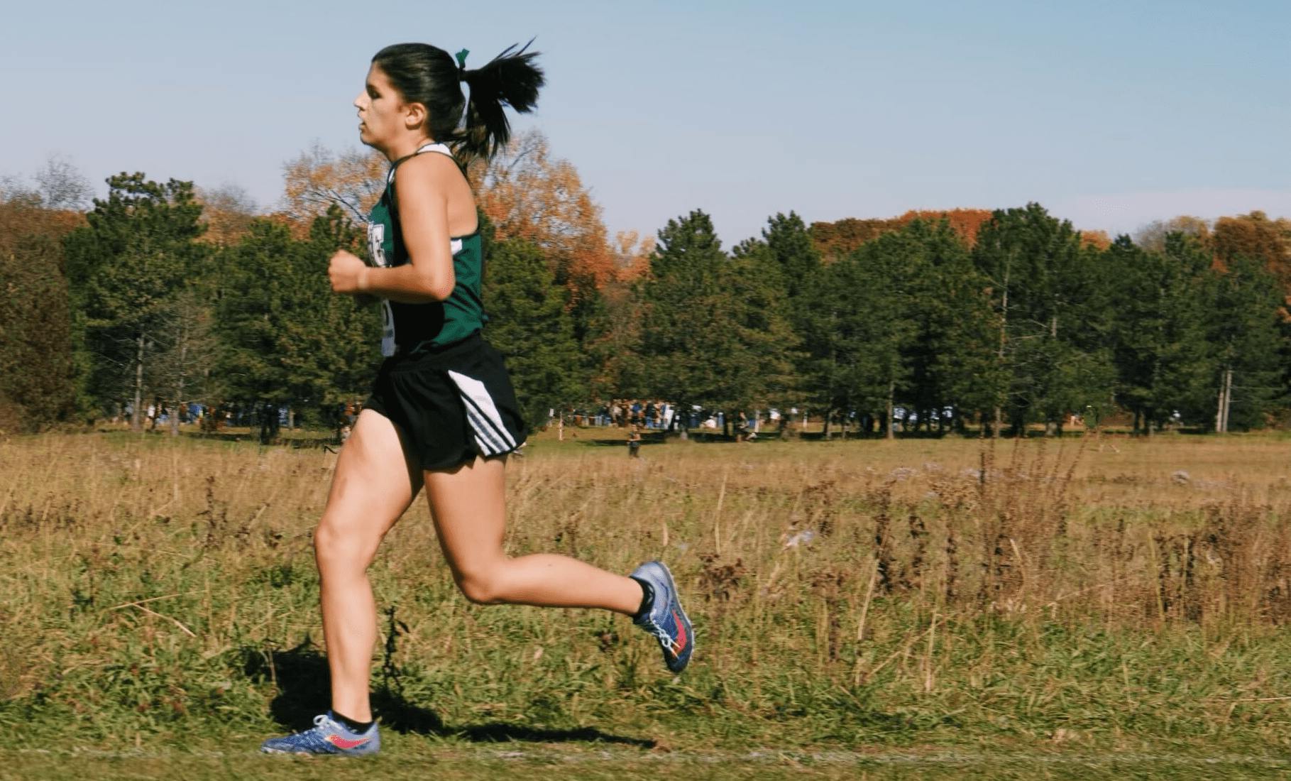
From my time as a cross-country runner to my adventures in backcountry skiing, I have always been captivated by the wealth of data hidden within our physical movements. Even during my high-school races, I would crunch numbers in my head, analyzing the statistics displayed on my running watch to draw meaningful conclusions about my performance – how can I do better and run faster? During those runs, I honed the craft of generating precise running loops in my mind, meticulously calculating the exact distances I wanted to cover. Furthermore, living in Germany, I kept a tally of the countries where I ran a half-marathon and got so much joy from tracking the different areas I covered on foot.
When I relocated to Vancouver, BC, my love for outdoor pursuits expanded to include a fascination with GPS navigation and visualization. Around this time, I discovered Strava and fell in love with visualizing and documenting my activity, as well as connecting with other athletes. The combination of movement, data, and the great outdoors fueled my career aspirations, particularly in the realm of data visualization. It was this passion that led me to pursue an internship at Plotly, a company renowned for turning data into interactive experiences.

Just five weeks ago, I started on my internship journey with Plotly's Professional Services team. The onboarding process was unlike any other I had experienced — an exciting and creative opportunity to create a Dash Enterprise app using a dataset of my choice. As a dedicated Strava user, I immediately knew I wanted to push the boundaries of visualizing my personal Strava data, with the ultimate goal of extending the app to benefit all 100 million Strava enthusiasts.
Undoubtedly, my idea was ambitious for a two-week onboarding period. However, with the support and guidance of my mentor, Tammy Do, I devised a plan to start simply and gradually expand the app's functionality as time permitted. Tammy's expertise proved invaluable as I delved deep into the world of Dash development. Thankfully, the learning curve for Dash was relatively low, enabling me to create a functioning homepage within a week, followed by the addition of highlight and maps pages in my second week.
One of the most enjoyable challenges was integrating the Strava API, culminating in the creation of a login button that allowed users to effortlessly connect their Strava accounts and authorize my app's temporary access to their data. Harnessing Dash for such a personally meaningful use case was an exhilarating experience, providing me with an incredible learning opportunity.
Features
Plotly’s extensive figures and components allowed me to brain-storm up about any visualization I could think of. While I am captivated by what I have so far, I am still planning to add more features that will give even more insight to a Strava user’s athletic performance and history.
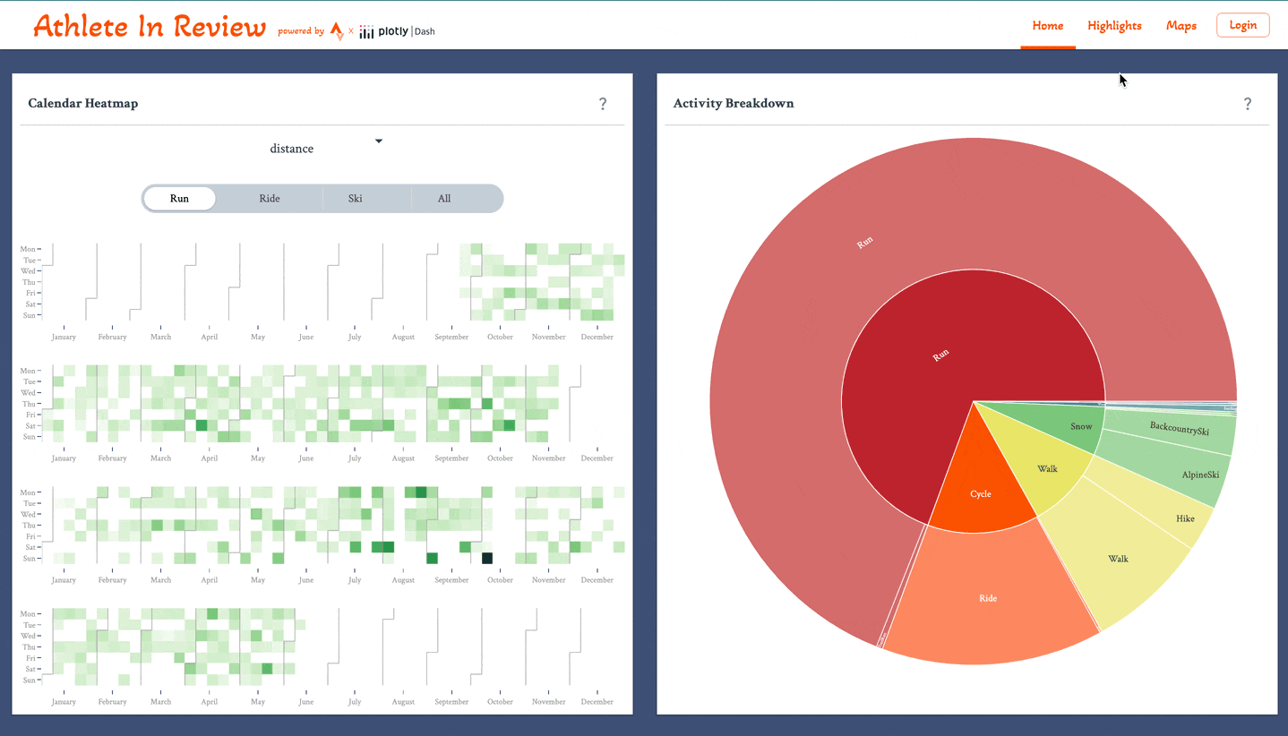
Home Page
The home page focuses on the types of activities you take part in, what time trends are related to those activities, and correlation trends for various statistics.
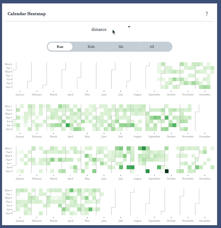
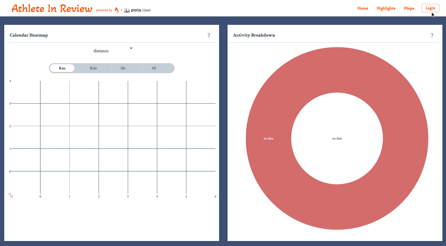
First I created a Calendar Heatmap that shows the intensity of a selected stat for a selected activity for any given day. To create this, I used the calplot ploty library, which was contributed by a Plotly Community member. To interact with the heat map, I added a Dash Mantine Components SegmentedControl to choose an activity and a Dash Core Components Dropdown to choose a stat to visualize.
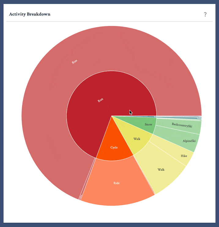
To the right is a sunburst graph, which shows the proportions of all your activity types by activity category, and specific activity type, such as snow sports and backcountry skiing. To create this chart, I used the Plotly Express Sunburst chart.
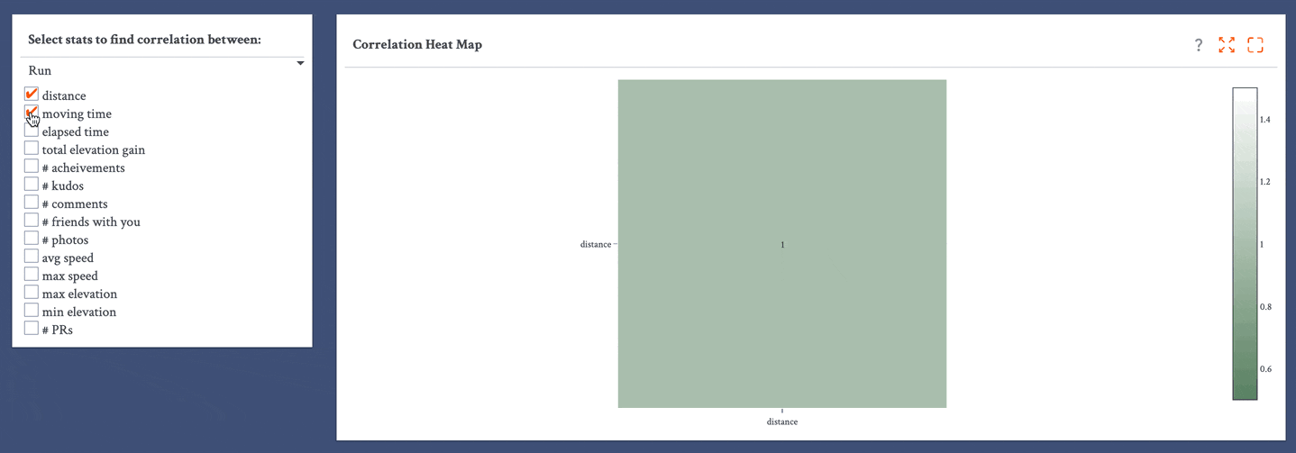
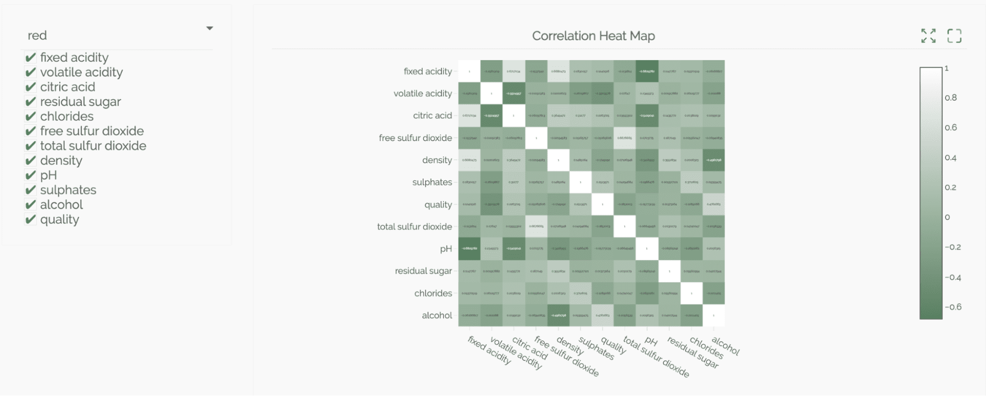
Below, I added a correlation heat map. This maps the correlation between different stats such as distance, average speed, number of photos, and if you ran with friends. For example, a particular map could conclude that the number of photos posted and the number of comments on that activity is strongly correlated, but there is little correlation between elapsed time and minimum elevation. To implement this map, I used the Pandas corr() function along with a Plotly Express imshow object. I got the idea for this from a previous onboarding project, made by one of Plotly’s Solutions Architects, Clea, during their onboarding, using wine data.
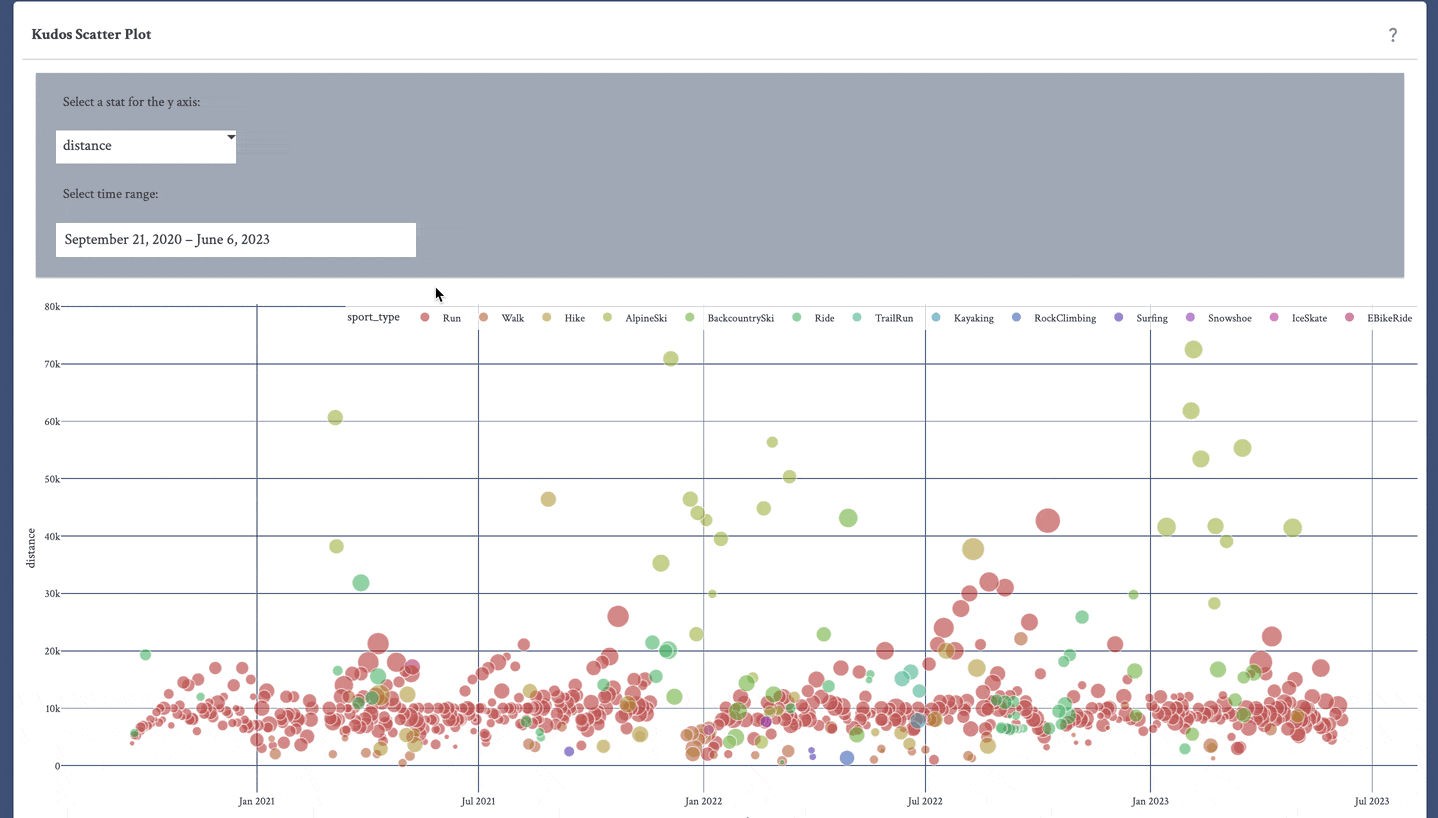
Last but not least on the home page, we have the Kudos Scatter Plot. This is a Plotly Express scatter plot, where the size of each point represents the number of kudos for that activity. The Y axis is customizable to the same stats in the correlation heat map. The time range is also customizable. Users can interact with the activity type legend to exclude an activity or display a single activity. One of my favourite insights from this plot is analyzing my maximum elevation over time, and seeing the different elevations of the places I have traveled to.
Highlights
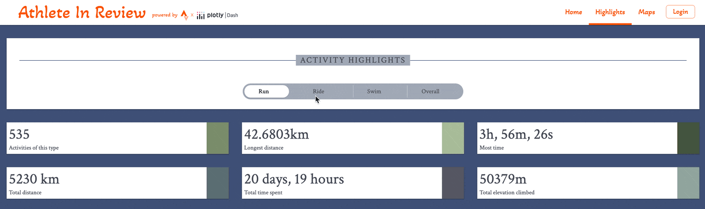
The highlights page was designed to be a simple overview of an athlete’s all-time accomplishments. This page consists of a SegmentedControl to view running, cycling, swimming, or overall stats. There are currently six Dash Design Kit DataCards that show the number of activities, the longest distance activity, the longest moving time activity, the total distance covered, total time spent, and total elevation climbed, of the selected type.
Maps page
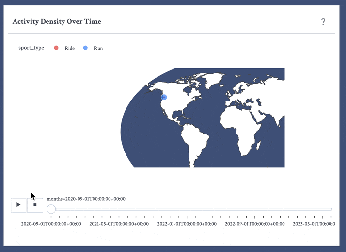
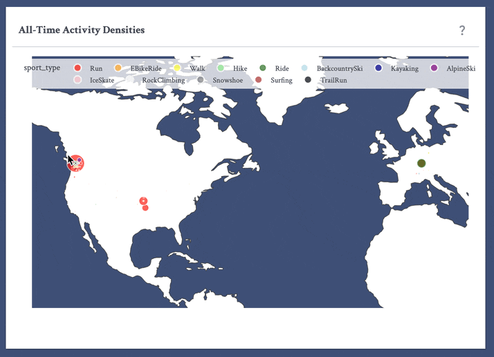
I loved the opportunity to use geographical data to create an animated map that portrays activity densities all over the world over time. Each frame in the animation is a Plotly Express geo scatter plot with the size of each point representing the number of activities of a certain type for that month in a given square 111 kilometres. I calculated this by grouping by month, followed by rounded latitude and longitude values (these points are from each activity's starting point), and activity type. The second map displays the same data in an unanimated form, over all time.
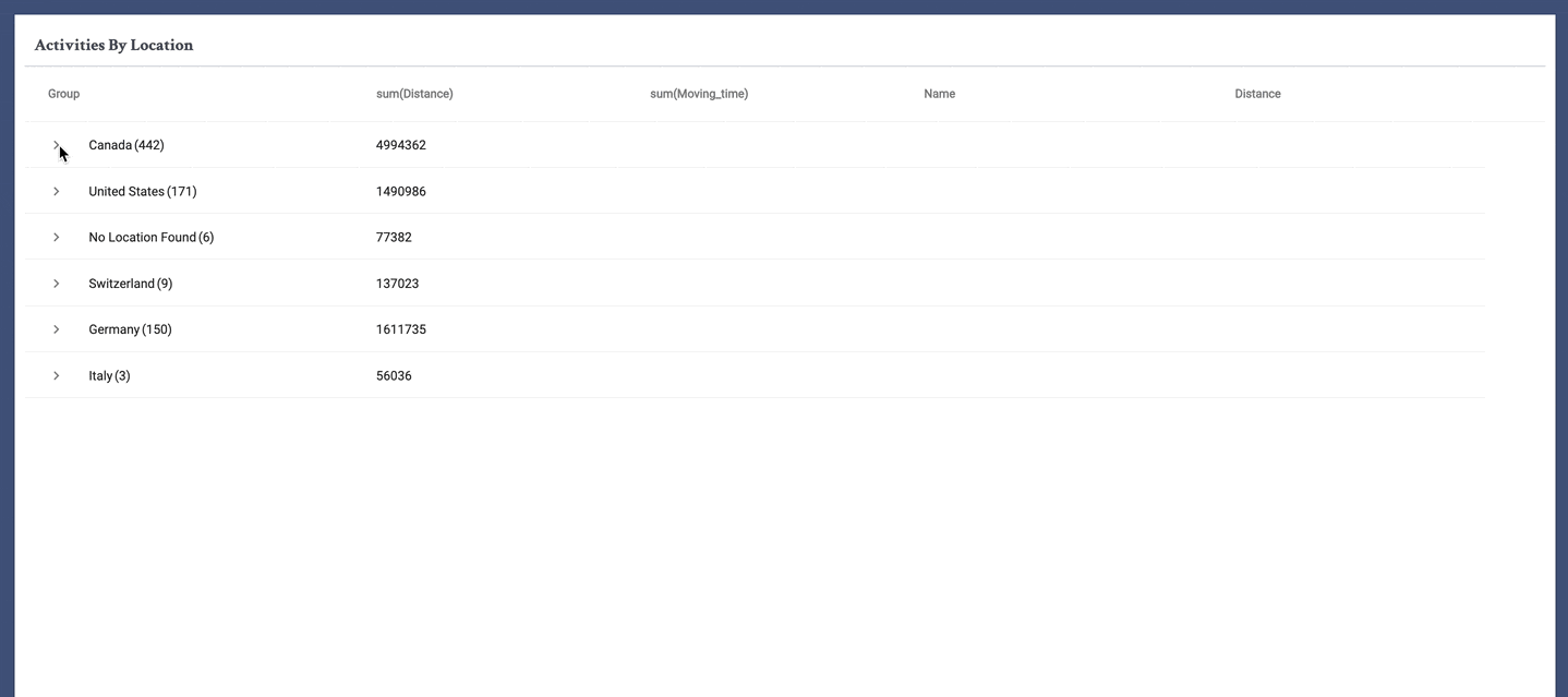
To accompany my maps, I created an AG Grid that stores all activity grouped by country, city/district, and activity. This allows users to take a deeper look into the data they see displayed in the maps.
Login Functionality
As mentioned earlier, I wanted to make my app accessible to any Strava user, and to do that, I needed to create a Login button that redirects to the Strava login page, and then once logged in, redirects to an authorization page to authorize my app to pull that user’s data, and then back to my app, with the information necessary to pull from that user’s Strava account. Strava’s API does most of the heavy lifting to make this happen. First I applied for the API using my Strava account. Through this, you receive a client ID, client secret, and a refresh token.
On click of my Login button, the user is redirected to https://www.strava.com/oauth/authorize?client_id={CLIENT_ID}&response_type=code&redirect_uri={REDIRECT_DOMAIN}/redirect/exchange_token&approval_prompt=force&scope=read,read_all,profile:read_all,activity:read_all where “REDIRECT_DOMAIN” is my app URL. This takes the user to the Strava login page, then the authorization page. Once the user authorizes, they are redirected to {REDIRECT_DOMAIN}/redirect/. The rest of the URL includes a code that we use to make a POST request to https://www.strava.com/api/v3/oauth/token. The response contains an authorization token and an athlete ID for that user.
We then use those credentials to access https://www.strava.com/api/v3/athlete/activities and https://www.strava.com/api/v3/athletes/{str(athlete_id)}/stats. The responses give us the user’s athlete data and stats. Then we use the Dash Core Components Store to store the data in the browser for the rest of the session. Allowing for quick and easy access to the data we need for each component. This also is a simple solution to allowing multiple users to securely use the app concurrently.
What's next?
Looking forward to the coming months, I have plans to add more statistics related to consistency, time of day, and speed to the highlights page. Additionally, I plan to add route maps to give insights on routes the athlete frequents for various activities using the Strava API’s polyline maps. Feel free to try out the app with your own Strava account! If you have any ideas or feedback for my app, you are more than welcome to email me at anna.riley@plotly.com.
Impact
It’s only been 5 weeks since I joined the Professional Services team, and I have already been able to apply what I learned in my onboarding project to a fascinating dashboard for a customer in the automotive industry. In addition to working on interesting projects, I get to work alongside an incredibly intelligent and fun team that has championed me and supported me. I am so grateful for my experiences at Plotly so far, and I am looking forward to the rest of the summer!
Feel free to contact us to learn more about Plotly Professional Services.
Happy trails!