
Chris Parmer
November 16, 2026
Power grid operations app for every US balancing authority
A data app example built with Dash and an AI coding agent in 25 minutes
TL;DR
- Building data apps with AI coding agents in Python and managing them on Dash Enterprise or Plotly Cloud is the modern alternative to BI. At Plotly, many of our customers are migrating away from point-and-click tools like Spotfire, Tableau, and Power BI toward code-backed tools powered by AI. This example showcases the types of apps that you can create.
- This app covers hourly demand, generation by fuel, and interchange for all 65 US balancing authorities since January 2023, from the Energy Information Administration's (EIA) public hourly grid data. A coding agent built it from one prompt in about 25 minutes.
- Every balancing authority has its own page and link, with the charts grid planners ask for by name: a duck curve and a load duration curve.
- Nothing is pre-aggregated, so every click runs fresh DuckDB queries against one Parquet file, and pages still load in a fraction of a second.
- The full prompt is below, so you can build the same kind of app on your own data and run it on Dash Enterprise behind your firewall or have it hosted for you on Plotly Cloud.
Walkthrough
People at utilities, Independent System Operators (ISOs), and trading desks ask the same questions every day: how high load got, how much of it came from wind and solar, and how good the forecast was. The app answers them for any US balancing authority, the organization that keeps supply and demand in balance in one area of the grid.
Each balancing authority has its own page with a URL like /ba/ERCO, so the back button works and a link you send opens the same page. A year selector switches the whole page between 2023, 2024, 2025, and the first half of 2026.
See how a balancing authority's year went
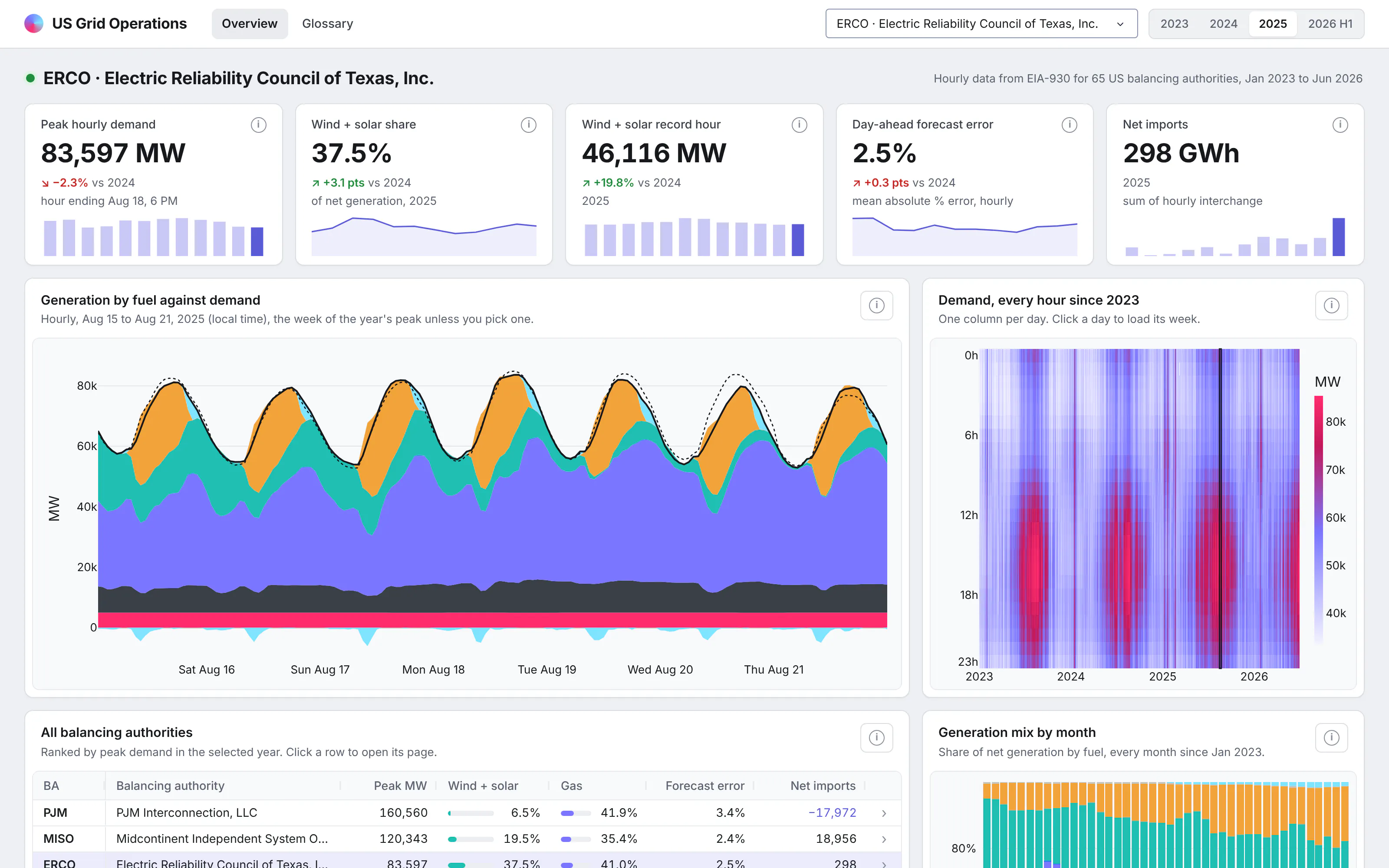
Five cards cover peak hourly demand, the share of generation from wind and solar, the best hour for wind and solar together, the error of the day-ahead demand forecast, and net imports. Each one compares with the same months a year earlier and has a small monthly trend line under it.
Every card also has an info icon with a plain definition of what it measures.
Find the week that matters
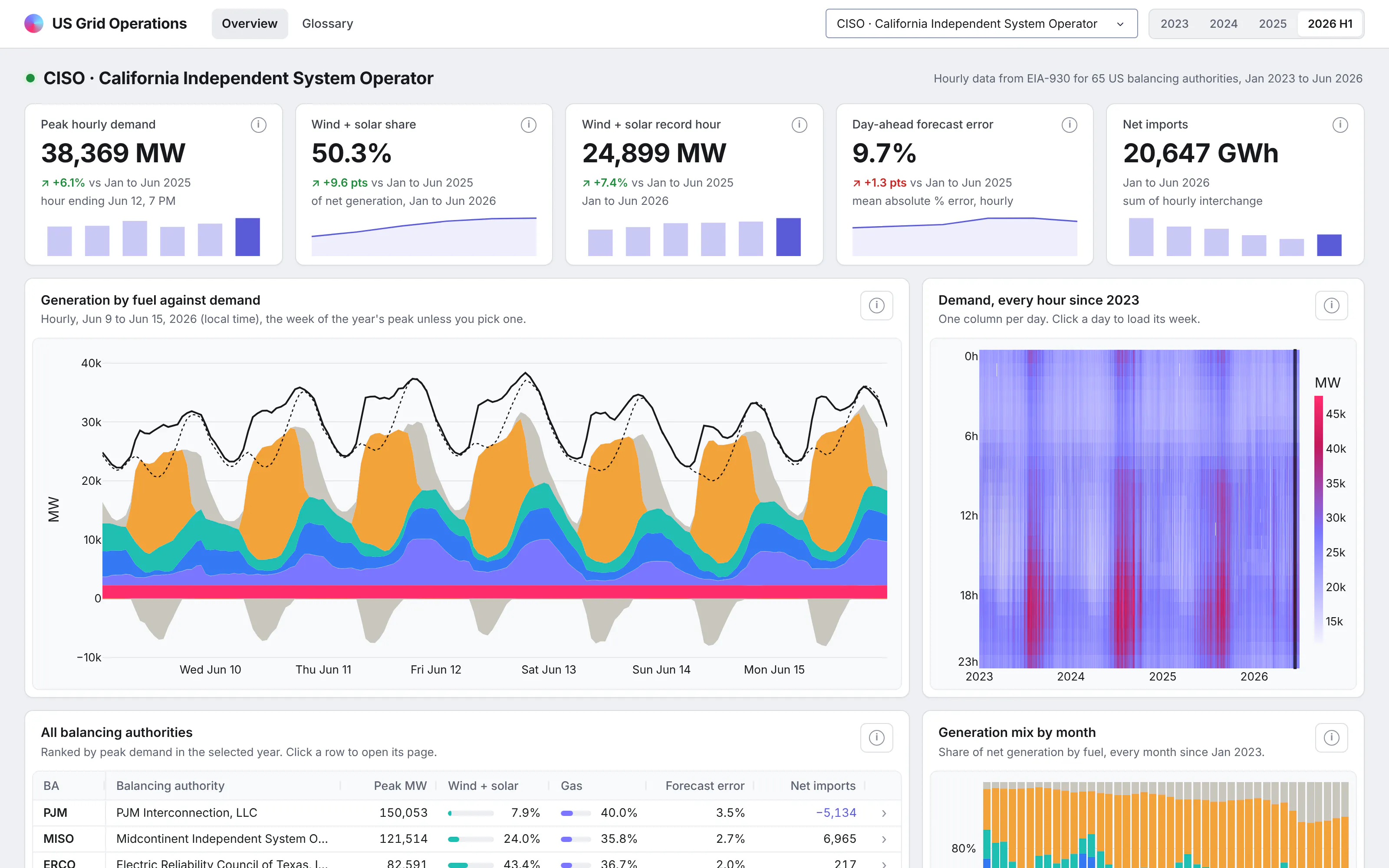
The main chart is a week of hourly generation by fuel, with actual demand and the day-ahead forecast drawn on top. Storage charging is drawn below zero, so in a solar-heavy system you can see batteries filling at midday and discharging into the evening peak.
It opens on the week of the year's peak demand, which is usually the week an operator wants to see first. Next to it, a heatmap shows demand for every hour since January 2023, and clicking any day loads that week.
Read the duck curve and the load duration curve
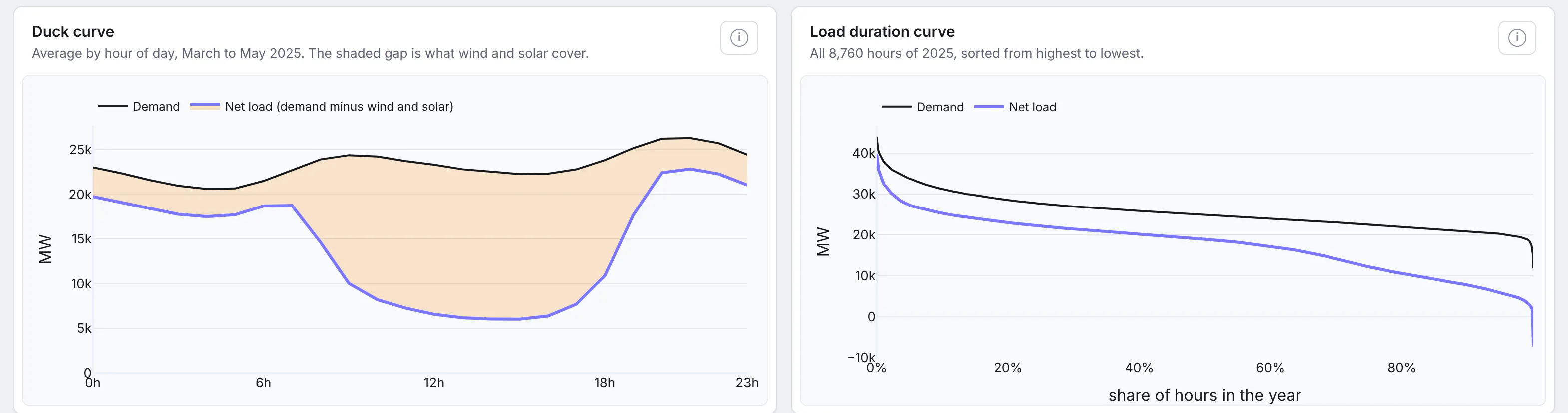
These are the two charts grid planners ask for by name, and both update for whichever balancing authority and year you pick.
The duck curve shows average demand and net load (demand minus wind and solar) by hour of day from March to May. The shaded gap at midday is what solar covers, and the climb after it is the evening ramp the rest of the fleet has to meet.
The load duration curve sorts every hour of the year from the highest load to the lowest. It shows how many hours the system spends near its peak, which is what capacity is sized for, and how much wind and solar change that picture.
Compare every balancing authority at once
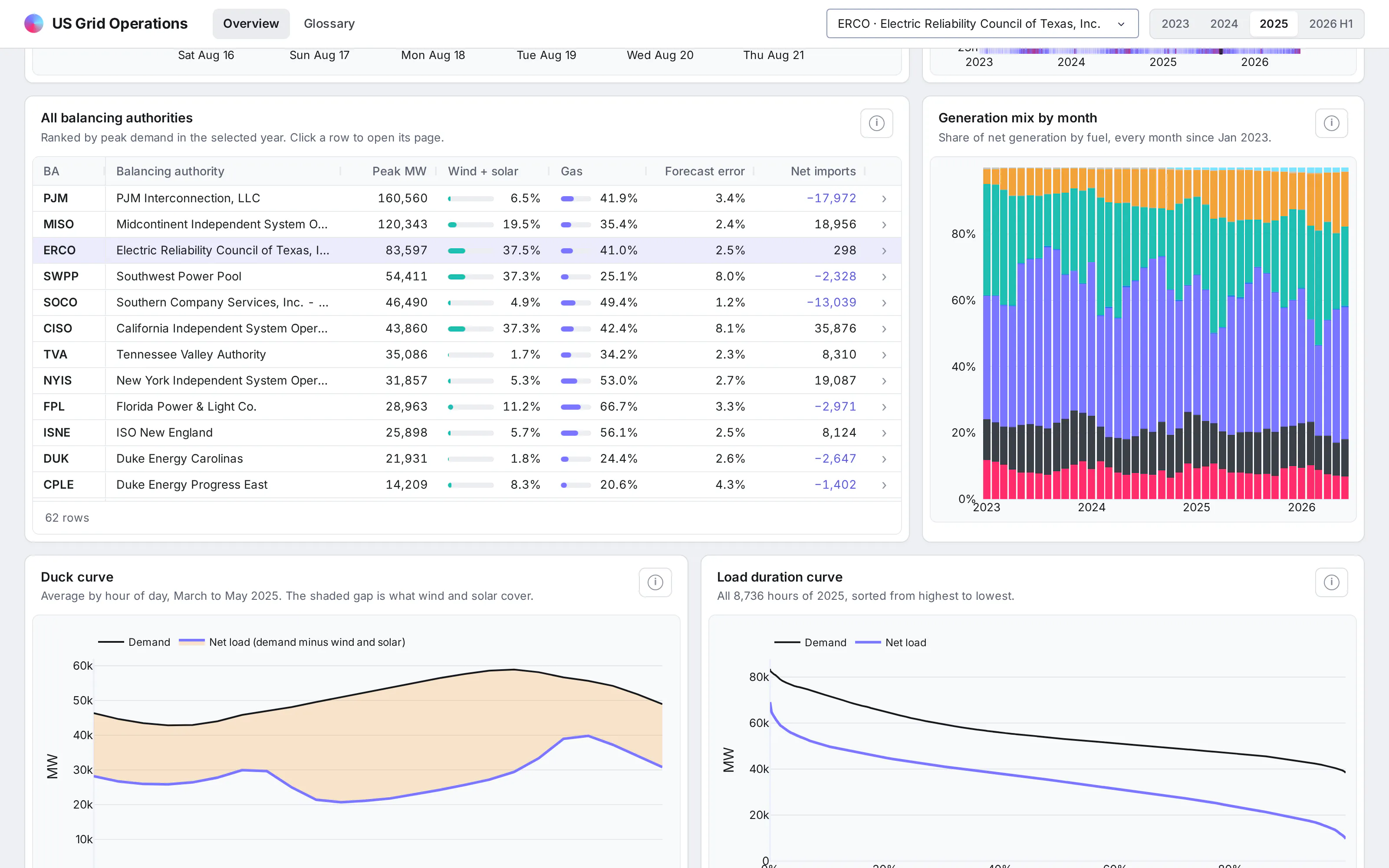
A table ranks every balancing authority by peak demand for the selected year, with inline bars for the wind and solar share and the gas share. Clicking a row opens that balancing authority's page, which makes the table the quickest way to move between neighbors.
Next to it, a stacked bar chart shows the generation mix for every month since January 2023, so a shift from gas or coal to wind and solar shows up across several years.
Look up a term without leaving the app
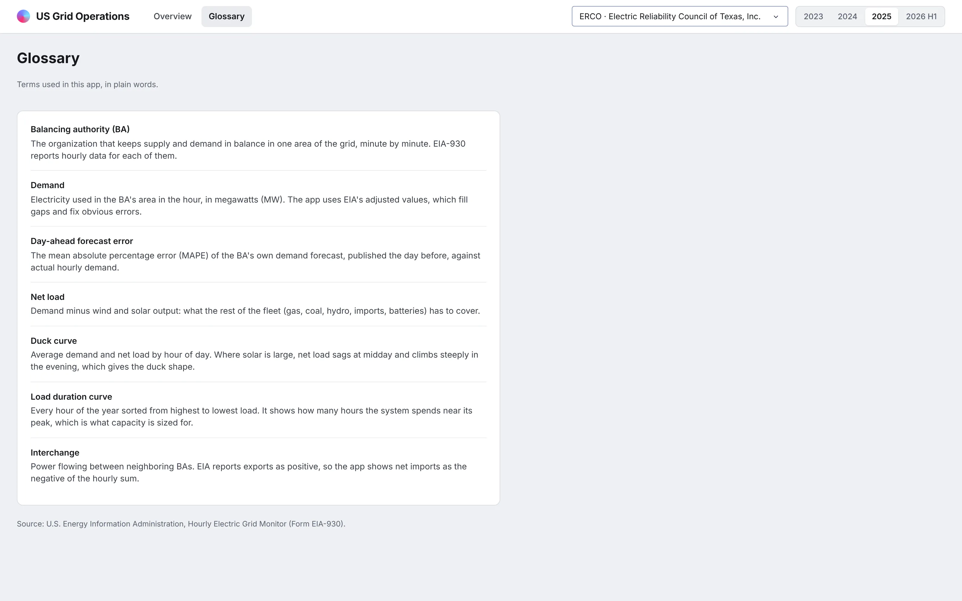
A glossary page defines every term in the app in plain words, from "balancing authority" to "interchange". It makes the app usable by people outside the operations team, such as finance or regulatory staff, without someone having to explain it.
A glossary page is also a natural home for your semantic layer: the functions and formulas behind each metric, written out in plain words next to the code that computes them.
What else could you add?
The prompt is a starting point. These are the kinds of things teams usually ask for next, and each one is a sentence or two more in the prompt:
- Read from your own historian, energy management system, or market data feed instead of EIA's files, and refresh on a schedule
- Put your own load forecast next to the balancing authority's day-ahead forecast and track the error by hour of day
- Add wholesale prices from your ISO next to load and net load
- Break interchange out by neighboring balancing authority
- Alert the team when net load ramps faster than a threshold you set
How is this different from Spotfire and other BI tools?
If you're comparing Spotfire alternatives or other BI tools, the main differences come down to five things:
- With AI, apps like this can be built quickly and cheaply by anyone, including the analysts and engineers who know the data best.
- The apps are backed by code, which you can version control, manage, and update more easily than a fleet of point-and-click dashboards, especially when AI is making the changes.
- The apps can go much further than a traditional BI tool, with multiple pages, write-back to databases, custom simulations, AI chart building inside the app, MCP endpoints, and more.
- You have full control over the app: the look and feel, the controls, filters, and buttons, and every computation. You aren't fighting a tool to get what you want.
- The apps can connect to several data sources at once, and to the other systems your team already uses.
How long did it take to build?
About 25 minutes, from the first data download to the finished app. Claude Code (with Claude Opus 5.5) downloaded the public data, built the app, ran it, took screenshots, and fixed what looked wrong in them, and most of the time went into design changes we asked for along the way.
While preparing the data, it found that EIA changed the layout of the solar and wind columns in mid-2024 and mapped the older and newer files onto the same fuel groups, so every chart reads the whole period the same way.
The prompt
Paste this into Claude Code, Codex, Copilot, Cursor, or another coding agent, in an empty folder. Swap in your own data source and the features you need.
Build a Dash app for grid operations on EIA's Hourly Electric Grid Monitor (EIA-930) data. Use DuckDB for every query.
Data
- Download the six-month BALANCE CSVs from eia.gov for Jan 2023 to Jun 2026 and the EIA-930 reference workbook for balancing authority names.
- Map the fuel columns onto one schema (they changed in mid-2024) and save one Parquet file. Query it on every interaction; don't pre-aggregate.
Pages (each with its own URL, and the back button must work)
- /ba/<code> for each balancing authority, chosen from a dropdown or by clicking its row in a table of all balancing authorities. A year selector.
- KPI cards: peak hourly demand and when it happened, wind + solar share, the wind + solar record hour, day-ahead forecast error (MAPE), net imports. Each card compares with the same months a year earlier and has a monthly sparkline.
- A week of hourly generation by fuel as a stacked area with demand and the day-ahead forecast on top, battery charging drawn below zero.
- A day-by-hour demand heatmap since 2023; clicking a day loads its week.
- A duck curve (average demand and net load by hour, March to May) and a load duration curve for the selected year.
- A table of every balancing authority with inline share bars, sorted by peak.
- A glossary page that defines every term in plain words.
- A footer that shows how long each query took.
Design
- A light gray page with white cards. Each card has a title and a one-sentence description, with the chart or table inset in a slightly tinted panel. Dense tables. Inter everywhere. No chart toolbars.
Run it, screenshot it at 1600x1000, and fix anything that overflows, looks empty or doesn't match the numbers before you stop.
How do I run it on Dash Enterprise or Plotly Cloud?
Dash Enterprise runs Dash apps inside your own infrastructure, behind your firewall and even air-gapped, with single sign-on and access control for each app.
This app needs nothing special. It's a Dash app with a requirements.txt, and your coding agent can deploy it through the Dash Enterprise or Plotly Cloud command line.
Keep the Parquet file on a persistent filesystem so the app doesn't download the data again after a restart. Point the app at it with an environment variable such as DATA_DIR=/data, and refresh it on a schedule as EIA publishes new data.
If you'd rather not run any infrastructure, Plotly Cloud hosts the same app for you. We tested this one there.
Tips and tricks
These are things we like doing when we build apps like this one.
- Let plain Python functions be your semantic layer. The queries behind the cards and charts are plain Python functions, which you can read, test, and change, and so can the agent. Functions like these can become your semantic layer, one definition that every page, test, and agent uses.
- Ask for the charts your field uses by name. Asking for "a duck curve and a load duration curve" gets you exactly those, with the right axes.
- Ask for a page per thing. A page for each balancing authority, with its own URL, lets people share exactly what they're looking at.
- Query on every click. DuckDB over a Parquet file is fast enough that you can skip pre-aggregated extracts, so a new question is a new query rather than a new data model.
- Show the timings. A footer with query times keeps everyone honest about speed, including the agent.
- Compare with last year by default. A change on every headline card answers the first question people ask about any number.
- Give definitions a home. An info icon on each card and a glossary page save a lot of "what does this mean?" messages.
- Iterate on the design with screenshots. We sent the agent screenshots of apps whose design we liked, and it matched the style in a few rounds.
- Wrap your Python functions in @mcp_enabled. Turn on enable_mcp=True in the Dash(...) call and mark the functions with @mcp_enabled, and chat agents like Claude, ChatGPT, or Copilot can call them over MCP and get the same numbers the app's pages show.
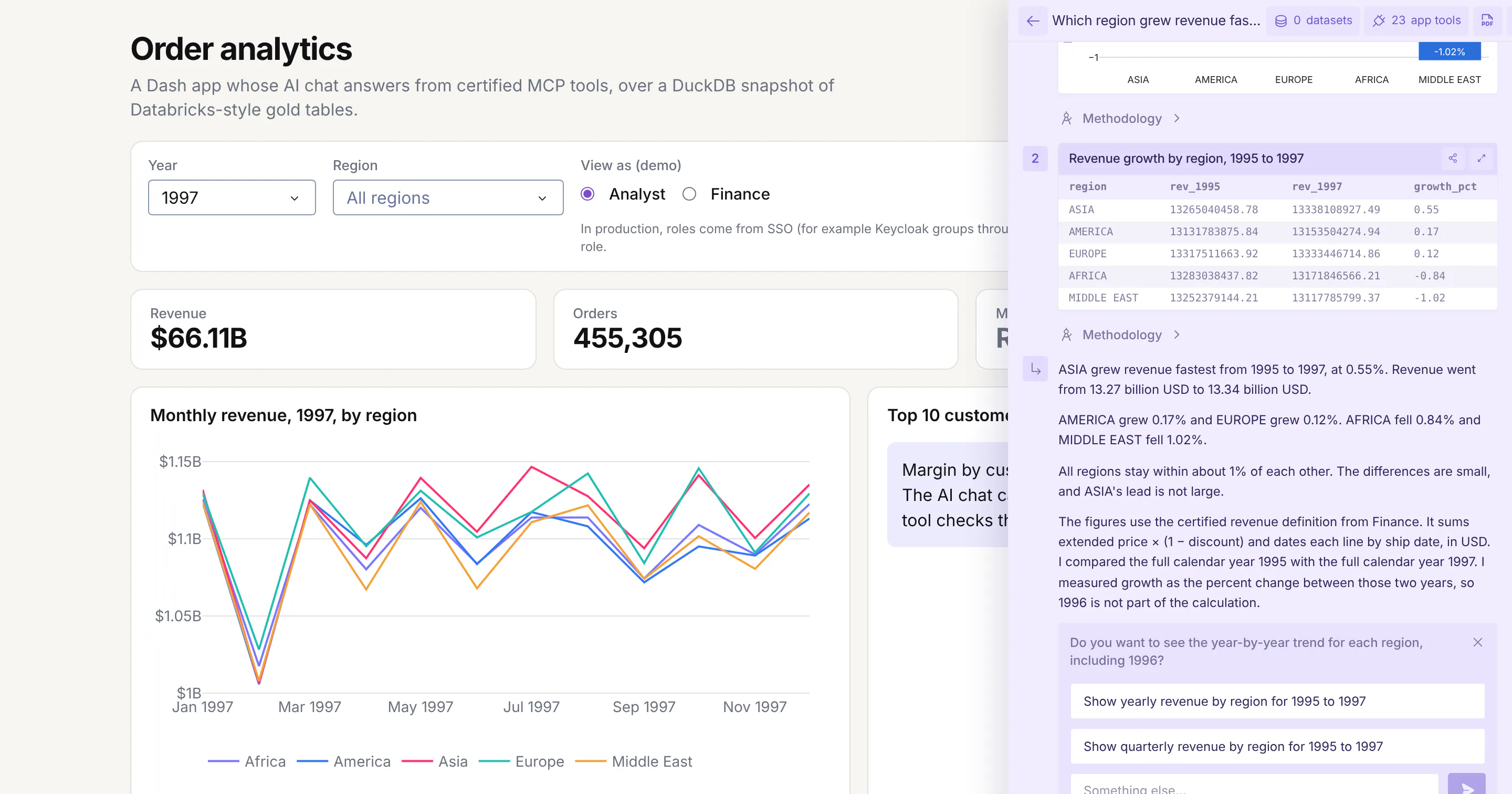
- Switch on Plotly Studio Embedded. The same tools power Plotly Studio Embedded, an AI chat inside the app that answers questions with charts and tables built from your functions. It's available now on Plotly Cloud (in beta) and is planned for Dash Enterprise in Q4 2026.
FAQ
See what Dash Enterprise and Plotly Cloud can do for your team
Our customers in energy, pharma, finance, and manufacturing are building apps like this one with coding agents and running them on Dash Enterprise behind their firewall or on Plotly Cloud. Request a demo and we'll show you how it works for your team.