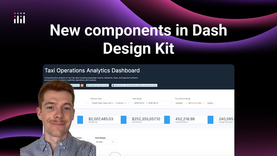
New components in Dash Design Kit
Meet the Speaker

Sam Tripp
Sam Tripp is a Technical Account Manager at Plotly.
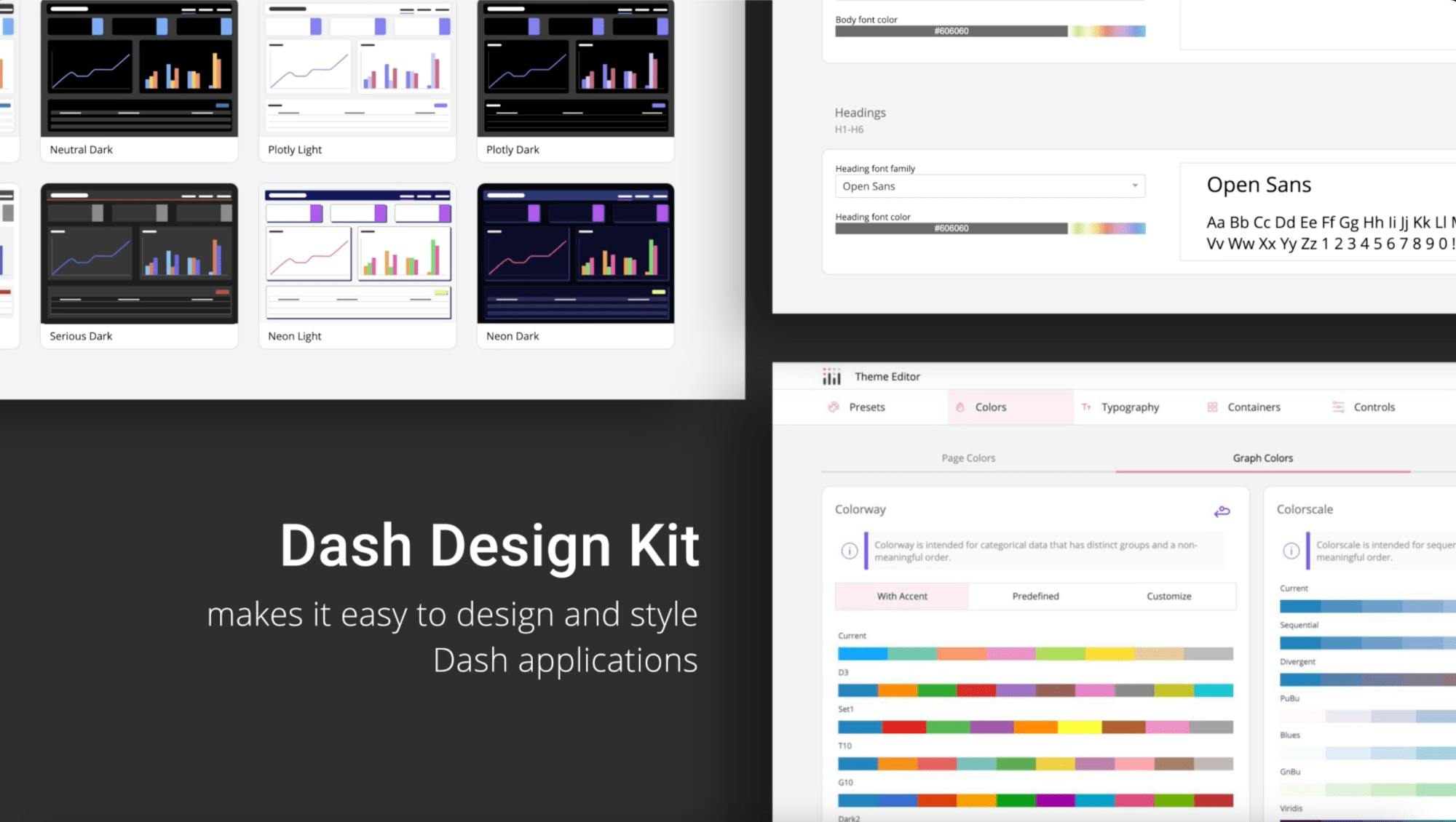
Dash Design Kit includes a comprehensive set of components designed to streamline layout and interface development. The fundamental building blocks are blocks, cards, and rows. Blocks and cards accept a width property that automatically aligns them horizontally until 100% of the width is reached, at which point they stack vertically. This makes it possible to create sophisticated nested layouts without extensive custom styling. The row property can be wrapped around blocks and cards to ensure they occupy the same height, creating more visually consistent designs.
The library also adds over 30 new Dash components that extend functionality beyond the standard offerings. New additions include:
- Tag component with text and icon support
- Card component with visibility toggle options
- Enhanced dropdown with automatic select all, deselect all, and search features
- Date picker that displays two months simultaneously with clearer date hierarchy
- Slider component with improved inputs and hover data
Watch the video to see these components in action and explore the full component list in the documentation.