Plotly Graphing Libraries, the most popular interactive charting library for Python

Meet the Speaker

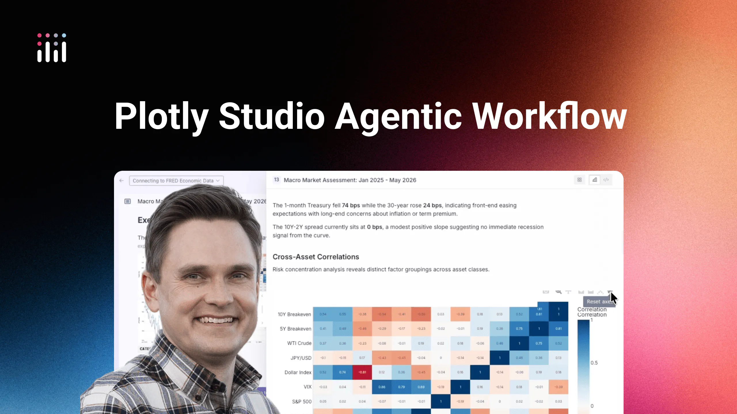
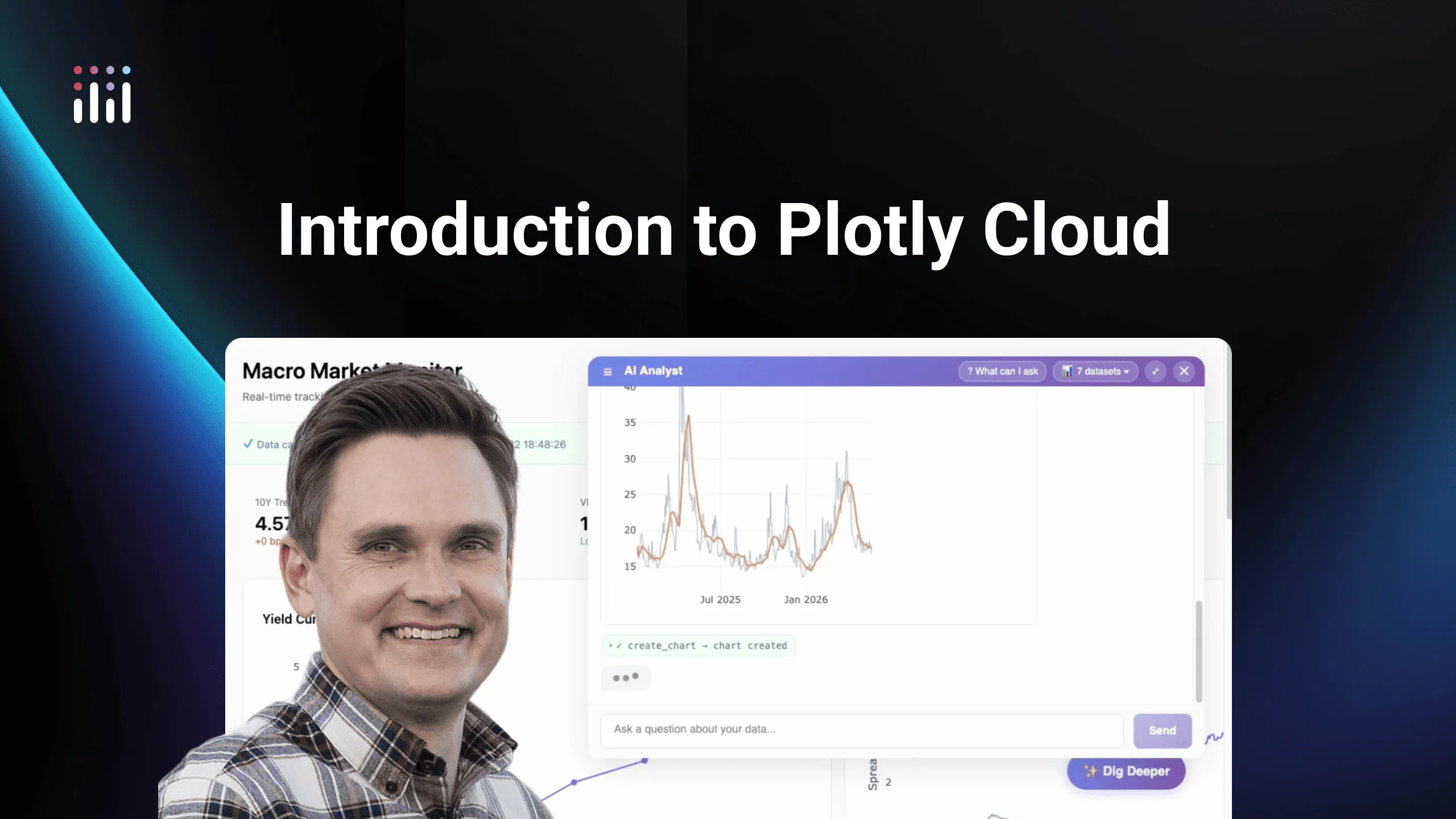
Matt Brown
Matt is a Senior Product Manager at Plotly, specializing in data analytics and visualization.
Plotly is an open source Python graphing library that turns data into interactive, publication-quality charts in just a few lines of code.
With over millions of monthly downloads, it's the most popular interactive charting library for Python. Every chart is interactive by default — hover, zoom, pan, and legend toggles built in, with fast client-side rendering and no extra configuration.
Plotly offers more than 70 chart types in one library, from scatter and bar charts to 3D surfaces, maps, candlesticks, and Sankey diagrams. Charts are publication-ready by default and fully customizable through a clean API. Plotly supports Python and JavaScript and embeds in Jupyter notebooks, browsers, BI tools, and dashboards. For Python teams, it pairs natively with Dash to build interactive data apps that scale to production with Dash Enterprise.
- Interactive by default with fast client-side rendering
- Dozens of chart types in a single library
- Publication-quality, fully customizable charts
- Python and JavaScript support
- Works in notebooks, browsers, and BI tools
- Native Dash integration for data apps
Plotly is a free, open source data visualization library for building interactive charts and data apps in Python.
Learn more about Plotly Graphing Libraries in the video above.