13 Ways to Visualize Time Series Data
One dataset, 13 charts.
People in San Francisco like to say September and October are the city's real summer. It's finally warm here this week, so we checked. We took 76 years of daily highs and lows from NOAA's weather station in downtown San Francisco and plotted them 13 different ways.
You can make every one of these charts in Plotly with a coding agent like Claude Code, Codex or Plotly Studio. Under each chart is a prompt you can give your agent to build it.
1. Temperature vs. time
The default chart puts the date on the x-axis and the temperature on the y-axis and draws one line. With daily data back to 1950 that's about 28,000 points, and you get a wall of blue. It tells you a typical high is in the 60s and that 90° days are rare. You can't see the seasons at all, and the seasons are what we wanted to compare.
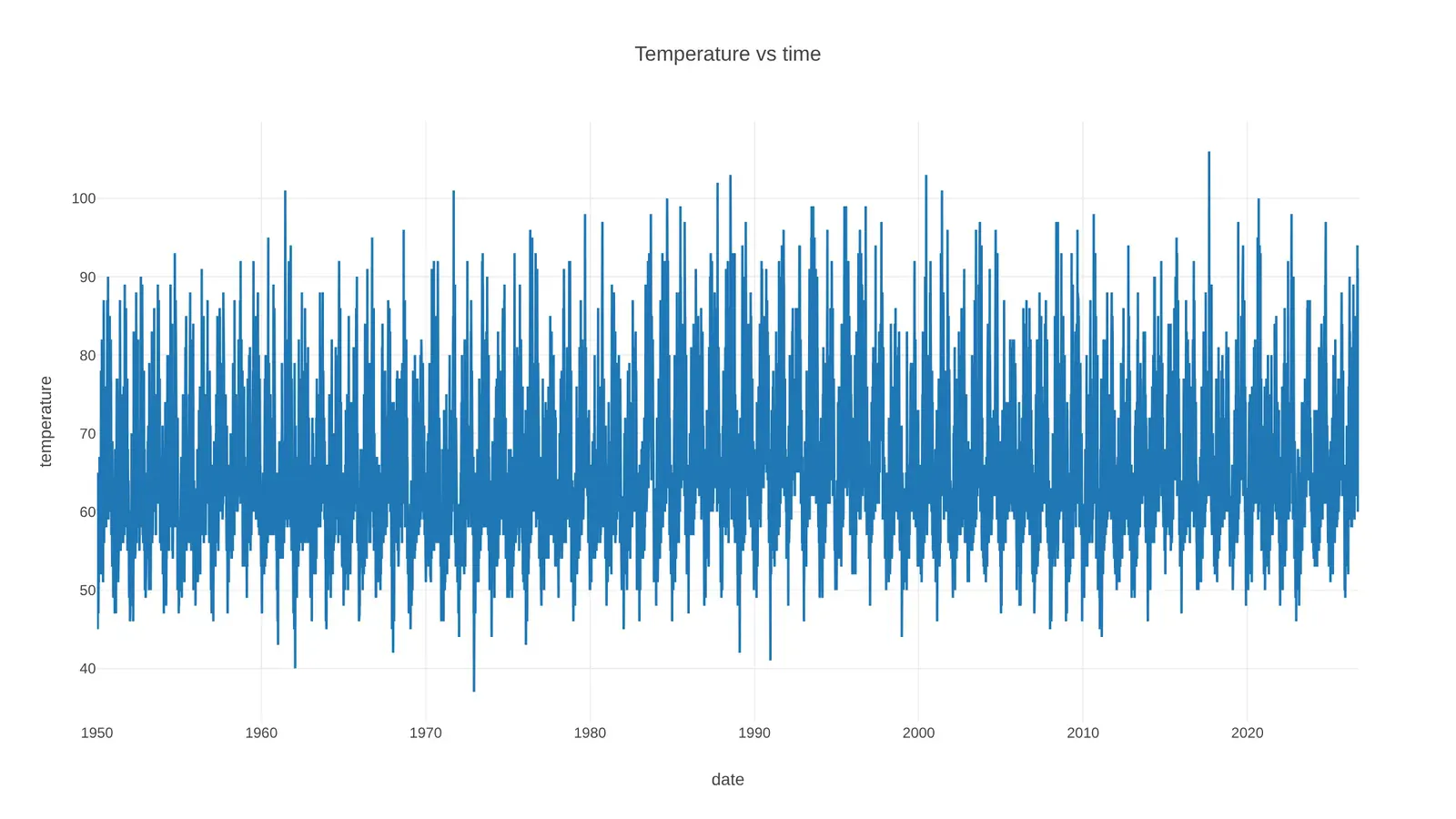
Prompt: Using Plotly, make a line chart of the daily high temperature in San Francisco from 1950 to today. Get the data from NOAA's GHCN-Daily dataset for the San Francisco Downtown station (USW00023272), using the TMAX column in °F. Put the date on the x-axis and the temperature on the y-axis, title it "Temperature vs time", and keep Plotly's default styling.
2. Month over month
Fold the calendar so every month shares one x-axis, day 1 to day 31, and draw a line per month. Each line is the normal daily high from 1991 to 2020. July, which most of the country thinks of as summer, sits around 67°. September and October run from 69° to 72°, higher than any other month. This is the first chart here that answers the question, and you can read it in a second.
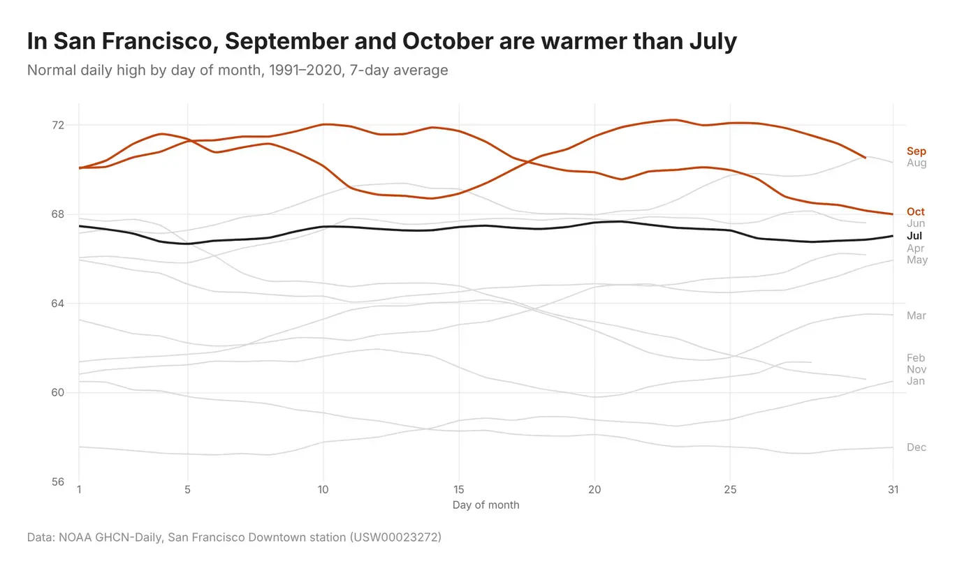
Prompt: Using Plotly, load NOAA GHCN-Daily TMAX for station USW00023272 (San Francisco Downtown). For each calendar day, average the daily high over 1991 to 2020 and smooth it with a 7-day rolling mean. Plot one line per month with day of month (1 to 31) on the x-axis and temperature in °F on the y-axis. Color July dark grey and September and October orange, make the other nine months light grey, and label each line at its right end with the month name instead of using a legend.
3. Every year in grey, this year in orange
Put every year on the same January-to-December axis with one thin grey line per year since 1950, then draw this year on top in a strong color. The grey cloud shows what's normal and how much it moves around. 2026 had a hot spell in March and a mild summer before its warmest stretch arrived in September. The dashed line is the 1991 to 2020 normal, which peaks in late September.
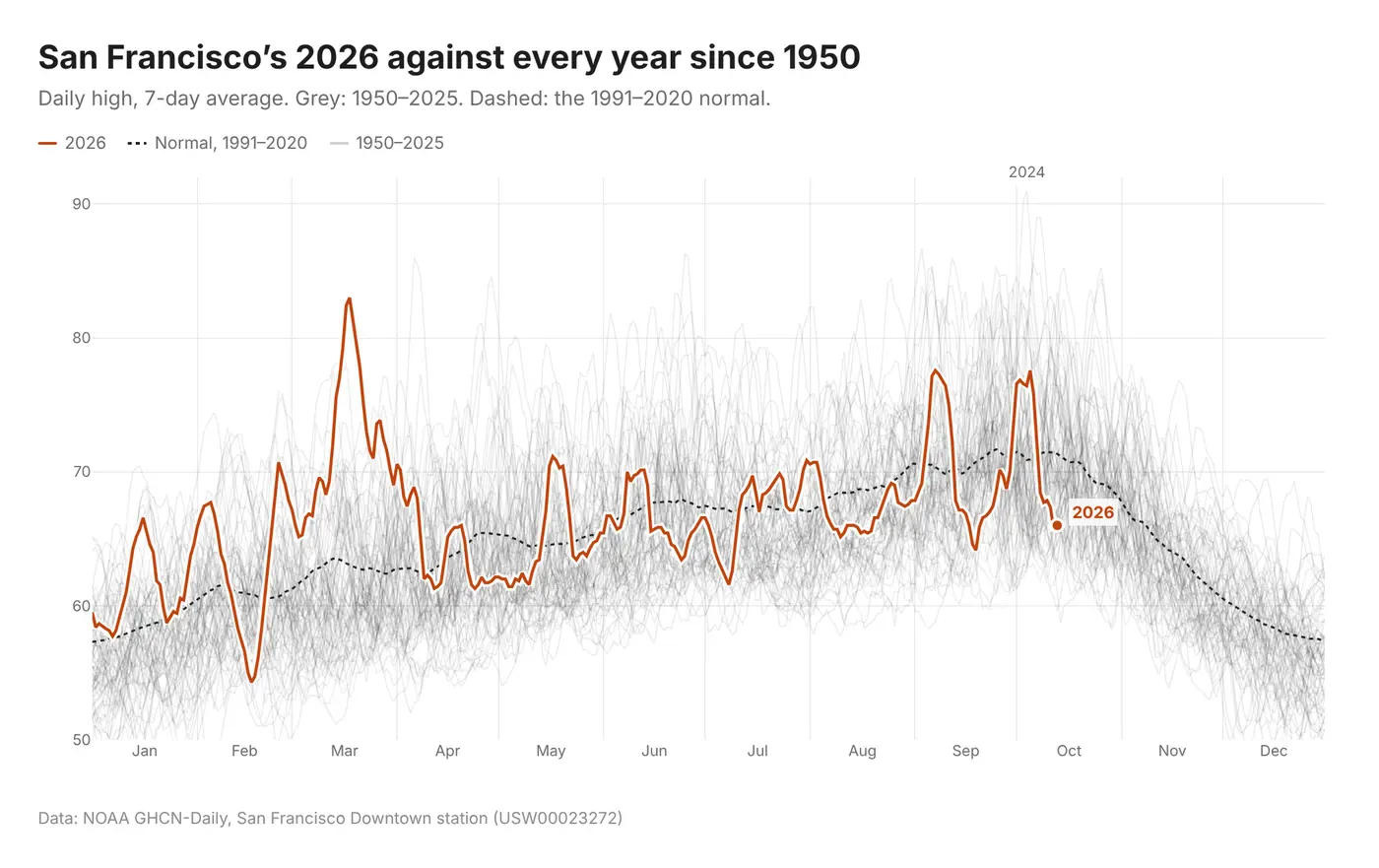
Prompt: Using Plotly and NOAA GHCN-Daily TMAX for San Francisco Downtown (USW00023272), plot the daily high for every year from 1950 to today on a shared January-to-December x-axis, dropping February 29. Smooth each year with a 7-day rolling mean. Draw 1950 to 2025 as thin grey lines at low opacity, the 1991 to 2020 average as a dashed black line, and 2026 as a thick orange line with a white outline and a label at its last point. On hover, highlight the year under the cursor.
4. The year as a circle
Wrap the year into a circle, January at the top and running clockwise, with temperature as the distance from the center. Each spoke is one day of 2026, drawn from its low to its high and colored by the high. Behind the spokes are the normal range and the record range for each date. It looks great, and outliers like March's heat wave jump out. Comparing two months is harder, because you're comparing angles and radii instead of reading heights off a line.
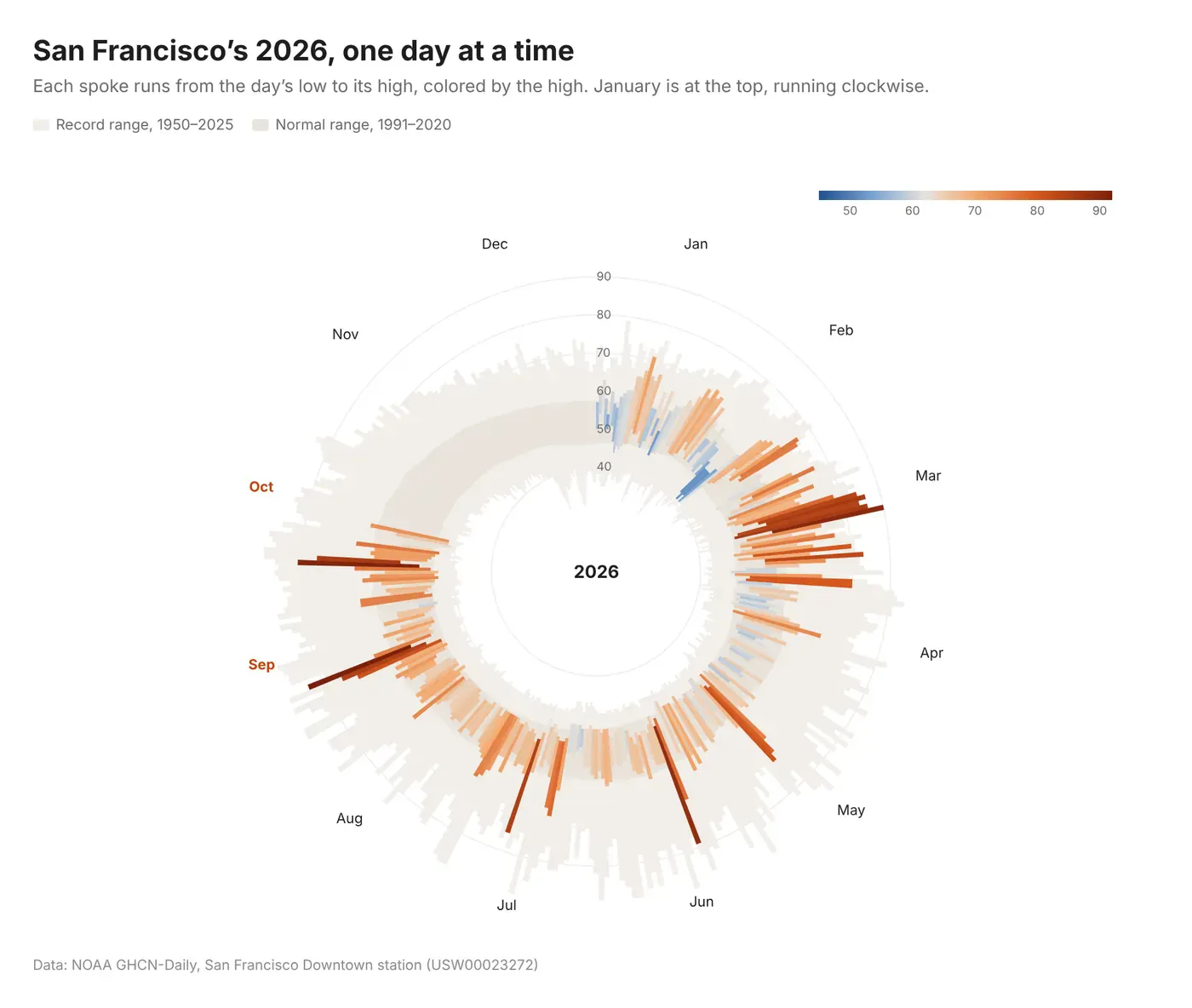
Prompt: Using Plotly's barpolar trace and NOAA GHCN-Daily TMAX and TMIN for San Francisco Downtown (USW00023272), draw the year as a circle. Use one bar per day of year, starting with January at the top and running clockwise, with each bar's base at the day's low and its top at the day's high. Layer three sets of bars: the record range for each date from 1950 to 2025 in very light beige, the 1991 to 2020 normal range in a darker beige, and 2026 colored by the daily high on a blue-to-orange diverging scale centered at 62°F. Leave a hole in the middle with the year as a label, and put month names around the edge.
5. A calendar
Everyone already knows how to read a calendar. Each cell is one day of 2026, colored by its high, so you can find your birthday or spot the week of 80s in March. September and the first half of October had 10 days at 75° or warmer. June, July and August had 6 between them. Each month's average high is in its heading.
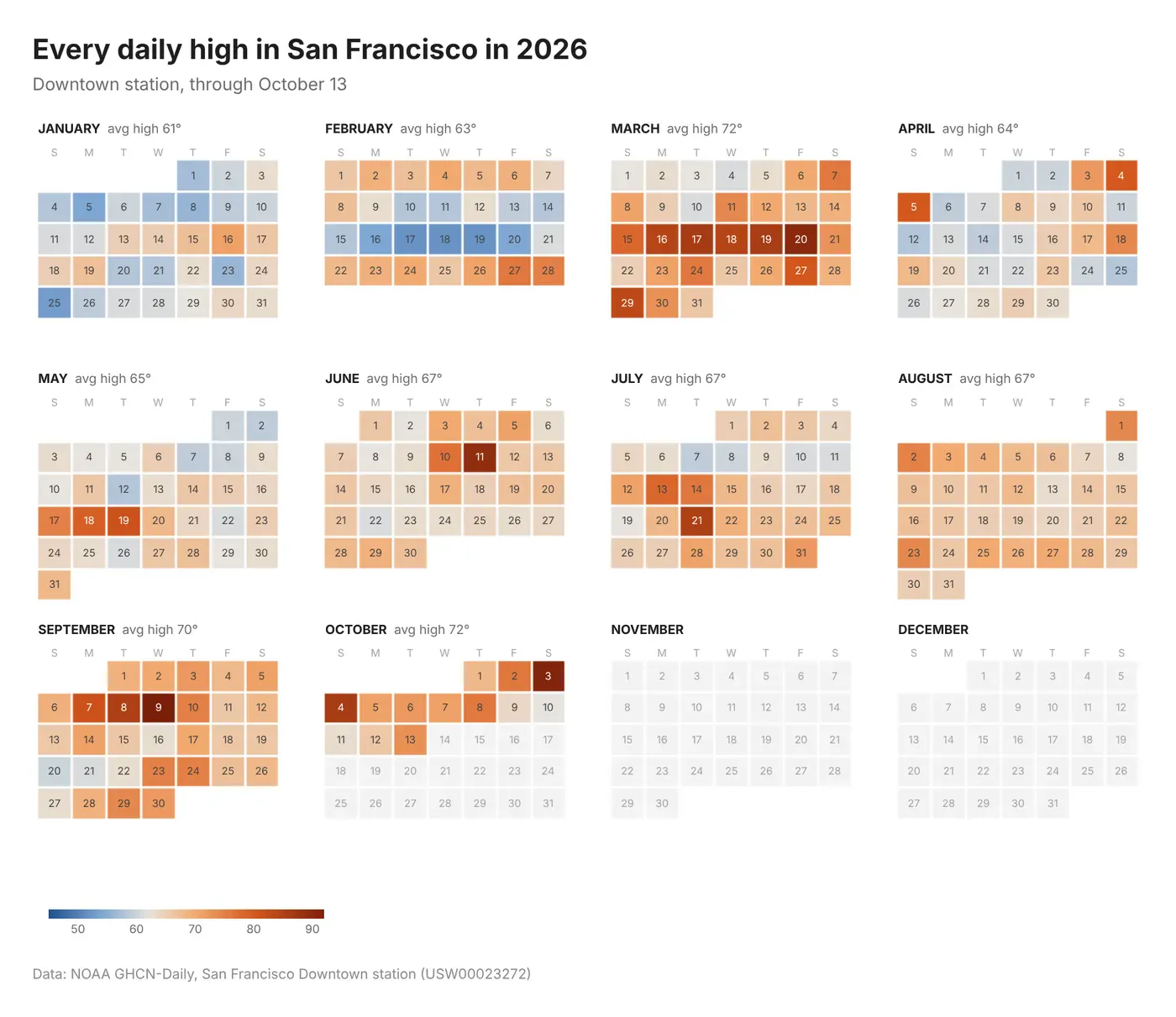
Prompt: Using Plotly, build a wall calendar of 2026 from NOAA GHCN-Daily TMAX for San Francisco Downtown (USW00023272). Make a 3 by 4 grid of subplots, one heatmap per month, with weekdays as columns (Sunday first) and weeks as rows. Color each day by its high on a blue-to-orange diverging scale centered at 62°F, leave a small gap between cells, print the day of the month in each cell, and show days with no data yet in light grey. Put the month name and its average high above each month, and share one color bar.
6. Highs vs. lows
This is the New York Times weather chart that Edward Tufte held up as an example of great design. Each day gets three bars: the record range for that date, the normal range, and the actual low to high in 2026. The typical day and the extremes sit in the same picture, so you can see where this year lands. Days that set a new record high are in orange. March 20 hit 90°, 12 degrees over the old record for that date.
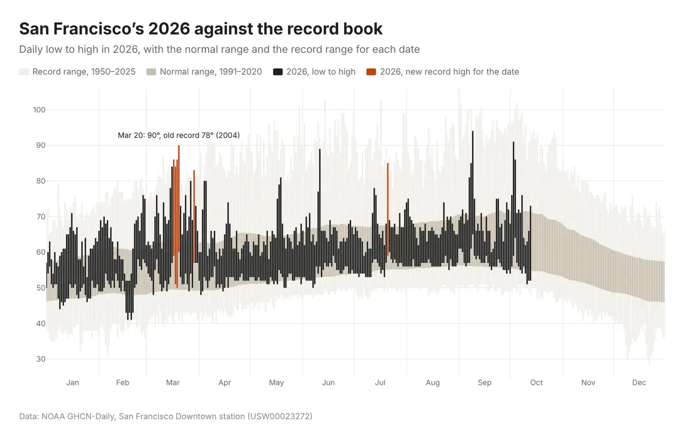
Prompt: Using Plotly and NOAA GHCN-Daily TMAX and TMIN for San Francisco Downtown (USW00023272), recreate the classic New York Times weather chart for 2026. For every day of the year, draw three overlaid bars using base and height: the record low to record high for that date from 1950 to 2025 in very light beige, the 1991 to 2020 normal low to normal high in a darker beige, and 2026's actual low to high in near-black. Color the 2026 bar orange on days that set a new record high, and annotate the biggest one.
7. Just the average
Average the high and the low and you get one smooth line per day. That's tidy, but you lose the gap between the afternoon and the night. Here are the normal high, average and low with each line's warmest day marked. The high and the average peak on September 25 and the low peaks on September 3.
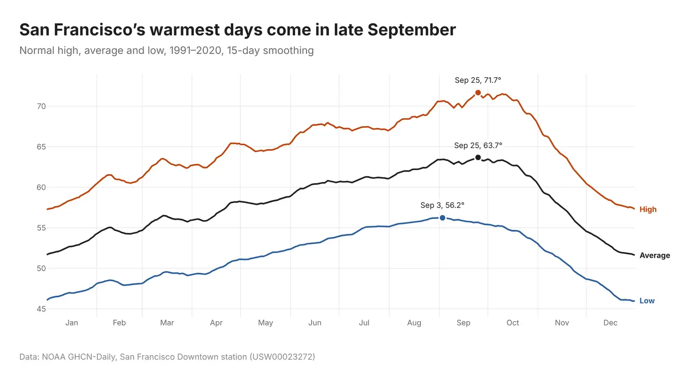
Prompt: Using Plotly and NOAA GHCN-Daily TMAX and TMIN for San Francisco Downtown (USW00023272), compute the 1991 to 2020 normal high, low and average ((high + low) / 2) for each day of the year, smoothed with a 15-day centered rolling mean. Plot them as three lines (high in orange, average in black, low in blue) with direct labels at the right end instead of a legend. Mark each line's maximum with a dot and annotate it with the date and temperature. Use a unified hover.
8. Temperature at sunset
What people really want to know is whether it's warm enough to sit outside in the evening, and daily summaries can't tell you that. So we took hourly readings from the same station going back to 2011, worked out the time of sunset for every day and interpolated the temperature at that minute.
Sunset temperature peaks around September 24 at a median of 62°. In mid-July it's 58°, nine degrees below the day's high, because the marine layer has usually rolled in by evening.
Here's how we got the number. The station reports the temperature about once an hour, at 43 minutes past. For each day we calculated the minute of sunset at the station from the sun's position, using NOAA's solar calculator method, which counts the sun as set when its top edge drops below the horizon. Then we took the readings just before and just after that minute and drew a straight line between them. If sunset is at 6:52 pm and the readings are 64° at 6:43 and 61° at 7:43, the sunset temperature is about 63.6°. We skipped days where those two readings were more than 2.5 hours apart. The chart shows the median for each date across 2011 to 2026, with the middle half of years shaded.
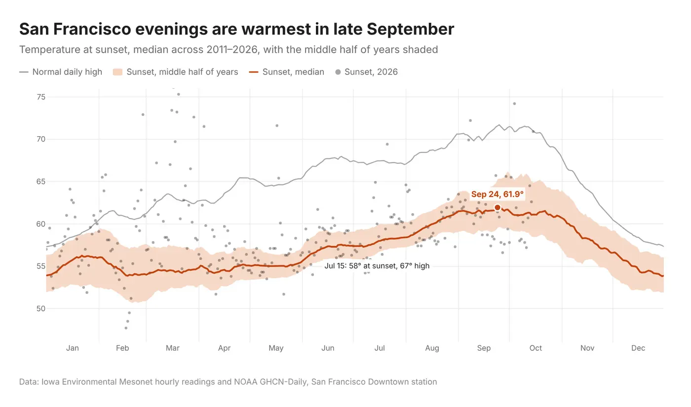
Prompt: Using Plotly, download hourly air temperature for the San Francisco Downtown station (SFOC1) from the Iowa Environmental Mesonet HADS archive for 2011 to today. For every day, compute the time of sunset at 37.7705° N, 122.4269° W with the NOAA solar position algorithm, then linearly interpolate between the readings just before and just after sunset, skipping days where those two readings are more than 2.5 hours apart. For each day of the year, plot the median sunset temperature as an orange line with a shaded band for the 25th to 75th percentile across years, smoothed over 15 days. Add the normal daily high from NOAA GHCN-Daily as a grey line and this year's sunset temperatures as small dots, and annotate the peak.
9. Every hour of every day
Put the day of the year along the bottom and the hour up the side, then color each cell by the average temperature. Afternoons warm up through the summer and peak in early October around 1 pm. The dashed line is sunset, so you can see how much warm daylight is left after work. The jumps in March and November are daylight saving time.
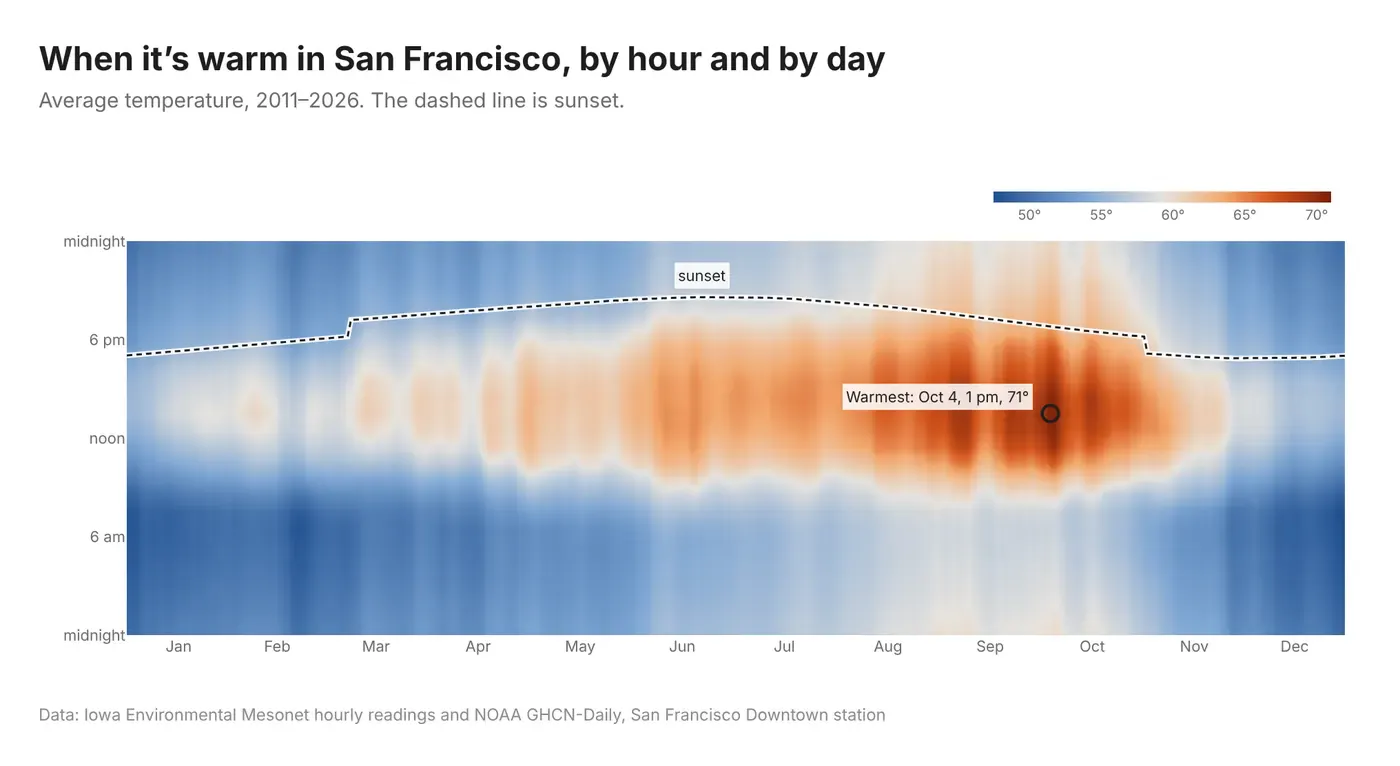
Prompt: Using Plotly, take hourly air temperature for San Francisco Downtown (SFOC1) from the Iowa Environmental Mesonet HADS archive, 2011 to today, in local time. Average it by day of year and hour of day, smoothing over a week, and plot it as a heatmap with day of year on the x-axis, hour on the y-axis (midnight at the bottom) and a blue-to-orange diverging color scale. Overlay the local sunset time as a dashed line with a white outline, and circle and label the warmest cell.
10. A ridgeline, Joy Division style
A ridgeline stacks lines so the peaks of each one rise into the lines behind it. It's also called a joy plot, after the Joy Division album cover, which drew 80 pulses from a pulsar this way. Here there are 76 lines, one per year, with 1950 at the top and 2025 at the bottom. Each line stays flat until the daily high goes above 66°, then rises.
The edges stay flat and the mountains pile up in September and October. In 65 of the 76 years, the most warmth above 66° came in one of those two months.
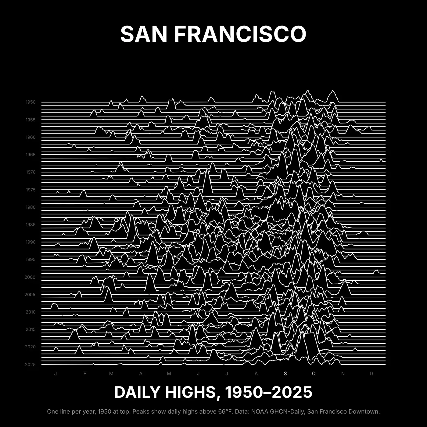
Prompt: Using Plotly and NOAA GHCN-Daily TMAX for San Francisco Downtown (USW00023272), make a ridgeline in the style of the Joy Division Unknown Pleasures cover, with one line per year from 1950 at the top to 2025 at the bottom and day of year on the x-axis. Smooth each year with a 7-day centered rolling mean, fill missing days by linear interpolation, and plot only how far each day's high is above 66°F, so the line stays flat on cooler days. Offset each year by one row and scale the peaks so the tallest rise about ten rows. Draw each line in white on a black background with the area under it filled black, so each line hides the ones behind it. Hide the axes, label every fifth year in small grey text at the left end of its line, and put small month initials along the bottom. Make it square, with SAN FRANCISCO in bold capitals above the plot and DAILY HIGHS, 1950–2025 below it.
11. The chance of a 70° day
This chart plots the chance that a given day reaches 70°, based on 1991 to 2025. It peaks at 50% on September 25. On July 15 it's 24%, about half that.
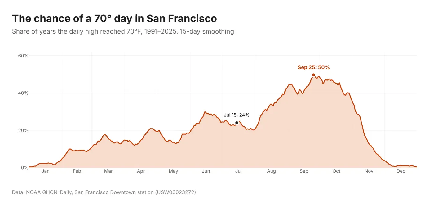
Prompt: Using Plotly and NOAA GHCN-Daily TMAX for San Francisco Downtown (USW00023272), 1991 to 2025, compute for each day of the year the share of years in which the high reached 70°F, smoothed with a 15-day centered rolling mean. Plot it as an orange line with a light orange fill to zero and a percentage y-axis, and annotate the peak day and July 15.
12. The warmest month, year by year
For each year since 1950, we found the month with the highest average daily high. October won 33 times and September 32. July won 5 times, June 4 and August 2. In 65 of the 76 years, the warmest month was September or October.
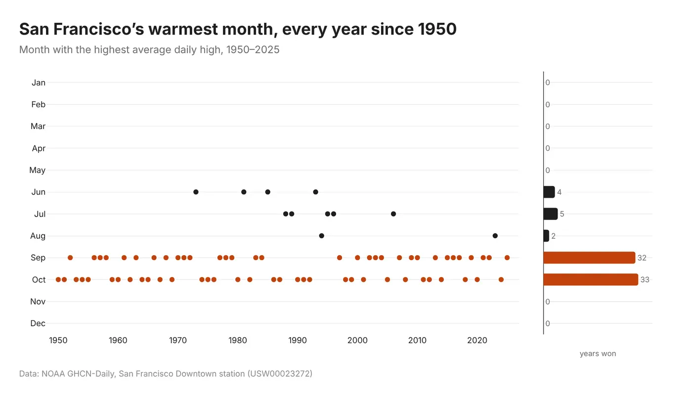
Prompt: Using Plotly and NOAA GHCN-Daily TMAX for San Francisco Downtown (USW00023272), find the month with the highest average daily high for each year from 1950 to 2025. Make a dot plot with year on the x-axis and a row for every month from January to December on the y-axis, one dot per year, with September and October in orange and the other months in dark grey. Next to it, as a second subplot sharing the y-axis, add a horizontal bar chart of how many years each month won, with the count printed at the end of each bar, including the months that never won.
13. A great table
You don't always need a chart. This table borrows its typography from mid-century US Census reports, with double rules at the top and bottom, grouped column headings, leader dots and serif figures. It holds everything from the charts above, including the normals, records, sunset temperatures and warm-day counts, and it's the only view here that gives you exact numbers.
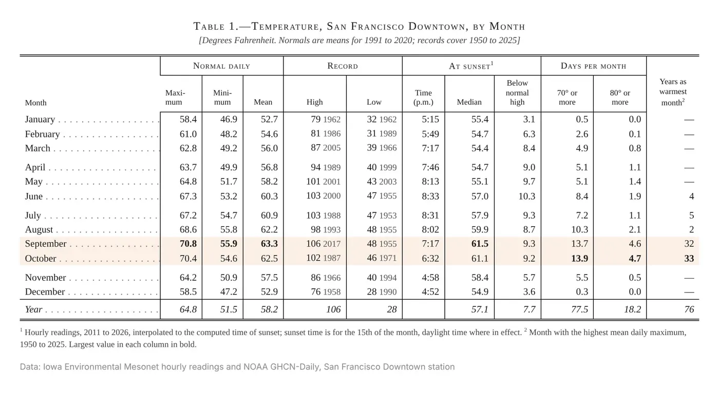
Prompt: Using Dash, build an HTML table (not a chart) of San Francisco Downtown temperatures by month from NOAA GHCN-Daily (USW00023272) and Iowa Environmental Mesonet hourly data (SFOC1). Columns: normal daily maximum, minimum and mean (1991 to 2020); record high and low with the year (1950 to 2025); sunset time on the 15th, median temperature at sunset and how far that is below the normal high; days per month at 70°F or more and 80°F or more; and years as the warmest month. Style it like a 1950s US Census table: a serif font with tabular figures, a double rule at the top and bottom, spanner headings in small caps with a rule under each group, vertical rules between columns, leader dots after each month name, extra space every three rows, bold for the largest value in each column and a light highlight on September and October.
Publish these charts with Plotly Cloud
Every chart here is a Plotly figure, so it can do more than sit in a blog post as a picture. Put it in a Dash app, add a date range or a station picker, and publish it to Plotly Cloud to get a live link with hover and zoom intact. Share it with your team, or keep it private.
If you work with a coding agent, the Plotly Cloud connector lets it build and deploy the app from the same conversation. You can get started at cloud.plotly.com.
Frequently asked questions
What is the best way to visualize time series data?
It depends on the question. A line chart over time is the default and shows long-term trends, but with daily data it hides seasonal patterns. To compare seasons, put every year or every month on the same axis, or plot how often a threshold is crossed on each date. When readers need exact values, use a table.
How do you show seasonality in time series data?
Align each period on a shared axis. Plot day of year on the x-axis with one line per year, or day of month with one line per month. Calendar heatmaps, hour-by-day heatmaps and radial charts also show seasonal cycles.
How do you compare this year to previous years?
Draw every past year as a thin grey line and the current year on top in a strong color, with the long-term average as a dashed line. You see the normal range and where this year falls in it.
What is a ridgeline plot?
A ridgeline plot, also called a joy plot, stacks many lines or distributions with a vertical offset so each one overlaps the one behind it. The name comes from the cover of Joy Division's Unknown Pleasures. In Plotly you can build one from violin traces with side='positive' or from filled scatter traces.
What is the warmest month in San Francisco?
Usually September or October. In NOAA data from the downtown San Francisco station from 1950 to 2025, October had the highest average daily high in 33 years and September in 32. The 1991 to 2020 normal high peaks at 71.7°F on September 25.
Can I make these charts with an AI coding agent?
Yes. Each chart above comes with a prompt you can give Claude Code, Codex, Plotly Studio or another coding agent. The agent writes the Plotly code, and you can publish the result as a Dash app on Plotly Cloud.