Vibe Analysis with Plotly Studio: Edit Graphs, Cards, and App Theme
Meet the Speaker

Austin Kiesewetter
Austin Kiesewetter is a Plotly community member and software engineer at Martin Engineering.
This video builds on a previous tutorial where a CSV file was used to generate a dashboard in Plotly Studio. The focus here is on how to edit charts, change themes, and use new features that make customizing dashboards easier. A new edit button lets you adjust any graph directly. The demo shows replacing a chart with a bubble chart by clicking edit, selecting the new chart type, and submitting changes. The video also introduces the remix option, which can automatically generate variations of a chart based on the prompt you provided.
Several resources are highlighted for deeper exploration. The Plotly Python documentation lists every chart type with examples, while a forum post by Plotly co-founder Chris showcases his favorite charts and techniques, offering inspiration for advanced designs. Both resources are useful for learning new approaches or refining chart aesthetics.
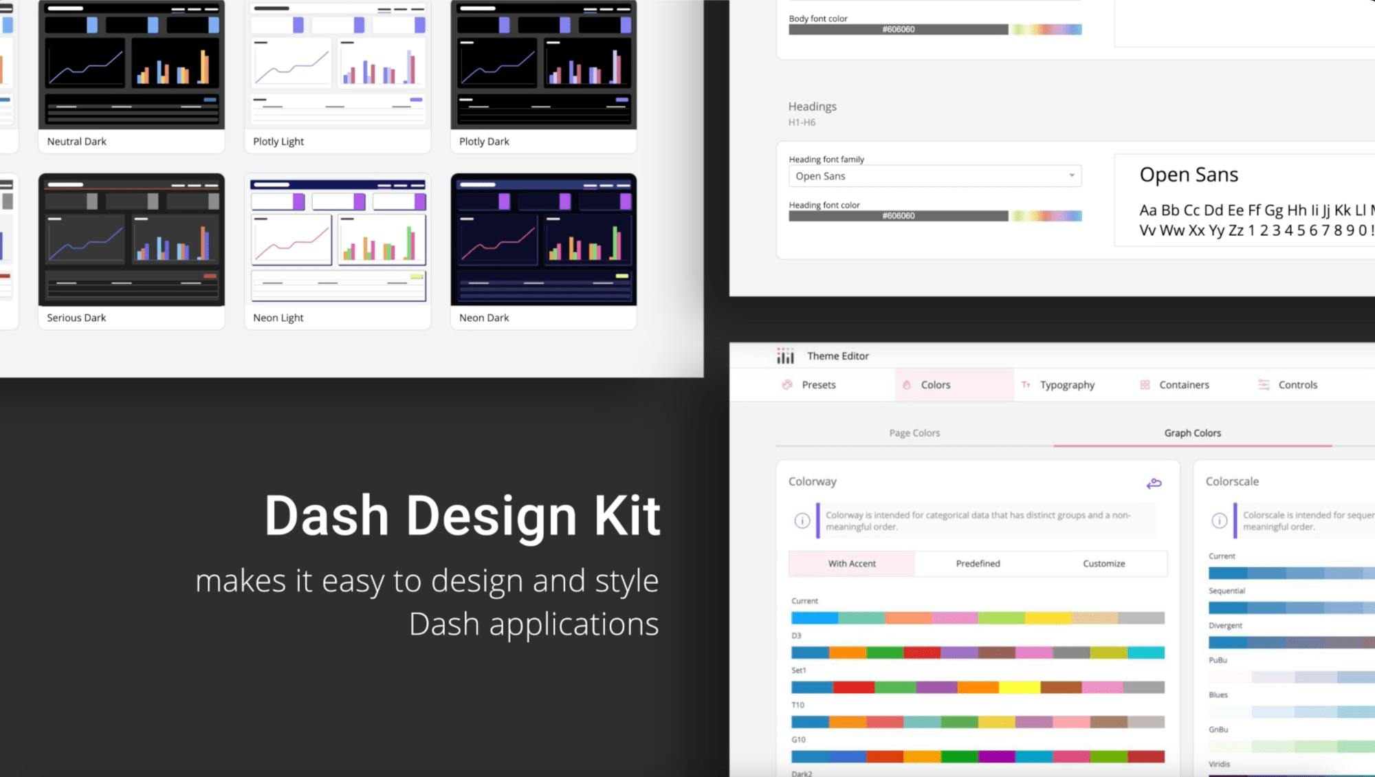
The walkthrough demonstrates how easy it is to experiment with different chart types, zoom and pan dynamically, and use built-in tools for interaction. The video also covers changing themes, such as switching from light to dark mode with a simple instruction, instantly updating the entire application style.
Key takeaways
- Edit button for quick chart adjustments
- Remix feature for automatic chart variations
- Forum resources for inspiration and advanced tips
- Theme customization with simple prompts
Watch the video to follow along and see how to quickly transform and style your dashboards.