Introduction to Plotly Studio
Meet the Speaker

Austin Kiesewetter
Austin Kiesewetter is a Plotly community member and software engineer at Martin Engineering.
The video introduces Plotly Studio, a new AI-powered tool for creating interactive dashboards. Instead of spending hours manually working with Excel files and building charts, users can now upload a dataset and let the AI handle the heavy lifting. Plotly Studio is purpose-built for data science and integrates directly with the Dash framework and Plotly graphs. This makes it simple to generate interactive applications that reveal insights in just a few steps.
The demo walks through uploading an income dataset covering US counties. By setting goals like analyzing income distribution and poverty rates, the AI generates an outline in under a minute. This outline structures the app into sections, defines filters, and sets a theme. The AI then builds out maps, charts, and layouts automatically. The result is a fully interactive dashboard where users can apply filters, explore data, and visualize patterns at scale.
Key points covered in the video include
- Plotly Studio builds dashboards from raw datasets with minimal input
- Dash and Plotly libraries provide the foundation for interactivity and visualization
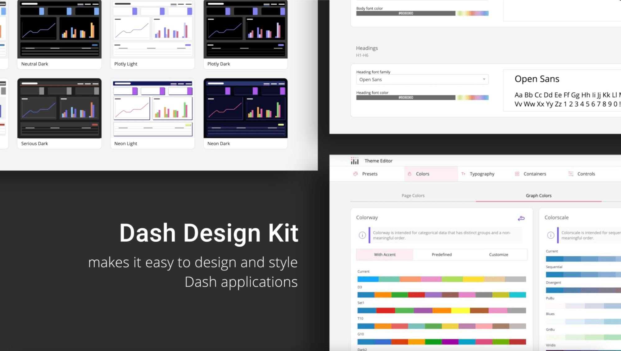
- The tool supports customization such as themes and filter controls
- Output dashboards are professional and ready for deeper exploration
The video also explains how Plotly Studio fits into Plotly’s broader ecosystem. Open source Plotly remains the graphing foundation, Dash enables Python-based dashboard development, and Dash Enterprise supports large scale corporate deployments. Plotly Studio now brings AI to dashboard creation while Plotly Cloud makes it easy to publish and share applications online.
Watch the video to follow along.