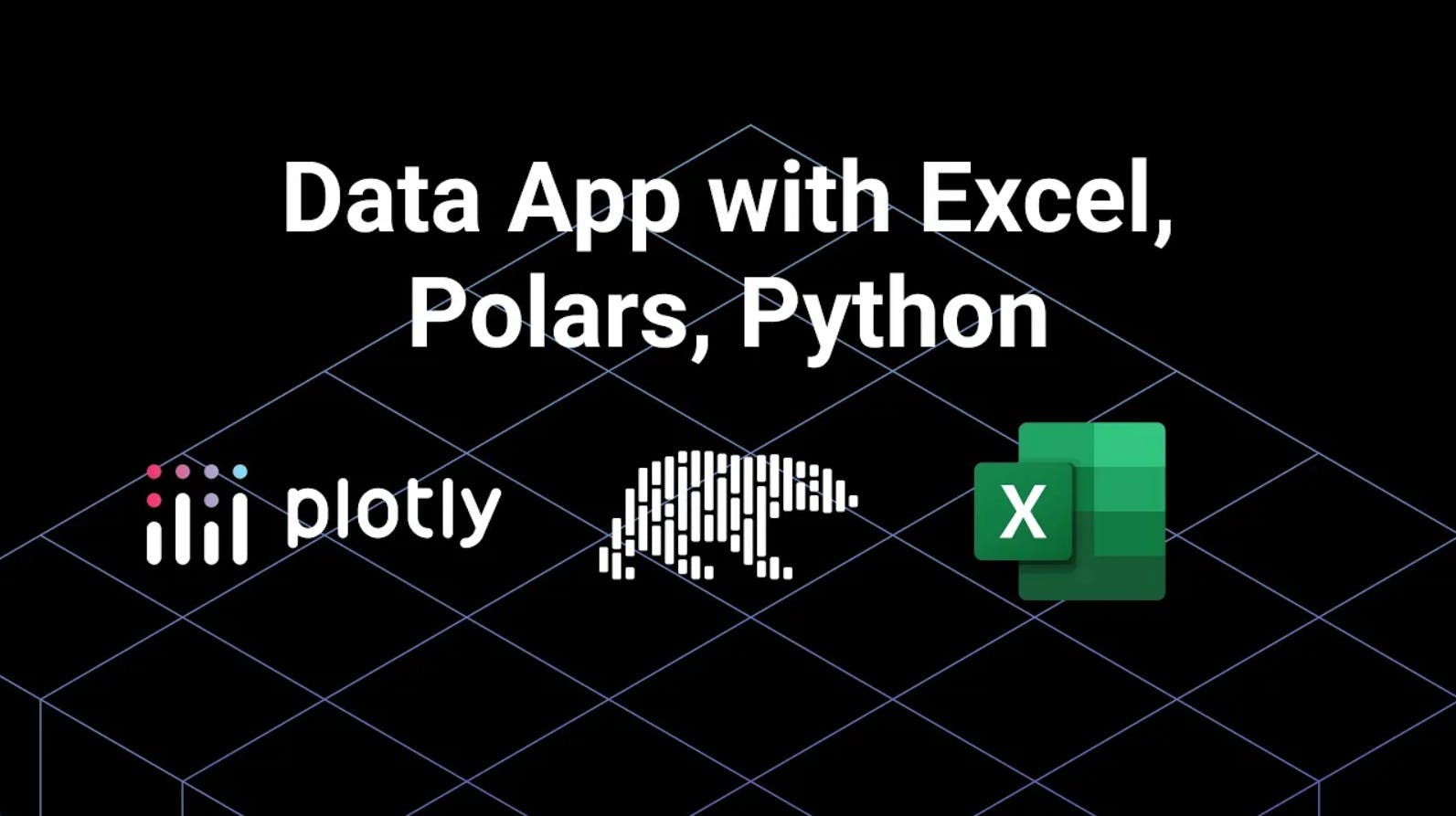
Build a Data App with Excel, Polars and Python
Meet the Speaker

Austin Kiesewetter
Austin Kiesewetter is a Plotly community member and software engineer at Martin Engineering.
In this walkthrough, Austin demonstrates how to build an interactive Dash app using Polars, Excel, and Python. The project expands on a previous dataframe benchmark comparing Pandas, Polars, and Narwhals, this time focusing specifically on how to use Polars within a Dash application. The app lets users upload Excel files, visualize their data on an interactive map, and explore it through an editable AG Grid table.
The workflow begins with Dash components such as dcc, html, input, output, and callback, alongside libraries like Plotly Express and Graph Objects for visualization. The video covers how the DCC Upload component handles file input and decoding through base64, transforming Excel files into Polars dataframes using pl.read_excel. The parsed data is stored in a DCC Store component for faster callback performance.
From there, the video walks through building helper functions that render both the map and AG Grid dynamically after upload. The map plots latitude and longitude values using a Plotly scatter map, filtering out missing or non-numeric coordinates, while the grid supports sorting and filtering with column definitions based on datatype. The app also syncs both views so that edits made in the grid update the map in real time.
The tutorial closes with a brief reflection on how Polars’ syntax differs slightly from Pandas but achieves similar results, highlighting its speed and flexibility for interactive applications. Watch the video to follow along and build your own Excel-powered Polars app in Dash.