
Waliyuddin Sammadikun
June 10, 2026
Pushing Plotly Dash Beyond Default Design
Author: Waliyuddin Sammadikun
When you think of Plotly Dash, you think of data-driven power. But Dash applications go far beyond basic charts and functional layouts. Today, developers and designers use Dash to build sleek, interactive, and visually stunning products. It bridges the gap between deep data science and elegant user experience.
With the right design direction, Dash can become far more than a data tool. It can power elegant, premium web applications that feel modern, immersive, and consumer-ready. Strong typography, layered layouts, refined spacing, custom CSS, and thoughtful interactions can completely transform how users experience a Dash product.
That idea became the foundation behind Travel Smart, a curated travel recommendation app built in Python. Rather than treating Dash as a dashboard library, I approached it like a product framework. The goal was simple, create something that feels closer to Airbnb or a startup landing page than a traditional analytics interface.
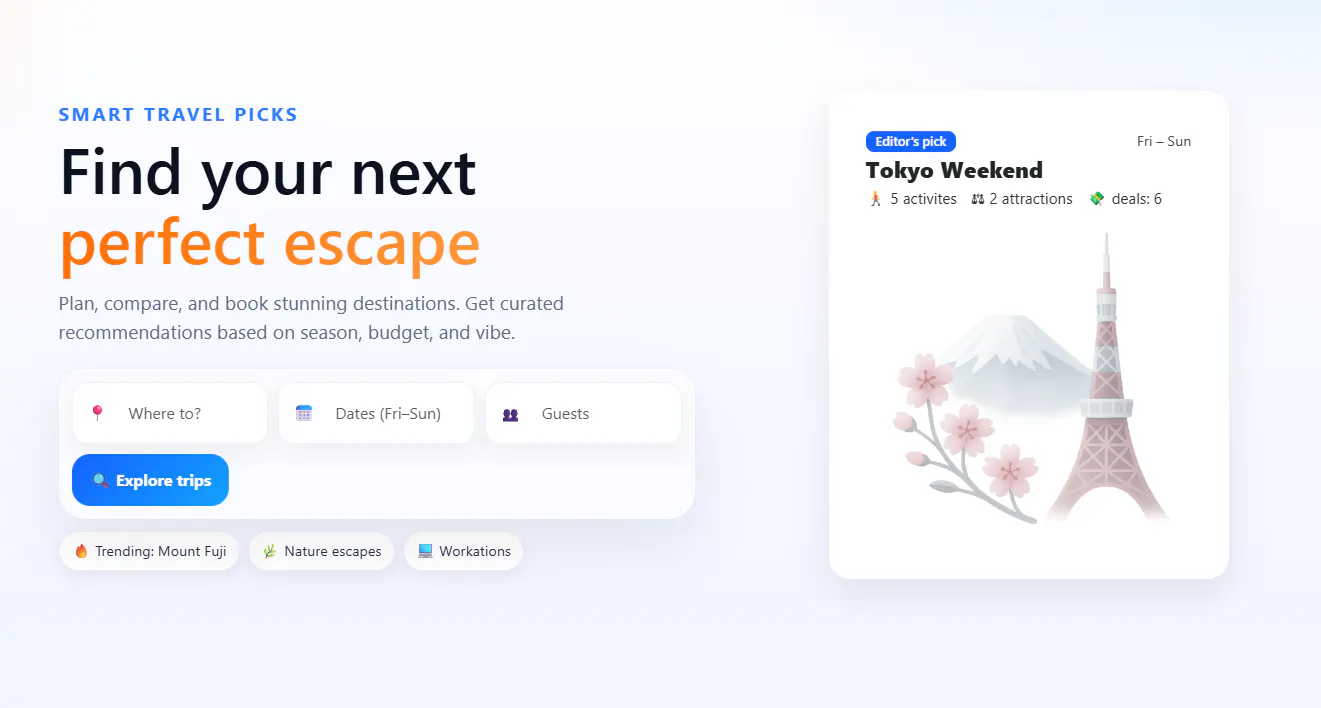
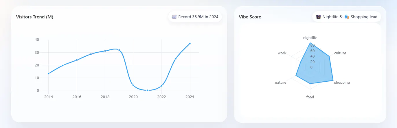
I focused initially on first impressions before introducing charts and filters. The interface was structured with clear visual hierarchy and designed as something users would genuinely want to explore. That same mindset carried into the analytics section. I didn’t want charts to look like separate white boxes dropped onto the page, so I created a reusable glass-card component that made every visualization feel naturally connected to the product.
dbc.Card(class_name="one-chart glass-card",children=[html.Div(className="glass-head",children=[html.H3("Visitors Trend (M)"),html.Span("📈 Record 36.9M in 2024", className="chip"),],),])
To make that possible, I built a reusable visual system around a custom glass-card class.
.one-chart.glass-card {background: rgba(255,255,255,.55);backdrop-filter: blur(10px);border: 1px solid rgba(255,255,255,.65);border-radius: 28px;padding: 16px;box-shadow: 0 25px 55px rgba(11,18,32,.08),inset 0 1px 0 rgba(255,255,255,.65);}
The combination of translucency, blur, and soft borders created a glassmorphism effect that immediately elevated the interface. Instead of harsh white containers competing with the background, each chart blended seamlessly into the page. Rounded corners and layered shadows added depth, while still keeping the overall experience light and modern.
What made this especially powerful was consistency. Every chart card followed the same visual language, which gave the app a stronger identity and made the experience feel intentional rather than assembled from default components.
I also refined Plotly’s own interaction layer. By disabling the default mode bar with config={"displayModeBar": False}, I removed unnecessary visual clutter and prevented accidental zoom or pan actions while users scrolled through the page. This may sound small, but details like this matter. Consumer-facing products should feel frictionless.
The result was simple: the charts no longer looked like analytics tools. They looked like part of a premium web product.
One of the fastest ways to ruin a dashboard is with information overload. Many developers assume more charts means more value, so they place every metric directly on the main page. The result is usually the same with endless scrolling, visual fatigue, and users who stop caring halfway through the experience.
I knew that if I displayed every chart for destinations like Tokyo or Mount Fuji upfront, the interface would become exhausting. Even strong visuals cannot save a page that asks users to process too much at once.
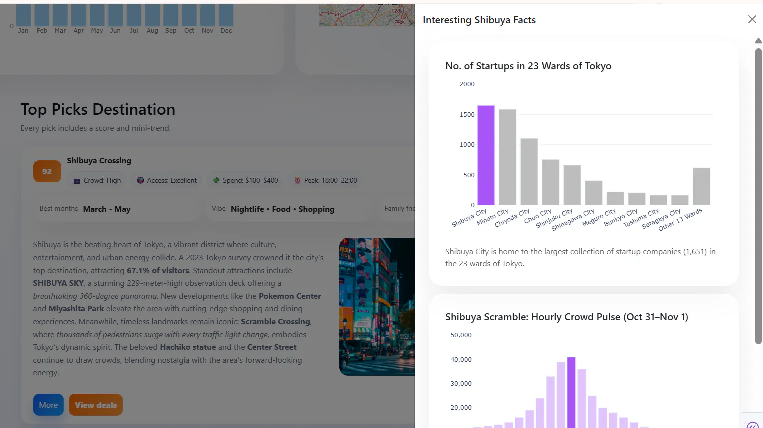
So instead of forcing all information into a single screen, I used a product design principle known as progressive disclosure. The homepage only presents what users need to make an initial decision: concise summary cards showing metrics like score, vibe, and best travel months. Clean, digestible, and easy to scan.
If a destination catches their attention, they can click More.
That action opens a smooth sliding side panel built with dbc.Offcanvas, where the deeper analytics live. This is where users can explore startup density, hourly crowd pulses, temperature breakdowns, and richer travel insight.
To keep the architecture clean, I avoided the clutter of repetitive callbacks. By using Dash’s Pattern-Matching Callbacks. With this approach, a single callback dynamically controls the open and close behavior for every destination card.
@app.callback(Output({"type":"offcanvas","index":MATCH}, "is_open"),[Input({"type":"open","index":MATCH}, "n_clicks"),Input({"type":"close","index":MATCH}, "n_clicks"),],State({"type":"offcanvas","index":MATCH}, "is_open"),prevent_initial_call=True,)
Link to code : https://walidata.vercel.app/portfolio.html
This is where Dash becomes powerful. Good apps are not only about charts; they are about deciding when information should appear.
To move past standard analytical interfaces and build a polished web app, the layout needs a clear visual hierarchy. In this section, I’ll break down how we integrated rich imagery into our component cards and the responsive design philosophy that dictated our layout. In this app, I utilized two approaches to source and style images:
Local Asset : Inside the initial Editor’s Pick Hero Card, I used the native Dash Bootstrap Components layout (dbc.CardImg) to host an illustration directly from project directory:
html.Div(dbc.CardImg(src="assets/tokyo.png"),className="pick-illustration")
Web Image Wrappers: For the destination spotlights (like the Top Destination section), I wrapped standard html.Img components inside custom html.Div containers using src links from Unsplash.
children=html.Div(className="topdest-imagewrap",children=html.Img(src="https://plus.unsplash.com/premium_photo-1661914240950-b0124f20a5c1?q=80&w=1740&auto=format&fit=crop&ixlib=rb-4.1.0&ixid=M3wxMjA3fDB8MHxwaG90by1wYWdlfHx8fGVufDB8fHx8fA%3D%3D",className="topdest-image",alt="Tokyo Destination",)
A common UI trap is making every dashboard container the exact same size. The layout deliberately varies column widths using Bootstrap's 12-column grid system based on the data type being presented:
# The Content Card (Spans the full row width)top_destination_section = dbc.Row([dbc.Col(dbc.Card(...), width=12)])# The Visualization Grid (Cards share row space side-by-side)chart_section = dbc.Row([dbc.Col(line_chart_section, md=7),dbc.Col(vibe_chart_section, md=5),dbc.Col(season_chart_section, md=6),dbc.Col(map_chart_section, md=6),])
Here is the design logic for text/image content sections stretch wider than standalone charts:
- Text & Imagery Demand Breathing Room: When displaying editorial content such as descriptions of Shibuya Crossing alongside a supporting photo, the layout requires a wide horizontal aspect ratio. Spreading this content out prevents paragraphs from folding into tight, vertically compressed blocks that fatigue the eye, allowing the user to scan statistics and narratives naturally left-to-right.
- Graphs Excel at Compact Elasticity: Plotly charts are inherently elastic. By pairing dcc.Graph with responsive=True and a fixed height (330px), our trend lines, vibe scores, and maps dynamically stretch or contract to fit tighter grid spots without clipping titles or losing visual context. This allows us to stack multiple data visualizations side-by-side efficiently, maximizing screen real estate while reserving the wide, prominent blocks for immersive storytelling.
Many developers assume that if you want to build a beautiful web app, you need React or Vue. That polished interfaces only come from heavy frontend stacks and JavaScript ecosystems.
I see it differently.
This project showed me that strong design is less about the framework and more about how you use the tools available. By combining Plotly Dash, the layout of Bootstrap grids, and carefully crafted custom CSS, it’s possible to create interfaces that feel modern, premium, and genuinely enjoyable to use.
Elements like glassmorphism, gradient accents, and small interactive components can dramatically change how a product is perceived. Dash handles the logic, Bootstrap structures the experience, and CSS brings personality to the interface.
When those pieces come together with intention, you’re no longer building a dashboard, you’re building a product people actually want to look at.