
Plotly
September 30, 2026
Interactive Dashboards vs Static Reports: Which Leads to Better Decisions?
TL;DR
- Interactive dashboards vs static reports: Interactive dashboards help users monitor changing data, explore follow-up questions, and act on insights. Static reports provide a fixed, controlled narrative for communication, distribution, and record keeping at a point in time.
- When to use an interactive dashboard: Choose a dashboard when data changes regularly, different roles need different views, users frequently request new breakdowns, assumptions must be tested, or the analysis connects to an operational action.
- When to use a static report: Choose a report when everyone needs the same figures, the analysis is complete, or the output must be printed, archived, formally reviewed, or circulated as a point-in-time record.
- Why interactive dashboards support better decisions: They shorten the path from signal to explanation, let users answer the next question, reduce the need for multiple reports, and turn models or scripts into tools that more people can use.
- What effective data storytelling requires: Start with the decision, make the default view meaningful, establish a clear visual hierarchy, and combine visualizations with enough text and context to explain why the data matters.
- How to design useful interactivity: Guide users from overview to variation, cause, detail, and possible action. Reveal complexity progressively, preserve filters and context, and ensure every interaction advances the analysis.
- Data storytelling examples: Across different workflows, strong dashboards surface an important signal, connect it to supporting evidence, and help users investigate before deciding what to do next.
- What all strong dashboard workflows share: They surface an important signal, let users investigate relevant variation, connect findings to supporting evidence, and lead toward a decision or next step.
- The practical conclusion: Organizations should use interactive dashboards as the working layer for recurring decisions and static reports as the formal record. The formats work best together, not as complete replacements for one another.
A monthly sales report shows that revenue has declined. It highlights the change, presents the relevant figures, and perhaps offers an initial explanation.
Then the questions begin.
Did the decline come from a particular region? Was performance affected by lower demand, stock availability, pricing, or something else entirely?
The report can only answer the questions it was designed to answer. Investigating anything further usually requires opening another spreadsheet, requesting another analysis, or waiting for someone to prepare a revised version.
An interactive dashboard changes that experience. The sales leader can select a region, compare product categories, inspect customer segments, and move from an aggregate figure to the underlying records. Instead of receiving one predetermined view of the data, the user can participate in the analysis.
Neither format becomes useful simply because it contains charts. Both still require data storytelling: the combination of analysis, visualization, context, and presentation that turns data into something people can understand and act on.
The real question, therefore, is which format best supports the decision at hand, and how interactive dashboards can become the working layer through which organizations use data every day.
Interactive dashboards vs static reports: The practical differences
An interactive dashboard is an analytical interface that lets users actively investigate data rather than only view a predetermined collection of charts.
A static report is a fixed or low-interactivity representation of data at a particular point in time. Users cannot freely filter the data, change assumptions, or follow unanticipated lines of investigation.
The distinction becomes clearer when the formats are compared according to the work they support.
Dimension
Interactive dashboard
Static report
Primary purpose
Monitor, investigate, compare, and respond
Explain, summarize, document, or approve
Data state
Frequently refreshed or live when required
Fixed snapshot
User role
Active participant
Guided reader
Questions supported
Initial and follow-up questions
Predetermined questions
Navigation
Filters, selections, drill downs, and linked views
Fixed sequence
Personalization
Different views of the same governed data
Same prepared view for every reader
Narrative
Guided but potentially branching
Linear and author controlled
Best suited to
Recurring operational and analytical decisions
Formal, periodic, or point-in-time communication
Common risk
Too much choice, clutter, or unclear interaction
Outdated information and repeated report requests
Typical output
Web-based, analytical interface or data app
PDF, slide deck, document, or printout
Plotly places both formats on a broader spectrum of data applications. In our article Building Data Applications the Modern Way, dashboards are described as applications for tracking metrics over time, while reports analyze snapshots with relatively low interactivity. More capable data applications can extend further into exploration, prediction, and action.
This does not mean every organization needs to turn every report into an advanced application. It means the format should match the job.
When should you use an interactive dashboard?
An interactive dashboard is usually the better format when the decision is recurring, the data changes regularly, or users need to pursue follow-up questions.
The data changes more frequently than the decision cycle
Consider a retailer that reviews sales, returns, and stock availability throughout the week. A report prepared on Monday can accurately describe Monday’s position, but it becomes less useful as orders arrive, inventory changes, and new returns are processed.
An interactive dashboard can present the most recently available information and let users investigate what has changed. The data does not have to stream in real time. It only needs to refresh at a frequency that matches the decision.
A small business might use this approach to track orders and stock levels across stores. A larger organization might apply the same pattern to production lines, logistics networks, hospital capacity, infrastructure performance, or service operations.
Users regularly ask follow-up questions
A static report works well when the relevant questions are known in advance. It becomes less efficient when every answer creates another request.
A marketing report might begin with campaign performance by channel. The next questions may concern regions, audiences, landing pages, conversion stages, creative formats, or time periods. If those questions recur, continually producing new spreadsheets is a sign that the organization needs an exploratory interface.
An interactive dashboard can support that sequence within the same governed environment. Users can begin with the overall result and then examine the dimensions relevant to their responsibilities.
Different roles need different views of the same data
An executive may need the overall trend and its commercial implications. A regional manager may need territory-level detail. An analyst may need access to the underlying records.
These users do not necessarily need separate reports built from separate files. They may need different views of the same data.
An interactive dashboard can provide a concise default view while allowing authorized users to reach the appropriate level of detail. With Dash, this can range from a straightforward KPI dashboard to a role-specific application containing detailed tables, maps, model outputs, and custom workflows.
Users need to change assumptions
Some decisions cannot be supported by a single final number.
Financial models, forecasts, pricing tools, portfolio models, capacity plans, and scientific analyses become more useful when users can change inputs and see the consequences.
This does not always require a complex predictive model. A finance team might compare hiring plans, revenue assumptions, or cost scenarios. A supply-chain team might adjust expected demand or supplier lead times to see how inventory requirements change. An operations team might change the forecast period to compare different staffing plans.
Instead of asking an analyst to rerun the same calculation repeatedly, users can explore a controlled set of inputs through an interface.
The analysis is connected to an operational action
Some dashboards only describe a condition. More useful applications help users determine what to do next.
A dashboard might allow someone to investigate an anomaly, allocate resources, change a forecast, inspect an individual record, review supporting evidence, or initiate another workflow.
Plotly’s customer examples show how this principle scales into specialized environments. Johnson Matthey uses Dash applications to make image analysis and machine-learning workflows accessible to researchers. S&P Global Market Intelligence uses analytical applications to help users explore earnings-call transcripts and identify themes.
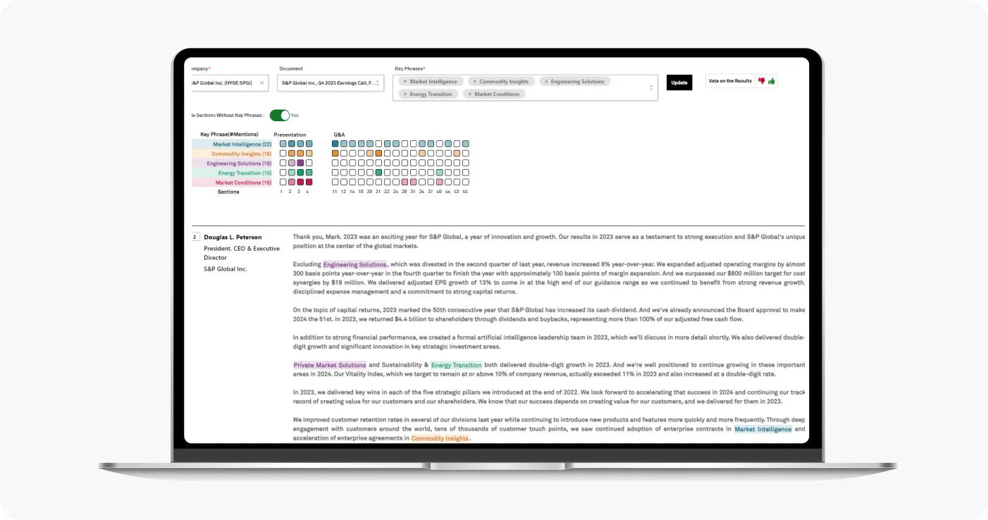
Identify the most significant topics in each earnings call transcript based on semantically- and contextually-similar keyphrase occurrences
These examples are technically sophisticated, but the underlying workflow is familiar:
- Identify something important
- Investigate it
- Decide what to do next
The advantage is not simply that the output looks more interactive. The application changed how the analysis was used.
When is a static report the better choice?
Interactive dashboards are better for many recurring decisions, but interactivity is not universally valuable.
A static report is usually the better choice when:
- A board, investor, auditor, or regulator needs a fixed set of figures
- The purpose is to explain a completed analysis
- The information must be archived as an organizational record
- The output needs to be printed, emailed, or presented without access to a live application
- Detailed notes, assumptions, disclosures, or methodological explanations matter more than exploration
- Every recipient must review exactly the same version
- The audience needs a conclusion rather than an analytical tool
Practical examples include quarterly board papers, annual financial statements, regulatory submissions, audit records, investor presentations, completed research reports, post-project reviews, and weekly management summaries circulated as consistent records.
Static reports also give the author control over data storytelling. The author decides what the audience sees first, which evidence appears next, and how the conclusion is framed.
That is particularly useful when the analysis has already been completed, and the principal task is communication. However, the extent of this is limited by the data populated in the static report.
A simple rule covers most situations:
Use a static report when the principal job is to explain or record. Use an interactive dashboard when the principal job is to monitor, investigate, compare, or respond.
In many mature workflows, organizations will use both.
Why interactive dashboards are better for most organizational decision making
When organizations need to make critical, data‑backed decisions, the comparison between interactive dashboards and static reports yields a clear winner: interactive dashboards.
While static reports are useful, they should not be the primary interface for decisions that recur, evolve, or generate strategic follow‑up questions.
Interactive dashboards are better suited for these decisions for several reasons:
They let users answer the next question
A static report is constructed around questions known in advance. An interactive dashboard gives users room to investigate a result that the report author may not have anticipated.
A revenue chart might answer whether sales increased. Interactivity can help determine where the change occurred, which products contributed, which customers were affected, and whether the pattern appears across multiple periods.
The dashboard does not guarantee that the user will reach the correct conclusion. It makes relevant investigation possible without requiring a new artifact for every question.
They shorten the distance between a signal and its explanation
When someone notices a change in a static report, the supporting detail may sit in another document, spreadsheet, database, or analyst’s notebook.
An interactive dashboard can connect those layers.
A user can move from a top-level metric to a region, product, time period, customer, asset, or transaction. Linked charts and tables can preserve the relationship between the summary and the evidence underneath it.
This does not mean dashboards automatically produce faster or better decisions. Their more precise advantage is that they can reduce the time and effort required to access and explore the information needed for a decision.
They support multiple users without producing multiple reports
Leaders from different departments and verticals frequently need different perspectives on the same business activity.
Separate reports can create duplicated work, inconsistent definitions, and uncertainty about which version is current. An interactive dashboard can present role-relevant views while keeping the underlying analytical logic connected.
This does not eliminate the need for permissions, governance, or metric definitions. Those requirements become more important when more people can access and explore the data.
They turn analytical models into usable tools
Models that remain inside Python notebooks, scripts, or complex spreadsheets often depend on the person who created them. Colleagues may be unable to use the analysis without editing formulas, running code, or asking the analyst to generate another output.
An application can place inputs, charts, tables, explanations, and model outputs inside an interface designed for the actual user.
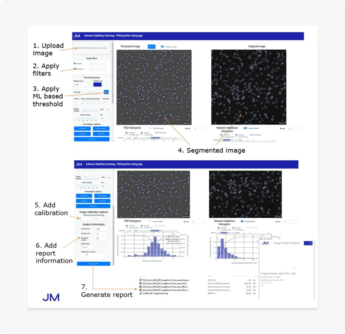
Workflow for a selected app that is used for measuring particle size
Johnson Matthey, for example, has built an internal platform containing more than 30 applications for image analysis and machine learning using Plotly’s Dash Enterprise, reducing some analyses from one day to a few minutes.
The same principle applies to less specialized work. A team could use Dash to wrap a forecasting script, pricing calculation, inventory model, or quality-control process in an interface that colleagues can use without opening a notebook or editing formulas.
They can connect insight to action
An interactive dashboard can move beyond showing what happened.
Depending on the workflow, it can let users:
- Change a forecast
- Run a model
- Compare scenarios
- Edit or approve a record
- Inspect supporting evidence
- Review an alert
- Export a selected view
- Begin another operational process
This introduces an important progression:
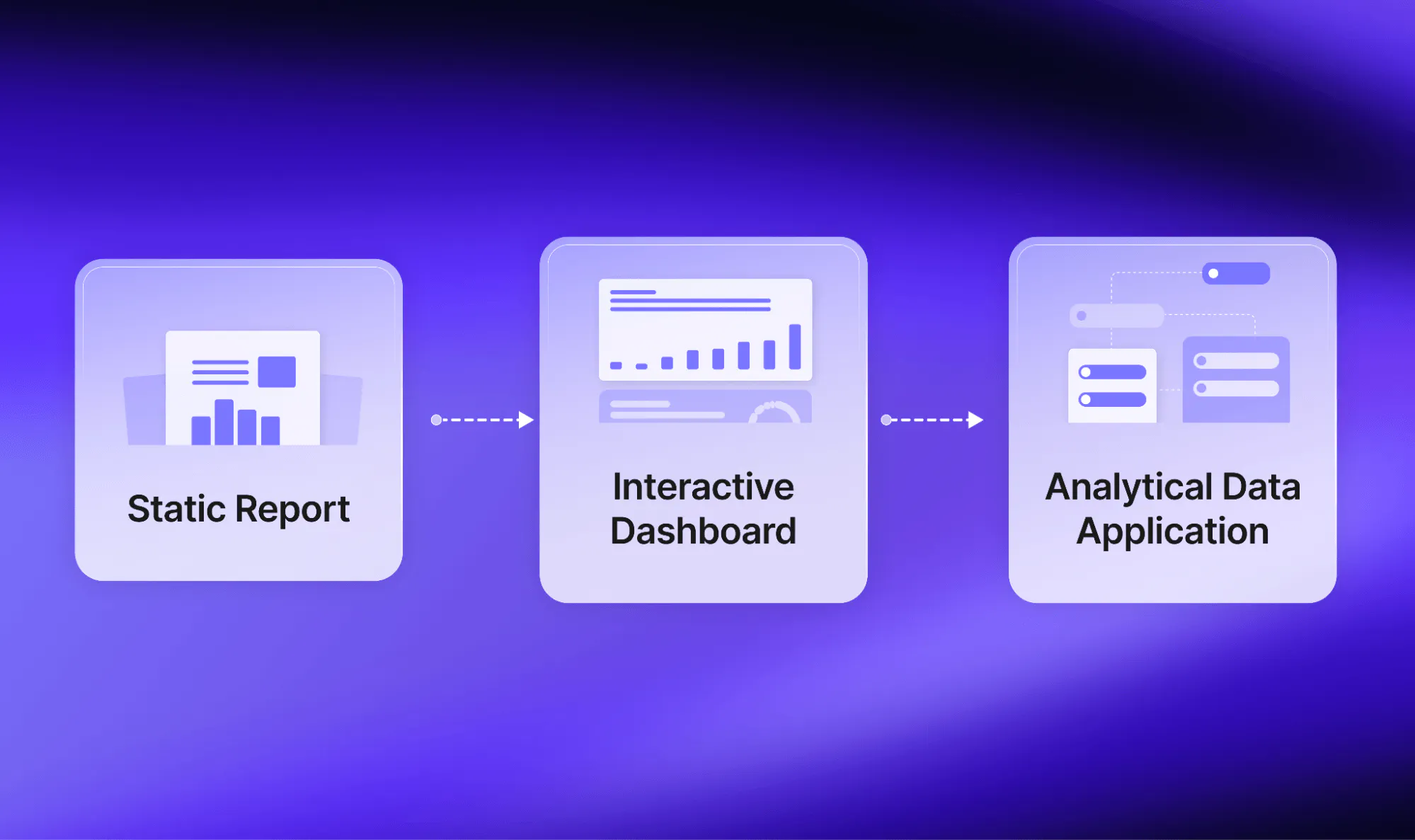
A static report communicates the result. An interactive dashboard allows exploration. An analytical data application can combine exploration with computation and action.
Data storytelling techniques for interactive dashboards
Interactivity gives users greater freedom. That freedom can also create confusion.
Without a clear hierarchy or narrative, users may not know where to begin, which metric matters, what an interaction changed, or when they have found enough information to act.
This is why data storytelling matters just as much in an interactive dashboard as it does in a presentation or report.
Research examining text in interactive dashboards found that text can provide context, establish reading order, explain insights, and give users navigational cues. A dashboard should not force users to infer its meaning from charts alone.
The following data storytelling techniques can make an interactive dashboard more useful.
Start with the decision
Before selecting charts or adding controls, define the question the dashboard should help its audience answer.
- Is the user deciding where to allocate inventory?
- Does staffing need to change?
- Which sales territory requires attention?
- Is the forecast assumption reasonable?
A dashboard designed around showing all available data will usually be less useful than one designed around a specific decision. Begin with a clear purpose and the decision the story is intended to inform.
Make the default view meaningful
The initial view should communicate the most important overall condition before asking the user to interact.
A sales dashboard might begin with revenue against target, the change from the previous period, and the segments contributing most to that change.
A manufacturing dashboard might begin with active quality alerts and the production lines affected.
The user should not need to configure five filters before the dashboard says anything useful.
Create a clear visual hierarchy
Not all metrics are created equal.
The primary signal should be visually dominant. Supporting context should help explain it. Filters and navigation should be easy to find without competing with the analysis.
Visual hierarchy gives the dashboard an intended reading order while preserving the ability to explore.
Combine text and visualization
Titles, annotations, definitions, benchmarks, tooltips, and brief explanations can clarify what a chart shows and why it matters.
Revenue by region describes a visual. West region revenue fell 12% after two months of slowing demand gives the user a reason to investigate.
The goal is not to fill the dashboard with paragraphs. It is to provide enough context that users understand the significance and limitations of what they see.
Design a logical investigation path
Interactions should help users move through a coherent sequence:
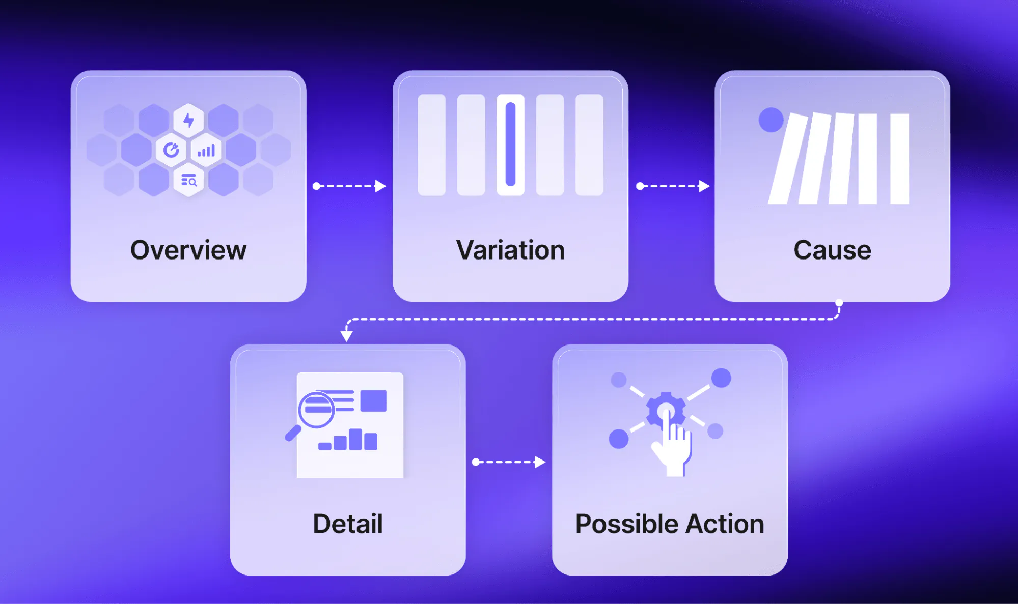
A user might move from total orders to a region, then to a product category, and finally to the individual transactions contributing to the result.
In a scientific application, the same structure might move from an overall result to a sample, image, model output, or experimental condition.
The exact content changes, but the storytelling technique remains consistent: each interaction should take the user somewhere analytically meaningful.
Reveal complexity progressively
Do not show every metric, filter, dataset, model, and control at once.
Start with what most users need. Reveal additional detail as the investigation becomes more specific. Tabs, expandable sections, linked selections, and drill-downs can help manage complexity without withholding necessary information.
Preserve context when the view changes
Once a user begins filtering, the dashboard should make the active state clear.
Users should be able to tell:
- Which filters are active
- Which period they are viewing
- Whether a chart shows totals, percentages, or rates
- How the selected segment differs from the default view
- Whether the data has refreshed
- How to return to the starting point
Without that context, interactivity can make the story harder rather than easier to follow.
End with a decision or next step
Where appropriate, the dashboard should show what the user can do with the insight.
That may mean reviewing the underlying records, changing an assumption, approving an action, contacting an owner, exporting a selected view, or recording a decision.
Plotly’s guidance on designing effective interactive graphics similarly emphasizes combining graphics, text, tables, navigation, and interactive tools into one coherent experience.
Data storytelling examples: Reports and dashboards in practice
The following data storytelling examples show how the same principles apply to familiar business reporting and more specialized analytical workflows.
The technical complexity varies. The underlying pattern does not.
Example 1: Monthly sales and inventory performance
A retailer wants to understand whether a change in revenue is connected to demand, stock availability, pricing, returns, or regional performance.
Static report
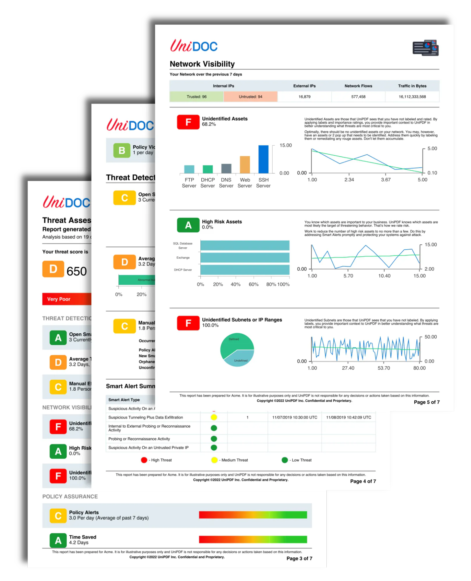
A monthly report presents the final result, identifies the main drivers, and communicates management’s conclusions. It creates a stable record of performance for the period.
Interactive dashboard
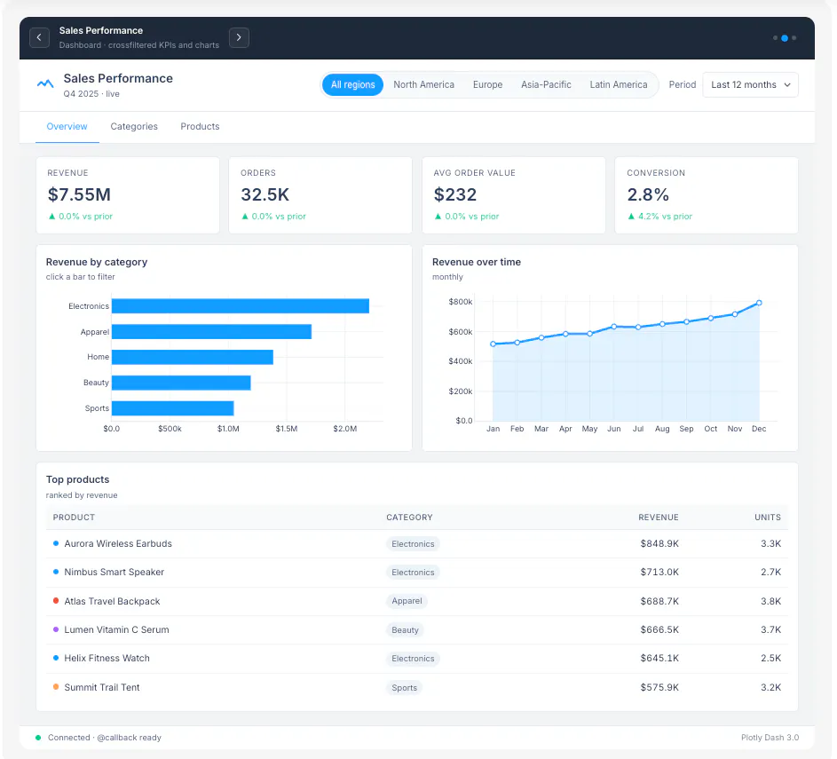
An interactive dashboard lets sales and operations teams compare stores, products, regions, sales channels, stock levels, returns, and time periods.
A user can begin with total revenue, select an underperforming region, identify the affected products, and investigate whether stockouts or lower conversion rates contributed to the result.
How Plotly can help
Plotly charts, Dash controls and callbacks, and Dash AG Grid can connect the high-level KPI view to detailed records. A team could also add a forecast or reorder calculation so users can test what might happen if demand or inventory assumptions change.
Best workflow
Use the dashboard throughout the month to monitor and investigate performance. Use a static report to summarize the period and document the conclusions.
Example 2: Customer support and service operations
A service team needs to understand ticket volumes, response times, backlog, and recurring issues.
Static report
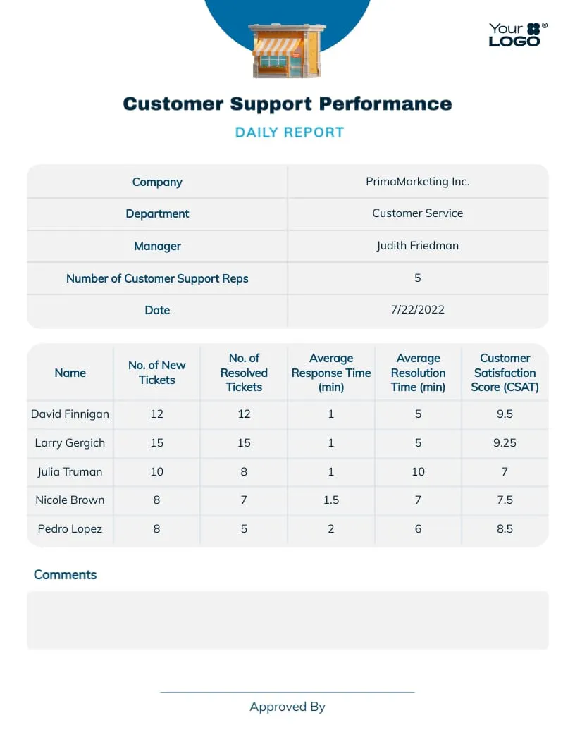
A weekly or monthly report summarizes average response time, resolution rate, open tickets, and performance against service targets.
Interactive dashboard
Managers can filter the data by team, product, priority, customer type, issue category, or time period. They can determine whether a backlog is concentrated in one queue, compare performance across teams, and inspect the tickets contributing to a spike.
How Plotly can help
A Dash application can combine KPI cards, trend charts, category breakdowns, and an interactive table of tickets. It could also include text search or a classification model to help users identify recurring themes.
Storytelling lesson
Begin with the service-level signal, guide the user toward the source of the problem, and provide enough detail to support an operational response.
Example 3: Hospital capacity planning
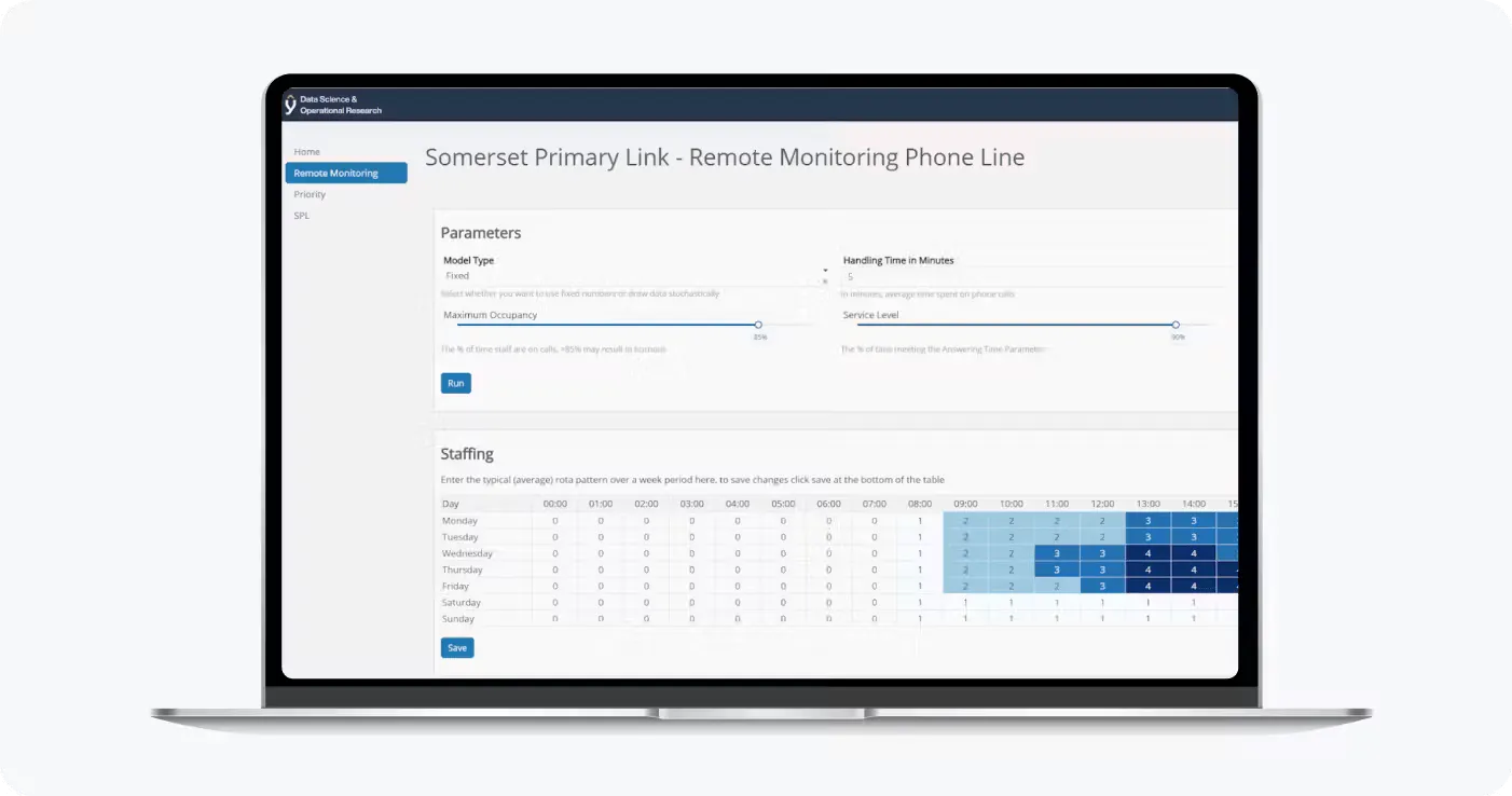
Somerset NHS Foundation Trust uses interactive applications for inpatient anomaly detection and occupancy forecasting. Its Plotly customer story explains how staff can access updated forecasts and use predictive and prescriptive methods across departments and sites.
How Plotly can help
A Dash application can bring together occupancy trends, forecasts, anomaly indicators, ward-level filters, and scenario inputs. Users can move from an organization-wide view to a particular ward or date range, then compare expected and actual occupancy.
Storytelling lesson
The narrative begins with the operational signal, provides the forecast and relevant context, and lets the user investigate the department or period requiring attention.
The environment is specialized, but the interaction pattern is familiar: monitor a changing metric, identify an exception, investigate its cause, and adjust a plan.
Example 4: A straightforward forecasting tool
A small operations team wants to estimate staffing needs for the next few weeks using historical demand.
Static report
A report provides one forecast and explains the assumptions used to produce it.
Interactive dashboard
The team can change the forecast period, adjust expected demand, compare locations, and see how staffing requirements change.
How Plotly can help
A relatively simple Dash application can connect user controls to a Python forecasting function and update charts and tables through callbacks. It does not need to become a complex enterprise platform to be useful.
Storytelling lesson
The dashboard makes assumptions visible and helps users understand how a recommendation changes.
Example 5: Investment scenario testing
RA Capital Management provides a clear example of how data storytelling changes when the user can alter an assumption.
Instead of presenting one final model output, an interactive application can let analysts and portfolio managers examine how different assumptions affect the investment case. Plotly’s summary of the RA Capital workflow describes how interactive scenario testing replaced a slower cycle of changing models and circulating revised reports.
How Plotly can help
Dash can expose model inputs, scenario controls, charts, tables, and supporting information in one application. Users can compare scenarios without repeatedly asking an analyst to regenerate the report.
Storytelling lesson
The narrative is no longer completely linear. The user participates in determining which scenario matters, while the application preserves the logic and context needed to interpret the result.
Example 6: Manufacturing quality and image analysis
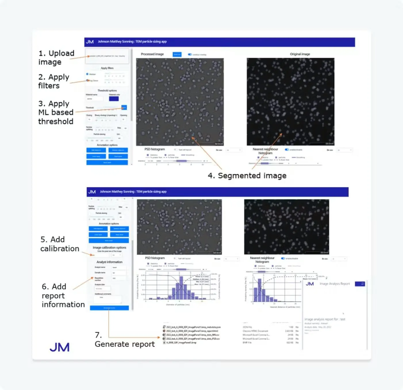
Johnson Matthey uses Dash applications to make image analysis and machine-learning workflows accessible to researchers who do not need to write code. According to its Plotly customer story, the company operates an internal platform containing more than 30 applications and has reduced some analyses from one day to a few minutes.
Static report
A completed report could present selected images, summary statistics, methodology, and conclusions.
Interactive data application
An application can allow users to select images, adjust parameters, compare results, inspect classifications, and review the underlying evidence.
How Plotly can help
Dash can connect image displays, model outputs, filters, annotations, and tables in one workflow. The result is not merely a collection of KPIs. It is an analytical application designed around a specialized task.
Storytelling lesson
The story develops through guided investigation. Users move from a summary result to the specific image, sample, or model output that explains it.
What these data storytelling examples have in common
The examples provided above range from sales reporting and customer support to hospital forecasting, investment modeling, and text analytics. Their technical complexity may differ, but the core pattern remains consistent:
- Present the important signal
- Let the user investigate relevant variation
- Connect the result to supporting detail
- Allow assumptions, scenarios, or evidence to be examined
- Support a decision or next action
That is the practical value of interactive data storytelling. The dashboard does not abandon narrative. It allows the narrative to respond to the user’s question.
Should organizations replace static reports with interactive dashboards?
Simply put…No.
Organizations should reduce their dependence on static reports as the primary interface for recurring analytical decisions. They should not eliminate static reporting altogether.
The formats support different stages of the decision process.
A connected workflow might look like this:
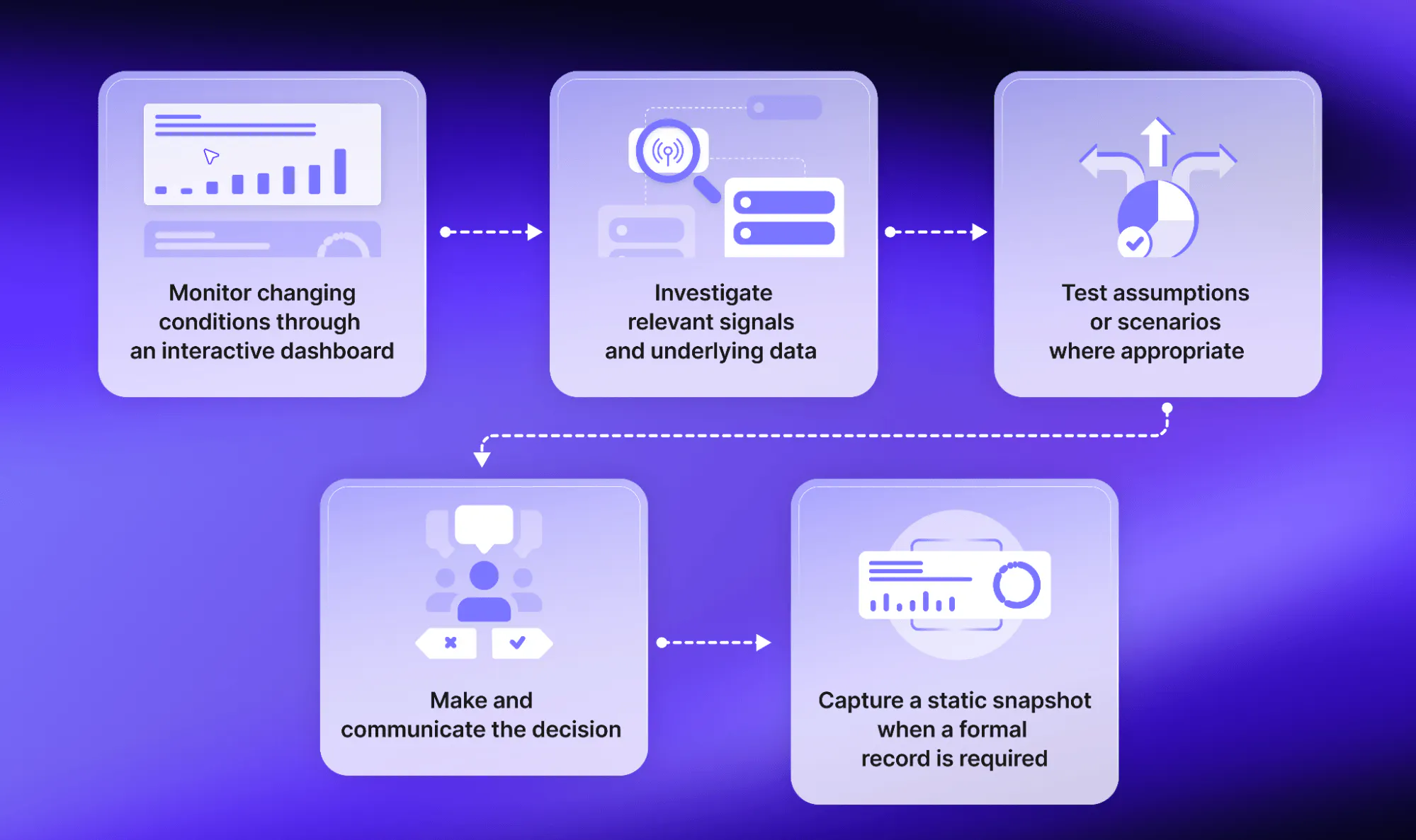
The interactive dashboard becomes the working layer. The static report becomes the record.
This approach preserves the strengths of both formats. Teams gain the flexibility to explore live or regularly refreshed information without losing the ability to communicate a controlled narrative, circulate a consistent document, or preserve a point-in-time result.
Make dashboards the working layer and reports the record
Static reports are useful for communicating a defined conclusion. Interactive dashboards are better for recurring organizational decisions that involve changing data, multiple users, follow-up questions, or adjustable assumptions.
But the advantage does not come from interactivity alone.
Effective dashboards combine reliable data, visual hierarchy, contextual explanation, purposeful interaction, and a clear path toward action. Data storytelling provides the narrative structure. Interactivity lets each user investigate the parts of the story relevant to their decision.
The same principles can support a sales dashboard, a service-operations tool, a forecasting application, or a specialized workflow for healthcare, finance, manufacturing, or research.
Dash makes it possible to turn these principles into analytical applications built around real organizational workflows. Teams can begin with a straightforward interactive dashboard and extend it as their questions, models, users, and decisions become more sophisticated.
Explore examples of applications built with Plotly or learn how to build an interactive application with Dash.
Frequently asked questions
What is an interactive dashboard?
An interactive dashboard is an analytical interface that allows users to explore data through filters, selections, drill-downs, linked visualizations, input controls, or other interactions. Unlike a fixed report, it responds to the questions and choices of the user. Plotly is built for exactly this: Plotly charts handle hover, zoom, selection, and click events out of the box, and Dash wires those interactions to Python callbacks so a selection in one chart updates everything else on the page.
What is the difference between interactive dashboards and static reports?
An interactive dashboard is designed for monitoring, exploration, comparison, and recurring decisions. A static report presents a fixed view of data and is better suited to explanation, distribution, documentation, and point-in-time reporting. Plotly charts can support interactive exploration, while Dash can connect multiple charts and controls into a responsive analytical interface. However, a static output may still be more appropriate when the audience needs a consistent record rather than an exploratory experience.
What are the benefits of an interactive dashboard?
Interactive dashboards can help users investigate follow-up questions, compare different views of the same data, access supporting details, change model assumptions, and connect insights to operational decisions. The benefits depend on whether the interactions correspond to real user needs. With Plotly and Dash, interactions can trigger Python calculations and update charts, tables, and other interface elements. The value still depends on whether those interactions address genuine user needs rather than adding complexity for its own sake.
When should you use a static report instead of a dashboard?
Use a static report when the audience needs a fixed narrative, print-ready document, formal record, detailed methodology, or consistent set of figures. Board papers, financial statements, audit records, regulatory submissions, and completed research reports are common examples. An interactive Plotly or Dash experience is more useful when users need to explore or recalculate the information; it should not replace a static document when consistency and permanence are the primary requirements.
How does data storytelling improve an interactive dashboard?
Data storytelling gives an interactive dashboard structure and context. It helps users understand what matters, where to begin, how to interpret the visualizations, and which interaction or next step is relevant. In a Plotly Dash application, teams can combine interactive charts with explanatory text, annotations, default views, and guided controls so that users are not left to interpret an unstructured collection of visualizations.
What are the most effective data storytelling techniques?
Useful data storytelling techniques include starting with the decision, creating a meaningful default view, establishing a visual hierarchy, combining text with visualization, designing a logical investigation path, revealing complexity progressively, preserving filter context, and connecting the result to a next action. Plotly and Dash can support these techniques through annotations, hover details, linked visualizations, input controls, and callbacks that reveal additional information as users explore.
What are some real-world data storytelling examples?
Examples include a sales dashboard that moves from revenue to region and product performance, a hospital-capacity application that connects occupancy forecasts to ward-level planning, an investment tool that recalculates scenarios, and a document-analysis application that links aggregate themes to original source material. With Plotly and Dash, these experiences can combine interactive visualizations with Python-based models, controls, and supporting detail in one analytical interface.
Can an interactive dashboard replace regular business reports?
It can replace some recurring reports, particularly when users repeatedly request new breakdowns or need regularly refreshed information. Static reports remain useful when the organization needs a formal, fixed, or distributable record. A Dash application, for example, can let users filter Plotly charts, inspect supporting data, and run calculations without requesting a new version of the report. Static reports remain useful when the organization needs a formal, fixed, or easily distributable record.
How do you build an interactive dashboard in Python?
Dash is Plotly’s open-source Python framework for building interactive dashboards and data applications. Developers and analysts can use coding agents, by starting the prompt with ‘Build a Dash app to’ and provide a detailed prompt of what they want the interactive dashboard or data application to be. Dash will define the layout using components such as Plotly charts, tables, dropdowns, and sliders, then connect inputs to outputs through callbacks. When a user changes a control or interacts with a chart, Dash runs the associated Python function and updates the relevant parts of the interface.
What is the difference between a dashboard and a data application?
A dashboard primarily helps users monitor and explore data. A data application can go further by incorporating models, calculations, data editing, workflow steps, approvals, or operational actions. Plotly charts provide the interactive visual layer, while Dash can connect visualizations and interface controls to Python logic. This makes it possible to move beyond displaying information and build an application that supports a broader decision or workflow.