
Plotly
October 16, 2026
Dashboard Design Mistakes That Mislead Decision Makers
TL;DR
- Accurate data can still be misleading when a summary hides an important tail, segment, or change in the underlying population.
- Most decision-oriented KPIs need a clearly named, decision-relevant comparison. A direction arrow without context invites assumptions.
- Axes and mark types should preserve the relationship in the data, while forecasts should look different from observations and show uncertainty where it matters.
- Layout should reflect decision priority, while size and color used as data encodings must represent the data accurately and consistently.
- Filter state, filter scope, reporting period, and data freshness should remain visible, and every intended component should update correctly.
Good dashboard design makes the evidence difficult to misread
Most dashboard projects devote substantial effort to getting the numbers right. Teams validate queries, reconcile totals, test calculations, and check the source system before they publish.
That work is essential, but numerical accuracy does not guarantee an accurate interpretation.
A reader can still leave with the wrong impression when a KPI hides a long tail, an arrow lacks a named comparison, an axis exaggerates a small change, or a filter silently affects only part of the page. Even with the right arithmetic, they fail in context and visual communication.
It is to make the evidence, comparison, scope, and uncertainty clear enough that readers can reach an appropriately qualified conclusion.
The following dashboard design mistakes can survive clean layouts and correct calculations. Here is how to recognize and fix them.
Choosing a summary that hides decision-critical variation
Every summary statistic removes detail. The question is whether it removes information that someone needs to make a decision.
Consider a hypothetical delivery operation with 100 orders:
- 85 orders arrive in 1 day
- 15 orders arrive in 13 days
The average delivery time is 2.8 days. That figure is mathematically correct, but it does not reveal that 15% of customers waited almost two weeks. If the service-level agreement is seven days, the dashboard has hidden the failure rate that operations need to address.
The mean may still matter for capacity planning or total fulfillment cost. The mistake is treating one statistic as a complete account of the data.
A more decision-ready view could show:
- Median delivery time: 1 day
- 95th percentile delivery time: 13 days
- Orders delivered outside the seven-day SLA: 15%
Aggregation can also hide opposing segment trends. Consider this illustrative churn example:
Period
Enterprise accounts at start of period
Enterprise churn
SMB accounts at start of period
SMB churn
Overall churn
Period 1
1,000
4.0%
1,000
6.2%
5.1%
Period 2
1,550
2.0%
700
11.0%
4.8%
Overall churn fell from 5.1% to 4.8%, but SMB churn rose sharply. The aggregate is not wrong: it answers a portfolio-level question. It simply conceals a segment-level problem, partly because the customer mix shifted toward enterprise accounts.
What to do instead
Inspect the distribution while designing the metric, and continue monitoring it if the distribution can change over time. Choose summaries based on the decision:
- Use a mean when the total or expected value matters
- Use a median when a typical observation matters and the distribution is skewed
- Use percentiles or threshold-breach rates when tail performance matters
- Add a compact distribution view when the audience and available space support it. A histogram can reveal the shape of a distribution, while a box plot summarizes quartiles and potential outliers. A box plot is compact, but it can conceal features such as multiple peaks, so it is not automatically the better choice.
Choose breakdowns because they are relevant to the decision, a plausible business mechanism, an accountable owner, or a material risk, not simply because one dimension happens to show the most variance.
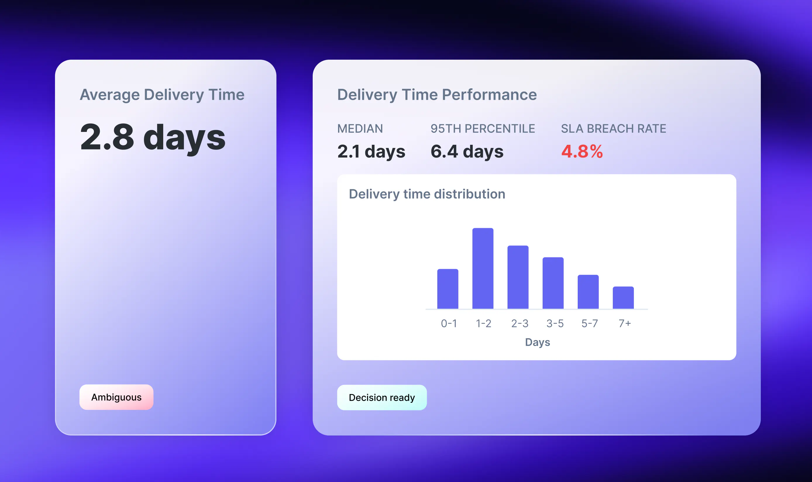
The principle: Every summary discards information. Make sure it does not discard the part that changes the decision.
Showing a metric without a meaningful comparison
Consider a KPI card that reads:
Revenue: $4.2M ▲ 12%
Twelve percent compared with what: the prior month, the same period last year, or the plan? The arrow implies a judgment, but the reader has to supply the basis for that judgment.
If revenue grew 12% while the plan required 25% growth, the same result is both an improvement over the prior period and a miss against target. Neither interpretation is complete without the comparator.
Choose the reference that matches the decision being made:
Comparator
Question it helps answer
Useful when
Prior period
How has this changed since the previous period?
Monitoring short-cycle operational changes
Same period last year
How does this compare with the equivalent seasonal period?
Annual cycles may affect the metric
Target or plan
Are we on track against the agreed goal?
Executive, financial, and commercial reporting
Relevant benchmark
How do we compare with a genuinely comparable baseline?
Evaluating quality, efficiency, or rate metrics
A single year-over-year comparison does not establish seasonality. That requires observations across multiple cycles. The comparison can still be useful because it holds the calendar position roughly constant.
What to do instead
Name the comparator in the label: for example, +12% vs. prior quarter or 8% below plan. Where practical, place the benchmark in the same visual through an annotated reference line or target band. This reduces the work required to reconcile separate cards.
Also show the reporting period and the last refresh time when latency could change the interpretation. Revenue through August 31; refreshed September 1 at 08:00 UTC is more useful than a confident arrow attached to an unknown data window.
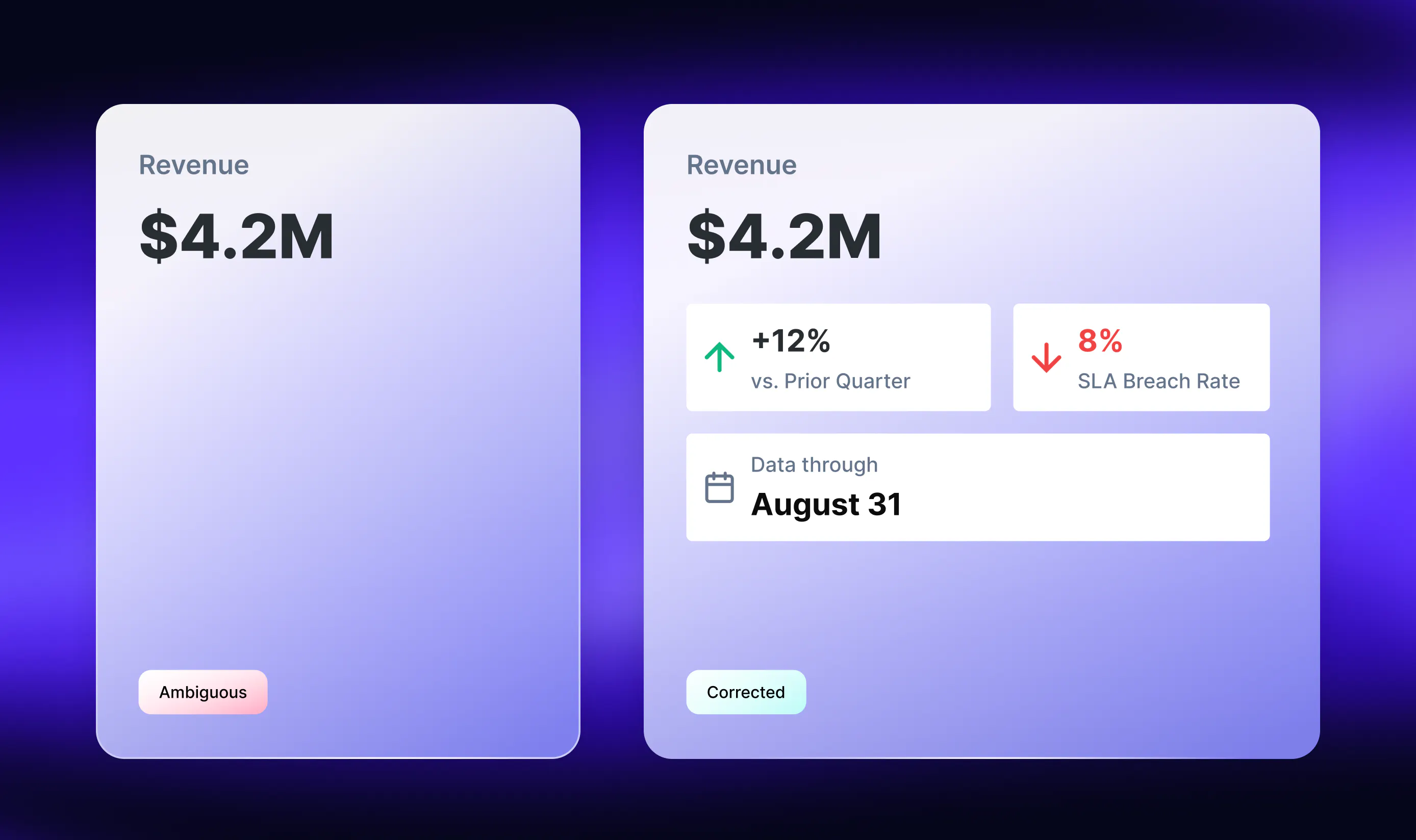
The principle: If two reasonable readers could assume different reference points, the comparison is underspecified.
Using a visual encoding that distorts magnitude or uncertainty
A chart can contain the right numbers and still create the wrong visual impression. Two common causes are inappropriate axis treatment and forecasts that look like observed data.
The axis changes the apparent story
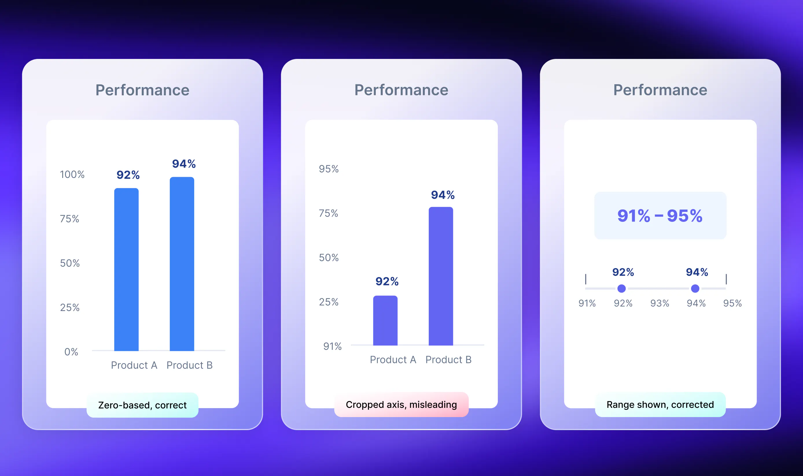
Suppose customer satisfaction increases from 92% to 94%.
In a bar chart with a zero baseline, the increase appears modest. If the axis begins at 91%, the bars are one and three percentage points above the baseline. The second bar therefore appears three times as tall, even though the reported values differ by only two percentage points.
Because bar length represents magnitude, bar and column charts should generally use a zero baseline when readers are comparing absolute levels. If the analytical goal is to make a small change visible, a line chart or dot plot with a clearly labeled nonzero range is usually more appropriate.
That does not mean every quantitative axis must begin at zero. A reactor temperature varying from 68°C to 74°C may require a narrower scale to reveal operationally important movement. The right range depends on the mark type, the comparison, and the decision.
Interactive views add another risk. A chart may automatically rescale when a user moves from a facility ranging from 2% to 8% to one ranging from 2% to 2.5%. Both series can fill the plotting area and appear equally volatile.
Use consistent scales when users need to compare absolute magnitudes across selections. When a changing scale is necessary to reveal within-view variation, make the new range conspicuous through the axis, subtitle, annotation, or an overview chart. Plotly's guidance on designing effective interactive graphics similarly emphasizes matching interactive choices to the audience, data, and purpose rather than applying one universal layout rule.
The forecast looks like a measurement
Now consider a time series in which historical data continues into a forecast with the same color, weight, and stroke. The visual suggests one continuous set of observations even though the future values are estimates.
Uncertainty disappears when the dashboard shows only a point forecast. False precision can make the problem worse: a model output of 0.6231 may not justify displaying 62.31% if the underlying uncertainty is much larger than one-hundredth of a percentage point.
What to do instead
- Mark the boundary between observed and forecast periods
- Style forecast values differently with a dashed line, lighter stroke, or another redundant cue
- Show and label an appropriate uncertainty interval when the model supports one and the interval matters to the decision
- Round values to a precision justified by the data and model
A forecast of 14,200 units with an 80% prediction interval of 9,800 to 18,600 leads to a different inventory decision from a chart that shows only 14,200. The interval level and meaning should be labeled; a confidence interval and a prediction interval are not interchangeable.
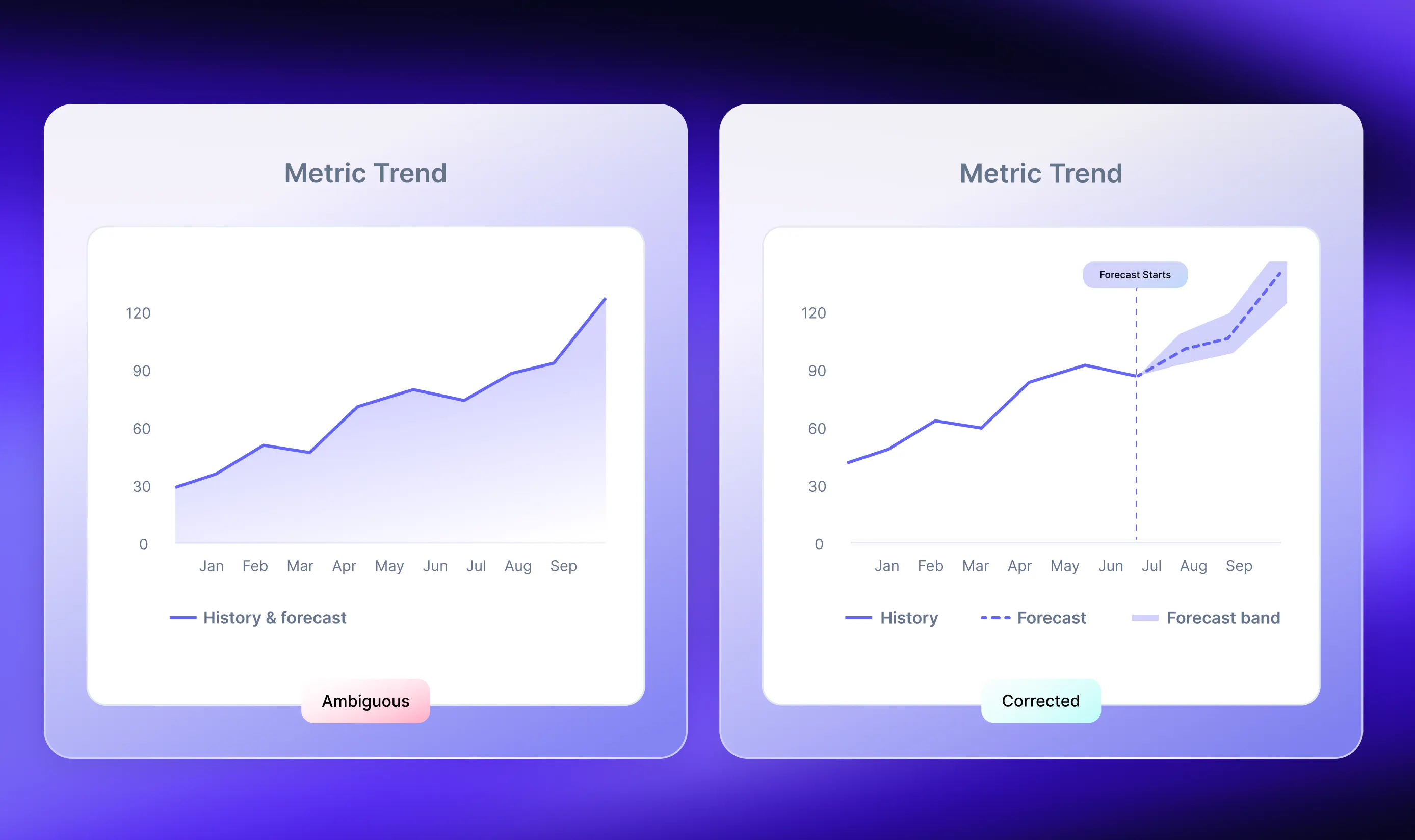
The principle: The graphic should preserve the quantitative relationship and distinguish what was observed from what was estimated.
Letting visual prominence or color imply the wrong priority or meaning
Imagine an acquisition dashboard dominated by this card:
TOTAL USERS: 2.4M
Below it, a small line chart shows 30-day retention declining for six consecutive months. If retention is the problem the team needs to address, the page hierarchy has made the less actionable number more prominent.
Page hierarchy and data encoding are related, but they are not the same job:
- Position, component size, whitespace, and contrast can signal decision priority
- The size, position, length, or color of marks inside a chart represents data and must follow the selected scale accurately
Research by Cleveland and McGill on graphical perception found that people make some quantitative judgments more accurately than others. Position along a common scale generally supports more precise comparison than area or color saturation. That makes a common-axis dot plot or bar chart a stronger default for precise ranking than circles sized by revenue.
What to do instead
Define the main decision before arranging the page. Then create a hierarchy:
- A primary zone for the signal that requires attention or action
- A supporting zone for the evidence that explains it
- A diagnostic zone for deeper investigation
Use page prominence to reflect decision priority. Use an accurate chart encoding for the comparison itself. Do not enlarge a data mark merely because the underlying metric is strategically important unless mark size is explicitly and proportionally encoding that metric.
Give color a consistent job
Color can identify categories, show ordered values, highlight divergence from a midpoint, or communicate status. Problems arise when the same color performs conflicting jobs on one page.
If Product C is red in one chart while red means below target in another, readers may carry the status meaning into the category chart. Avoid reusing the same color for unrelated meanings when that reuse could create ambiguity.
Define categorical, sequential, diverging, and status palettes deliberately, then apply them consistently. Plotly templates can centralize default colors, fonts, annotations, shapes, and other visual elements instead of styling each figure independently.
Accessibility needs a separate check. The US National Eye Institute estimates that about one in 12 men has color vision deficiency. Do not rely on color alone to communicate a category or state. WCAG 2.2 guidance on the use of color recommends adding another cue, such as text or pattern.
For Level AA contrast, WCAG 2.2 specifies at least 4.5:1 for normal text and 3:1 for large text. Meaningful interface states and graphical objects generally require 3:1 contrast against adjacent colors.
A grayscale review is a useful heuristic, but it is not a complete accessibility test. Use a contrast checker and color-vision-deficiency simulation as well, and pair color with labels, shapes, line styles, or patterns.
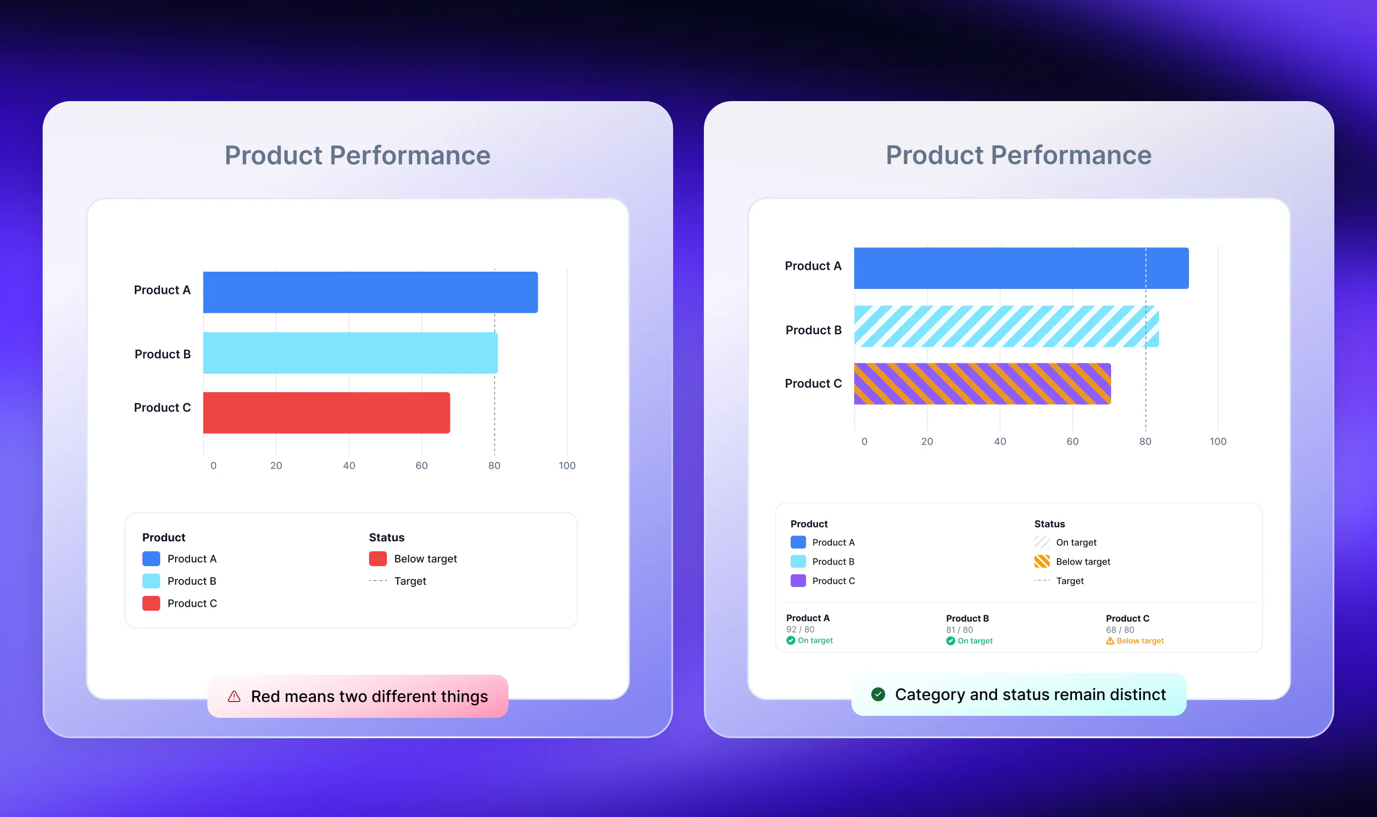
The principle: Use layout to signal importance and visual marks to represent data accurately. Give each color a consistent meaning within the view.
Allowing filter scope, state, or data freshness to become invisible
Suppose a dashboard has five charts and a region filter. A user selects North America. Four charts update, while the fifth remains global.
That can represent either of two very different situations:
- The fifth chart is intentionally global and serves as a benchmark. This is valid if its scope is clearly labeled
- The fifth chart was supposed to update but did not. This is an implementation or QA defect
Both become interpretation risks when every chart looks as though it shares the same state.
Other problems arise when a date range persists after navigation, a default filter silently narrows the data, or one component shows older data than its neighbors. Filter-state visibility is a design responsibility. Components that fail to update and stale pipelines are engineering and QA responsibilities. The dashboard has to account for all three.
What to do instead
A user should be able to determine, without guessing:
- Which data slice is currently visible
- Which filters are active
- Whether each filter is global or scoped to specific components
- Which reporting period the data covers
- When the data was last refreshed
- What the most recent interaction changed
- How to return to the default view
Keep active filters visible, provide an obvious reset, state any narrowing defaults, and label intentionally unfiltered benchmark charts. Use loading, error, and stale-data states that cannot be confused with current results.
Then test the implementation. For each control, verify that every intended component updates, every intentionally unaffected component remains clearly scoped, and failures surface visibly. An error message is safer than a stale value presented as current.
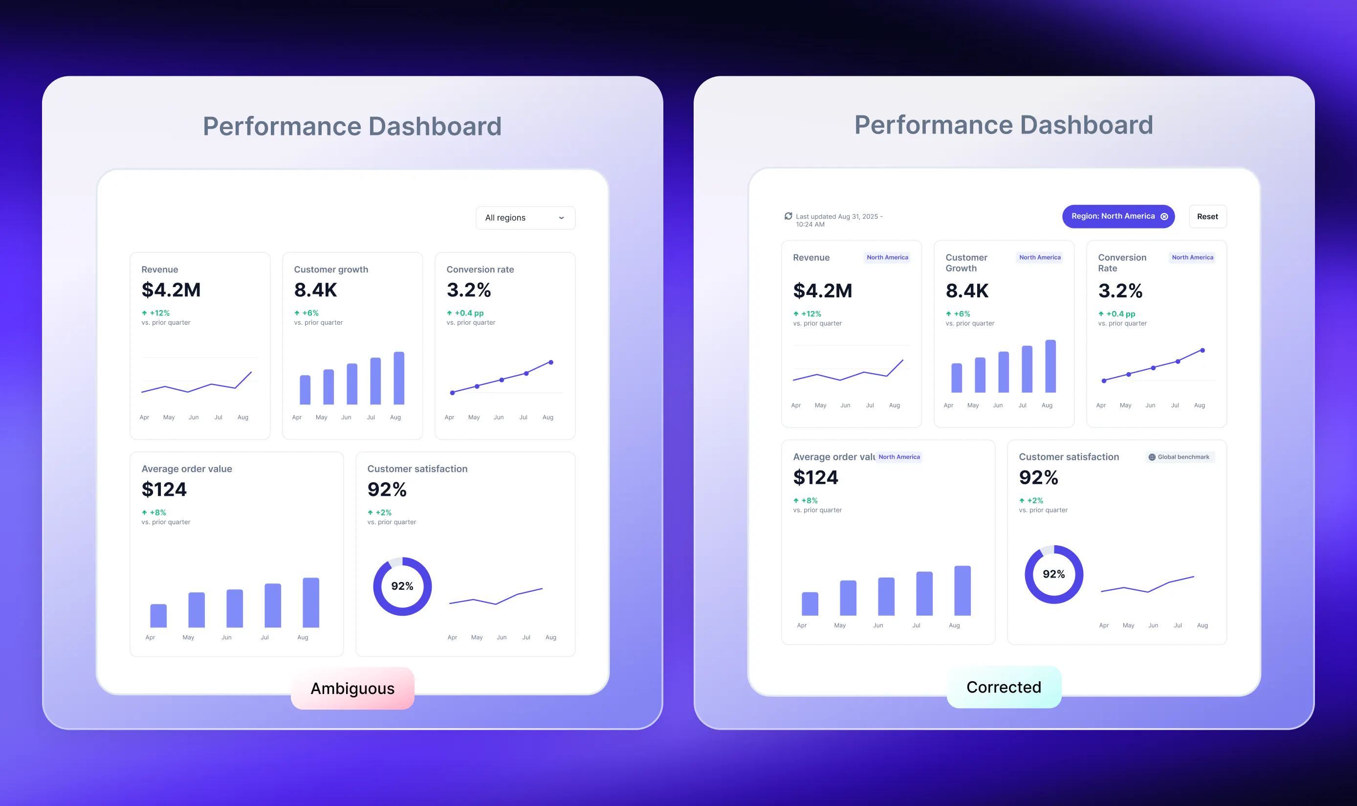
The principle: Every state-changing interaction changes context. Make both the scope and the result of that change visible.
A quick audit: Try to misread your own dashboard
Review the dashboard by asking one question about each design decision:
Decision
Audit question
Which summary to show
What tail, segment, or distribution shape disappears inside this number, and could it change the decision?
What to compare it with
Is the comparator named, relevant, and sufficient for the conclusion being drawn?
How to encode the data
Does the mark type and axis preserve magnitude? Are observations, estimates, and uncertainty distinguishable?
What to make prominent
Does the page emphasize the decision-critical signal? Do size and color represent data accurately and consistently?
What users can change
Is it clear which components each filter affects, and do all intended components update? Are the active state and data freshness visible?
Next, give the dashboard to a colleague who was not involved in building it and ask them to describe what they think is happening. Let them finish before explaining the intended reading. Every material gap between their interpretation and the evidence is a usability finding.
Accurate data is the prerequisite. Good dashboard design makes the metric, comparison, uncertainty, scope, and freshness clear enough that the evidence is difficult to misunderstand.
Clear design is step one of a reliable dashboard
Once the dashboard communicates honestly, the next challenge is keeping it reliable in production. Manual refreshes, broken connections, repetitive styling work, and fragile deployment processes can consume time, even when the visual design is sound.
If you are preparing to move an analytical app from prototype to wider use, the Plotly Publishing Playbook covers publishing options, interactivity, live data, security, access control, and scaling for larger audiences.