Sadaf Najam
November 03, 2025
Chasing Nines on AI Reliability Benchmarks
TL;DR: Plotly Studio just achieved a 100% benchmark success rate across 100+ daily dataset tests, proving that yes, AI can actually handle your messy data without having a meltdown.
We just launched our AI-native data analysis tool, Plotly Studio! It's going to change how knowledge professionals work with data, enabling anyone to build enterprise-grade data applications. It combines intuitive exploration with AI agents that generate stunning visualizations in minutes. But, how reliable is AI-powered visualization generation when faced with real and messy data?
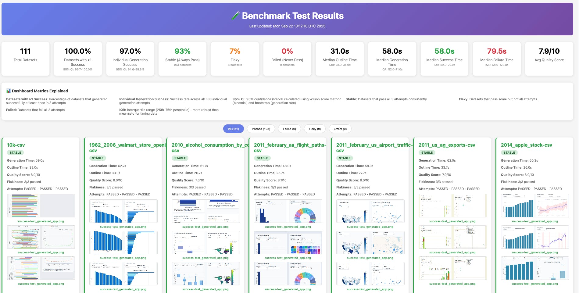
We built a comprehensive benchmark system to start providing us the answer. Testing across more than 100 diverse datasets daily, we generate complete data applications, launch them in browsers, and verify both functionality and visual output.
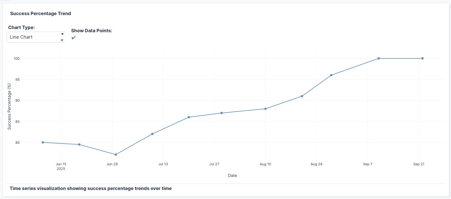
Our early, initial implementation was only scoring around 30% on this benchmark, which quickly showed us the challenge at hand. We then improved Plotly Studio behind the scenes, and, as a result, began to see remarkable consistency: in our latest test, every single app generated successfully within three attempts, maintaining 100% benchmark success rates.
Building on this success, we are now expanding our benchmark with user-donated datasets to make it even more challenging and representative.
Why we built our own Plotly Studio benchmarking and testing framework
The level of reliability we achieved didn't happen by accident. As Plotly Studio's capabilities expanded, we recognized that manual spot-checking couldn't validate performance across the endless variety of data scenarios our users encounter. We needed systematic validation at scale.
Most AI evaluation frameworks focus on language model outputs: evaluating response quality, measuring hallucination rates, or comparing model performance across standard benchmarks. Those frameworks are designed for API-based systems where you can directly inspect model responses. That approach doesn't directly apply to desktop applications like Plotly Studio, where the AI generates actual running code that launches in a browser with full UI interactions.
We're not doing AI evals in the traditional sense, yet (more to come on this, stay tuned). We're not scoring prompt responses or measuring semantic similarity. Instead, we're validating that the code our AI generates actually works when a real user opens it on their machine. That requires browser automation, screenshot verification, and testing actual user workflows at scale.
Our solution is a three-part benchmark system that runs comprehensive tests daily, from parallel dataset processing and automated browser validation to visual verification and continuous integration monitoring. Read on for the details.
How we built a benchmark system from scale: architecture overview
Testing AI-generated data apps requires a different approach than traditional software testing. Standard unit tests focus on function outputs, but validating user experience demands more sophisticated methods.
Each component in our architecture serves a specific purpose in achieving comprehensive validation at the scale we need. The benchmark system consists of three key components working together: dataset processing & app generation, automated UI testing, and test result aggregation.
Dataset processing and app generation
The benchmark script orchestrates parallel testing while triggering app generation for each dataset:
This orchestration script divides our dataset collection into smaller chunks and runs multiple test attempts on each one to ensure consistent results.
```bash# Calculate dynamic chunk size based on total chunks passed from workflow# Default to 1 chunk if not specified (useful for local testing)TOTAL_CHUNKS=${TOTAL_CHUNKS:-1}CHUNK_SIZE=$(( (FILE_COUNT + TOTAL_CHUNKS - 1) / TOTAL_CHUNKS ))```# Test each dataset multiple timesFLAKINESS_TEST=true RETRY_COUNT=3 ./run_benchmark_datasets.sh --chunk 1
App generation
Plotly Studio can generate visualizations and data apps in under two minutes for any dataset. The benchmark system splits over 100 datasets across parallel chunks to speed up execution. Each dataset gets tested three times to detect any inconsistencies in generation, which helps us identify the datasets that consistently produce working apps and which ones might need additional handling for edge cases. To prevent conflicts, each test runs separately with its own dedicated connection to avoid interference between simultaneous tests.
Automated UI testing
After each app is generated, we use Playwright, a browser testing tool, to launch it in a browser and verify it works properly:
```typescripttest('generated app should not contain error messages', async ({ page }) => {await page.goto(`http://localhost:${process.env.APP_PORT || '8050'}`);await page.waitForLoadState('networkidle');// Verify the app loads without errorsconst pageContent = await page.evaluate(() => document.body.innerText);// Check for various error patterns…// Take screenshot for visual validationawait takeFullPageScreenshot(page, 'success-test_generated_app.png');});```
This testing catches various issues that could break the user experience. We look for runtime problems like Python crashes or JavaScript errors, data processing issues when the app can't handle certain formats, and UI problems where components fail to load properly. The screenshots we capture give us visual proof that everything is rendered correctly, which is especially useful for spotting layout issues or missing charts.
Interactive dashboard generation for test aggregation
The dashboard generator transforms raw test results into an interactive, visual dashboard that enables teams to quickly understand system success rates. It pulls together data from multiple sources, such as test results, timing information, and screenshots, giving us a complete picture of how our system is performing. It calculates success rates and other key metrics in real-time, so we always know our current status. When we need to dig deeper, we can click on screenshots to view them full-size.
Flakiness detection and identifying datasets with inconsistent behavior
Even with a reliable system, some datasets might work perfectly one day and fail the next. This inconsistent behavior, called "flakiness," can hide real issues or create false alarms in testing. Our benchmark system runs multiple attempts on each dataset to identify these patterns and separate truly problematic data from occasional hiccups.
```Flakiness Test Results for stock-data-csv=================================Total attempts: 3Passed: 2Failed: 1Status: FLAKY (2/3 passed)Attempt 1: PASSEDAttempt 2: FAILEDAttempt 3: PASSED```
This approach helps us understand which datasets work reliably every time, which ones have fundamental compatibility issues, and which ones produce inconsistent results that might need special handling or further investigation.
AI observability through automated CI/CD integration
Our benchmark system wouldn't be as helpful if it required manual oversight every day. All of this testing infrastructure runs automatically through GitHub Actions, providing continuous validation without anyone needing to babysit the process. This is how we maintain AI observability across our entire LLM pipeline quality chain.
The system kicks off every weekday morning, distributing work across parallel processes to complete testing efficiently rather than dragging on for hours. It handles the entire infrastructure dance: spinning up environments, starting servers, verifying system health, then capturing results, screenshots, and logs for review. Everything uploads automatically to AWS S3 cloud storage with timestamps, creating a historical record that tracks how our system evolves.
Traditional AI systems struggle with observability because model behavior is opaque. You don't know what's happening inside the neural network. Using a CI/CD approach gives us more visibility. We see exactly how code generation performs across hundreds of scenarios every single day. When success rates dip, we know immediately. When specific dataset types start failing, the patterns emerge in our dashboards.
The impact of benchmarking on our development process
This automated workflow means our team starts each morning with fresh benchmark results waiting in their inbox. No more wondering if overnight changes broke something or manually triggering test runs to check system health. We can focus on what matters: analyzing results and making Plotly Studio even more reliable for our users.
The benchmark system has fundamentally changed how we approach product development. When we add new features or modify existing functionality, we immediately know their impact on real-world performance across diverse datasets. Edge cases that might have slipped through manual testing get caught automatically. Problems that could have frustrated users in production get identified and fixed before release.
Perhaps most importantly, this system gives us confidence to move fast without breaking things. We can iterate on AI models, experiment with new visualization types, and optimize performance knowing that any regressions will surface within 24 hours. The comprehensive historical data helps us understand not just what broke, but when and why, making debugging faster and more targeted.
For our users, this translates to a more stable, reliable platform that handles their messy, real-world data consistently. The 100% success rate we achieve today reflects thousands of automated tests validating that Plotly Studio works as expected, every single day.
Here is a benchmark trend depicting the success rate of Plotly Studio over the early access period. To try it for yourself, download Plotly Studio now and create your first AI-generated data app.