
Chris Parmer
September 18, 2026
Announcing plotly.js 4.0 and plotly.py 7.0
Plotly.js 4.0.0 was released last month! We've been maintaining Plotly.js in the open since 2015 and this was our 275th release. Plotly.py, Plotly's Python graphing library, uses plotly.js as its rendering engine and included the new version in its 7.0 release. Dash uses Plotly.py's version of Plotly.js, so if you upgrade `plotly`, you'll get the latest graphing library in your Dash apps as well.
This release included a new chart type, the removal of a few long-deprecated attributes, chart sharing to Plotly Cloud, and a few changes to the chart defaults.
Plotly.js is an extraordinarily stable library; we take backwards compatibility and browser support very seriously. So the changes to defaults are very minor, and we believe they are strictly better defaults (so much so that they old defaults could almost be considered bugs). In any case, they are changes to the defaults which is the main reason that we bumped the major version number.
This release had many community contributors, huge thanks to everyone involved in making this happen. We've included attribution to all of the authors below.
Without further ado, here are all (and I mean all!) of the changes in this release. If you want to get started, scroll to the very bottom or just ask your favorite coding agent.
Cheers!
New trace type: quiver
Community contribution by @degzhaus, PR 7710. A quiver plot draws a vector field as arrows. Each arrow has a position (x, y) and a direction (u, v). You can color the arrows by any value, with a colorscale, like any other marker.
Plotly.newPlot(gd, [{type: "quiver",x: xs, y: ys, // arrow positionsu: us, v: vs, // arrow directionsmarker: { color: magnitude, colorscale: "Viridis" },}]);
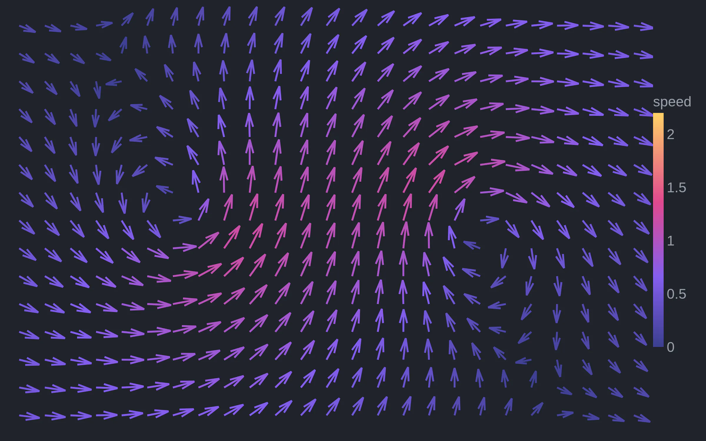
A vortex pair in a slow current. The arrow length and color show the speed.
Quiver plots with real data
The examples below come from A Field Guide to Quiver, a great collection of quiver plots.
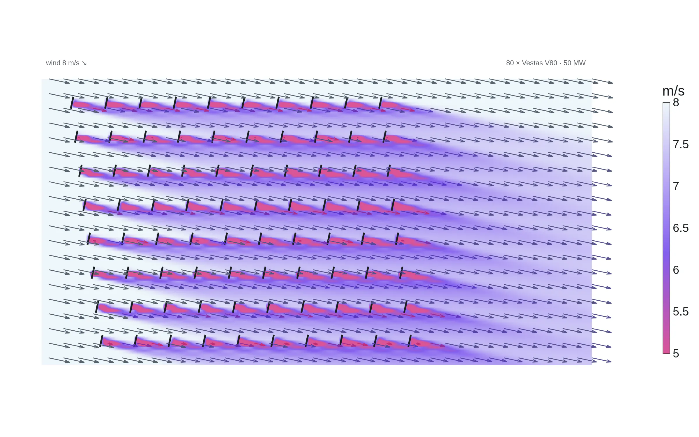
Wakes in a wind farm. Horns Rev 1 has 80 turbines. Each arrow shows the wind speed and direction. The wake behind each rotor slows the wind. Built with the PyWake library using Bastankhah–Porté-Agel wake model.
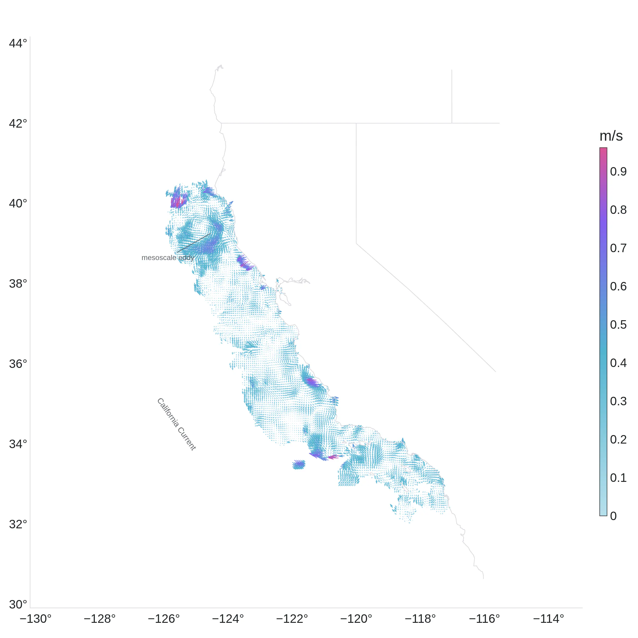
Currents off California. HF radar measures the surface current at each point. The arrows show the California Current and an eddy off Cape Mendocino. Data from NOAA HFRNet with a 6 km mosaic on 2026-08-13.
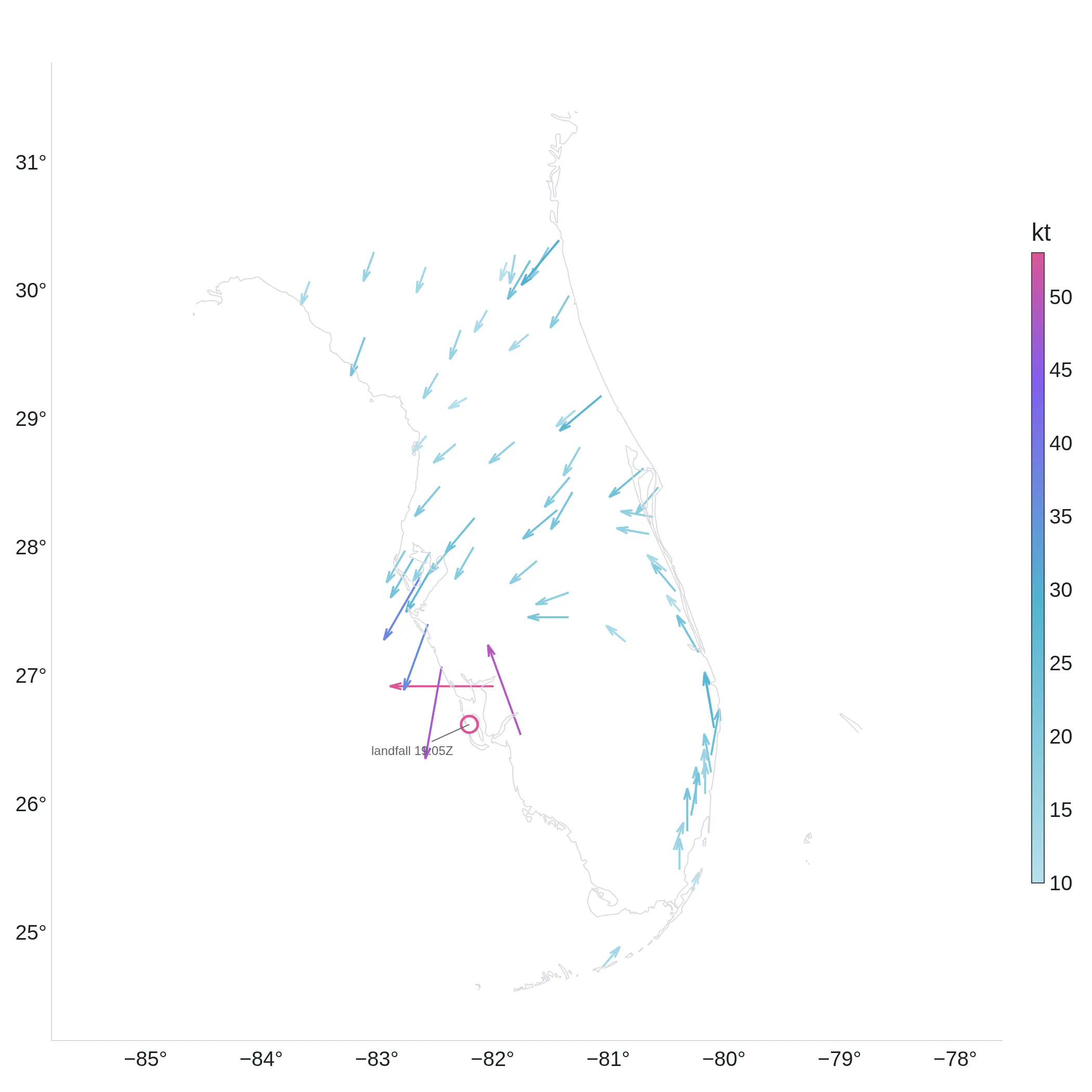
Hurricane Ian at landfall showing 62 weather stations in Florida. The arrows turn counterclockwise around the eye. Data from Iowa Mesonet ASOS on 2022-09-28.
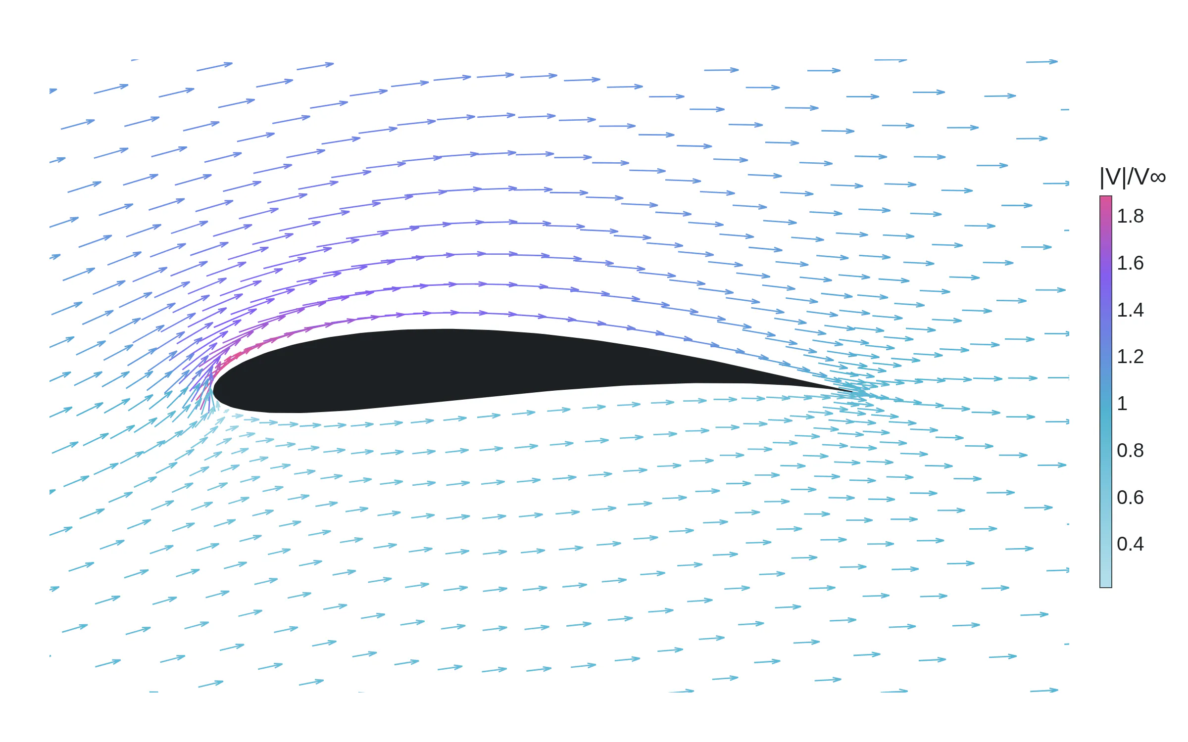
Flow over an airfoil at 8° angle of attack. The air speeds up over the upper surface and slows down below.
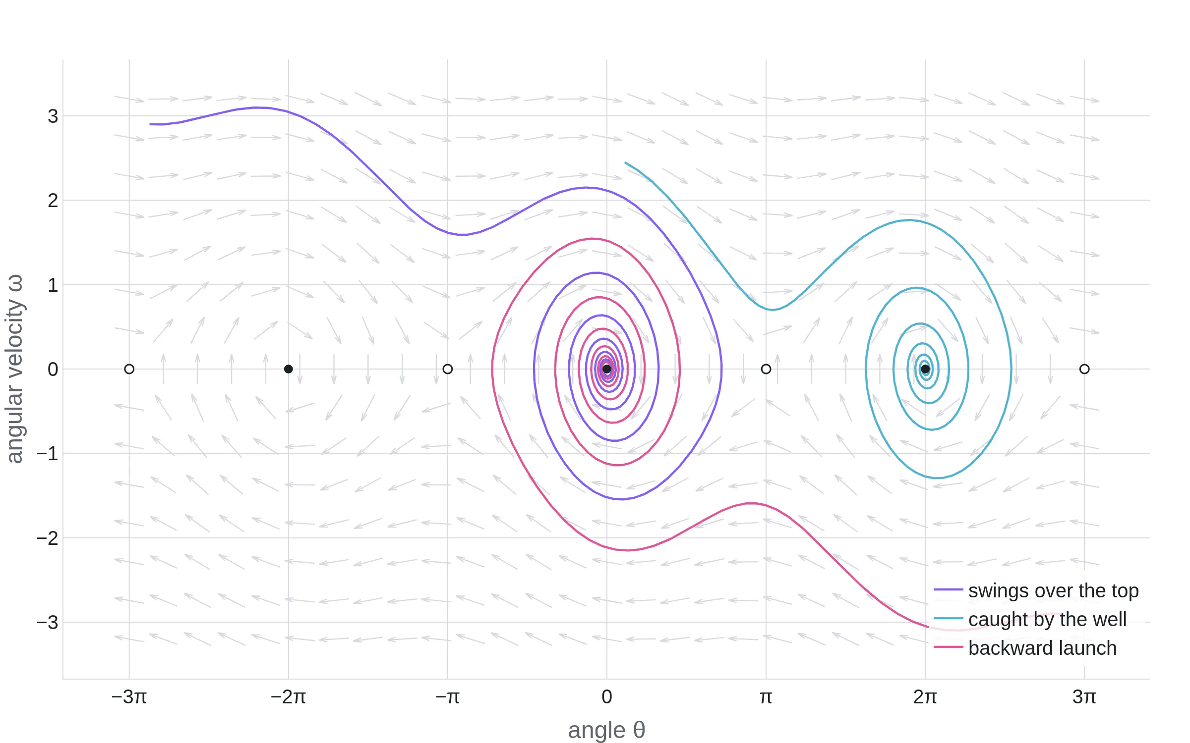
A pendulum phase portrait. The grey arrows show the direction field of a damped pendulum as the three paths spiral into the stable points.
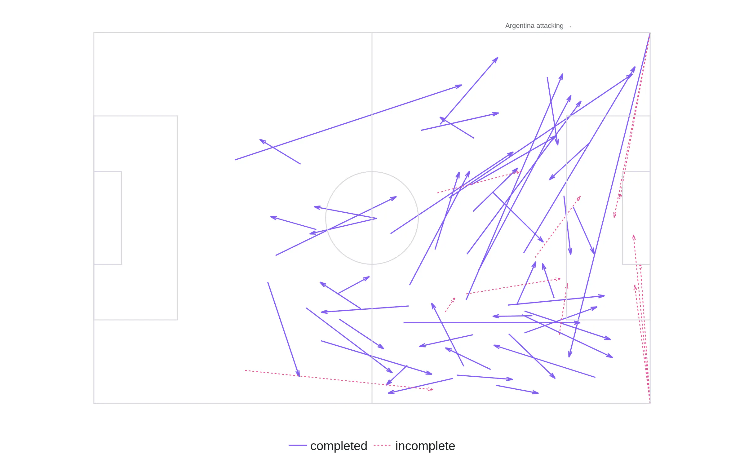
Every Messi pass in the 2022 World Cup final. One arrow per pass, from where the ball left to where it arrived.
{ type: "sankey",direction: "reversed", // "forward" is the defaultnode: { label: ["Solar", "Wind", "Hydro", "Grid", "Homes", "Industry"] },link: { source: [0, 1, 2, 3, 3], target: [3, 3, 3, 4, 5],value: [30, 45, 25, 55, 45] } }
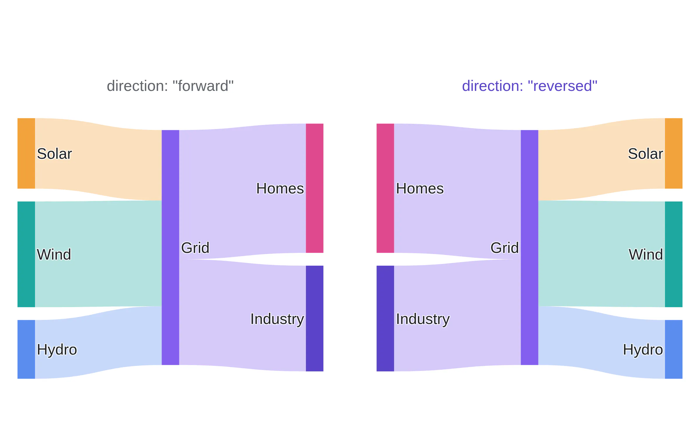
The same trace with direction "forward" on the left and direction "reversed" on the right.
Sankey sort
Community contribution by @adamreeve, PR 7873. @adamreeve also upgraded d3-sankey to 0.12.3 in PR 7830. With sort "auto", the default, the layout sets the vertical order of the nodes and links and moves nodes to reduce crossings. With sort "input", the order you give is the order you get. In the example, the input order is Solar, Wind, Hydro on the left and Homes, Industry on the right. The layout puts Wind first and Industry last. With sort "input", nothing moves.
{ type: "sankey",node: { sort: "input", // "auto" is the defaultlabel: ["Solar", "Wind", "Hydro", "Homes", "Industry"] },link: { sort: "input",source: [0, 1, 2, 0, 2], target: [4, 3, 3, 3, 4],value: [20, 10, 15, 5, 8] } }
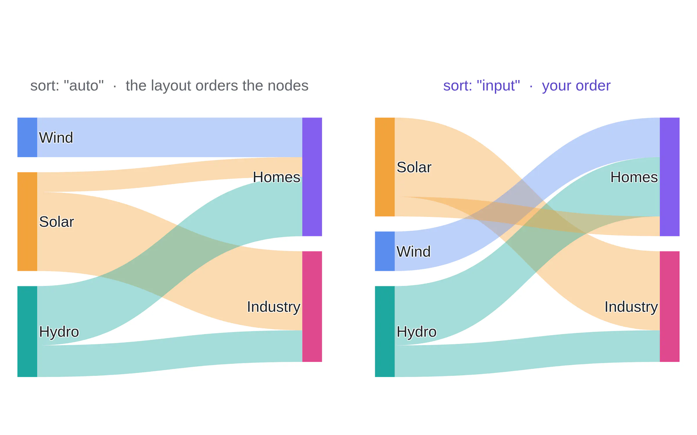
On the left is sort "auto" and the layout puts Wind above Solar and Homes above Industry. On the right is sort "input" where the nodes are in the order that you gave.
All CSS color strings are now supported
plotly.js now parses colors with culori (PRs 7536, 7962) instead of TinyColor. With this change, every CSS Color 4 string now works: oklch(), oklab(), lab(), lch(), color(), hwb(), 8-digit and 4-digit hex, rgb() with a slash alpha, hsl(0.5turn 60% 40%) and hsl(none 60% 40%).
// twelve strings TinyColor could not read, as shape fillsvar strings = ["oklch(70% 0.2 300)", "oklab(65% 0.1 -0.15)", "lab(60% 60 -50)", "lch(65% 70 20)","color(display-p3 0 0.7 0.9)", "hsl(0.5turn 60% 40%)", "hsl(none 60% 40%)", "hwb(200 10% 20%)","#845eeecc", "#f00a", "rgb(255 0 0 / 0.5)", "hsl(0 100% 50% / 0.5)",];layout.shapes = strings.map(function (fill, i) {return { type: "rect", xref: "paper", yref: "paper",x0: (i % 4) * 0.25, x1: (i % 4) * 0.25 + 0.2,y0: 0.7 - Math.floor(i / 4) * 0.3, y1: 0.9 - Math.floor(i / 4) * 0.3,fillcolor: fill, line: { width: 0 } };});
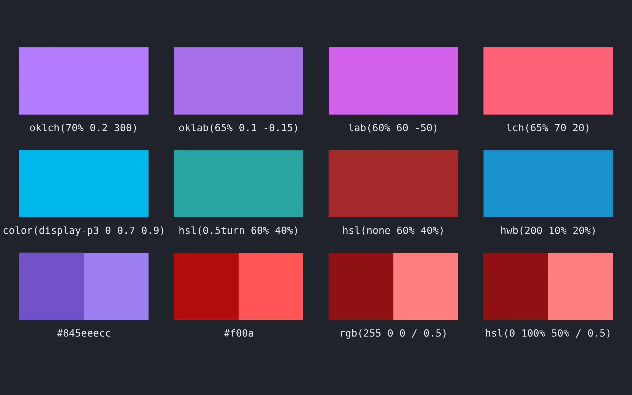
Twelve shapes showing the various CSS color strings.
Breaking changes for color strings
The new parser follows the CSS Color specification. Previously TinyColor parsed some color strings that weren't "to spec" and will behave diffrently now. Here are some examples:
- rgb(0.5, 0, 0). Before: TinyColor read 0.5 as 50% red. Now: 0.5 is out of 255, so the color is almost black. Write rgb(50% 0 0) or rgb(128, 0, 0).
- hsv(0, 100%, 100%). Before: TinyColor parsed this as red. Now: hsv() is not supported as it's not in the CSS color spec. The CSS Color specification defines rgb(), hsl(), hwb(), lab(), lch(), oklab(), oklch() and color(). Instead of hsv, use hsl(0 100% 50%) or #ff0000.
- rgb(255, 0, 0, 0.5). Before: the fourth value was ignored, so the color was opaque red. Now: rgb() accepts an alpha, so the color is 50% transparent (same behavior as CSS).
- hsl(120, 50% 50%) (noticed the inconsistent commas). Before: this was accepted. Now: a string that mixes commas and spaces is not valid CSS, so it does not parse. Instead, fix this to hsl(120, 50%, 50%).
- Contrasting text. Before: label and border colors used a brightness rule and now they use the WCAG contrast ratio. Some labels on saturated mid-tone fills change from dark to white.
// before // aftermarker: { color: "rgb(0.5, 0, 0)" } marker: { color: "rgb(50% 0 0)" }marker: { color: "hsv(0, 100%, 100%)" } marker: { color: "hsl(0 100% 50%)" }marker: { color: "hsl(120, 50% 50%)" } marker: { color: "hsl(120, 50%, 50%)" }// opaque before, 50% transparent now: add or remove the alpha on purposemarker: { color: "rgb(255, 0, 0, 0.5)" } marker: { color: "rgb(255, 0, 0)" }
TypeScript
The package now ships its own TypeScript types, generated from the plot schema (PR 7680). There is one interface for each trace. This is an alternative to @types/plotly.js.
import Plotly from "plotly.js-dist-min";import type { QuiverData, Layout } from "plotly.js";const trace: QuiverData = { type: "quiver", x: [0], y: [0], u: [1], v: [2] };const layout: Partial<Layout> = { title: { text: "Fully typed" } };await Plotly.newPlot("graph", [trace], layout);
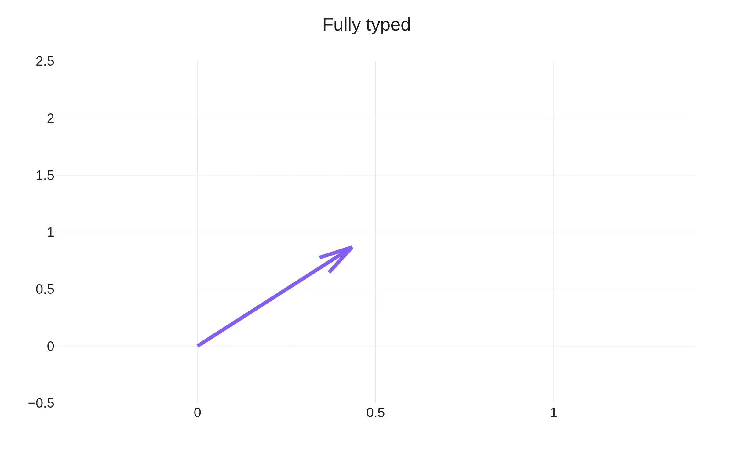
The figure from the code above.
One interface per trace
The types have depth! A bar marker and a scatter marker are different types, in the same way that go.bar.Marker and go.scatter.Marker are different classes in plotly.py. For example BarData["marker"] has pattern and cornerradius. ScatterData["marker"] has symbol, gradient and maxdisplayed.
import type { BarData, ScatterData, Data } from "plotly.js";type BarMarker = NonNullable<BarData["marker"]>; // pattern, cornerradius, … no symboltype ScatterMarker = NonNullable<ScatterData["marker"]>; // symbol, gradient, maxdisplayed, …const bar: BarData = { type: "bar", marker: { symbol: "diamond" } };// error TS2353: Object literal may only specify known properties,// and 'symbol' does not exist in type '{ autocolorscale?: …; pattern?: …; }'const data: Data[] = [{ type: "bar", marker: { pattern: { shape: "/" } } },{ type: "scatter", marker: { symbol: "star", gradient: { type: "radial" } } },];
Nested types, all the way down
The nesting goes as deep as the schema. marker.line, marker.colorbar.title.font and layout.xaxis.title.font are all typed. Typing handles cases multiple levels down, with wrong values or values outside enumerations. The error messages are nice too, they'll show valid values if you specify one that isn't supported.
const bar: BarData = {type: "bar", x: [1, 2], y: [3, 4],marker: {line: { width: 2, color: "#333" },colorbar: { title: { text: "value", font: { size: 14, family: "Inter" } } },pattern: { shape: "/", size: 6 },},}; // OKconst a: ScatterData = { type: "scatter", marker: { line: { widht: 2 } } };// error TS2561: 'widht' does not exist in type 'Line'. Did you mean to write 'width'?const b: Partial<Layout> = { xaxis: { title: { font: { size: "big" } } } };// error TS2322: Type 'string' is not assignable to type 'number'.const c: HeatmapData = { type: "heatmap", colorbar: { title: { side: "diagonal" } } };// error TS2322: Type '"diagonal"' is not assignable to type '"right" | "top" | "bottom" | undefined'.
MathJax v4
plotly.js now supports MathJax v3 and v4 (PR 7898). MathJax is an external dependency in JavaScript projects (this keeps the bundle size small). To get MathJaX v4, change the script tag to the mathjax@4 URL.
The LaTeX strings have no breaking changes. So everything that you've included in $…$ strings in titles, axis labels and annotations stay the same.
MathJax v4 is an opt-in upgrade on the MathJax side: the mathjax@3 URL does not change. Version 4 adds more fonts, line breaking, an updated expression explorer for accessibility, and HTML inside TeX.
<!-- before --><script src="https://cdn.jsdelivr.net/npm/mathjax@3/es5/tex-svg.js"></script><!-- after --><script src="https://cdn.jsdelivr.net/npm/mathjax@4/tex-svg.js"></script>// the plot code does not changelayout: {title: { text: "$f(x) = \\frac{1}{\\sigma\\sqrt{2\\pi}} e^{-(x-\\mu)^2 / 2\\sigma^2}$" },}
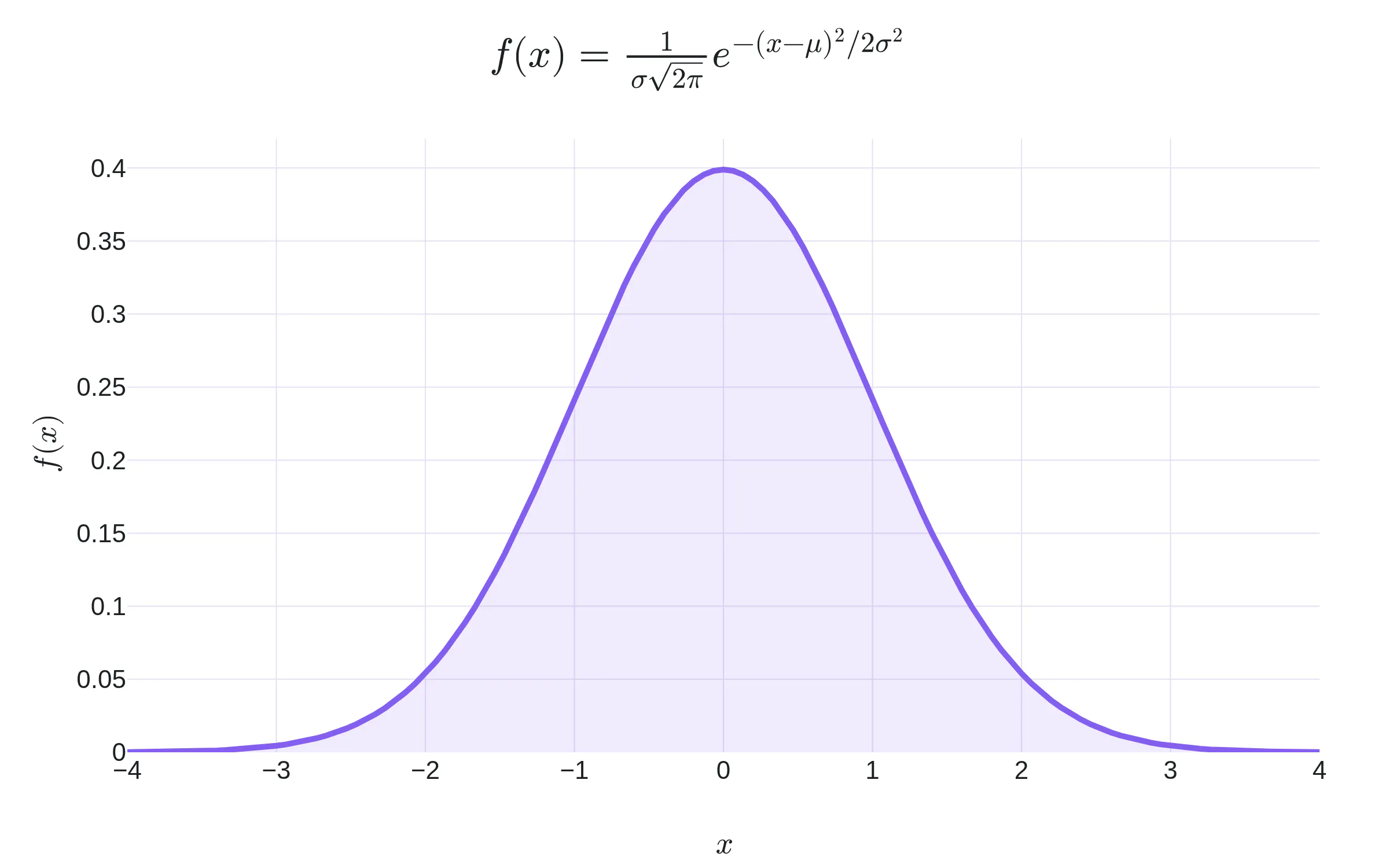
The title, typeset by MathJax v4.0.0 on the page.
layout: {geo: {lonaxis: { range: [-12, 30] }, lataxis: { range: [34, 62] }, // the first view: Europeprojection: { type: "mercator", minscale: 1, maxscale: 3 },},}
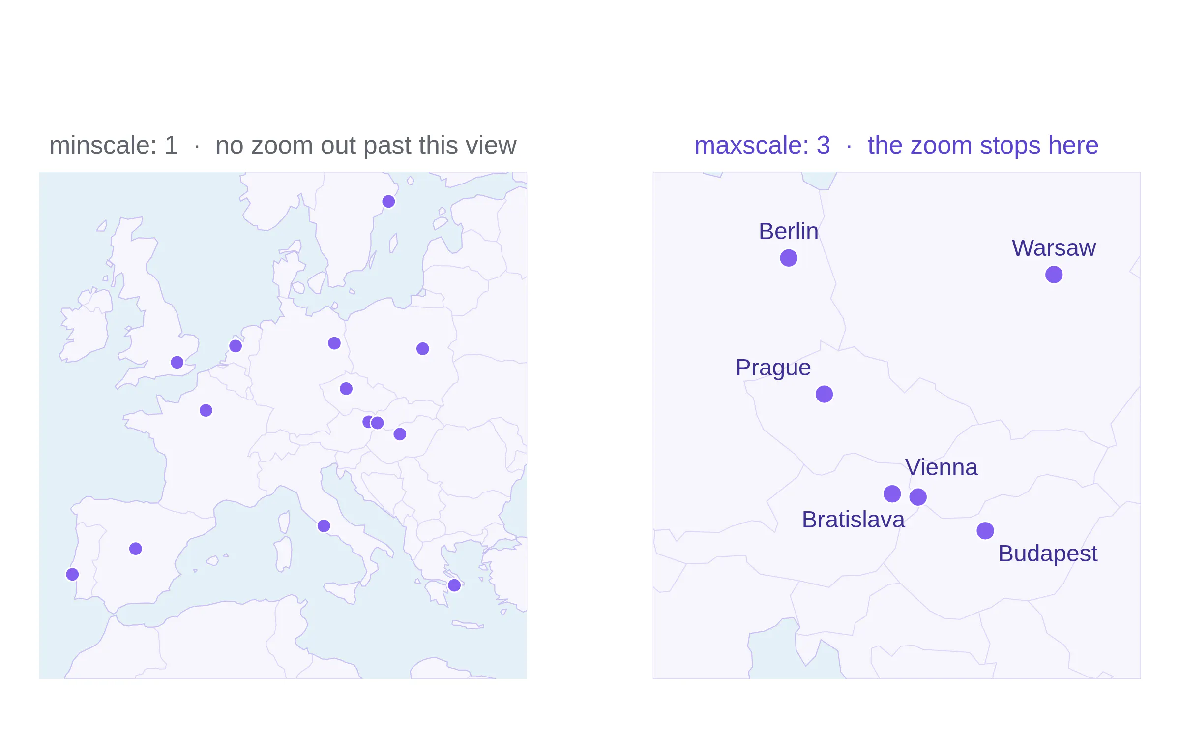
Left: the first view, at minscale 1, The reader cannot zoom out past this. Right: the view at maxscale 3, the reader cannot zoom in any further than this.
Easily share charts
PRs 7909, 7928. The modebar has a new button to easily share charts.
Sharing static charts has always been easy: click the camera button in the chart and it'll download a static image (you can also do this programmatically). If you want to share an interactive chart, it's a lot harder. You either have to export the HTML files and find some web hosting platform or put your chart into a Dash app and deploy it as an app. And that's not to mention sharing your charts privately behind a log in screen.
Now that we have Plotly Cloud, we've added back single click chart sharing. It's opt-in, and we'll show you a modal confirming the upload to prevent any accidental sharing. Sharing a chart requires a Plotly Cloud account and we have a free tier.
The button is on by default. To remove it, set showSendToCloud to false in the config.
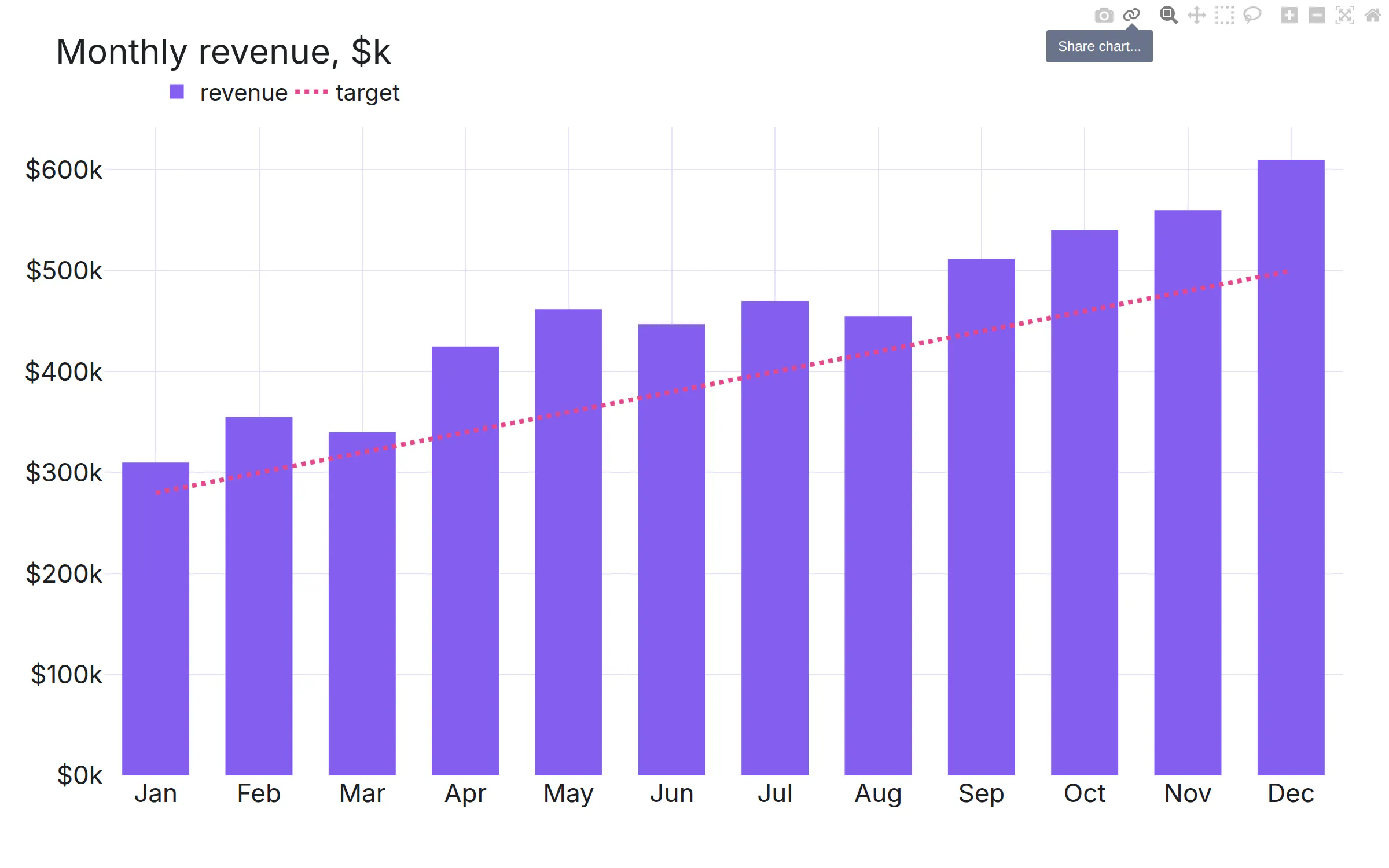
The cloud button in the modal is "Share chart…".
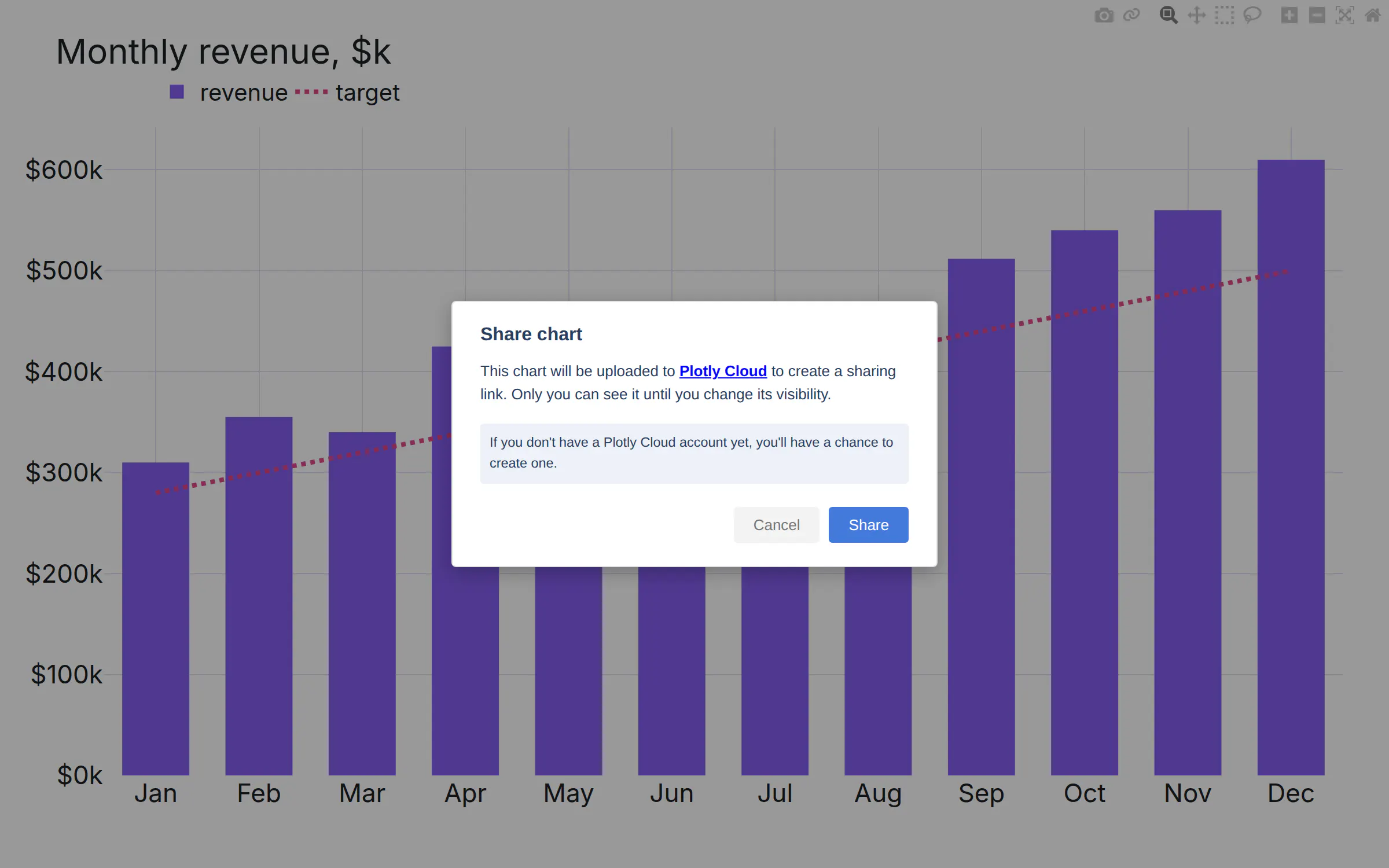
The confirmation dialog before sharing. Nothing leaves the page until you press the Share button.
// on by defaultPlotly.newPlot(gd, data, layout);// remove the buttonPlotly.newPlot(gd, data, layout, { showSendToCloud: false });// send charts to your own server instead of cloud.plotly.comPlotly.newPlot(gd, data, layout, { plotlyServerURL: "https://charts.example.com/newchart" });
Downloads named after the plot
PR 7828. Before: the camera button saved newplot.png, then newplot (1).png and so on Now: it uses the plot title as the file name. The chart below downloads as "Espresso consumption vs. lines of code.png".
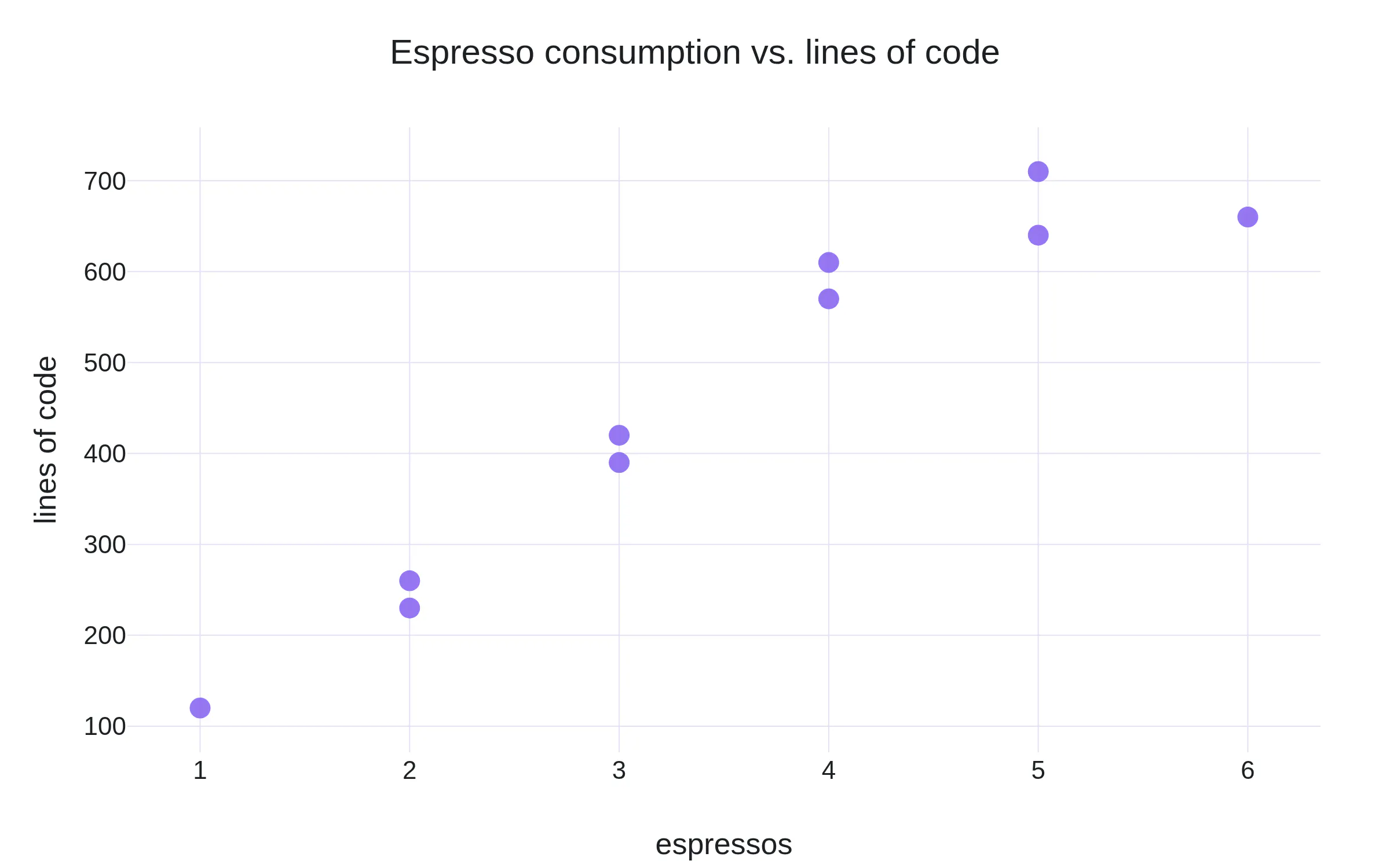
The camera button in the toolbar downloads the chart and the file is named after the title.
Other additions
- Hover and click events carry xPixel and yPixel. They give the cursor position in pixels, relative to the top-left corner of the graph div (PR 7966).
- With hoveranywhere on, plotly.js emits plotly_unhover when the cursor leaves the plot area (PR 7966).
- A shape trace with a dash gets a dashed marker in the legend (PR 7845).
9 minor breaking changes
Two removals and seven new defaults in plotly.js. These same changes also apply to plotly.py 7.0. Most of these changes make a chart better with no change to your code.
1. Mapbox traces are removed
PR 7860. Before: scattermapbox, choroplethmapbox and densitymapbox rendered with Mapbox GL and needed an access token. Now these traces are renamed as `map` traces. Under the hood, we swapped out the Mapbox library with the open source MapLibre library. This means the mapbox mapboxAccessToken config option is also removed. The traces have the same API and need no tokens or accounts to use them.
Separately, scattermap and densitymap also compute center and zoom from the data (PRs 7884, 7913) rather than an arbitrary point. Set layout.map.fitbounds to false to turn that off.
Deprecation background: the map traces arrived and the mapbox traces were deprecated in plotly.js 2.35.0, August 2024 (PR 7087). plotly.py deprecated them in 6.0, January 2025 (PR 4900), with a migration guide. After two years of deprecation these were removed in this release.
// before: plotly.js 3.xPlotly.newPlot(gd, [{type: "scattermapbox",lon: [121.49, 103.85, 4.48], lat: [31.23, 1.29, 51.92],mode: "markers", marker: { size: 14 },}], {mapbox: { style: "dark", center: { lon: 60, lat: 20 }, zoom: 1.5 },}, {mapboxAccessToken: "pk.eyJ1Ijo…",});
// after: plotly.js 4.0Plotly.newPlot(gd, [{type: "scattermap",lon: [121.49, 103.85, 4.48], lat: [31.23, 1.29, 51.92],mode: "markers", marker: { size: 14 },}], {map: { style: "dark" }, // center and zoom are optional: the view fits the data});// no token// the same renames for the other two traces and the subplot// scattermapbox -> scattermap// choroplethmapbox -> choroplethmap// densitymapbox -> densitymap// layout.mapbox -> layout.map// config.mapboxAccessToken -> remove
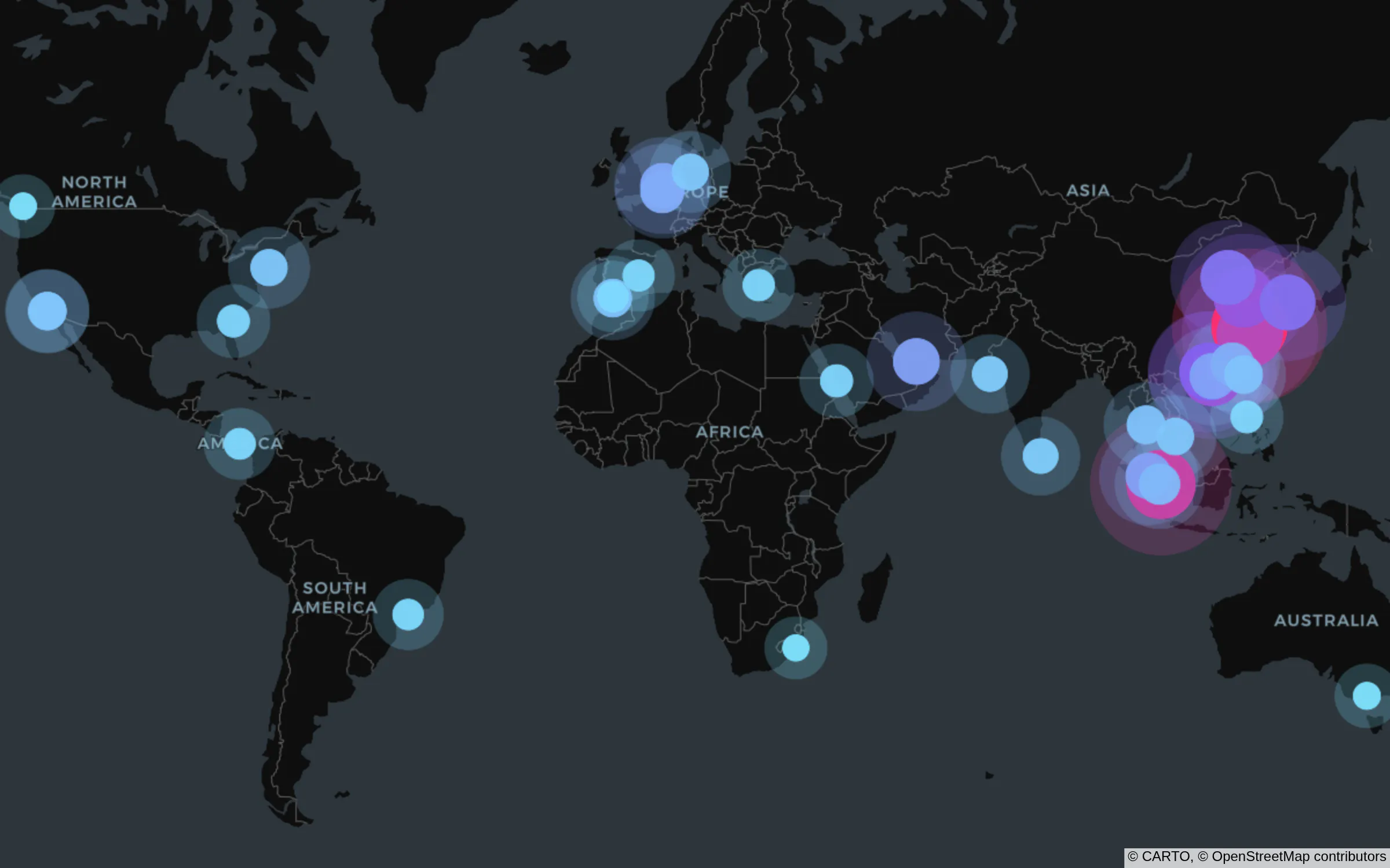
The busiest container ports of the world sized by throughput.
2. MathJax v2 is not supported
PR 7898. Before: plotly.js typeset math with MathJax v2 or v3. Now: it typesets with v3 or v4. If a page has v2, the plot renders and the math stays as text.
History: MathJax v3 support arrived in plotly.js 2.10.0, March 2022 (PR 6073).
3. Geo maps auto-fit
PR 7895. Before: layout.geo.fitbounds was false, so a geo map opened on the whole world. Now: fitbounds is "locations", so the map opens on the data.
History: fitbounds has existed since plotly.js 1.52.0, January 2020 (PR 4419).
// before: plotly.js 3.x opened on the whole worldPlotly.newPlot(gd, [{ type: "scattergeo", lon: lon, lat: lat }], {geo: { projection: { type: "natural earth" } },});// after: plotly.js 4.0 opens on the dataPlotly.newPlot(gd, [{ type: "scattergeo", lon: lon, lat: lat }], {geo: { projection: { type: "natural earth" } }, // fitbounds: "locations" is the default});// to keep the old viewPlotly.newPlot(gd, [{ type: "scattergeo", lon: lon, lat: lat }], {geo: { projection: { type: "natural earth" }, fitbounds: false },});
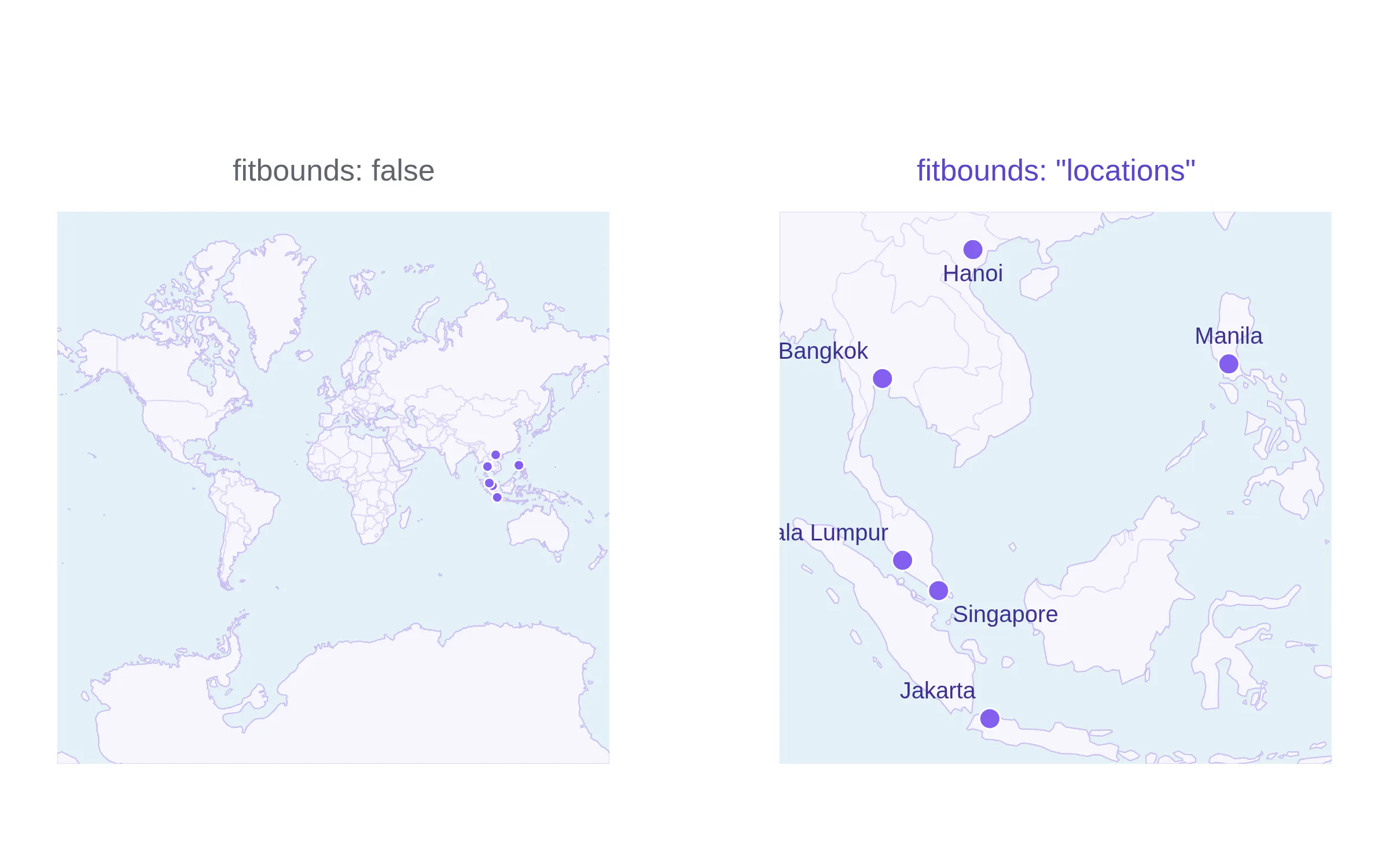
The same six cities. Left: fitbounds false, the old default. Right: fitbounds "locations", the new default.
4. Splom axes match
PR 7843. SPLOM ("Scatter PLOt Matrices") are all about symmetry. This default change preserves the symmetry during interaction. Before: splom.axis.matches was false, so the x axis and the y axis of one dimension had separate ranges. Now: matches is true, so they share one range. The difference shows when you zoom: drag-zoom a column, and the row of the same dimension follows, so the matrix stays symmetric. The figure below shows the same drag-zoom on "sepal len", left and right. History: the matches attribute has existed since plotly.js 1.45.0, February 2019 (PRs 3506, 3565). Only the default changes.
// before: plotly.js 3.x, each axis on its own{ type: "splom",dimensions: [{ label: "sepal len", values: [...] },{ label: "sepal wid", values: [...] },{ label: "petal len", values: [...] },] }// after: plotly.js 4.0, the x and y axes of each dimension share a range{ type: "splom",dimensions: [{ label: "sepal len", values: [...] }, // axis: { matches: true } is the default{ label: "sepal wid", values: [...] },{ label: "petal len", values: [...] },] }// to keep the old behavior{ type: "splom",dimensions: [{ label: "sepal len", values: [...], axis: { matches: false } },{ label: "sepal wid", values: [...], axis: { matches: false } },{ label: "petal len", values: [...], axis: { matches: false } },] }
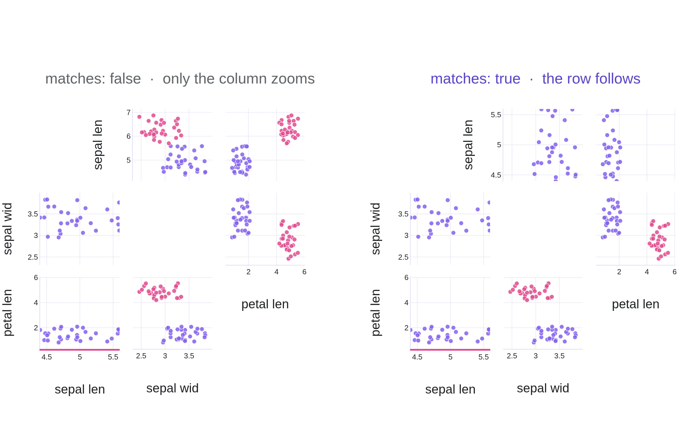
The same drag-zoom on "sepal len", 4.4 to 5.6. Left: matches false, the old default and only the column zooms. Right: matches true, the new default where the column and the symmetrical transposed row also zooms.
5. Dual-axis gridlines align
PR 7684. Before: a second y-axis chose its own ticks, so a chart had two grids. Now: an overlaying axis defaults to tickmode "sync". It puts its ticks on the gridlines of the first axis and will adjust the numbers to match. This looks a lot better (it's way less busy) and so we decided it was a better default to make.
History: tickmode "sync" has existed since plotly.js 2.18.0, January 2023 (PRs 6356, 6443).
// before: plotly.js 3.x, two gridslayout: {yaxis: { title: { text: "revenue" } },yaxis2: { title: { text: "margin" }, overlaying: "y", side: "right" },}// after: plotly.js 4.0, one gridlayout: {yaxis: { title: { text: "revenue" } },yaxis2: { title: { text: "margin" }, overlaying: "y", side: "right" }, // tickmode: "sync" is the default}// to keep the old behaviorlayout: {yaxis: { title: { text: "revenue" } },yaxis2: { title: { text: "margin" }, overlaying: "y", side: "right", tickmode: "auto" },}
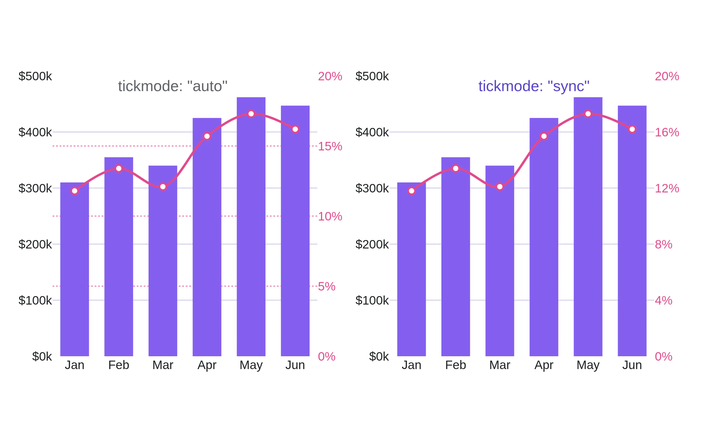
Left: tickmode "auto", the old default, with two grids. Right: tickmode "sync", the new default, with one grid.
6. Color strings follow the CSS specification
PRs 7536, 7962. The section New color engine above lists each string that changes, with the code before and after. In short: rgb(0.5, 0, 0) is now almost black, hsv() does not parse, rgb(255, 0, 0, 0.5) is now transparent, and a string that mixes commas and spaces does not parse.
7. Country names resolve through country-iso-search
PR 7856. Before: a choropleth or scattergeo trace with locationmode "country names" matched each name with a regular expression from the country-regex package. Now: it resolves each name with country-iso-search, a maintained package with ISO 3166-1 records and aliases. Most names match as before. We compared the two packages on 181 names. These are the differences:
- Six codes for countries that no longer exist are gone: CSK (Czechoslovakia), DDR (East Germany), YUG (Yugoslavia), ANT (Netherlands Antilles), YMD (South Yemen) and EAZ (Zanzibar). These names no longer resolve.
- Historical names that the old regular expressions mapped to a current code no longer resolve: USSR and Soviet Union (was RUS), West Germany (was DEU), Upper Volta (was BFA), Bechuanaland (was BWA), British Honduras (was BLZ), Abyssinia (was ETH), Gold Coast (was GHA), Nyasaland (was MWI), Basutoland (was LSO), British Guiana (was GUY), New Hebrides (was VUT), Kirghizia (was KGZ), Byelorussia (was BLR) and Bohemia (was CZE).
- Names that did not resolve before, and do now: Türkiye, Eswatini, Micronesia, Åland Islands, Saint Martin, England, Scotland, Wales, Northern Ireland, native names such as Deutschland, España and 中国, and flag emoji.
- One change of target: "Republic of the Congo" resolved to COG (Brazzaville) before and resolves to COD (Kinshasa) now. Use the alpha-3 code for either Congo.
History: plotly.js 3.1.0, August 2025, added a console warning on locationmode "country names" to announce this change (PR 7514). If your data has historical names, map them to alpha-3 codes before you plot. locationmode "ISO-3" does not change.
// before: plotly.js 3.x resolved a historical name{ type: "choropleth", locationmode: "country names",locations: ["Germany", "West Germany", "Czechoslovakia"], z: [1, 2, 3] }// after: plotly.js 4.0. "Germany" still resolves. The other two do not.// Map historical names to current codes before you plot.{ type: "choropleth", locationmode: "ISO-3",locations: ["DEU", "CZE", "SVK"], z: [1, 3, 3] }
8. hoveranywhere returns data values
PR 7964. Before: the xvals and yvals in a hoveranywhere or clickanywhere event were calcdata values which is an intermediate representation of the data that we use. This means that a date axis gave a number of milliseconds and a category axis gave an index instead of the input data values like date strings and categories. Linear and log axes do not change.
History: hoveranywhere and clickanywhere arrived in plotly.js 3.5.0, April 2026 (PR 7707). The change comes five months later, before the events are in wide use.
gd.on("plotly_hover", function (ev) {// before, on a date x-axis and a category y-axisev.xvals; // [1735689600000]ev.yvals; // [2]// afterev.xvals; // ["2025-01-01"]ev.yvals; // ["wed"]});
9. Node 22 to build
PR 7861. Node 22 is the minimum version to build plotly.js from source. This does not affect the built bundle in a browser and only affects the development experience.
Also removed, not breaking for most
The Chart Studio config attributes (showLink, linkText, sendData, showSources, showEditInChartStudio), the stream trace attribute, all *src attributes and layout.hidesources are removed from the schema (PRs 7812, 7829). The Share chart button replaces the Chart Studio link.
plotly.py 7.0
plotly.py 7.0.0 (August 25) updates plotly.js from 3.6.0 to 4.0.0 (PR 5673). Everything above applies in Python. This means that the mapbox graph_objects and Plotly Express functions are removed in favor of the map versions.
History: The mapbox functions have raised a deprecation warning since plotly.py 6.0, January 2025 (PR 4900).
# before: plotly.py 6.ximport plotly.express as pximport plotly.graph_objects as gofig = px.scatter_mapbox(df, lat="lat", lon="lon", color="teu",mapbox_style="carto-darkmatter", zoom=1)fig.update_layout(mapbox_accesstoken="pk.eyJ1Ijo…")fig = go.Figure(go.Scattermapbox(lat=df.lat, lon=df.lon, mode="markers"))fig.update_layout(mapbox=dict(style="carto-darkmatter", center=dict(lat=20, lon=60), zoom=1))
# after: plotly.py 7.0import plotly.express as pximport plotly.graph_objects as gofig = px.scatter_map(df, lat="lat", lon="lon", color="teu",map_style="carto-darkmatter") # zoom is optional: the view fits the data# no access tokenfig = go.Figure(go.Scattermap(lat=df.lat, lon=df.lon, mode="markers"))fig.update_layout(map=dict(style="carto-darkmatter"))# the full list of renames# px.scatter_mapbox -> px.scatter_map# px.line_mapbox -> px.line_map# px.choropleth_mapbox -> px.choropleth_map# px.density_mapbox -> px.density_map# go.Scattermapbox -> go.Scattermap# go.Choroplethmapbox -> go.Choroplethmap# go.Densitymapbox -> go.Densitymap# layout.mapbox -> layout.map# mapbox_style= -> map_style=# mapbox_accesstoken -> remove
Also removed in plotly.py 7.0
The deprecated figure factories (PR 5627). Each one has carried a deprecation notice and replacement recommendation in its docstring for years:
- Since plotly.py 4.4, December 2019, almost seven years: create_2d_density (use go.Histogram2dContour), create_bullet (use go.Indicator), create_candlestick (use go.Candlestick), create_distplot (use px.histogram with marginal), create_facet_grid (use facet_row and facet_col in Plotly Express), create_ohlc (use go.Ohlc), create_scatterplotmatrix (use px.scatter_matrix) and create_violin (use px.violin).
- Since plotly.py 5.5, January 2022, more than four years: create_annotated_heatmap (use px.imshow with text_auto), create_choropleth (use px.choropleth) and create_gantt (use px.timeline).
- Since plotly.py 6.4, November 2025: create_hexbin_mapbox (use create_hexbin_map, PR 5358 by @ajlien).
Also removed: Orca for static images, and Kaleido versions before 1.0 (PR 5677). plotly.py 6.2, June 2025, added deprecation warnings for both (PR 5236). The engine argument on write_image, to_image, write_images, full_figure_for_development and the renderer constructors is removed with them (PR 5677).
# beforeimport plotly.figure_factory as fffig = ff.create_distplot([x1, x2], ["a", "b"])fig = ff.create_scatterplotmatrix(df, index="species")fig = ff.create_gantt(tasks)fig.write_image("chart.png", engine="kaleido")# afterimport plotly.express as pxfig = px.histogram(df, x="value", color="group", marginal="rug")fig = px.scatter_matrix(df, color="species")fig = px.timeline(tasks, x_start="Start", x_end="Finish", y="Task")fig.write_image("chart.png") # pip install -U kaleido
Fixed in plotly.py 7.0
- hex_to_rgb. Before: a 3-digit color such as #FFF raised an error. Now: it parses. @genrichez, PR 5662.
- px.scatter_map and the other px map functions. Before: a map with no zoom and no center opened on a default view. Now: it fits the data. PR 5686.
- to_html(). Before: the output had no doctype. Now: it starts with <!doctype html>. @mishrakushal, PR 5693.
- density_heatmap and density_contour. Before: a histogram marginal showed raw bin counts. Now: it applies histfunc and z. @lucasjamar, issue 3521.
- mpl_to_plotly. Before: violin, pcolor, fill_between, stem and stack plots were dropped. Now: they render as polygons and lines. @robertoffmoura, PR 5702.
Upgrade with pip install -U plotly. plotly.py 7.1.0 followed on September 15 with plotly.js 4.1.1, a heatmap marginal for density_heatmap, custom tick values in mpl_to_plotly, and a fix for unsigned-integer columns in Plotly Express.
Fixes
Map icons in color
PR 7825. Before: a scattermap symbol other than circle ignored marker.color and rendered in one color. Now: every symbol uses marker.color. Also the Maki icons are upgraded to 8.2.
// one trace per color — icons take their trace's marker.color{ type: "scattermap", marker: { symbol: "cafe", color: "#845eee", size: 26 } },{ type: "scattermap", marker: { symbol: "harbor", color: "#1fa8a0", size: 26 } },{ type: "scattermap", marker: { symbol: "park", color: "#2e9e4f", size: 26 } },
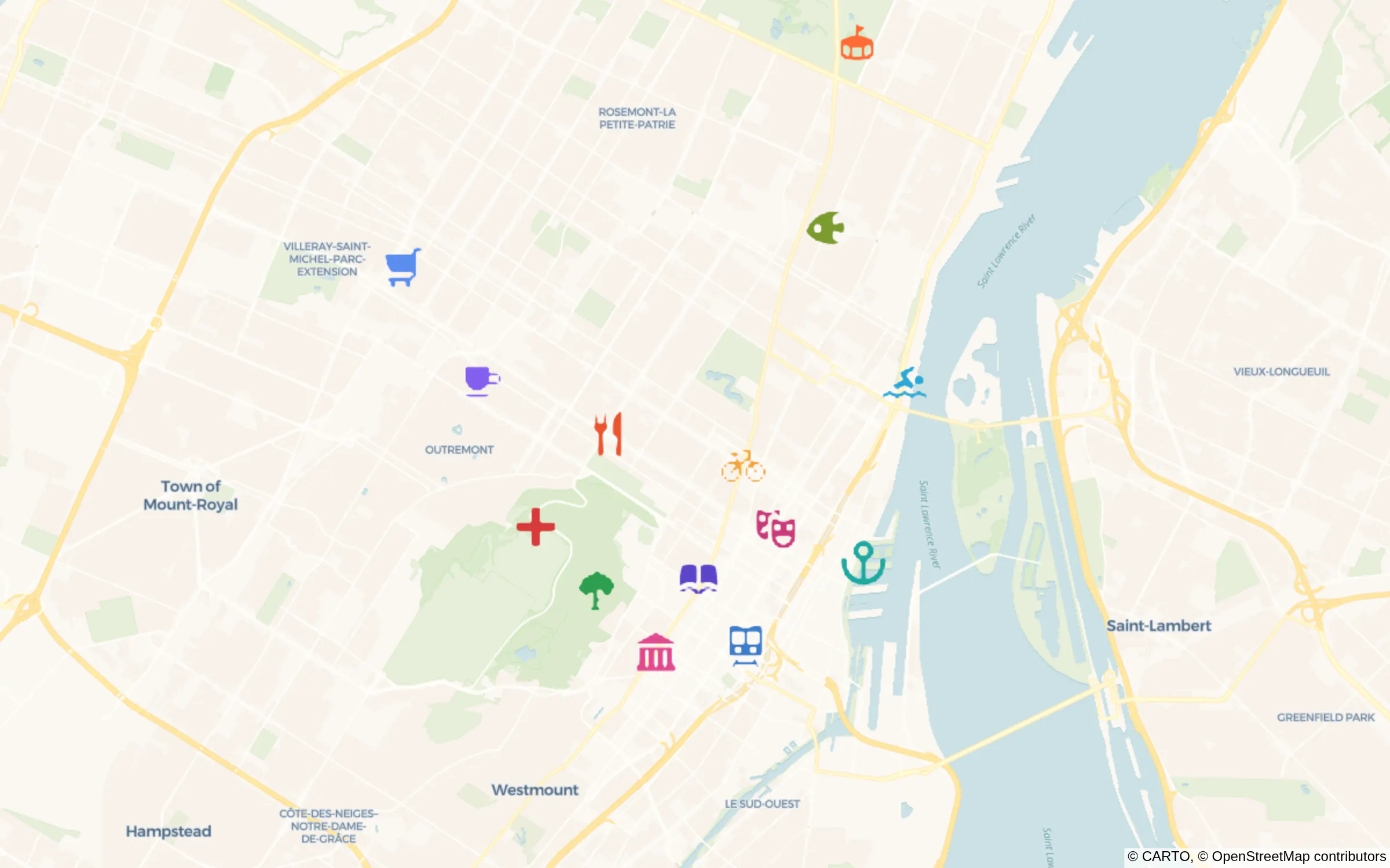
A day in Montréal, in Maki 8.2 icons. Each icon has its own color.
Maps across the antimeridian
PRs 7891, 7948. Before: a choropleth or scattergeo shape that crosses the 180° line got a bounding box that wrapped around the world, so auto-fit showed the whole globe. Now: the bounding box is correct, and auto-fit works when antimeridian shapes are mixed with normal ones. This comes up with graphing data around Fiji which crosses the 180° line.
{ type: "choropleth",locations: ["FJI", "VUT", "WSM", "TON", "NCL"],z: [1, 2, 3, 4, 5] }
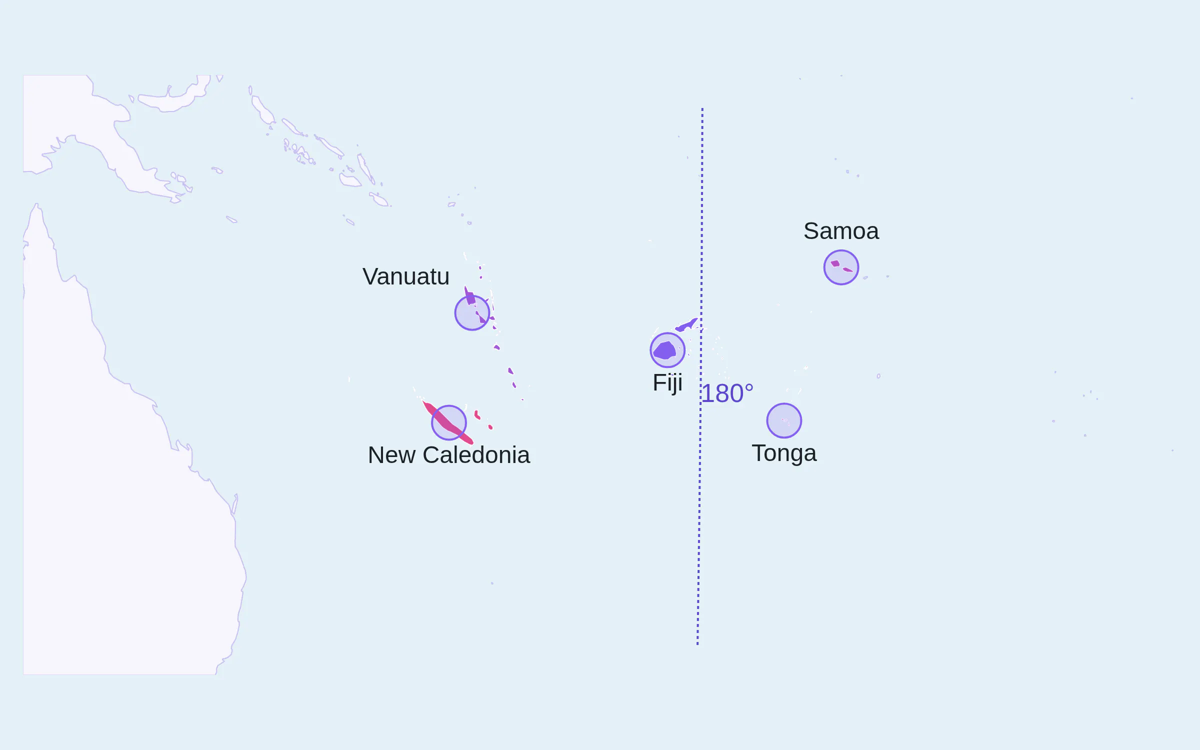
Antimeridian-crossing shapes, auto-fitted.
Plotly.react("graph", [{ type: "histogram", x: sample }, // many points{ type: "histogram", x: [2.2] }, // a single point], { barmode: "overlay" });
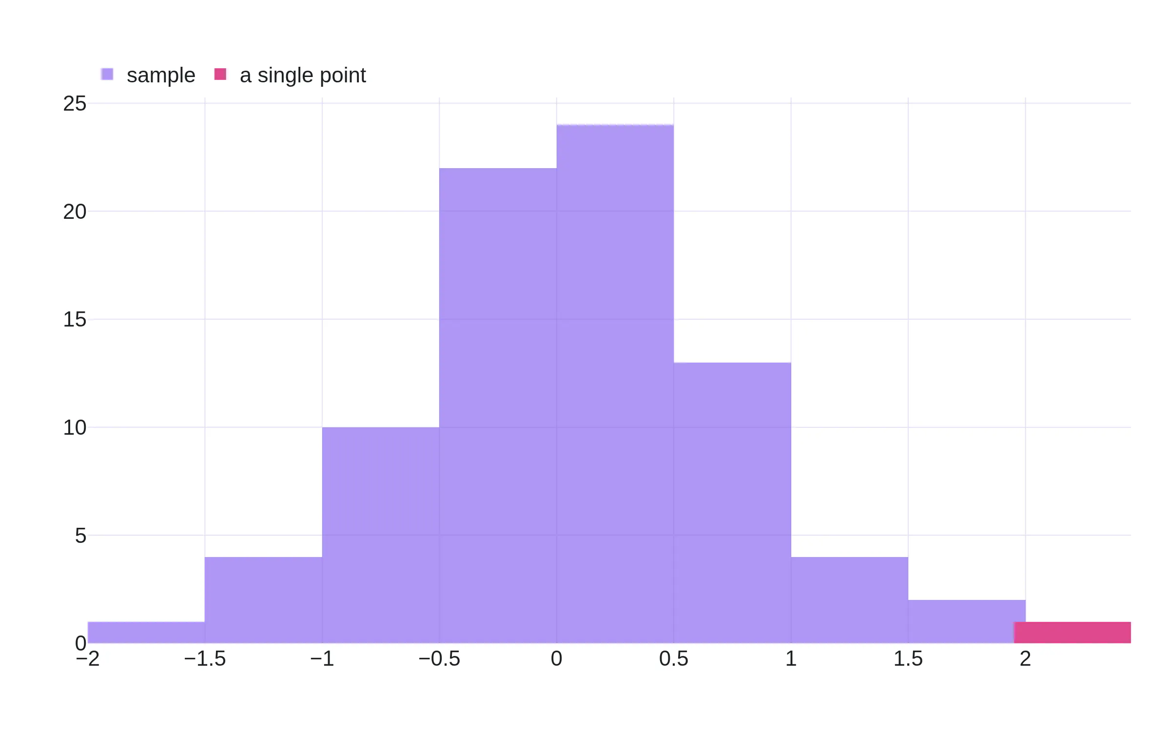
The pink single-point bar keeps the bin width of the violet trace.
Exponential tick labels
@Hasnaathussain, PR 7768.
Before: with exponentformat "e", tick labels for small numbers such as 1e-7 were wrong.
Now: well, now they are correct.
yaxis: { exponentformat: "e" } // values down at 1e-7
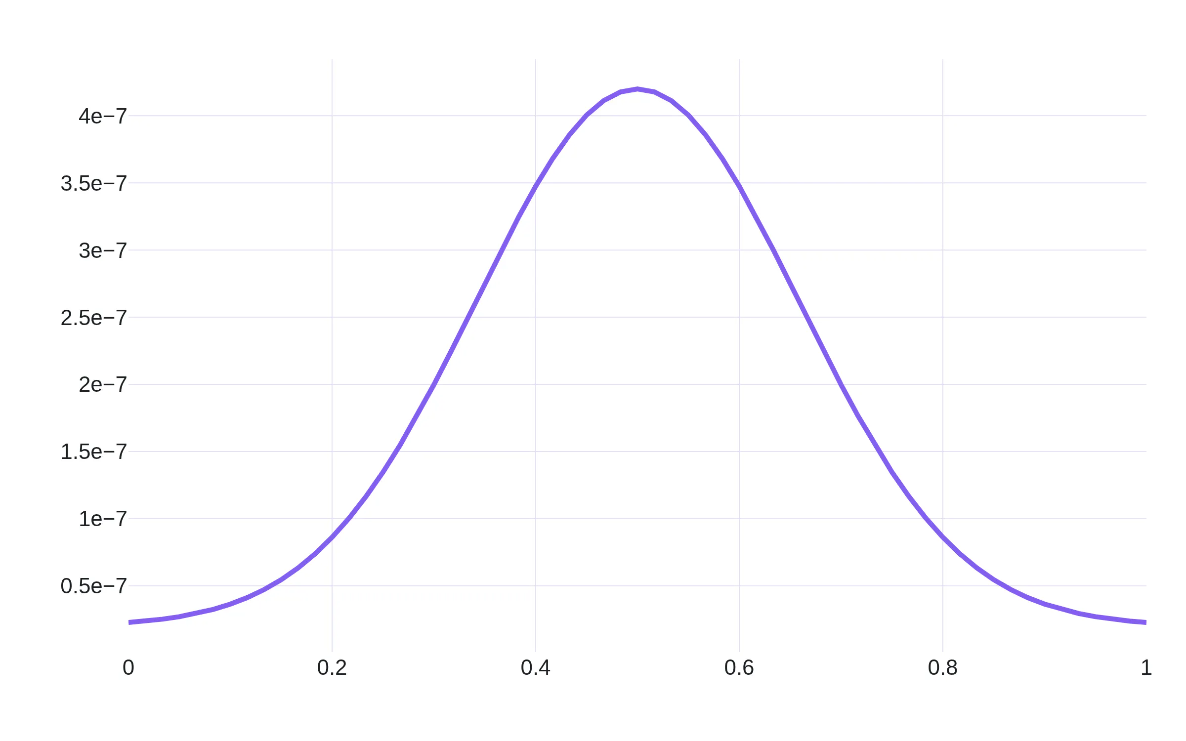
Values near 1e-7, with readable ticks.
Plotly.newPlot("graph", data, { yaxis: { automargin: true } },{ scrollZoom: true });
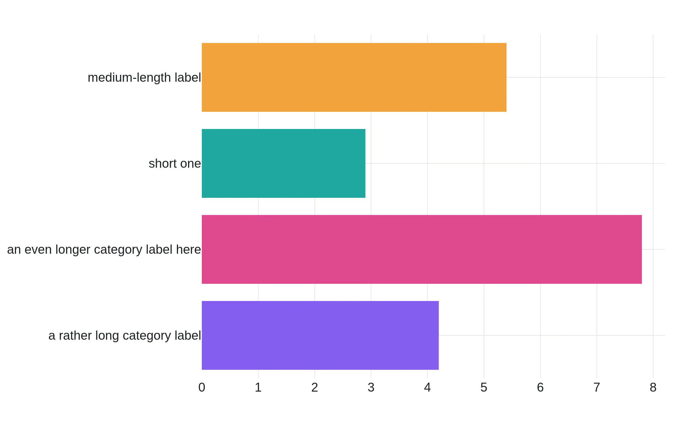
Long labels with automargin. The plot stays in place during a scroll zoom.
{x: ["mon", "tue", "wed", "thu", "fri"],y: [12, null, 18, 7, null],layout: { xaxis: { categoryorder: "total descending" } },}
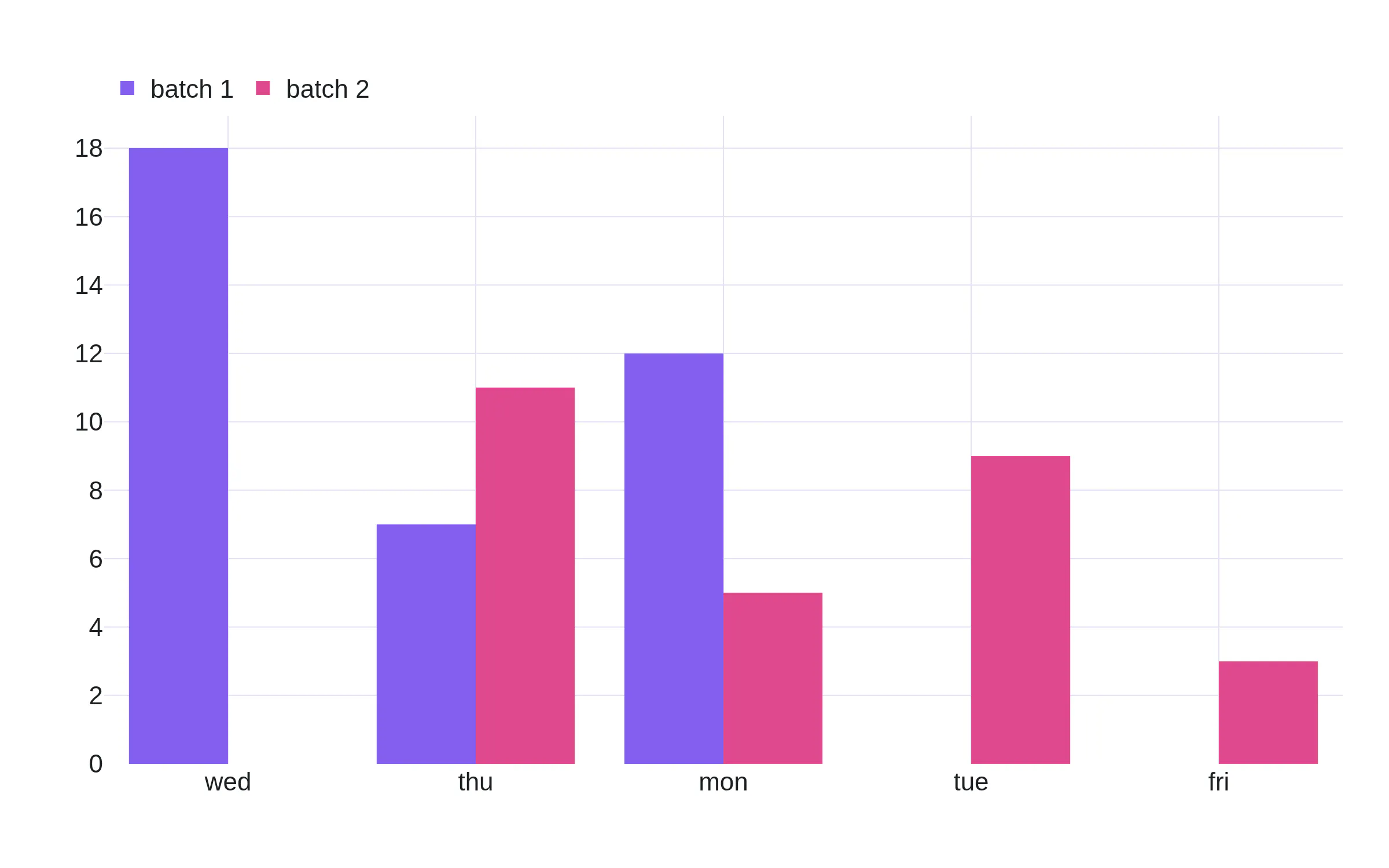
Sorted by total, with nulls in both traces.
{type: "bar",y: [4, 0, 6, 0, 3],texttemplate: "%{y}",textposition: "outside",}
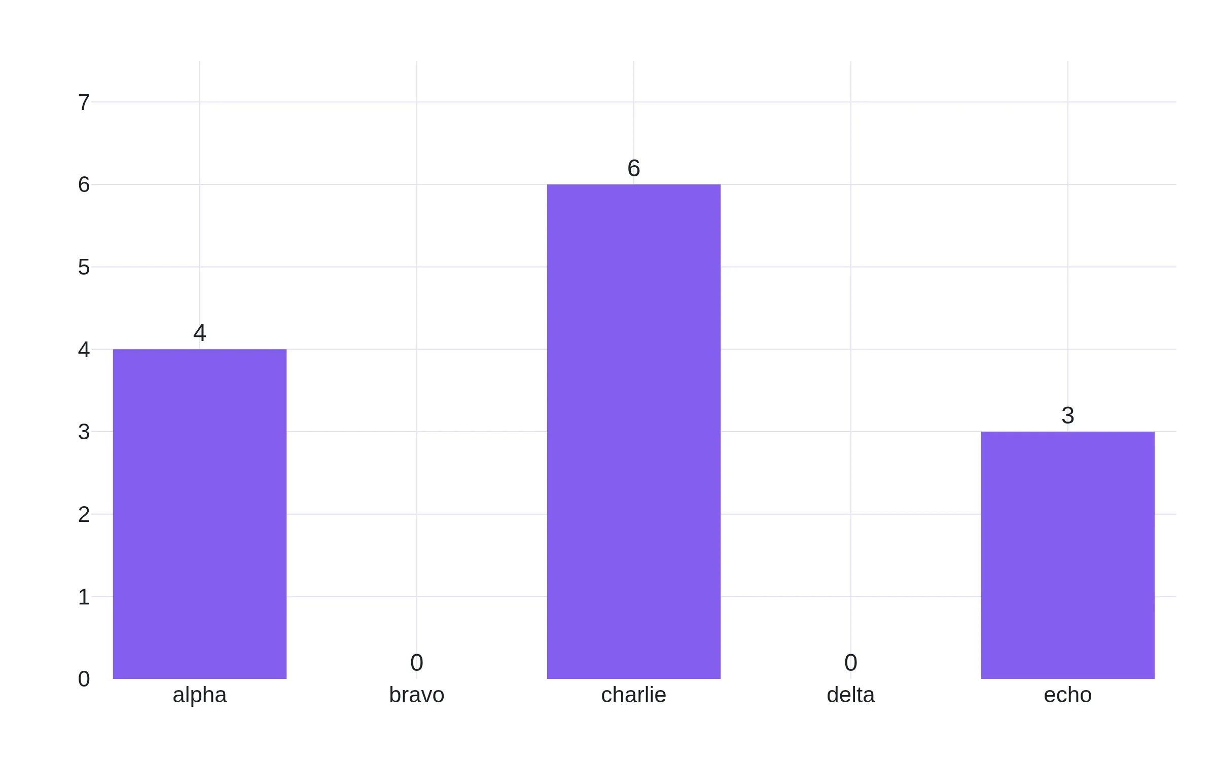
The zeros sit above the axis labels, not on them.
{texttemplate: "%{y:+.2f}",layout: { yaxis: { tickformat: "+.2f" } },}
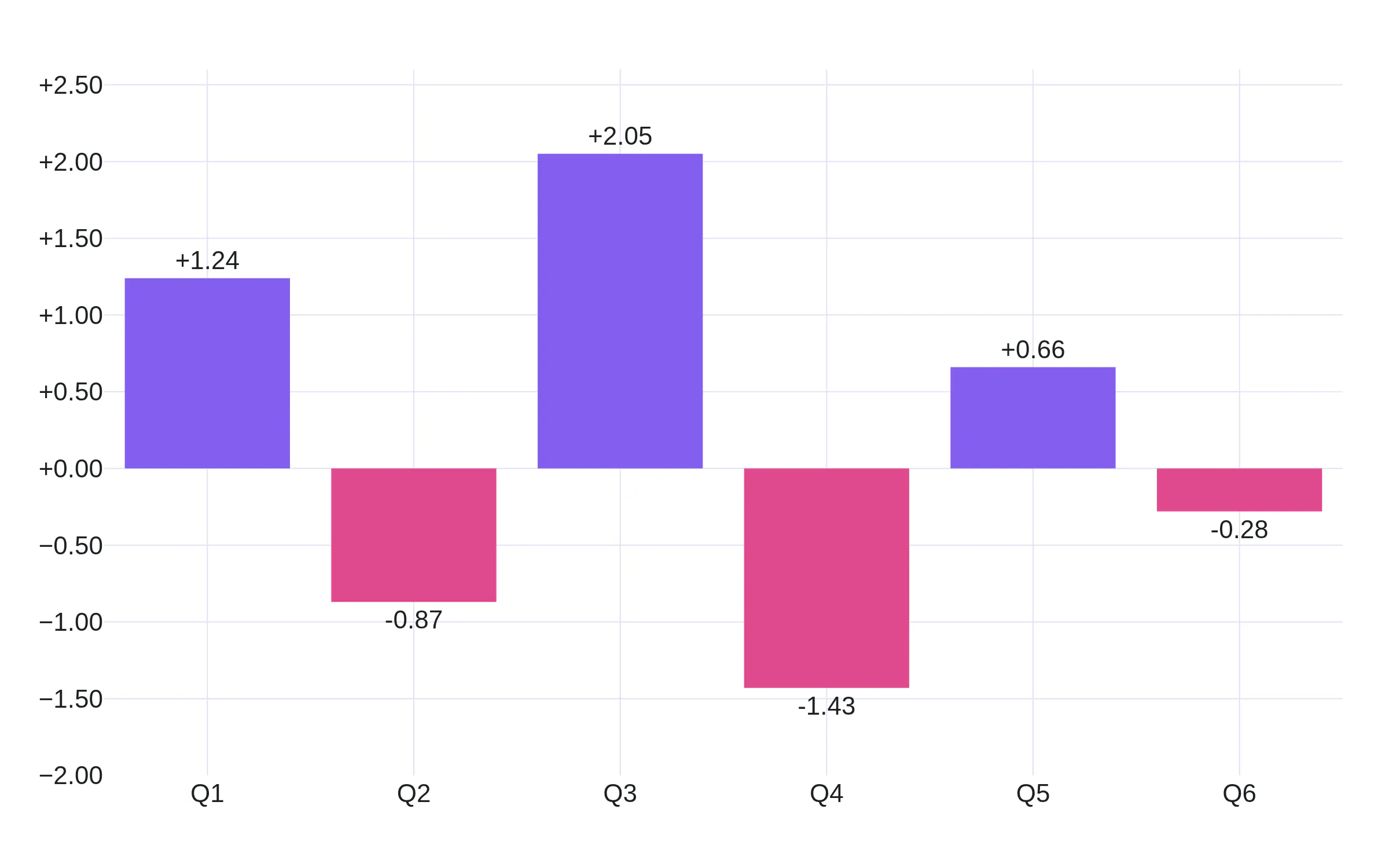
Signed labels on the ticks and on the bars.
No floating-point tick artifacts
@arieleli01212 and @kirthi-b, PR 7901, issue 7765.
tickformat takes a d3-format string. In "~r", the r means: print the number in plain decimal notation, rounded to significant digits, with no exponent and the ~ means: trim the trailing zeros.
So "~r" is the format for ticks that read 0.3 and 0.25 with no fixed number of decimals and no exponent.
Before: plotly.js computed each tick value by adding the tick step to the last one, so a value could carry a floating-point artifact, such as 0.30000000000000004 in place of 0.3, and a custom format could show it.
Now: plotly.js snaps each tick value to the exact multiple of the step before it formats it, so the tick reads 0.3.
yaxis: { tickformat: "~r" } // plain decimals, trailing zeros trimmed
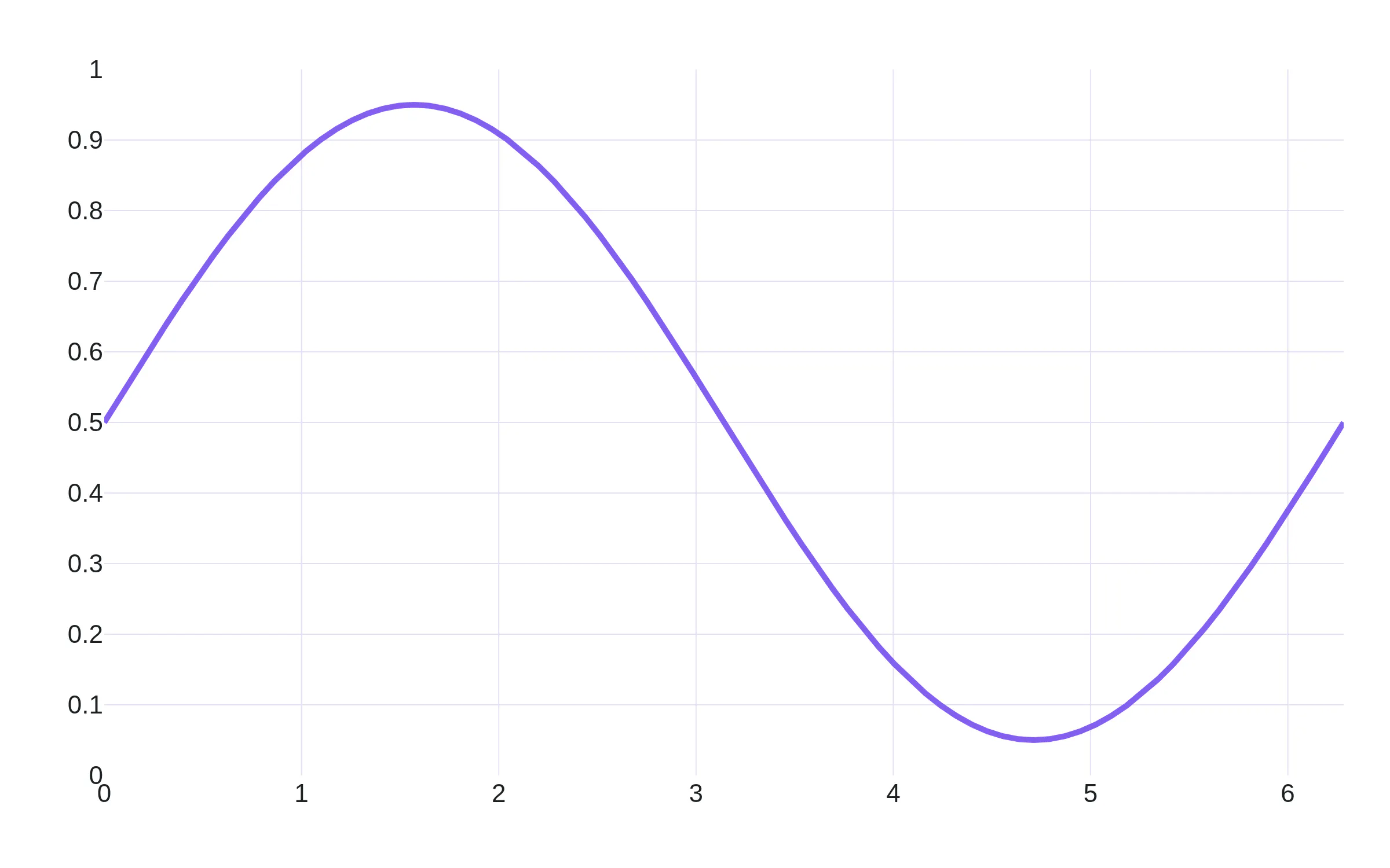
A ~r axis with clean decimals.
{type: "scattermap",lon: [176, 178, 179.5, -179.5, -178, -176], // across 180°lat: [-16, -17, -17.5, -17.5, -17, -16],}
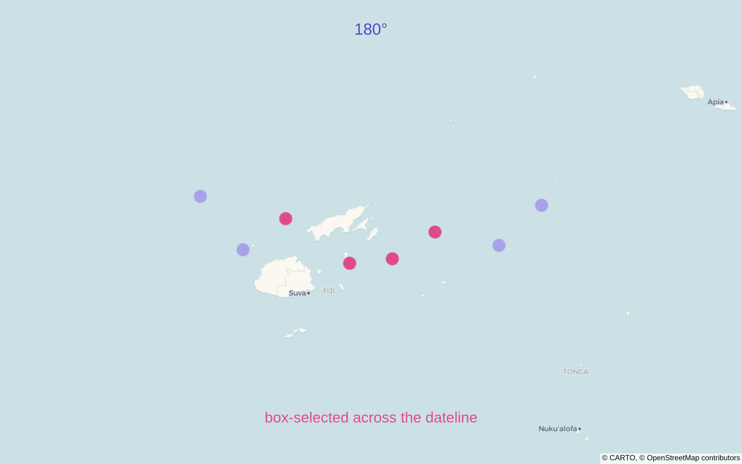
Points on both sides of the 180° line. The pink points are selected in one box.
colorbar: { title: { text: "a very tall colorbar title" }, ypad: 60 }
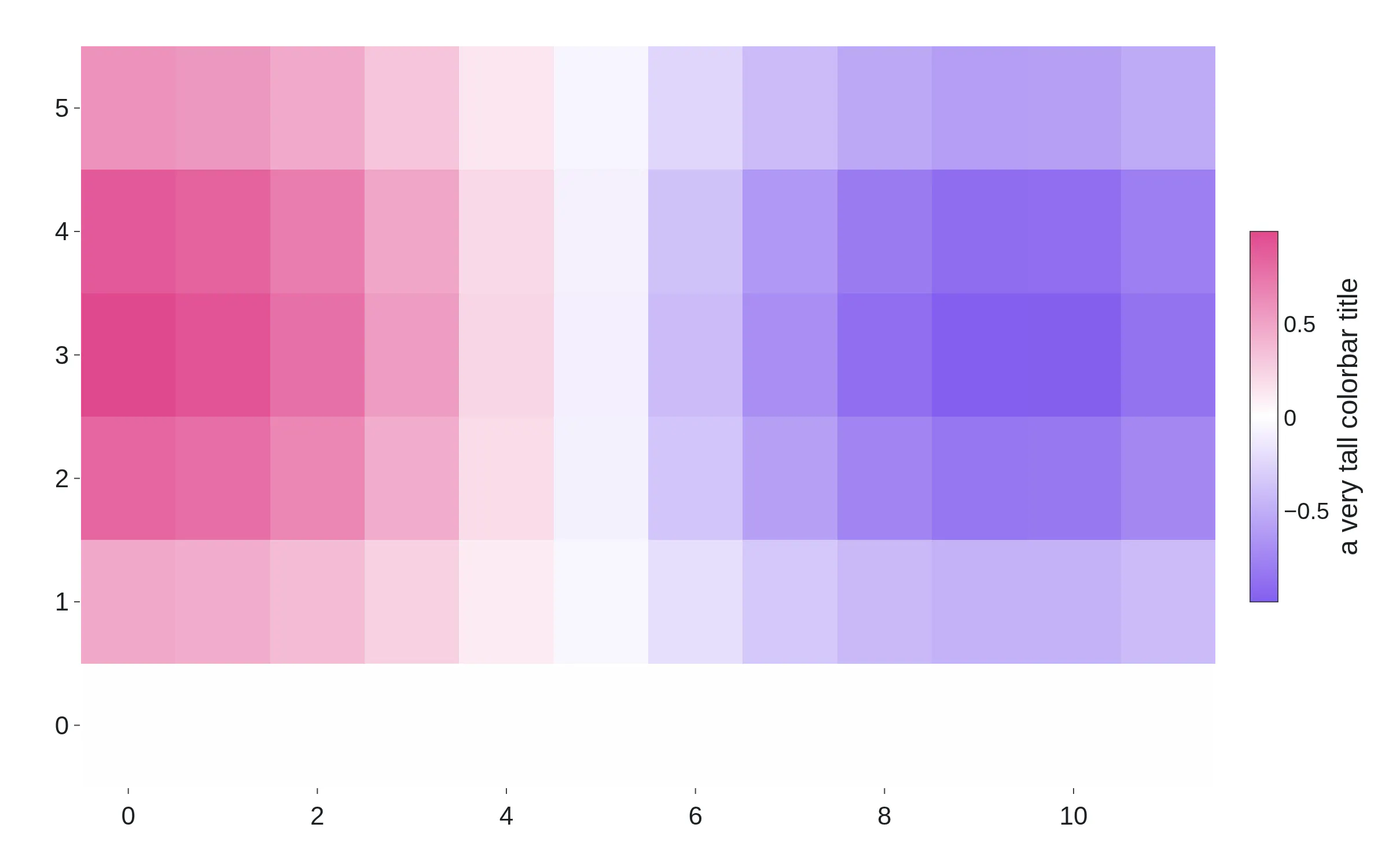
Cramped, and rendered.
// feature "degenerate" collapses to a single point{ type: "MultiPolygon",coordinates: [[[[16, 4], [16, 4], [16, 4], [16, 4]]]] }
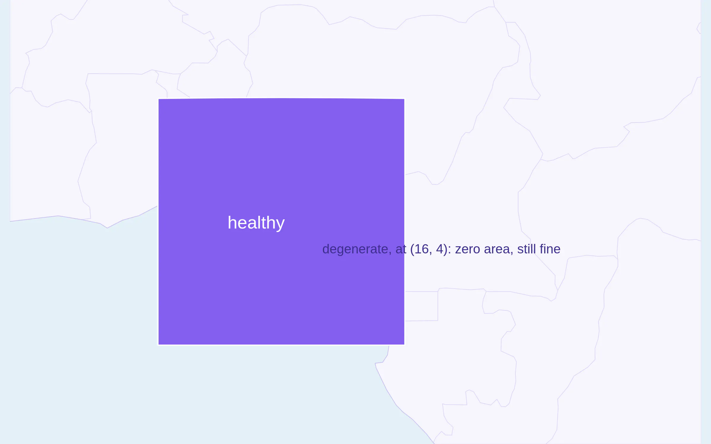
A healthy feature beside a degenerate one. The map renders.
Numeric color sorting in parallel categories
@CAOShurong, PR 7959. A parallel categories diagram, parcats, shows how the rows of a table spread over several categorical columns. Each column is a dimension, each ribbon is a group of rows that take the same path through the categories, and its width is the count of those rows. Color the ribbons by a number, and plotly.js bundles the ribbons of each path and stacks them in color order.
Before: the bundles sorted numeric colors as strings, so 10 came before 2.
Now: they sort as numbers. In the figure, the score runs from 1 to 10 and the ribbons stack in that order.
{type: "parcats",dimensions: [{ label: "Plan", values: plan }, // "Free", "Pro", "Team", one per row{ label: "Platform", values: platform },{ label: "Region", values: region },],line: { color: score, // a number per rowcolorscale: [[0, "#d9d4f7"], [0.55, "#845eee"], [1, "#e0498f"]],shape: "hspline" },}
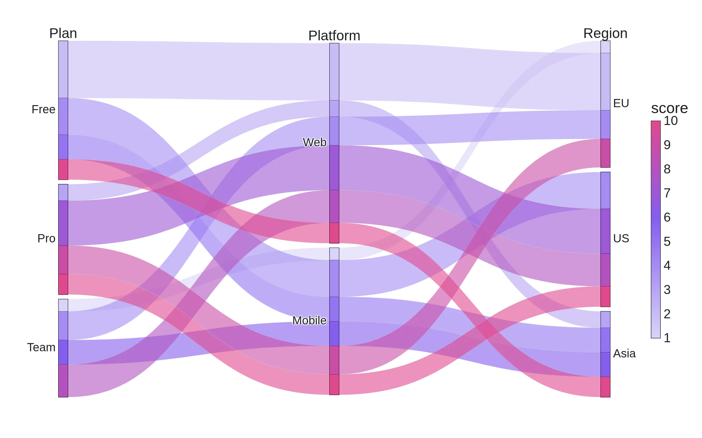
Ribbons bundled by path and stacked in numeric color order.
Fix for scattermap and density map without center or zoom specified.
Before: a map with no center and no zoom could hide some points.
Now: plotly.js computes the center and zoom from the data, so every point shows. @palmerusaf and @DhruvGarg111, PRs 7884, 7913. The container-port map above is an example.
Thank you
Twenty-two community contributors contributed to this release. Many thanks to everyone involved!
plotly.js
- the quiver trace — @degzhaus (PR 7710)
- Sankey direction — @wf-r (PR 7870)
- Sankey sort, and d3-sankey 0.12.3 — @adamreeve (PRs 7873, 7830)
- geo minscale and maxscale — @mojoaxel (PR 7371)
- histogram autobin on Plotly.react — @Lexachoc (PR 7507)
- exponential tick labels for small numbers — @Hasnaathussain (PR 7768)
- no automargin jitter during scroll zoom — @keilogic (PR 7815)
- zero-length bars keep text off the ticks — @vizansh (PR 7872)
- scattermap shows every point, with auto center and zoom — @palmerusaf, @DhruvGarg111 (PRs 7884, 7913)
- sign-flag formats like +.2f — @TemRevil (PR 7900)
- ticks snap to delta, no float artifacts — @arieleli01212, @kirthi-b (PR 7901)
- map selection across the antimeridian — @coyaSONG (PR 7905)
- no crash on a colorbar with a negative domain — @zeehio (PR 7908)
- degenerate MultiPolygons in choropleths — @swjturay (PR 7921)
- numeric color sorting for parcats — @CAOShurong (PR 7959)
- category order by value, with nulls — @SAY-5 (PR 7855)
plotly.py
- #FFF shorthand in hex_to_rgb — @genrichez (PR 5662)
- <!doctype html> in to_html() — @mishrakushal (PR 5693)
- histfunc on density marginals — @lucasjamar (issue 3521)
- matplotlib path collections in mpl_to_plotly — @robertoffmoura (PR 5702)
- create_hexbin_map, the replacement for create_hexbin_mapbox — @ajlien (PR 5358)
- and everyone who filed the issues behind these fixes
Get started
plotly.js
Load the bundle from the CDN, or install it from npm.
<!-- the CDN bundle --><script src="https://cdn.plot.ly/plotly-4.0.0.min.js" charset="utf-8"></script><div id="graph"></div><script>Plotly.newPlot("graph", [{ type: "quiver", x: [0, 1], y: [0, 1], u: [1, 0.5], v: [0.5, 1] }]);</script>
# npmnpm install plotly.js-dist-min@4# or the full source package, with the TypeScript typesnpm install plotly.js@4
import Plotly from "plotly.js-dist-min";Plotly.newPlot("graph", [{ type: "quiver", x: [0, 1], y: [0, 1], u: [1, 0.5], v: [0.5, 1] }]);
TypeScript
The types are in the plotly.js package. Import the runtime from plotly.js-dist-min and the types from plotly.js and remove @types/plotly.js if you were using it.
npm install plotly.js-dist-min@4 plotly.js@4npm uninstall @types/plotly.js
import Plotly from "plotly.js-dist-min";import type { Data, Layout, PlotMouseEvent } from "plotly.js";const data: Data[] = [{ type: "scatter", x: [1, 2, 3], y: [2, 4, 3], mode: "lines+markers" }];const layout: Partial<Layout> = { title: { text: "Typed" } };const gd = await Plotly.newPlot("graph", data, layout, { responsive: true });gd.on("plotly_click", (ev: PlotMouseEvent) => console.log(ev.points[0].x, ev.xPixel));
Python
plotly.py 7 includes plotly.js 4.0 so simply upgrade plotly to get these fixes. For static images, install Kaleido 1.0 or later.
pip install -U plotly kaleido
import plotly.graph_objects as gofig = go.Figure(go.Quiver(x=[0, 1], y=[0, 1], u=[1, 0.5], v=[0.5, 1]))fig.show()fig.write_image("quiver.png")
Dash
Dash serves the plotly.js that ships inside your plotly package. Upgrade plotly, and every dcc.Graph in your app renders with plotly.js 4.0.
pip install -U dash plotly
from dash import Dash, dcc, htmlimport plotly.express as pxapp = Dash()app.layout = html.Div([dcc.Graph(figure=px.scatter_map(df, lat="lat", lon="lon", color="teu")),])if __name__ == "__main__":app.run()