Plotly
August 8, 2025
5 Highlights from Spreadsheet to Spectacular
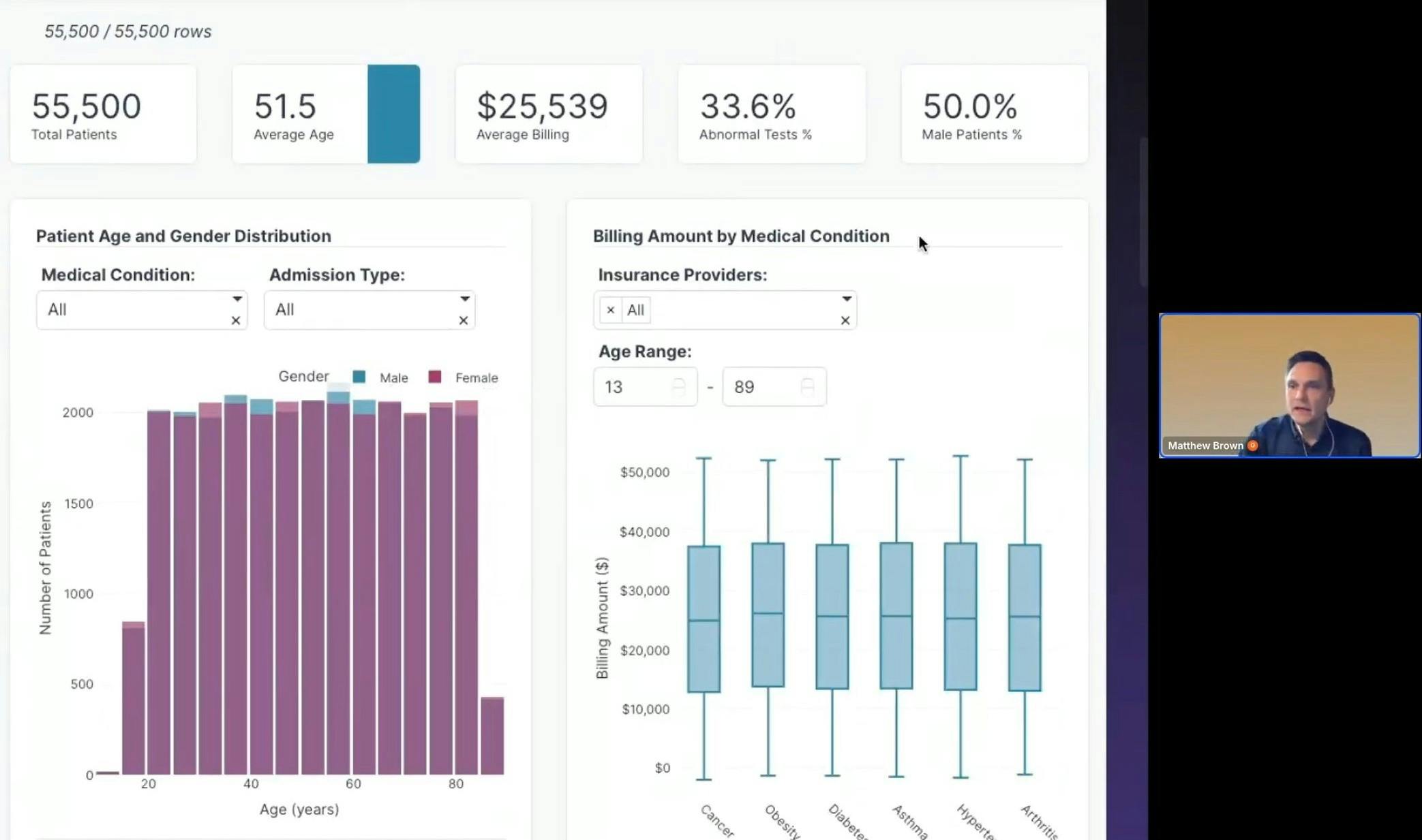
Our latest Plotly Studio webinar, “From Spreadsheet to Spectacular,” walked through how fast you can build interactive apps starting with just a dataset. This demo showed how Studio removes the usual friction of BI tools and frontend dev work.

Hosted by Chris Parmer, Plotly’s Chief Product Officer, and Matt Brown, Senior Product Manager, the session covered:
- How to go from pasted spreadsheet data to a working app in seconds
- What makes Plotly Studio different from traditional BI tools
- How prompting works step by step
- How to add interactivity like filters and sliders
- How to publish and share your app in one click
If you missed the live session, here are five standout moments that show what’s possible with agentic AI anaytics app generation in Plotly Studio.
1. You can build a working app in less than a minute from a spreadsheet
Check your desktop right now. Chances are, you have at least one spreadsheet file. Our session kicks off with a plain Excel file and Plotly Studio. We upload the entire sheet directly to Studio. That’s it. Studio auto detects the structure, including columns, types, and metrics, and drops the dataset into a clean table. From there, the first prompt generates a working bar chart. There’s no setup, no manual column mapping, and no syntax to learn.
2. Natural language prompts generate clean, structured visual logic
\When you ask for a chart, such as “show average sales by country as a bar chart,” Studio understands what that means. It aggregates correctly, formats currency, titles the axes, sorts the bars, and applies a color scheme. It also shows the full prompt output so you can see exactly how the logic was interpreted. This is not a search bar slapped on top of templates. It is an app builder that interprets your intent and makes structured updates.
3. Iterating with AI feels like building with a teammate
You can prompt Studio to make changes sentence by sentence. You can add each change, like new filters, different visual types, or layout options, as a new line in the same prompt. You are not wiping the slate clean with every request. This lets you think in steps: adjust a legend, add a dropdown, move a component. Studio applies each update on top of what you have already built. You are guiding the app’s growth without ever touching raw code.
4. You can design flexible UI components in plain language
The demo adds sliders, dropdowns, layout containers, and formatting rules with short prompts like “add a year slider” or “color the bars by category.” These are real, interactive controls. They are functional inputs that drive changes in the visual output. You see responsive behavior immediately without needing to wire up callbacks or conditionals. You are working at the level of user experience, not infrastructure.
5. Deploying to the cloud takes one click, not a DevOps process
What do you do once your app is ready? You publish it instantly to Plotly Cloud! The app gets a live URL with no export step or bundling process. In our demo, we showed the published, fully interactive, mobile friendly, and shareable app. For workflows that usually end in a screenshot or PDF, this is a full upgrade to interactive, live reporting. Imagine sending your boss a live data app on the web 😎 instead of a deck 😴.
Try Plotly Studio now
If you work with spreadsheets and want more than static charts or inflexible dashboards, this is the fastest way to level up. Our community at the event loved it:
"Power BI lacks power. Plotly & Python is POWERFUL!"
Missed the show? No worries, we got you covered. Replay here.
Better yet, jump in and try it for yourself. Go build that app!