

Parallel Coordinates Plot with Tabular Data
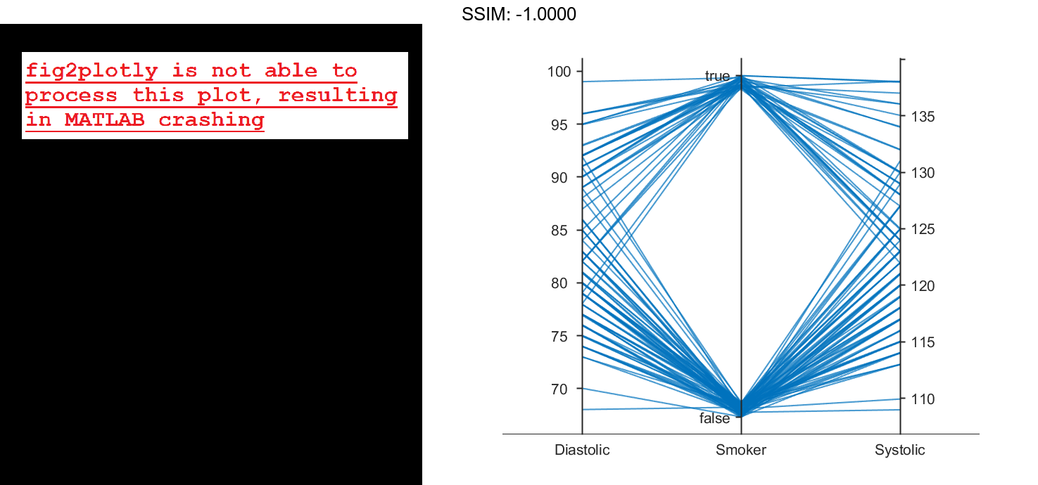
Create a parallel coordinates plot from a table of medical patient data.
Load the patients data set, and create a table from a subset of the variables loaded into the workspace. Create a parallel coordinates plot using the table. The lines in the plot correspond to individual patients. Use the plot to observe trends in the data. For example, the plot indicates that smokers tend to have higher blood pressure values (both diastolic and systolic).
load patients
tbl = table(Diastolic,Smoker,Systolic);
p = parallelplot(tbl)

fig2plotly()


p =
  ParallelCoordinatesPlot with properties:

            SourceTable: [100x3 table]
    CoordinateVariables: {'Diastolic'  'Smoker'  'Systolic'}
          GroupVariable: ''

  Show all properties
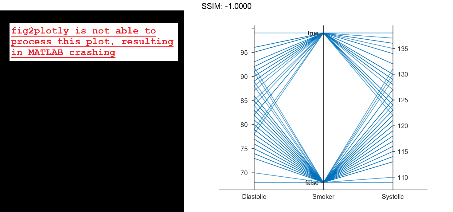
By default, the software randomly jitters plot lines so that they are unlikely to overlap perfectly along coordinate rulers. This jittering is particularly helpful for visualizing categorical data because it enables you to distinguish between plot lines more easily. For example, observe the plot lines along the Smoker coordinate ruler; the plot lines are not flush with either the true or false tick marks.
To disable the default jittering, set the Jitter property to 0.
p.Jitter = 0;

fig2plotly()

Specify Coordinate and Group Variables
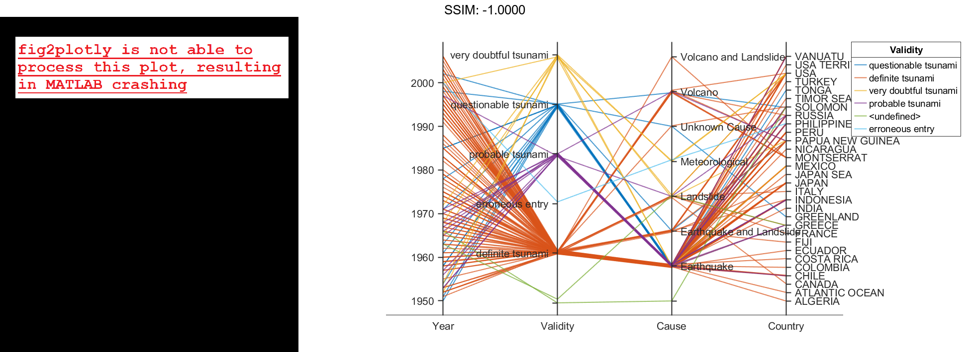
Create a parallel coordinates plot from a table of tsunami data. Specify the table variables to display and their order, and group the lines in the plot according to one of the variables.
Read the tsunami data into the workspace as a table.
tsunamis = readtable('tsunamis.xlsx');
Create a parallel coordinates plot using a subset of the variables in the table. First, increase the figure window size to prevent overcrowding in the plot. Then, to specify the variables and their order, use the 'CoordinateVariables' name-value pair argument. To group occurrences according to their validity, set the 'GroupVariable' name-value pair argument to 'Validity'. The lines in the plot correspond to individual tsunami occurrences. The plot indicates that most of the occurrences in the data set that have a Validity value are considered definite tsunamis.
figure('Units','normalized','Position',[0.3 0.3 0.45 0.4])
coordvars = {'Year','Validity','Cause','Country'};
p = parallelplot(tsunamis,'CoordinateVariables',coordvars,'GroupVariable','Validity');

fig2plotly()

Parallel Coordinates Plot with Binned Data
Create a parallel coordinates plot from a matrix containing medical patient data. Bin the values in one of the columns in the matrix, and group the lines in the plot using the binned values.
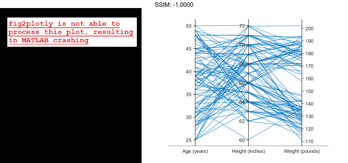
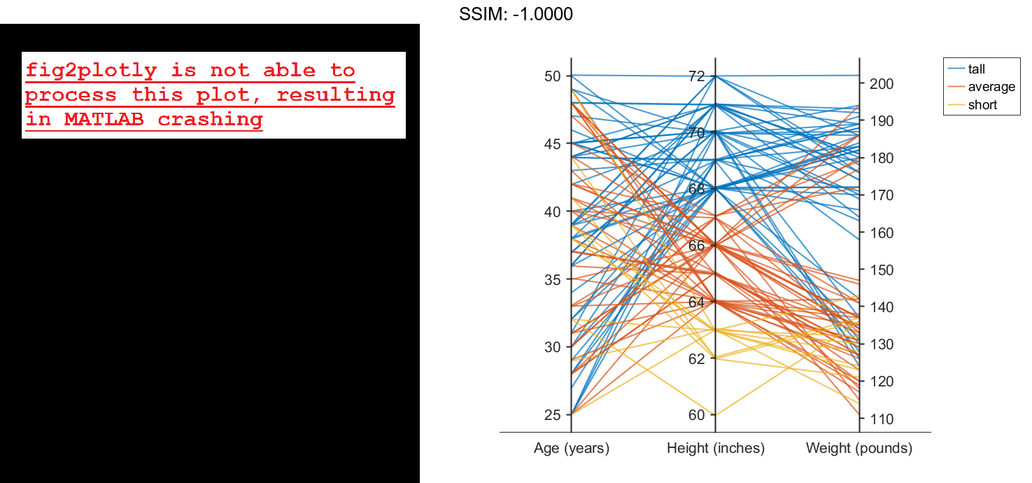
Load the patients data set, and create a matrix from the Age, Height, and Weight values. Create a parallel coordinates plot using the matrix data. Label the coordinate variables in the plot. The lines in the plot correspond to individual patients.
load patients
X = [Age Height Weight];
p = parallelplot(X)

fig2plotly()
p =
  ParallelCoordinatesPlot with properties:

              Data: [100x3 double]
    CoordinateData: [1 2 3]
         GroupData: []

  Show all properties
p.CoordinateTickLabels = {'Age (years)','Height (inches)','Weight (pounds)'};

fig2plotly()

Create a new categorical variable that groups each patient into one of three categories: short, average, or tall. Set the bin edges such that they include the minimum and maximum Height values.
min(Height)
ans = 60
max(Height)
ans = 72
binEdges = [60 64 68 72];
bins = {'short','average','tall'};
groupHeight = discretize(Height,binEdges,'categorical',bins);

fig2plotly()
Now use the groupHeight values to group the lines in the parallel coordinates plot. The plot indicates that short patients tend to weigh less than tall patients.
p.GroupData = groupHeight;

fig2plotly()

Specify Coordinate and Group Data
Create parallel coordinates plots from a matrix containing medical patient data. For each plot, specify the columns of the matrix to display, and group the lines in the plot according to a separate variable.
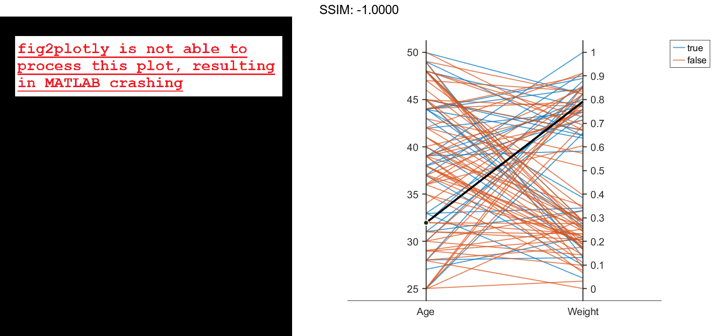
Load the patients data set, and create a matrix from some of the variables loaded into the workspace.
load patients
X = [Age Height Weight];
Create a parallel coordinates plot using a subset of the columns in the matrix X. To specify the columns and their order, use the 'CoordinateData' name-value pair argument. Group patients according to their smoker status by passing the Smoker values to the 'GroupData' name-value pair argument. The lines in the plot correspond to individual patients. The plot indicates that no clear relationship exists between smoker status and either age or weight.
coorddata = [1 3];
p = parallelplot(X,'CoordinateData',coorddata,'GroupData',Smoker)
p =
  ParallelCoordinatesPlot with properties:

              Data: [100x3 double]
    CoordinateData: [1 3]
         GroupData: [100x1 logical]

  Show all properties
p.CoordinateTickLabels = {'Age','Weight'};

fig2plotly()

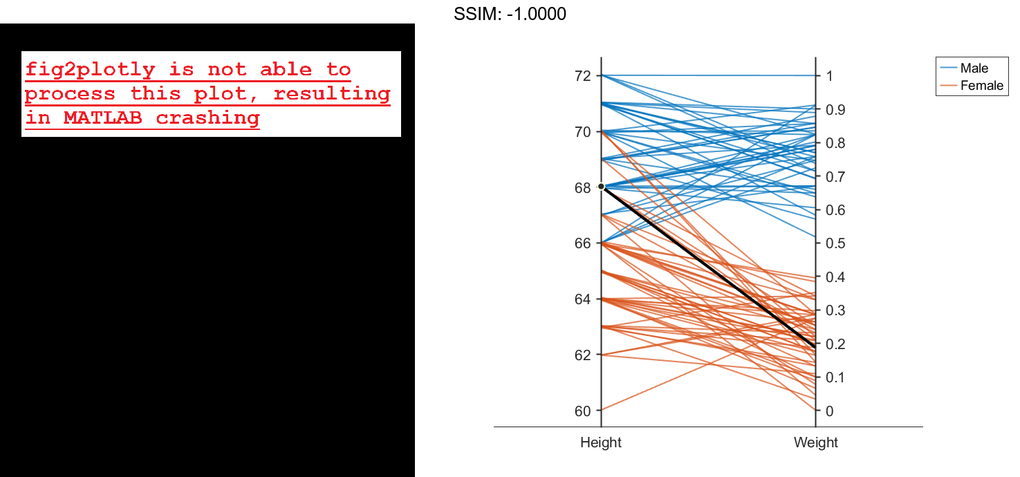
Create another parallel coordinates plot using a different subset of the columns in X. Group the patients according to their gender. The plot indicates that the men are taller and weigh more than the women.
coorddata2 = [2 3];
p2 = parallelplot(X,'CoordinateData',coorddata2,'GroupData',Gender)
p2 =
  ParallelCoordinatesPlot with properties:

              Data: [100x3 double]
    CoordinateData: [2 3]
         GroupData: {100x1 cell}

  Show all properties
p2.CoordinateTickLabels = {'Height','Weight'};

fig2plotly()

Change Data Normalization in Plot
Create a parallel coordinates plot from a table of power outage data. Change the normalization method for the numeric coordinate variables.
Read the power outage data into the workspace as a table. Display the first few rows of the table.
outages = readtable('outages.csv');
head(outages)
ans=8×6 table
       Region           OutageTime        Loss     Customers     RestorationTime            Cause
    _____________    ________________    ______    __________    ________________    ___________________

    {'SouthWest'}    2002-02-01 12:18    458.98    1.8202e+06    2002-02-07 16:50    {'winter storm'   }
    {'SouthEast'}    2003-01-23 00:49    530.14    2.1204e+05                 NaT    {'winter storm'   }
    {'SouthEast'}    2003-02-07 21:15     289.4    1.4294e+05    2003-02-17 08:14    {'winter storm'   }
    {'West'     }    2004-04-06 05:44    434.81    3.4037e+05    2004-04-06 06:10    {'equipment fault'}
    {'MidWest'  }    2002-03-16 06:18    186.44    2.1275e+05    2002-03-18 23:23    {'severe storm'   }
    {'West'     }    2003-06-18 02:49         0             0    2003-06-18 10:54    {'attack'         }
    {'West'     }    2004-06-20 14:39    231.29           NaN    2004-06-20 19:16    {'equipment fault'}
    {'West'     }    2002-06-06 19:28    311.86           NaN    2002-06-07 00:51    {'equipment fault'}
Create a new variable called OutageDuration that indicates how long each power outage lasted. Convert OutageDuration to the number of days each power outage lasted. Add the new variable to the outages table, and call it OutageDays.
OutageDuration = outages.RestorationTime - outages.OutageTime;
outages.OutageDays = days(OutageDuration);
Create a parallel coordinates plot using the Loss, Customers, and OutageDays variables. Because the coordinate variables are numeric, display the values in the plot as z-scores, without any jittering, using the 'DataNormalization' and 'Jitter' name-value pair arguments.
coordvars = {'Loss','Customers','OutageDays'};
p = parallelplot(outages,'CoordinateVariables',coordvars,'DataNormalization','zscore','Jitter',0);

fig2plotly()
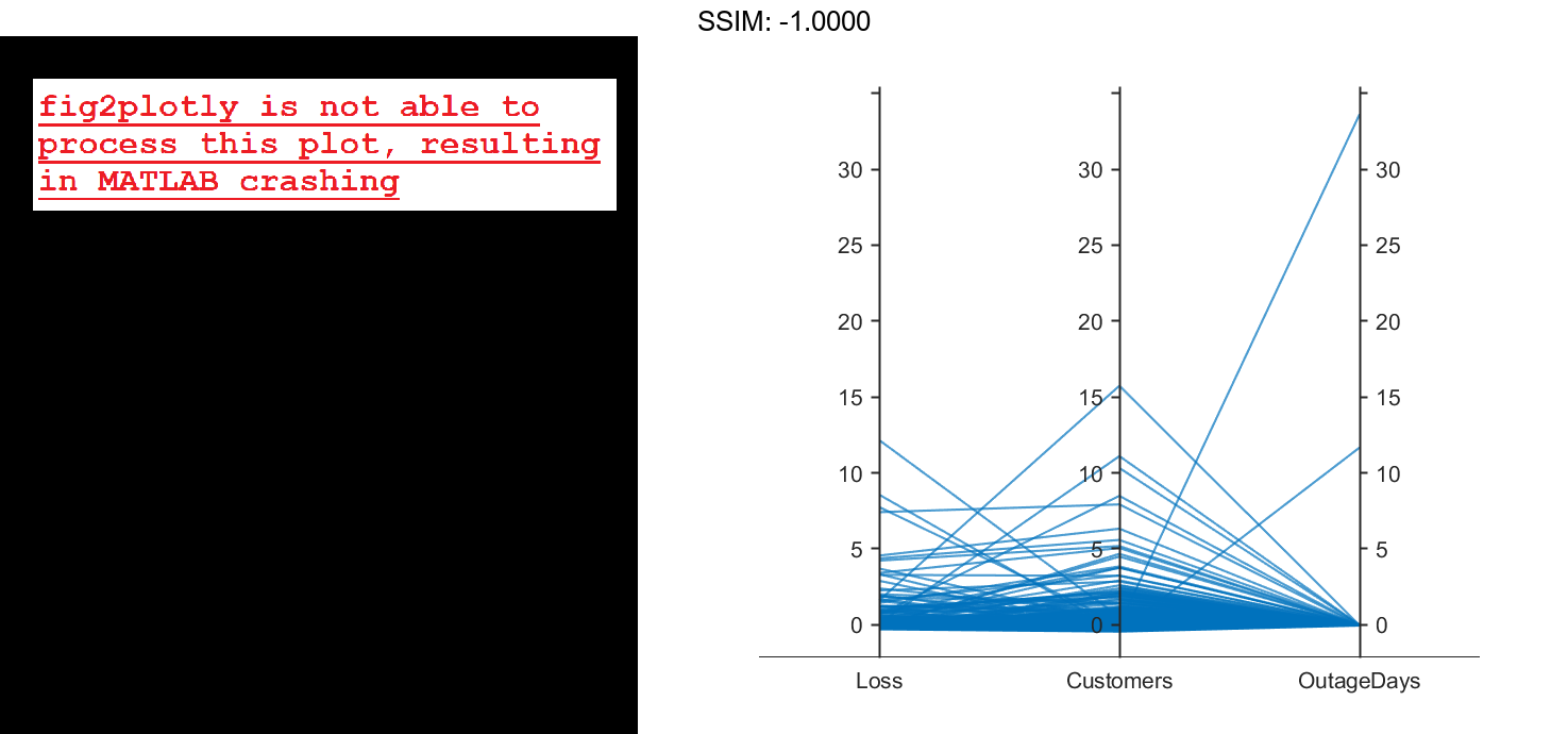

The OutageDays variable contains one value that is more than 30 standard deviations away from the mean OutageDays value and another value that is more than 10 standard deviations away from the mean. Hover over the values in the plot to display data tips. Each data tip indicates the row in the table corresponding to the line in the plot.
Find the rows in the outages table that have the identified extreme OutageDays values. Notice that the RestorationTime values for these two power outages are suspicious.
outliers = outages([1011 269],:)
outliers=2×7 table
       Region           OutageTime        Loss     Customers     RestorationTime            Cause            OutageDays
    _____________    ________________    ______    __________    ________________    ____________________    __________

    {'NorthEast'}    2009-08-20 02:46       NaN    1.7355e+05    2042-09-18 23:31    {'severe storm'    }       12083
    {'MidWest'  }    2008-02-07 06:18    2378.7             0    2019-08-14 16:16    {'energy emergency'}      4206.4
Reorder Categories of Coordinate Variable in Plot
Create a parallel coordinates plot. Reorder the categories of one of the coordinate variables.
Read data on power outages into the workspace as a table.
outages = readtable('outages.csv');
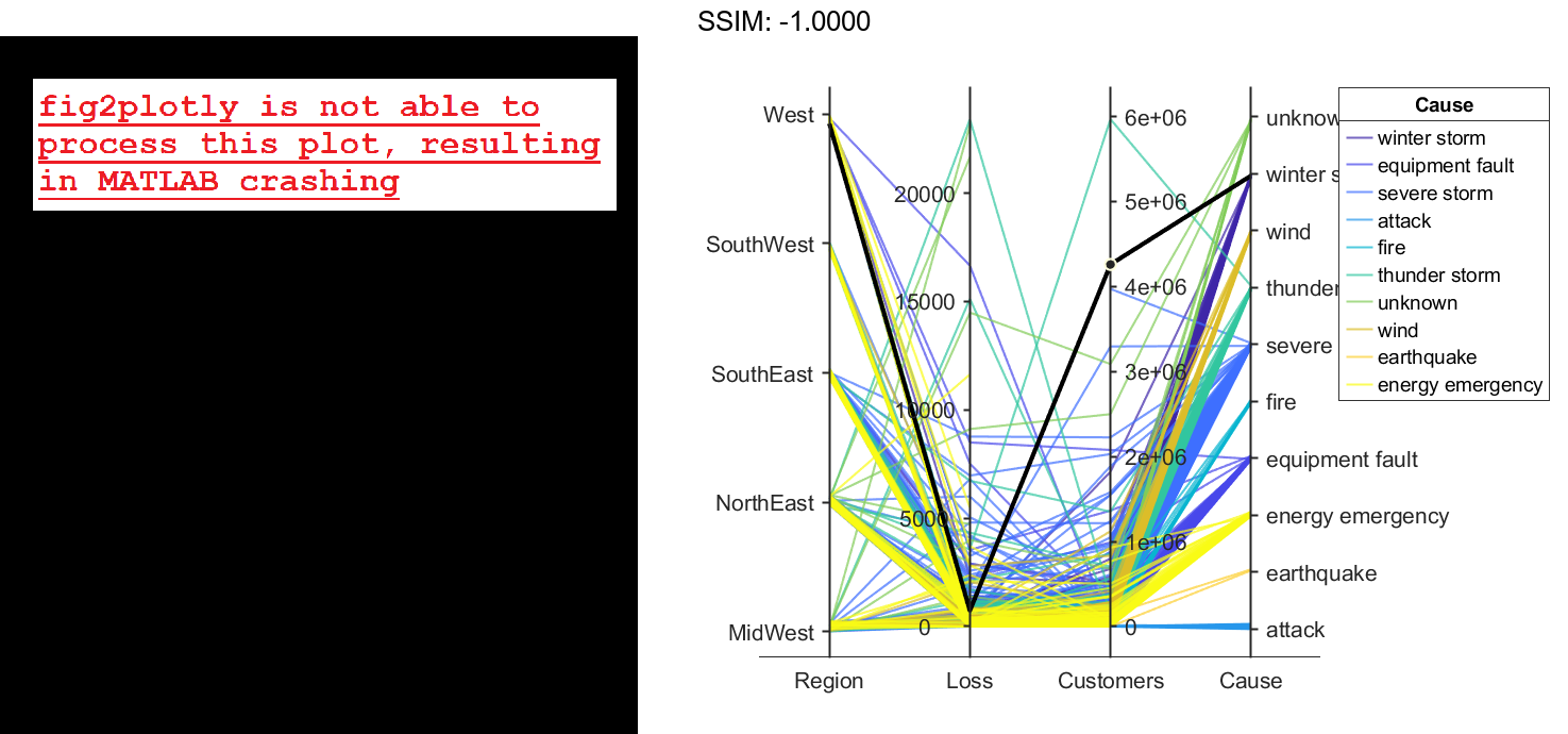
Create a parallel coordinates plot using a subset of the columns in the table. Group the lines in the plot according to the event that caused the power outage.
coordvars = [1 3 4 6];
p = parallelplot(outages,'CoordinateVariables',coordvars,'GroupVariable','Cause');

fig2plotly()
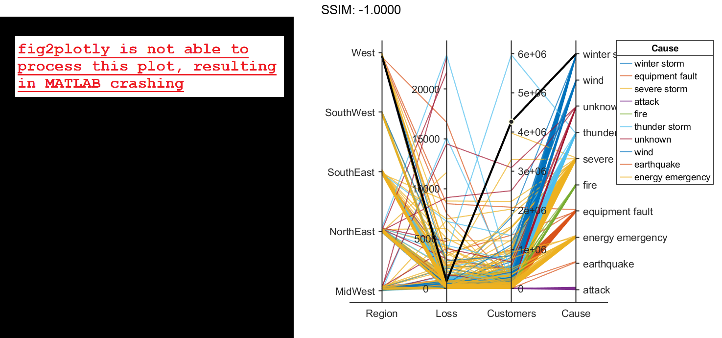

Change the order of the events in Cause by updating the source table. First, convert Cause to a categorical variable, specify the new order of the events, and use the reordercats function to create a new variable called orderCause. Then, replace the original Cause variable with the new orderCause variable in the source table of the plot.
categoricalCause = categorical(p.SourceTable.Cause);
newOrder = {'attack','earthquake','energy emergency','equipment fault', ...
    'fire','severe storm','thunder storm','wind','winter storm','unknown'};
orderCause = reordercats(categoricalCause,newOrder);
p.SourceTable.Cause = orderCause;

fig2plotly()


Because the Cause variable contains more than seven categories, some of the groups have the same color in the plot. Assign distinct colors to every group by changing the Color property of p.
p.Color = parula(10);

fig2plotly()

Parallel Coordinates Plot for Grouped Data
Load the Fisher iris sample data.
load fisheriris
The data contains four measurements (sepal length, sepal width, petal length, and petal width) from three species of iris flowers. The matrix meas contains all four measurements for each of 150 flowers. The cell array species contains the species name for each of the 150 flowers.
Create a cell array that contains the name of each measurement variable in the sample data.
labels = {'Sepal Length','Sepal Width','Petal Length','Petal Width'};
Create a parallel coordinate plot using the measurement data in meas. Use a different color for each group as identified in species, and label the horizontal axis using the variable names.
parallelcoords(meas,'Group',species,'Labels',labels)

fig2plotly()
The resulting plot contains one line for each observation (flower). The color of each line indicates the flower species.
Parallel Coordinates Plot with Quantile Values
Load the Fisher iris sample data.
load fisheriris
The data contains four measurements (sepal length, sepal width, petal length, and petal width) from three species of iris flowers. The matrix meas contains all four measurements for each of 150 flowers. The cell array species contains the species name for each of the 150 flowers.
Create a cell array that contains the name of each measurement variable in the sample data.
labels = {'Sepal Length','Sepal Width','Petal Length','Petal Width'};
Create a parallel coordinates plot using the measurement data in meas. Plot only the median, 25 percent, and 75 percent quartile values for each group identified in species. Label the horizontal axis using the variable names.
parallelcoords(meas,'group',species,'labels',labels,...
               'quantile',.25)

fig2plotly()
The plot shows the median values for each group as a solid line and the quartile values as dotted lines of the same color. For example, the solid blue line shows the median value measured for each variable on setosa irises. The dotted blue line below the solid blue line shows the 25th percentile of measurements for each variable on setosa irises. The dotted blue line above the solid blue line shows the 75th percentile of measurements for each variable on setosa irises.
Adjust Line Properties in Parallel Coordinates Plot
Load the Fisher iris sample data.
load fisheriris
The data contains four measurements (sepal length, sepal width, petal length, and petal width) from three species of iris flowers. The matrix meas contains all four measurements for each of 150 flowers. The cell array species contains the species name for each of the 150 flowers.
Create a cell array that contains the name of each measurement variable in the sample data.
labels = {'Sepal Length','Sepal Width','Petal Length','Petal Width'};
Create a parallel coordinates plot using the measurement data in meas. Plot only the median, 25 percent, and 75 percent quartile values for each group identified in species. Label the horizontal axis using the variable names. Set the line width to 2.
parallelcoords(meas,'group',species,'labels',labels,...
               'quantile',.25,'LineWidth',2)

fig2plotly()
Specifying 'LineWidth' in this way sets the width of every line in the plot to 2.
Recreate the parallel coordinates plot, but this time, use handles to increase the width of only the line representing the median value for each measurement made on irises in the setosa group.
h = parallelcoords(meas,'group',species,'labels',labels,...
               'quantile',.25)

fig2plotly()
h =
  9x1 Line array:

  Line    (median)
  Line    (lower quantile)
  Line    (upper quantile)
  Line    (median)
  Line    (lower quantile)
  Line    (upper quantile)
  Line    (median)
  Line    (lower quantile)
  Line    (upper quantile)
The returned column vector h contains handles that correspond to each line object created by parallelcoords. For example, h(1) corresponds to the median line for the first grouping variable (setosa).
Use dot notation to increase the width of the line showing the median value for each measurement made on irises in the setosa group.
h(1).LineWidth = 2;

fig2plotly()