Mathematical Expressions and Functions Plots in MATLAB®
How to make Mathematical Expressions and Functions Plots in MATLAB® with Plotly.
Plot Expression
Plot sin(x) over the default x interval [-5 5].
fplot(@(x) sin(x))

fig2plotly()


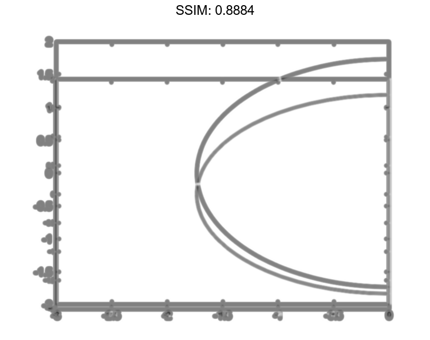
Plot Parametric Curve
Plot the parametric curve x=cos(3t) and y=sin(2t).
xt = @(t) cos(3*t);
yt = @(t) sin(2*t);
fplot(xt,yt)

fig2plotly()


Specify Plotting Interval and Plot Piecewise Functions
Plot the piecewise function
ex   -3 < x < 0
cos(x)  0 < x < 3.
Plot multiple lines using hold on. Specify the plotting intervals using the second input argument of fplot. Specify the color of the plotted lines as blue using 'b'. When you plot multiple lines in the same axes, the axis limits adjust to incorporate all the data.
fplot(@(x) exp(x),[-3 0],'b')
hold on
fplot(@(x) cos(x),[0 3],'b')
hold off
grid on

fig2plotly()


Specify Line Properties and Display Markers
Plot three sine waves with different phases. For the first, use a line width of 2 points. For the second, specify a dashed red line style with circle markers. For the third, specify a cyan, dash-dotted line style with asterisk markers.
fplot(@(x) sin(x+pi/5),'Linewidth',2);
hold on
fplot(@(x) sin(x-pi/5),'--or');
fplot(@(x) sin(x),'-.*c')
hold off

fig2plotly()


Modify Line Properties After Creation
Plot sin(x) and assign the function line object to a variable.
fp = fplot(@(x) sin(x))

fig2plotly()


fp =
  FunctionLine with properties:

     Function: @(x)sin(x)
        Color: [0 0.4470 0.7410]
    LineStyle: '-'
    LineWidth: 0.5000

  Show all properties
Change the line to a dotted red line by using dot notation to set properties. Add cross markers and set the marker color to blue.
fp.LineStyle = ':';
fp.Color = 'r';
fp.Marker = 'x';
fp.MarkerEdgeColor = 'b';

fig2plotly()


Plot Multiple Lines in Same Axes
Plot two lines using hold on.
fplot(@(x) sin(x))
hold on
fplot(@(x) cos(x))
hold off

fig2plotly()


Add Title and Axis Labels and Format Ticks
Plot sin(x) from -2π to 2π using a function handle. Display the grid lines. Then, add a title and label the x-axis and y-axis.
fplot(@sin,[-2*pi 2*pi])
grid on
title('sin(x) from -2\pi to 2\pi')
xlabel('x');
ylabel('y');

fig2plotly()


Use gca to access the current axes object. Display tick marks along the x-axis at intervals of π/2. Format the x-axis tick values by setting the XTick and XTickLabel properties of the axes object. Similar properties exist for the y-axis.
ax = gca;
ax.XTick = -2*pi:pi/2:2*pi;
ax.XTickLabel = {'-2\pi','-3\pi/2','-\pi','-\pi/2','0','\pi/2','\pi','3\pi/2','2\pi'};

fig2plotly()


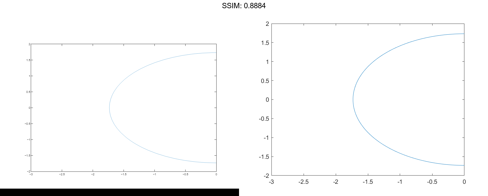
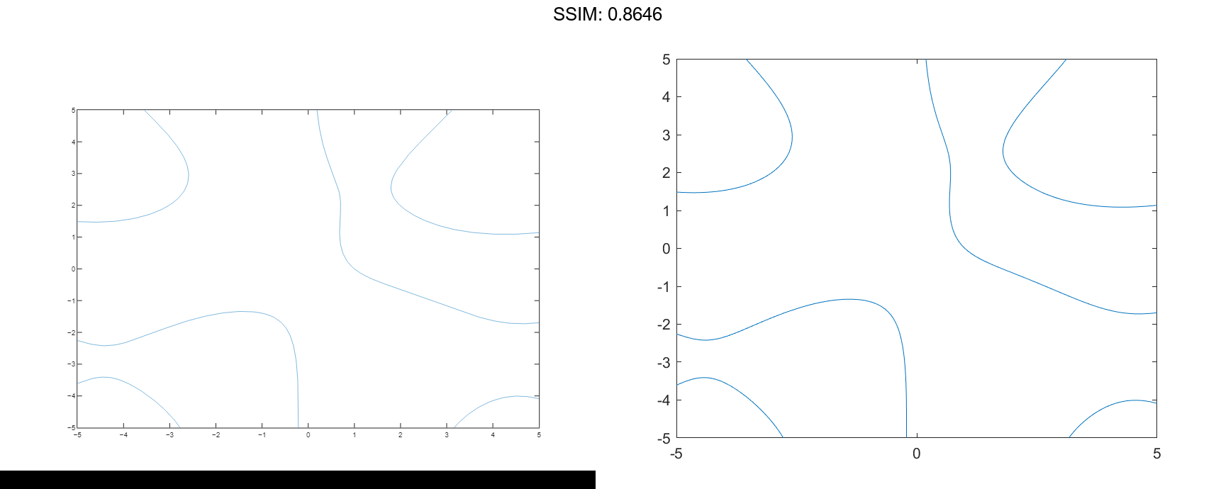
Plot Implicit Function
Plot the hyperbola described by the function x2-y2-1=0 over the default interval of [-5 5] for x and y.
fimplicit(@(x,y) x.^2 - y.^2 - 1)

fig2plotly()

Specify Plotting Interval
Plot the function x2+y2-3=0 over the intervals [-3 0] for x and [-2 2] for y.
f = @(x,y) x.^2 + y.^2 - 3;
fimplicit(f,[-3 0 -2 2])

fig2plotly()
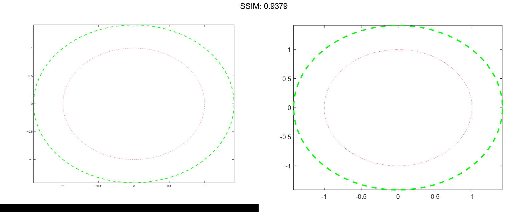
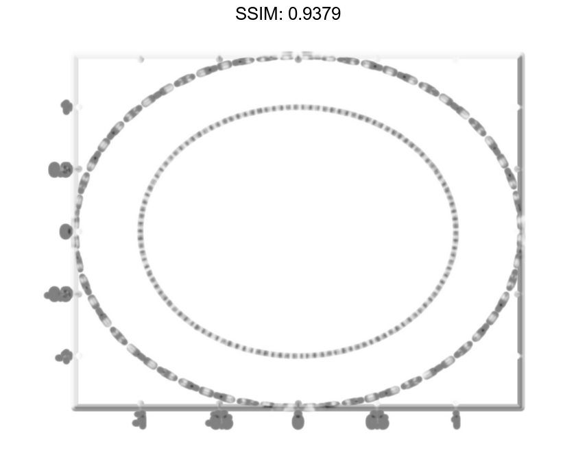
Modify Appearance of Implicit Plot
Plot two circles centered at (0,0) with different radius values. For the first circle, use a dotted, red line. For the second circle, use a dashed, green line with a line width of 2 points.
f1 = @(x,y) x.^2 + y.^2 - 1;
fimplicit(f1,':r')

hold on
f2 = @(x,y) x.^2 + y.^2 - 2;
fimplicit(f2,'--g','LineWidth',2)
hold off

fig2plotly()
Modify Implicit Plot After Creation
Plot the implicit function ysin(x)+xcos(y)-1=0 and assign the implicit function line object to the variable fp.
fp = fimplicit(@(x,y) y.*sin(x) + x.*cos(y) - 1)

fig2plotly()

fp =
  ImplicitFunctionLine with properties:

     Function: @(x,y)y.*sin(x)+x.*cos(y)-1
        Color: [0 0.4470 0.7410]
    LineStyle: '-'
    LineWidth: 0.5000

  Show all properties
Use fp to access and modify properties of the implicit function line object after it is created. For example, change the color, line style, and line width.
fp.Color = 'r';
fp.LineStyle = '--';
fp.LineWidth = 2;

fig2plotly()

Plot Contours of Function
Plot the contours of f(x,y)=sin(x)+cos(y) over the default interval of -5 < x < 5 and -5 < y < 5.
f = @(x,y) sin(x) + cos(y);
fcontour(f)

fig2plotly()
Specify Plotting Interval and Plot Piecewise Contour Plot
Specify the plotting interval as the second argument of fcontour. When you plot multiple inputs over different intervals in the same axes, the axis limits adjust to display all the data. This behavior lets you plot piecewise inputs.
Plot the piecewise input
erf(x)+cos(y)   -5 < x < 0
sin(x)+cos(y)   0 < x < 5
over -5 < y < 5.
fcontour(@(x,y) erf(x) + cos(y),[-5 0 -5 5])
hold on
fcontour(@(x,y) sin(x) + cos(y),[0 5 -5 5])
hold off
grid on

fig2plotly()
Change Line Style and Width
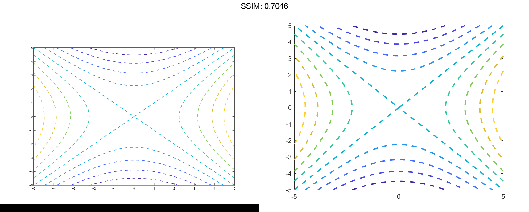
Plot the contours of x2-y2 as dashed lines with a line width of 2.
f = @(x,y) x.^2 - y.^2;
fcontour(f,'--','LineWidth',2)

fig2plotly()
Plot Multiple Contour Plots
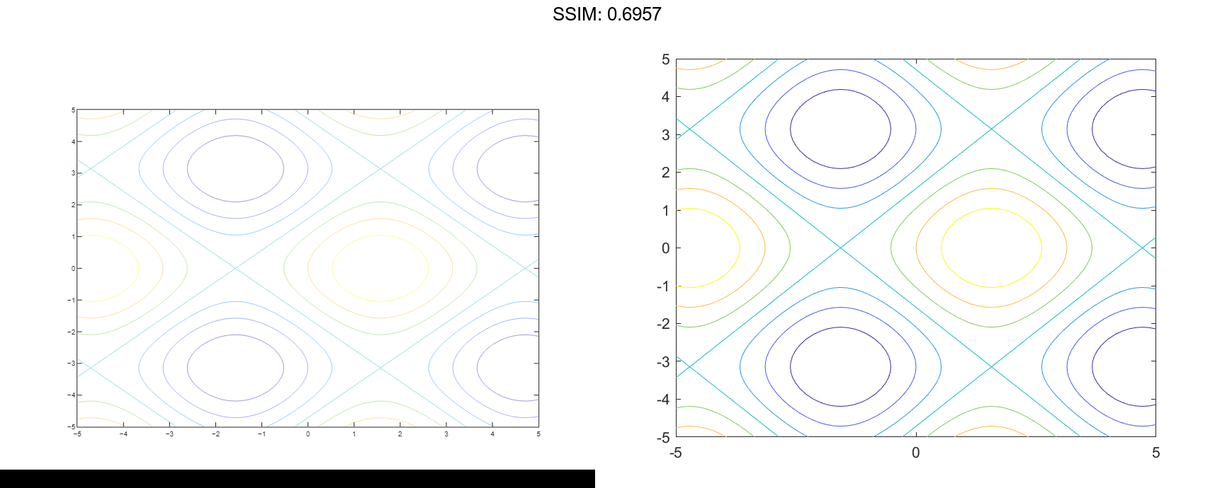
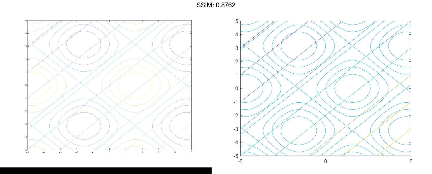
Plot sin(x)+cos(y) and x-y on the same axes by using hold on.
fcontour(@(x,y) sin(x)+cos(y))
hold on
fcontour(@(x,y) x-y)
hold off

fig2plotly()
Modify Contour Plot After Creation
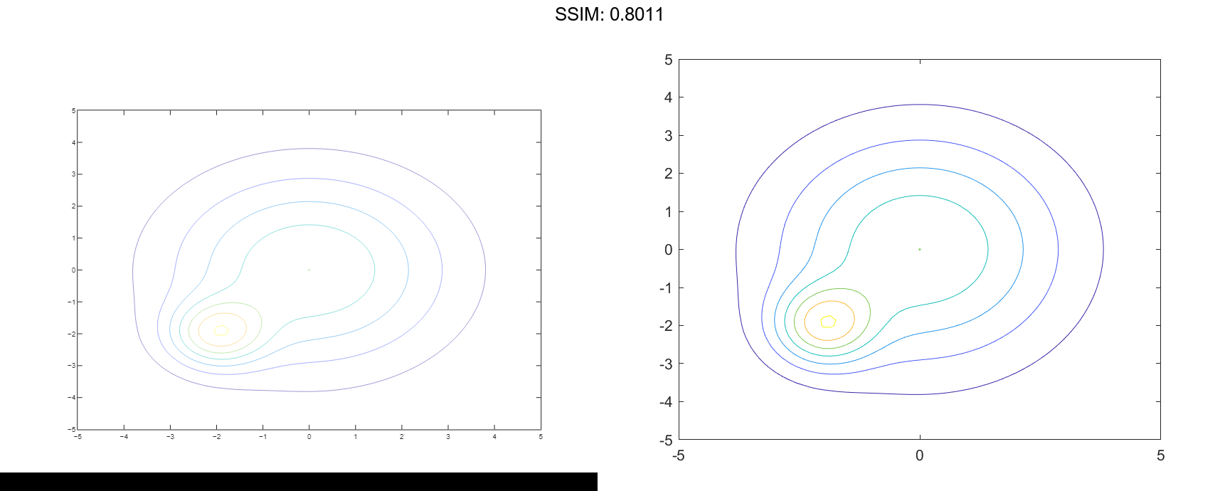
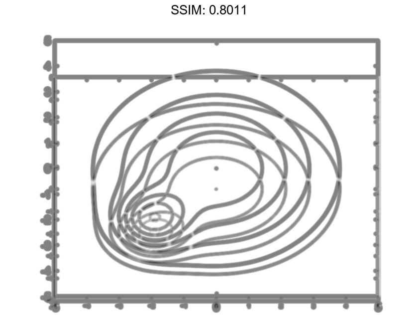
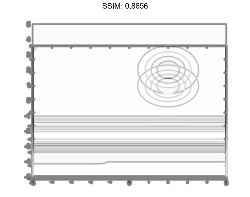
Plot the contours of e-(x/3)2-(y/3)2+e-(x+2)2-(y+2)2. Assign the function contour object to a variable.
f = @(x,y) exp(-(x/3).^2-(y/3).^2) + exp(-(x+2).^2-(y+2).^2);
fc = fcontour(f)

fig2plotly()
fc =
  FunctionContour with properties:

     Function: @(x,y)exp(-(x/3).^2-(y/3).^2)+exp(-(x+2).^2-(y+2).^2)
    LineColor: 'flat'
    LineStyle: '-'
    LineWidth: 0.5000
         Fill: off
    LevelList: [0.2000 0.4000 0.6000 0.8000 1 1.2000 1.4000]

  Show all properties
Change the line width to 1 and the line style to a dashed line by using dot notation to set properties of the function contour object. Show contours close to 0 and 1 by setting the LevelList property. Add a colorbar.
fc.LineWidth = 1;
fc.LineStyle = '--';
fc.LevelList = [1 0.9 0.8 0.2 0.1];
colorbar

fig2plotly()
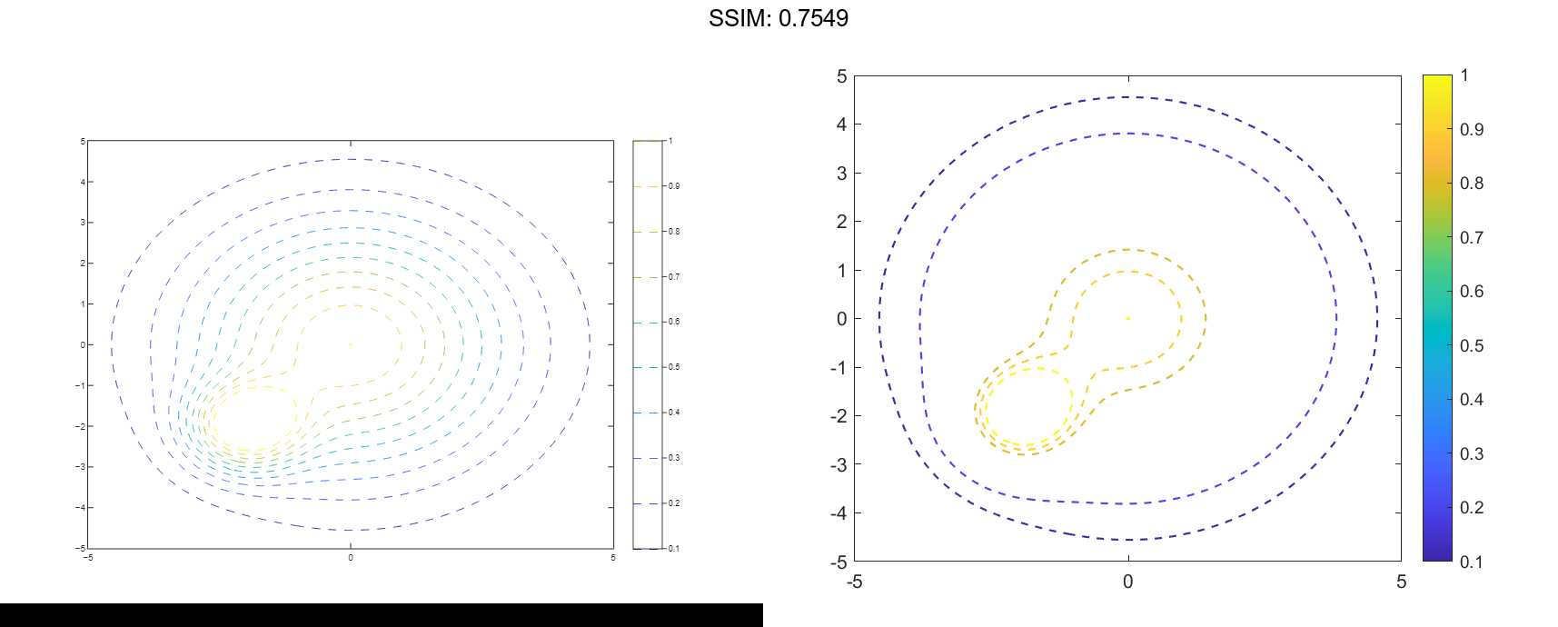
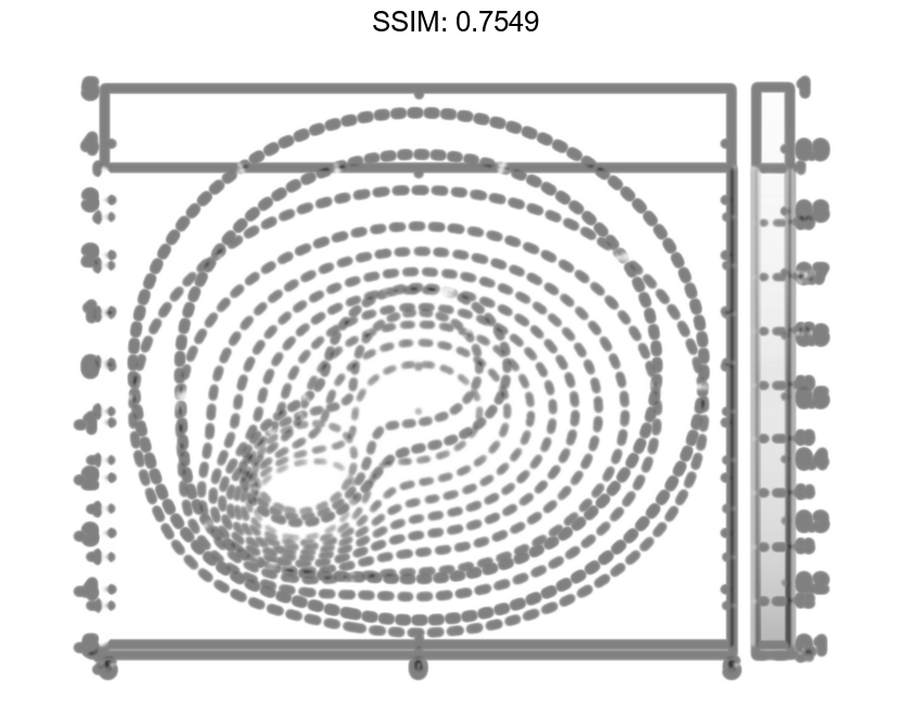
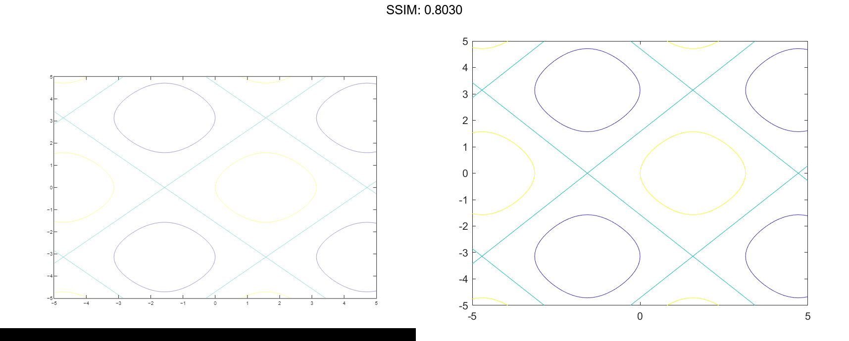
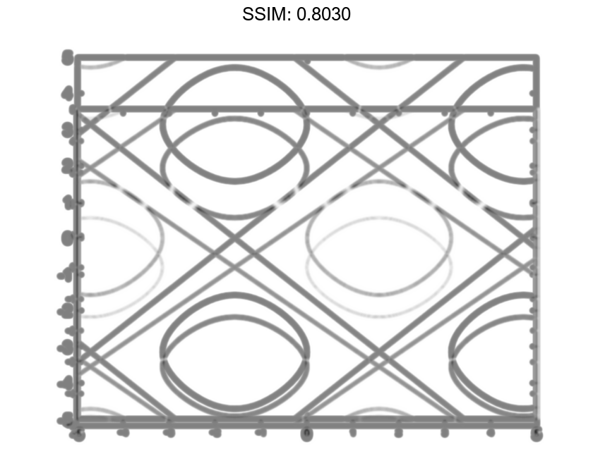
Fill Area Between Contours
Create a plot that looks like a sunset by filling the area between the contours of
f = @(x,y) erf((y+2).^3) - exp(-0.65*((x-2).^2+(y-2).^2));
fcontour(f,'Fill','on');

fig2plotly()
If you want interpolated shading instead, use the fsurf function and set its 'EdgeColor' option to 'none' followed by the command view(0,90).
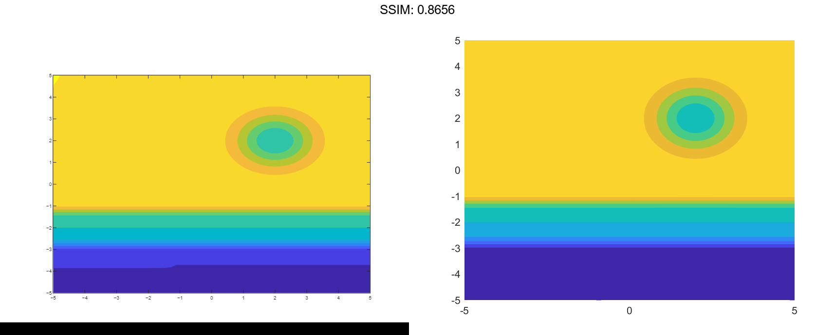
Specify Levels for Contour Lines
Set the values at which fcontour draws contours by using the 'LevelList' option.
f = @(x,y) sin(x) + cos(y);
fcontour(f,'LevelList',[-1 0 1])

fig2plotly()
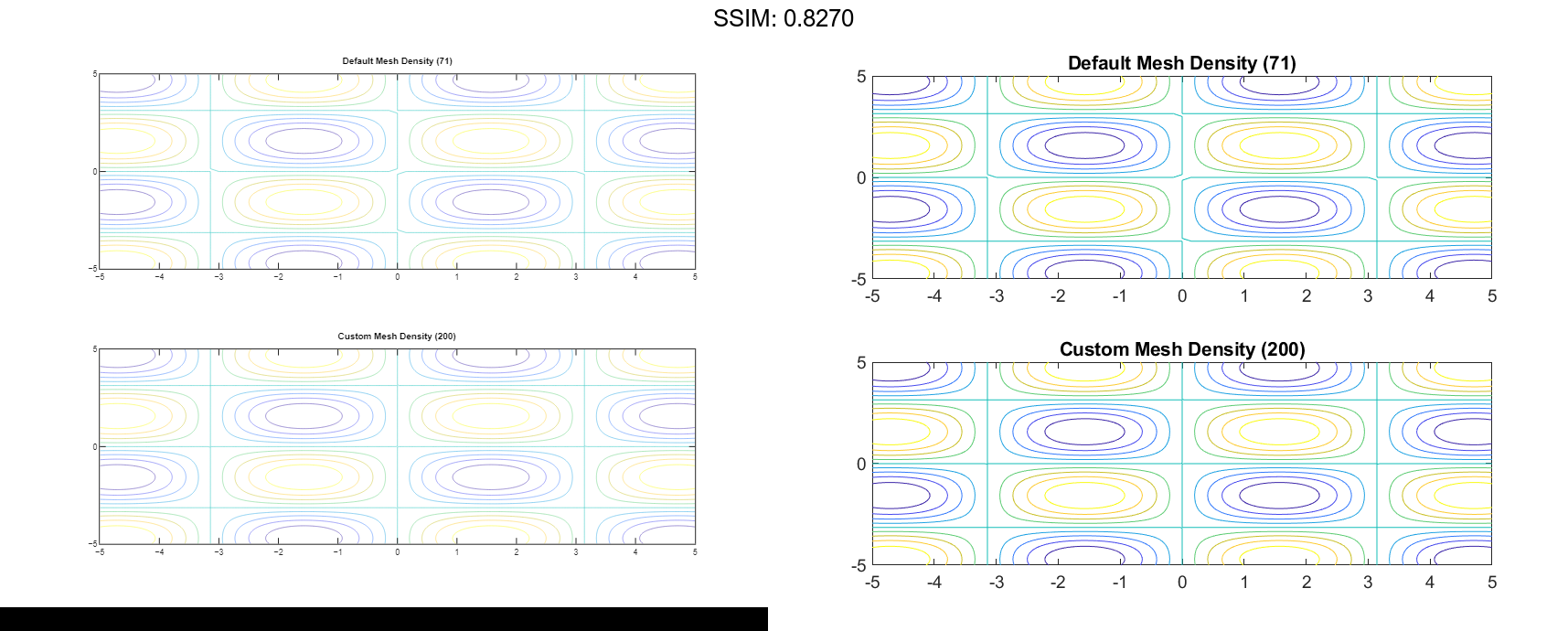
Control Resolution of Contour Lines
Control the resolution of contour lines by using the 'MeshDensity' option. Increasing 'MeshDensity' can make smoother, more accurate plots, while decreasing it can increase plotting speed.
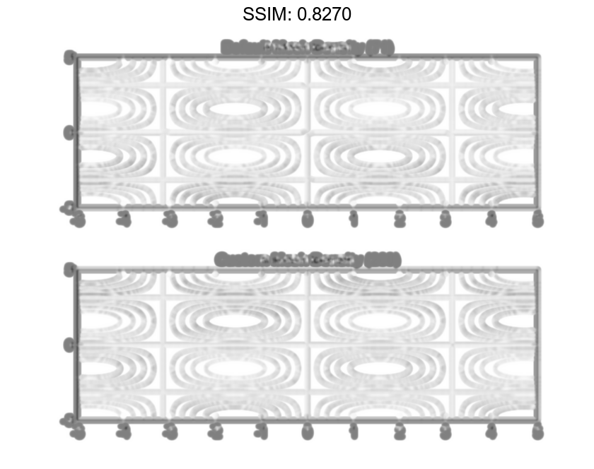
Create two plots in a 2-by-1 tiled chart layout. In the first plot, display the contours of sin(x)sin(y). The corners of the squares do not meet. To fix this issue, increase 'MeshDensity' to 200 in the second plot. The corners now meet, showing that by increasing 'MeshDensity' you increase the resolution.
f = @(x,y) sin(x).*sin(y);
tiledlayout(2,1)
nexttile
fcontour(f)
title('Default Mesh Density (71)')

nexttile
fcontour(f,'MeshDensity',200)
title('Custom Mesh Density (200)')

fig2plotly()
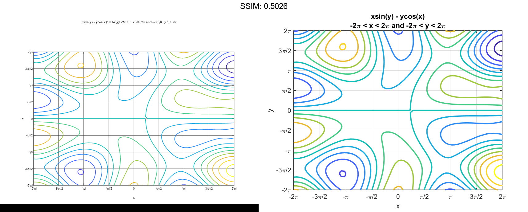
Add Title and Axis Labels and Format Ticks
Plot xsin(y)-ycos(x). Display the grid lines, add a title, and add axis labels.
fcontour(@(x,y) x.*sin(y) - y.*cos(x), [-2*pi 2*pi], 'LineWidth', 2);
grid on
title({'xsin(y) - ycos(x)','-2\pi < x < 2\pi and -2\pi < y < 2\pi'})
xlabel('x')
ylabel('y')

fig2plotly()
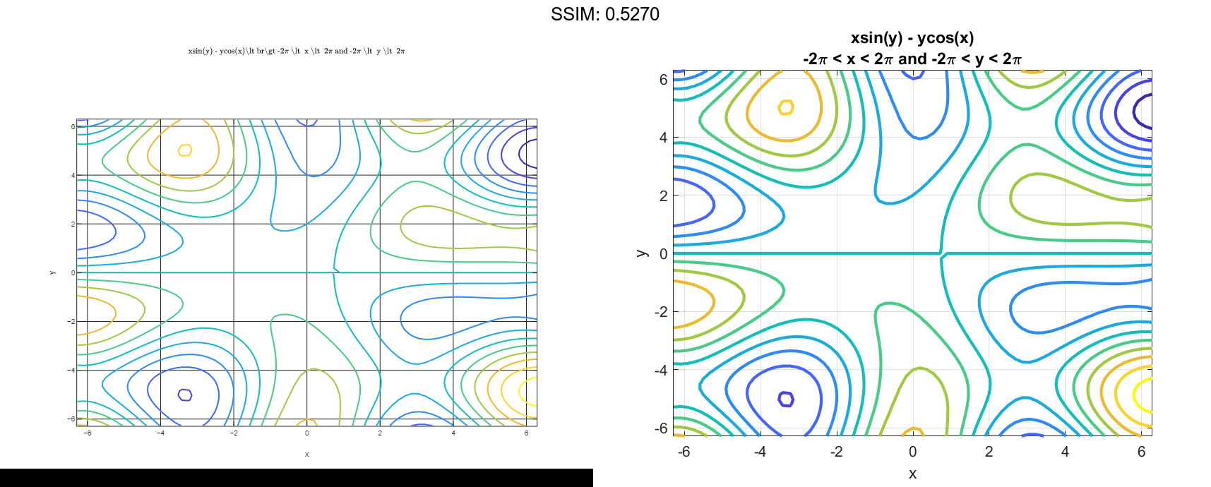
Set the x-axis tick values and associated labels by setting the XTickLabel and XTick properties of the axes object. Access the axes object using gca. Similarly, set the y-axis tick values and associated labels.
ax = gca;
ax.XTick = ax.XLim(1):pi/2:ax.XLim(2);
ax.XTickLabel = {'-2\pi','-3\pi/2','-\pi','-\pi/2','0','\pi/2','\pi','3\pi/2','2\pi'};
ax.YTick = ax.YLim(1):pi/2:ax.YLim(2);
ax.YTickLabel = {'-2\pi','-3\pi/2','-\pi','-\pi/2','0','\pi/2','\pi','3\pi/2','2\pi'};

fig2plotly()