Create Bubble Cloud with Table Data
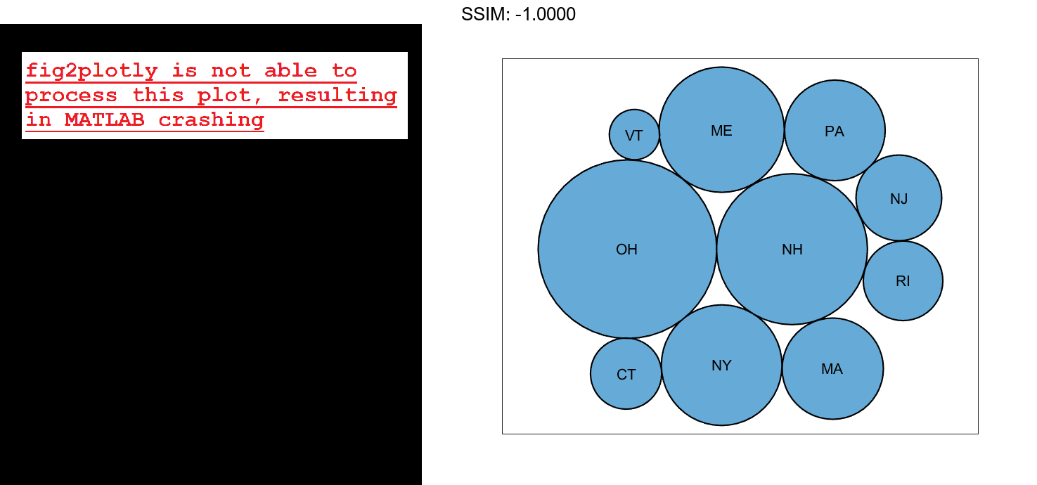
Create a table with three variables. For example, create a table that shows the number of mislabeled Halloween costumes in 10 states. Of the 10,000 princess kits sold, 1,000 had spooky monster labels by mistake.
n = [58 115 81 252 180 124 40 80 50 20]';
loc = ["NJ" "NY" "MA" "OH" "NH" "ME" "CT" "PA" "RI" "VT"]';
plant = ["Plant A" "Plant A" "Plant A" "Plant A" ...
       "Plant A" "Plant A" "Plant A" "Plant B" "Plant B" "Plant B"]';
tbl = table(n,loc,plant,'VariableNames',["Mislabeled" "State" "Manufacturing Plant"])

fig2plotly()
tbl=10×3 table
    Mislabeled    State    Manufacturing Plant
    __________    _____    ___________________

        58        "NJ"          "Plant A"
       115        "NY"          "Plant A"
        81        "MA"          "Plant A"
       252        "OH"          "Plant A"
       180        "NH"          "Plant A"
       124        "ME"          "Plant A"
        40        "CT"          "Plant A"
        80        "PA"          "Plant B"
        50        "RI"          "Plant B"
        20        "VT"          "Plant B"
Create a bubble cloud to visualize the mislabeled costumes by state.
bubblecloud(tbl,"Mislabeled","State")

fig2plotly()


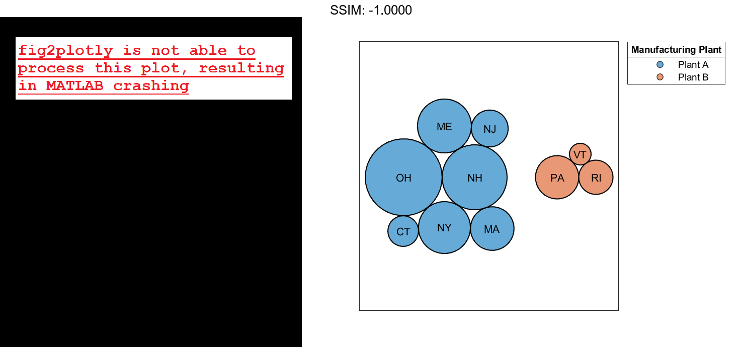
Divide the bubbles into groups by specifying the groupvar argument. In this case, the groups are in the variable called "Manufacturing Plant".
bubblecloud(tbl,"Mislabeled","State","Manufacturing Plant")

fig2plotly()

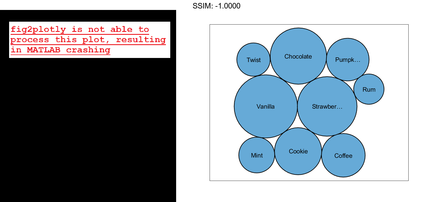
Create Bubble Cloud with Vector Data
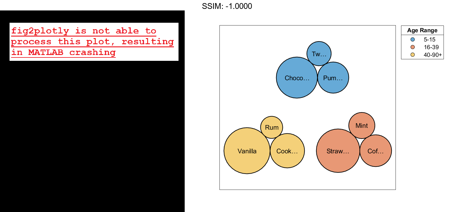
Define n as a vector of bubble sizes with the numbers from a survey of favorite ice cream flavors. Define flavs as a string vector containing the flavor names. Then create a bubble cloud that shows the distribution of favorite ice cream flavors.
n = [58 115 81 252 200 224 70 120 140];
flavs = ["Rum" "Pumpkin" "Mint" "Vanilla" "Chocolate" ...
    "Strawberry" "Twist" "Coffee" "Cookie"];
bubblecloud(n,flavs)

fig2plotly()

Define ages as a categorical vector containing the age group that prefers each flavor. Specify the order of the categories by calling the reordercats function. Then create a new bubble cloud with the bubbles grouped by age, and return the BubbleCloud object as b. When you specify group data, the chart displays a legend by default. Add a title to the legend by setting the LegendTitle property of b.
ages = categorical(["40-90+" "5-15" "16-39" "40-90+" ...
   "5-15" "16-39" "5-15" "16-39" "40-90+"]);
ages = reordercats(ages,["5-15" "16-39" "40-90+"] );
b = bubblecloud(n,flavs,ages);
b.LegendTitle = 'Age Range';

fig2plotly()

Customize Bubble Color
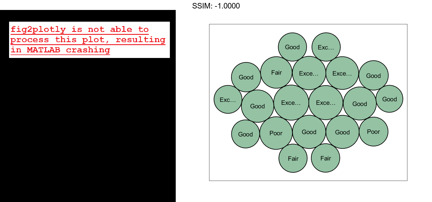
Load the patients data set, and create a bubble cloud of 20 patient weight measurements with the corresponding self-assessed health status values ('poor', 'fair', 'good', or 'excellent'). Customize the color of the bubbles by specifying the FaceColor name-value argument. Return the BubbleCloud object as b, so you can set properties on the object later.
load patients
b = bubblecloud(Weight(1:20),SelfAssessedHealthStatus(1:20), ...
    'FaceColor',[0.3 0.6 0.4]);

fig2plotly()

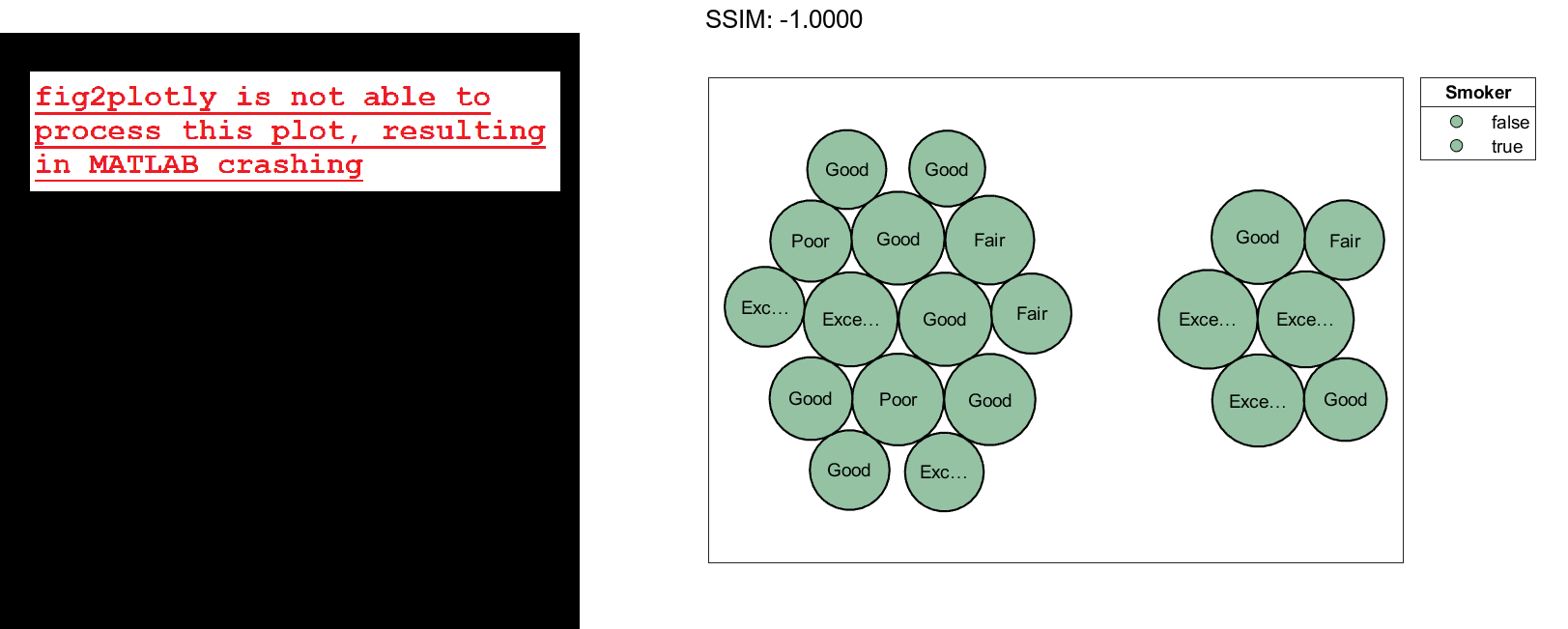
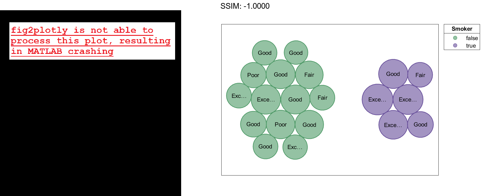
Group the bubbles according to whether the patients are smokers. When you group the data, a legend automatically appears in the figure. Specify a title for the legend. Then, retain the visibility of the bubble labels by increasing the size of the figure and setting the font size to 9 points.
b.GroupData = Smoker(1:20);
b.LegendTitle = "Smoker";
f = gcf;
f.Position([3 4]) = [655 395];
b.FontSize = 9;

fig2plotly()

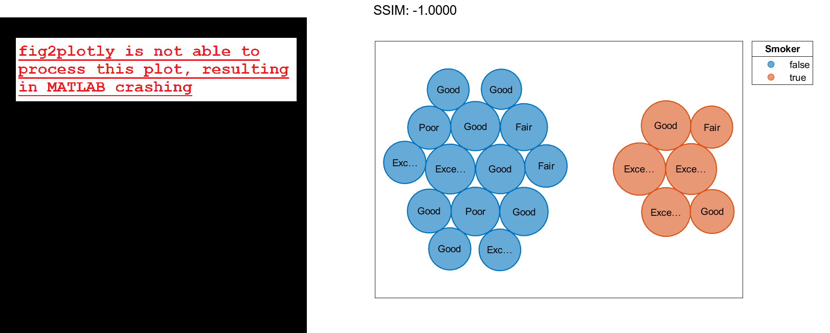
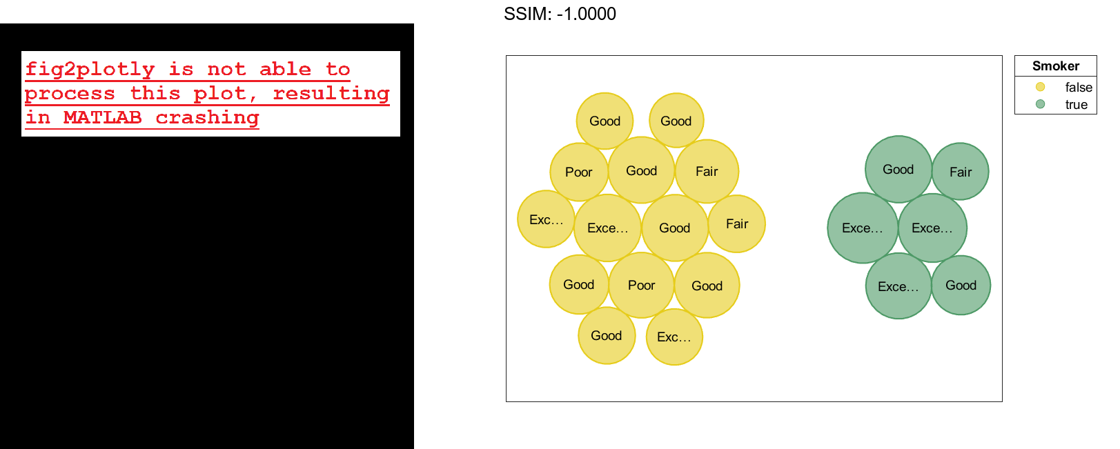
To visualize the groups with different colors, set the FaceColor property back to the default value of 'flat'. To make the edges of the bubbles use those same colors, set the EdgeColor property to 'flat'.
b.FaceColor = 'flat';
b.EdgeColor = 'flat';

fig2plotly()

To customize the group colors, set the ColorOrder property to a matrix containing the RGB triplets for the new colors.
b.ColorOrder = [0.3 0.6 0.4; 0.4 0.3 0.6];

fig2plotly()

Alternatively, you can pass the BubbleCloud object to the colororder function to set this property. When you use this function, you can specify the colors as RGB triplets, hexadecimal color codes, or predefined color names. For example, specify the hexadecimal color codes for two colors.
colororder(b,["#E6CC1A"; "#4D9966"])

fig2plotly()

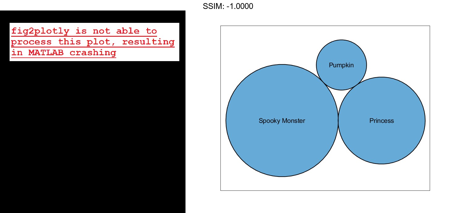
Visualize Categorical Data with Bubble Cloud
Define c as a categorical array. Use the histounts function to bin the categorical data and return the bubble sizes and the labels. Then pass the bubble sizes and labels to the bubblecloud function.
c = categorical(["Pumpkin" "Princess" "Princess" "Princess" "Spooky Monster" ...
    "Spooky Monster" "Spooky Monster" "Spooky Monster" "Spooky Monster"]);
[sz,labels] = histcounts(c);
bubblecloud(sz,labels)

fig2plotly()