

MATLAB coneplot in MATLAB®
Learn how to make 1 coneplot charts in MATLAB, then publish them to the Web with Plotly.
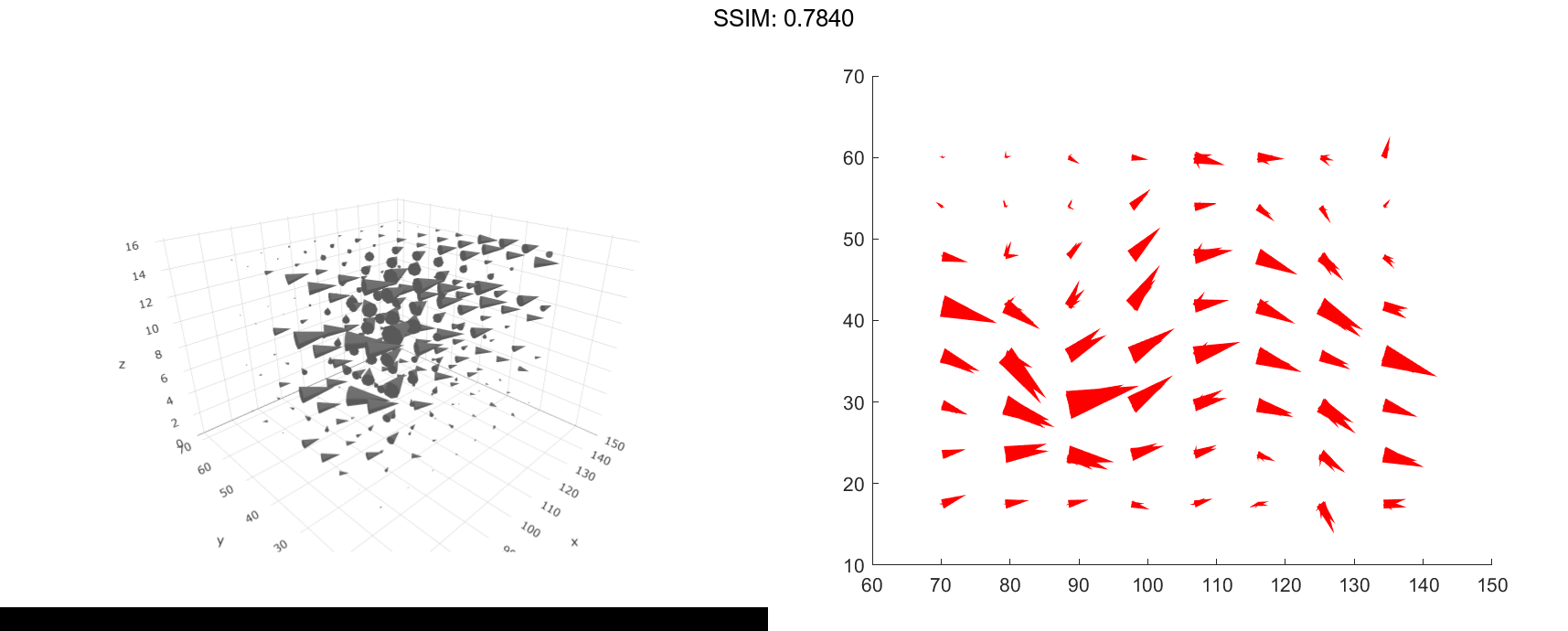
3-D Cone Plot
Plot velocity vector cones for vector volume data representing motion of air through a rectangular region of space.
Load the data. The wind data set contains the arrays u, v, and w that specify the vector components and the arrays x, y, and z that specify the coordinates.
load wind
Establish the range of the data to place the slice planes and to specify where you want the cone plots.
xmin = min(x(:)); xmax = max(x(:)); ymin = min(y(:)); ymax = max(y(:)); zmin = min(z(:));
Define where to plot the cones. Select the full range in x and y and select the range 3 to 15 in z.
xrange = linspace(xmin,xmax,8); yrange = linspace(ymin,ymax,8); zrange = 3:4:15; [cx,cy,cz] = meshgrid(xrange,yrange,zrange);
Plot the cones and set the scale factor to 5 to make the cones larger than the default size.
figure
hcone = coneplot(x,y,z,u,v,w,cx,cy,cz,5);


fig2plotly('TreatAs', 'coneplot')


Set the cone colors.
hcone.FaceColor = 'red';
hcone.EdgeColor = 'none';


fig2plotly('TreatAs', 'coneplot')

Calculate the magnitude of the vector field (which represents wind speed) to generate scalar data for the slice command.
hold on wind_speed = sqrt(u.^2 + v.^2 + w.^2);
Create slice planes along the x-axis at xmin and xmax, along the y-axis at ymax, and along the z-axis at zmin. Specify interpolated face color so the slice coloring indicates wind speed, and do not draw edges.
hsurfaces = slice(x,y,z,wind_speed,[xmin,xmax],ymax,zmin); set(hsurfaces,'FaceColor','interp','EdgeColor','none') hold off
Change the axes view and set the data aspect ratio.
view(30,40)
daspect([2,2,1])


fig2plotly('TreatAs', 'coneplot')


Add a light source to the right of the camera and use Gouraud lighting to give the cones and slice planes a smooth, three-dimensional appearance.
camlight right
lighting gouraud
set(hsurfaces,'AmbientStrength',0.6)
hcone.DiffuseStrength = 0.8;


fig2plotly('TreatAs', 'coneplot')

