
MATLAB polarhistogram in MATLAB®
Learn how to make 4 polarhistogram charts in MATLAB, then publish them to the Web with Plotly.
Create Histogram Chart in Polar Coordinates
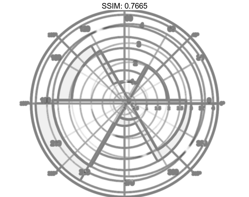
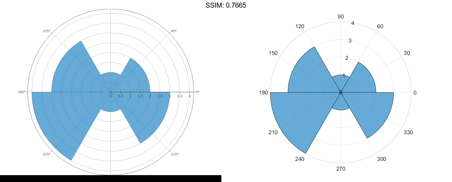
Create a vector of values between 0 and 2π. Create a histogram chart that shows the data sorted into six bins.
theta = [0.1 1.1 5.4 3.4 2.3 4.5 3.2 3.4 5.6 2.3 2.1 3.5 0.6 6.1];
polarhistogram(theta,6)

fig2plotly('TreatAs', 'polarhistogram')
Specify Number of Bins for Polar Histogram Chart
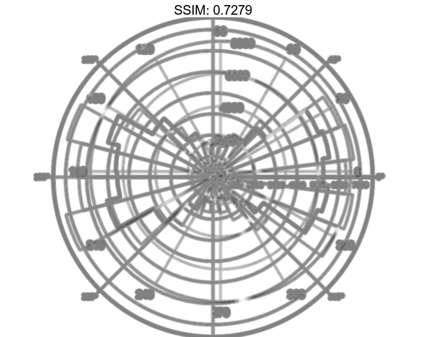
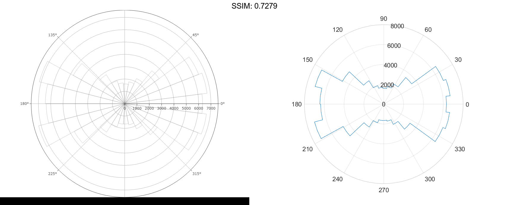
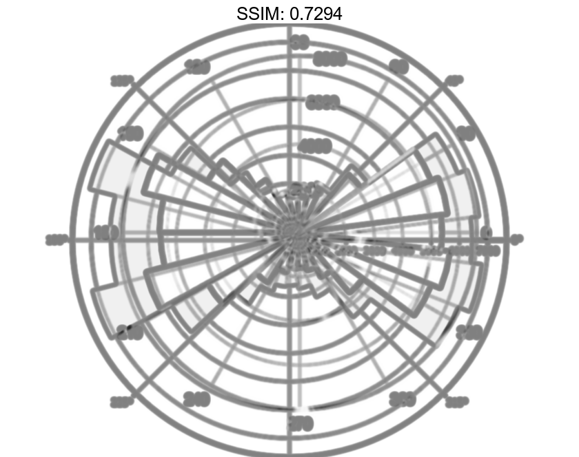
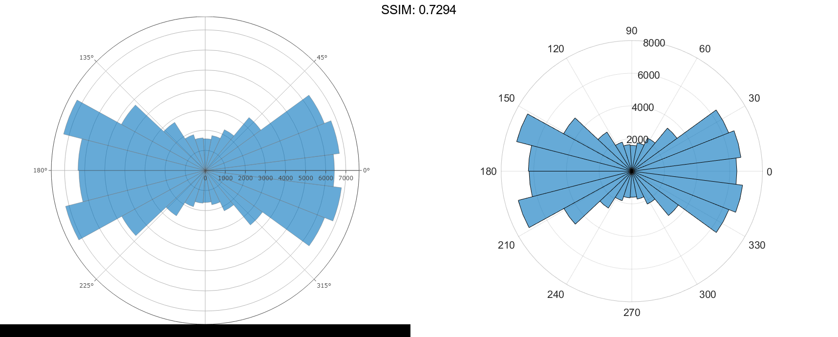
Create a histogram plot from 100,000 values between -π and π, and sort the data into 25 bins.
theta = atan2(rand(100000,1)-0.5,2*(rand(100000,1)-0.5));
polarhistogram(theta,25);

fig2plotly('TreatAs', 'polarhistogram')
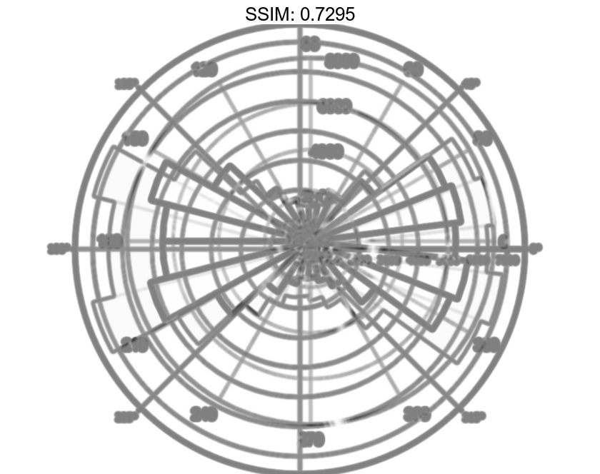
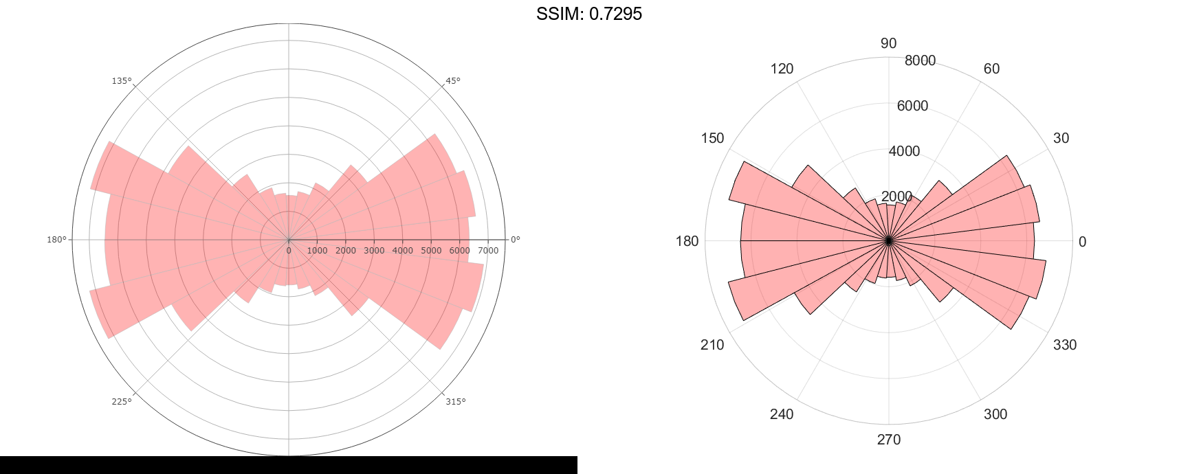
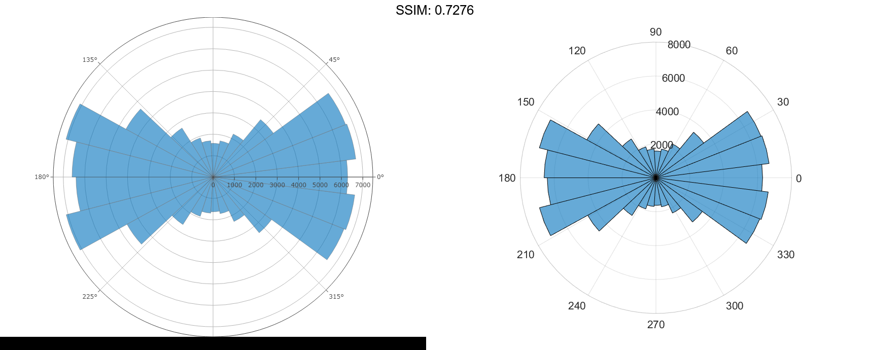
Modify Appearance of Histogram Chart
Create a histogram chart in polar coordinates, and then change its appearance. Specify the bar colors by setting the FaceColor property to a character vector of a color name, such as 'red', or an RGB triplet. Specify the transparency by setting the FaceAlpha property to a value between 0 and 1.
theta = atan2(rand(100000,1)-0.5,2*(rand(100000,1)-0.5));
polarhistogram(theta,25,'FaceColor','red','FaceAlpha',.3);

fig2plotly('TreatAs', 'polarhistogram')
Modify Appearance of Histogram Chart After Creation
Create a histogram chart in polar coordinates. Assign the histogram object to the variable h.
theta = atan2(rand(100000,1)-0.5,2*(rand(100000,1)-0.5)); h = polarhistogram(theta,25)
h =
  Histogram with properties:

             Data: [100000x1 double]
           Values: [1x25 double]
          NumBins: 25
         BinEdges: [1x26 double]
         BinWidth: 0.2513
        BinLimits: [-3.1416 3.1416]
    Normalization: 'count'
        FaceColor: 'auto'
        EdgeColor: [0 0 0]

  Show all properties
h.DisplayStyle = 'stairs';

fig2plotly('TreatAs', 'polarhistogram')