
MATLAB polarbubblechart in MATLAB®
Learn how to make 5 polarbubblechart charts in MATLAB, then publish them to the Web with Plotly.
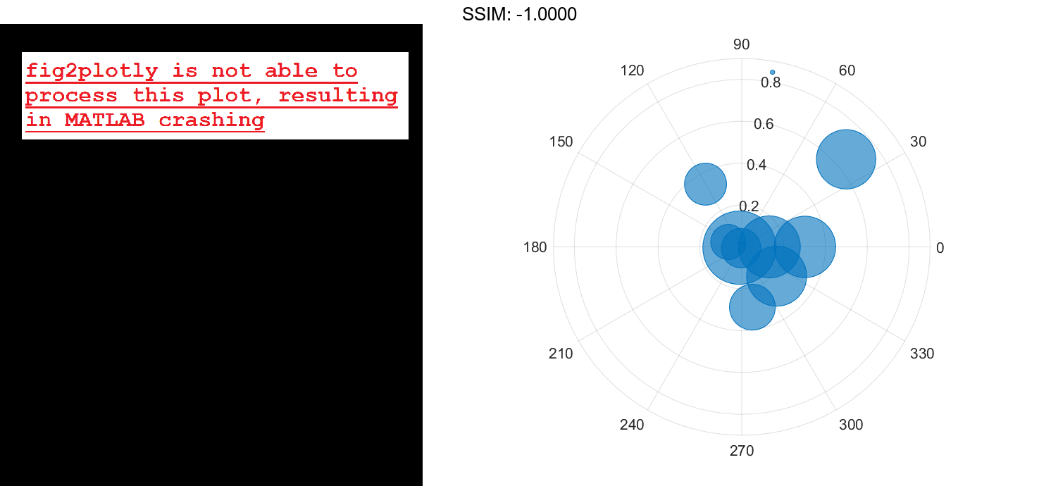
Plot Random Bubbles
Define a set of bubble coordinates as the vectors th and r. Define sz as a vector of bubble sizes. Then create a bubble chart of these values.
th = linspace(0,2*pi,10);
r = rand(1,10);
sz = rand(1,10);
polarbubblechart(th,r,sz);

fig2plotly()

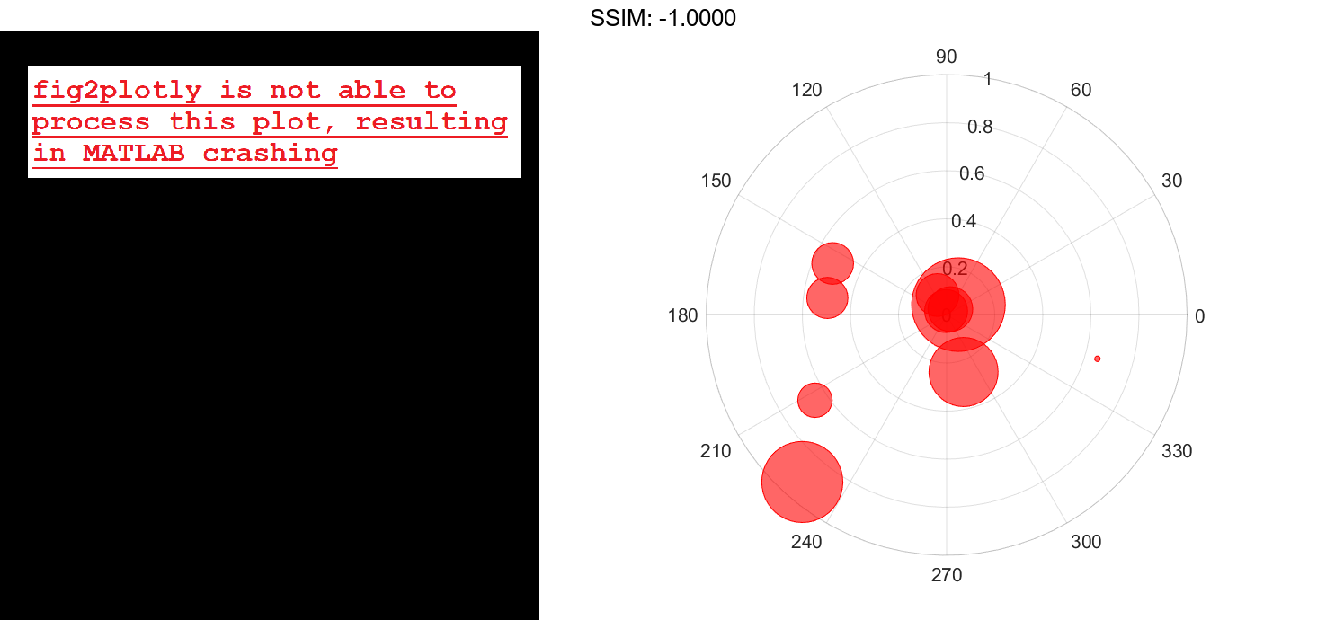
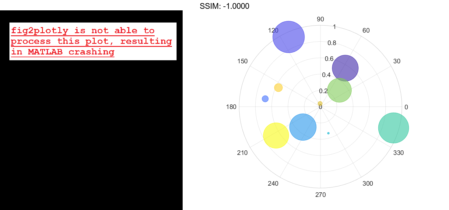
Specify Bubble Colors
Define a set of bubble coordinates as the vectors th and r. Define sz as a vector of bubble sizes. Then create a bubble chart and specify the color as red. By default, the bubbles are partially transparent.
th = 1:10;
r = rand(1,10);
sz = rand(1,10);
polarbubblechart(th,r,sz,'red');

fig2plotly()

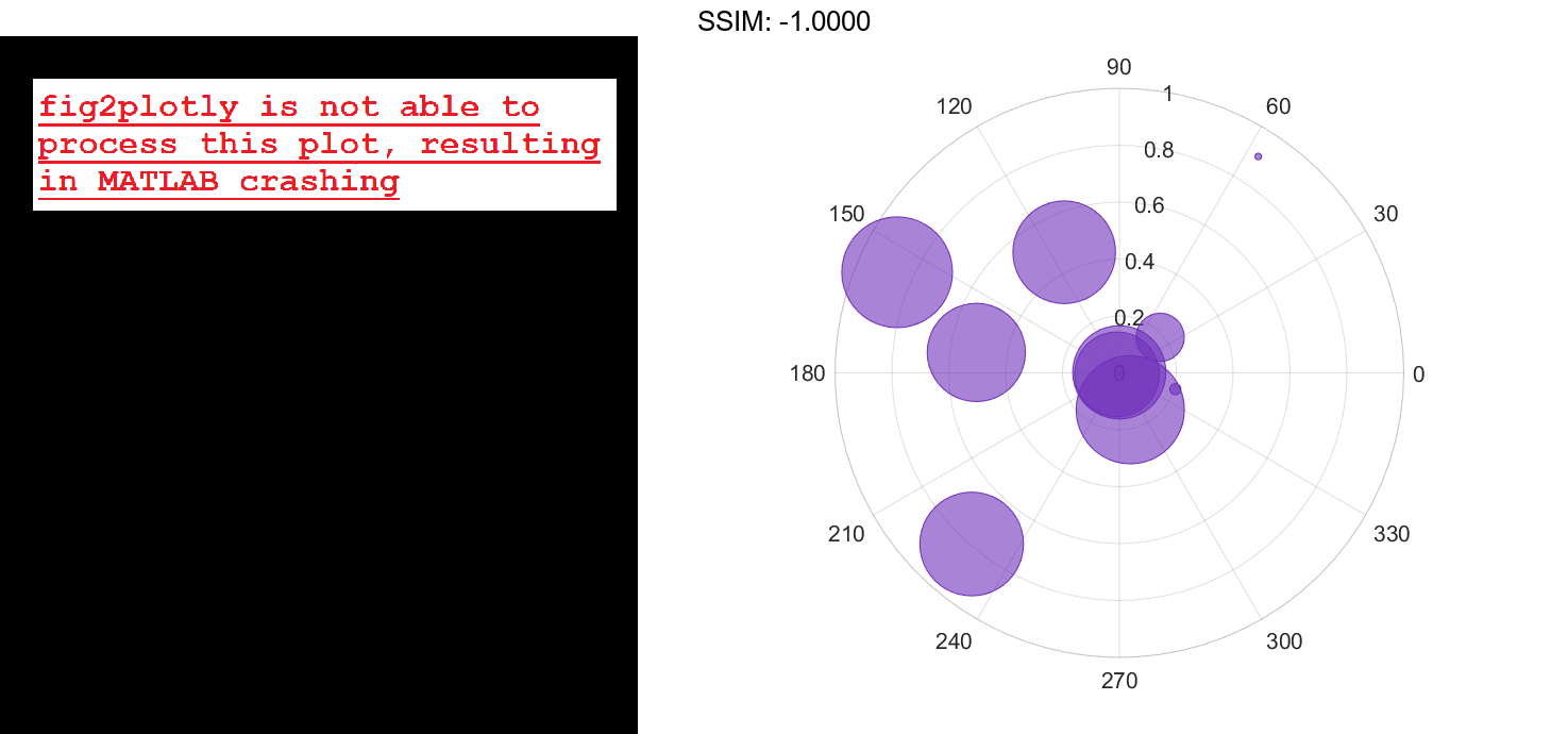
For a custom color, you can specify an RGB triplet or a hexadecimal color code. For example, the hexadecimal color code '#7031BB', specifies a shade of purple.
polarbubblechart(th,r,sz,'#7031BB');

fig2plotly()

You can also specify a different color for each bubble. For example, specify a vector to select colors from the figure's colormap.
c = 1:10;
polarbubblechart(th,r,sz,c)

fig2plotly()

Specify Bubble Transparency and Outline Color
Define a set of bubble coordinates as the vectors th and r. Define sz as a vector of bubble sizes. Then create a bubble chart. By default, the bubbles are 60% opaque, and the edges are completely opaque with the same color.
th = linspace(0,2*pi,10);
r = rand(1,10);
sz = rand(1,10);
polarbubblechart(th,r,sz);

fig2plotly()
You can customize the opacity and the outline color by setting the MarkerFaceAlpha and MarkerEdgeColor properties, respectively. One way to set a property is by specifying a name-value pair argument when you create the chart. For example, you can specify 20% opacity by setting the MarkerFaceAlpha value to 0.20.
bc = polarbubblechart(th,r,sz,'MarkerFaceAlpha',0.20);
If you create the chart by calling the polarbubblechart function with a return argument, you can use the return argument to set properties on the chart after creating it. For example, you can change the outline color to purple.
bc.MarkerEdgeColor = [0.5 0 0.5];

fig2plotly()
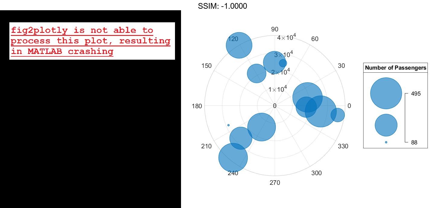
Add a Bubble Legend
Define a data set that shows the incoming air traffic at a certain airport over a certain period of time.
- Define
thetaas a vector of angles of approach for the incoming planes. - Define
altitudeas a vector of altitudes. - Define
planesizeas a vector of plane sizes, measured in the number of passengers. Then display the data in a bubble chart with a bubble legend that shows the relationship between the bubble sizes and the number of passengers on the planes.
theta = repmat([0 pi/2 7*pi/6],1,4) + 0.25*randn(1,12);
altitude = randi([13000 43000],1,12);
planesize = randi([75 500],[1 12]);
polarbubblechart(theta,altitude,planesize)
bubblelegend('Number of Passengers','Location','eastoutside')

fig2plotly()

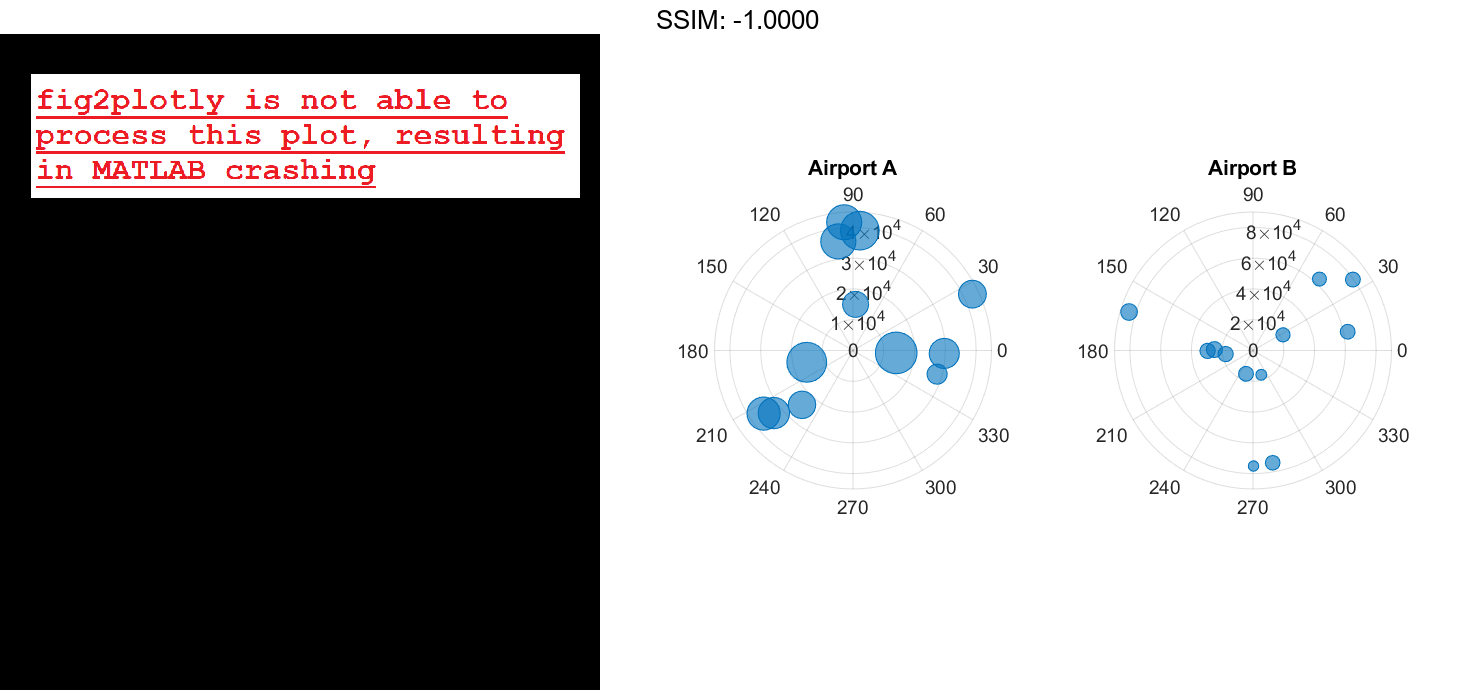
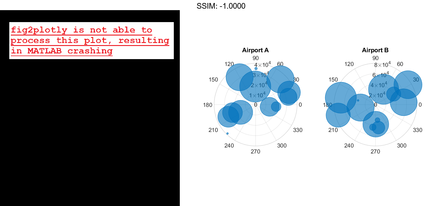
Display Bubbles in Different Axes on the Same Scale
Define two data sets showing the incoming air traffic at two different airports over a certian period of time.
- Define
theta1andtheta2as vectors containing the angles of approach for the incoming planes. - Define
planesize1andplanesize2as a vectors of plane sizes, measured in the number of passengers. - Define
altitude1andaltitude2as vectors containing the altitudes for the planes.
theta1 = repmat([0 pi/2 7pi/6],1,4) + 0.25randn(1,12); theta2 = repmat([pi pi/6 3pi/2],1,4) + 0.25randn(1,12); planesize1 = randi([75 500],[1 12]); planesize2 = randi([1 50],[1 12]); altitude1 = randi([13000 43000],1,12); altitude2 = randi([13000 85000],1,12);
Create a tiled chart layout so you can visualize the data side-by-side. Then, create a polar axes object in the first tile, plot the data for the first airport, and add a title. Then repeat the process in the second tile for the second airport.
t = tiledlayout(1,2);
pax1 = polaraxes(t);
polarbubblechart(pax1,theta1,altitude1,planesize1)
title('Airport A')

pax2 = polaraxes(t);
pax2.Layout.Tile = 2;
polarbubblechart(pax2,theta2,altitude2,planesize2);
title('Airport B')

fig2plotly()

Reduce all the bubble sizes to make it easier to see all the bubbles. In this case, change the range of diameters to be between 5 and 20 points.
bubblesize(pax1,[5 20])
bubblesize(pax2,[5 20])

fig2plotly()
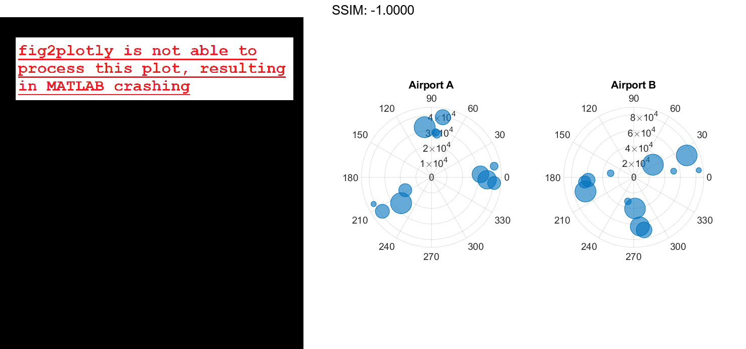

The planes at Airport A are generally much smaller than at Airport B, but the bubble sizes do not reflect this information in the preceding charts. This is because the smallest and largest bubbles map to the smallest and largest data points in each of the axes. To display the bubbles on the same scale, define a vector called allsizes that includes the plane sizes at both airports. Then use the bubblelim function to reset the scaling for both charts.
allsizes = [planesize1 planesize2];
newlims = [min(allsizes) max(allsizes)];
bubblelim(pax1,newlims)
bubblelim(pax2,newlims)

fig2plotly()