MATLAB compass in MATLAB®
Learn how to make 7 compass charts in MATLAB, then publish them to the Web with Plotly.
Create Compass Plot Using Cartesian Coordinates
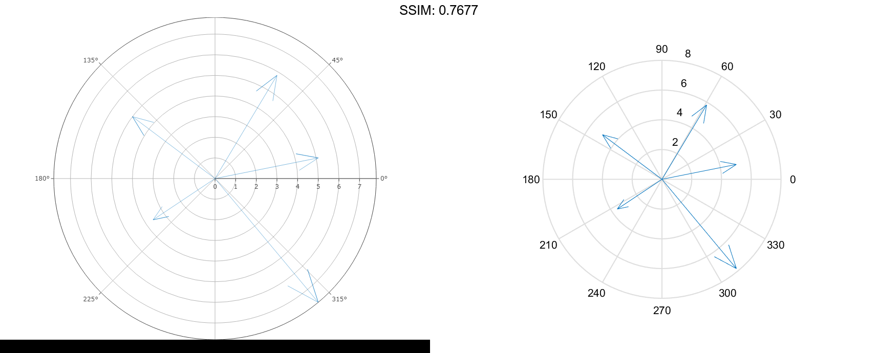
Create a compass plot by specifying the Cartesian coordinates of each arrow.
u = [5 3 -4 -3 5];
v = [1 5 3 -2 -6];
compass(u,v)

fig2plotly('TreatAs', 'compass')
Create Compass Plot Using Polar Coordinates
Create a compass plot using polar coordinates by first converting them to Cartesian coordinates.
To do this, specify data using polar coordinates. Convert them to Cartesian coordinates using the pol2cart function. Then, create the plot.
th = linspace(pi/4,2*pi,10);
r = linspace(5,20,10);
[u,v] = pol2cart(th,r);
compass(u,v)

fig2plotly('TreatAs', 'compass')
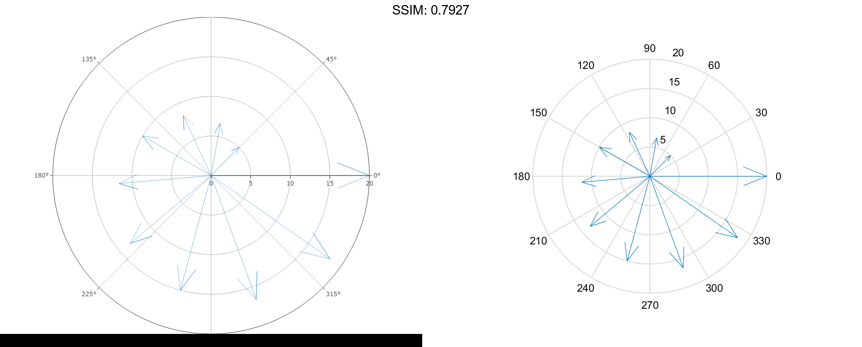
Note that the theta-axis and r-axis tick labels correspond to the polar coordinates.
Create Compass Plot Using Complex Values
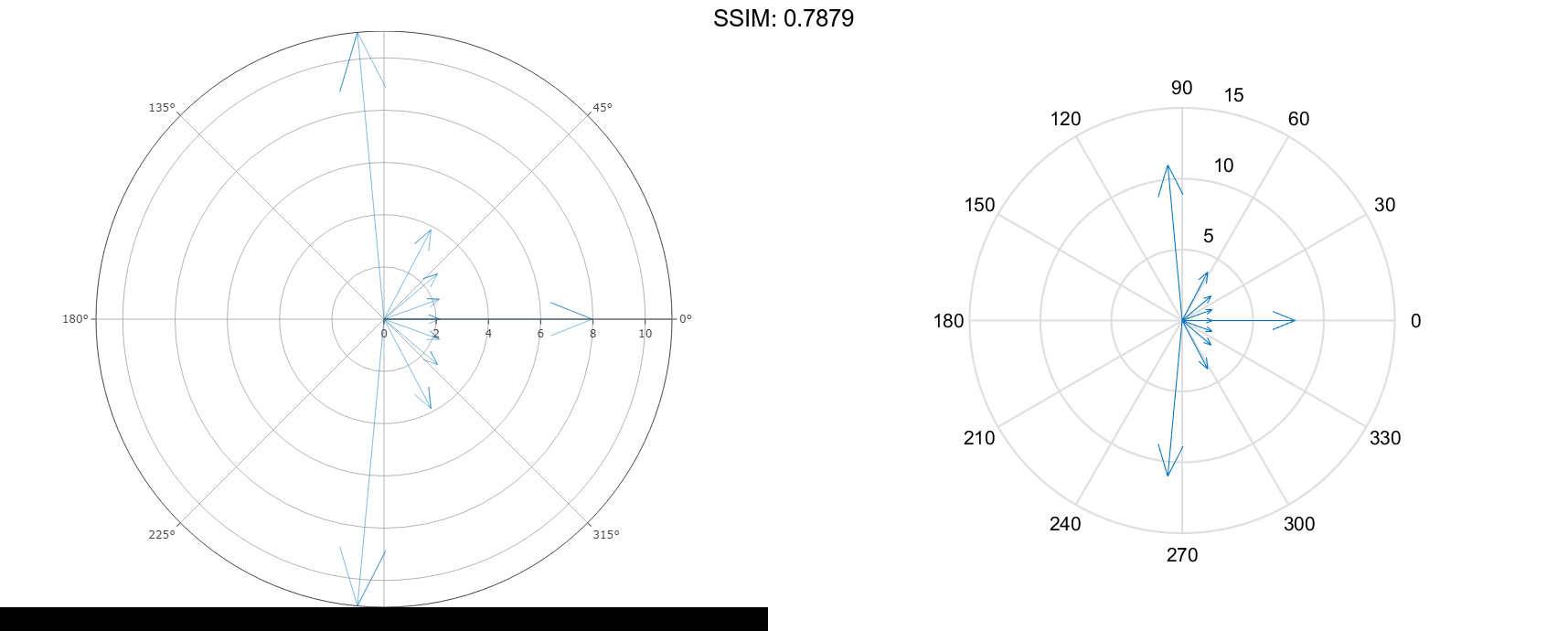
Sample a sinusoid at equally spaced intervals. Then, compute the 10-point discrete Fourier transform of the sinusoid. The result is a vector of complex values.
t = linspace(0,8pi,100); y = sin(2t) + 2*sin(t+pi/2); f = fft(y,10);
Display the complex values using a compass plot. The real part determines the x-coordinate of each arrow, and the imaginary part determines the y-coordinate.
compass(f)

fig2plotly('TreatAs', 'compass')
Specify Appearance of Whole Plot
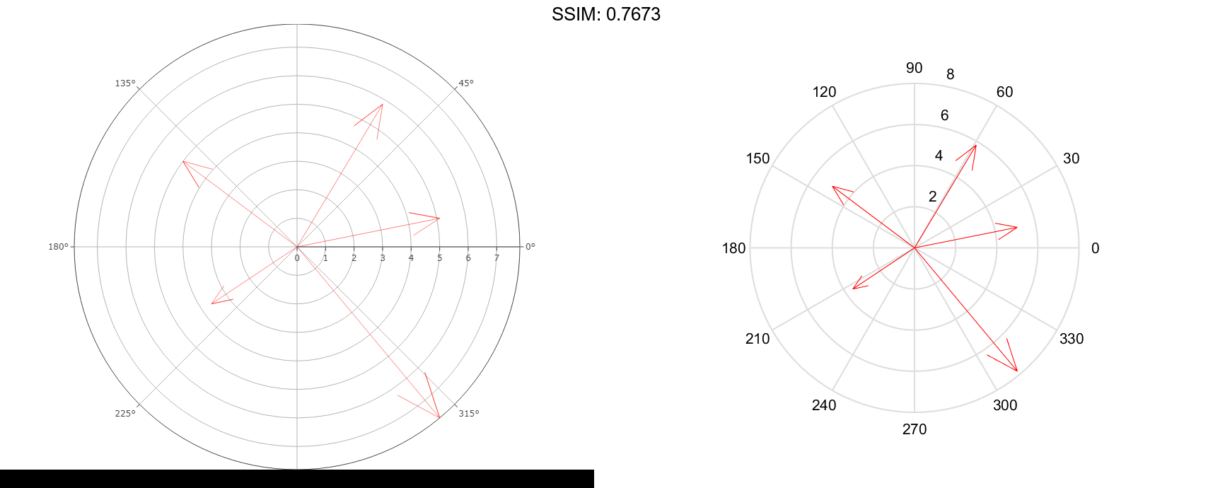
Create a compass plot with red arrows.
u = [5 3 -4 -3 5];
v = [1 5 3 -2 -6];
compass(u,v,'r')

fig2plotly('TreatAs', 'compass')

Specify Appearance of One Arrow
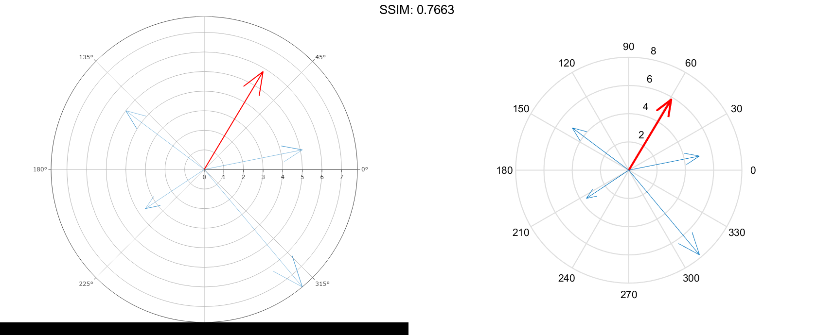
Specify the line width and color of a single arrow by assigning the arrow to a variable and then setting its properties. To do this, first create a compass plot and return an array of Line objects.
u = [3 5 -4 -3 5]; v = [5 1 3 -2 -6]; c = compass(u,v);
Assign the first arrow to a variable. The first arrow corresponds to the first elements of u and v. Then, change the line width and color.
c1 = c(1);
c1.LineWidth = 2;
c1.Color = 'r';

fig2plotly('TreatAs', 'compass')
Rotate Compass Plot
Rotate a compass plot so that 0 degrees points up by using the view function.
To do this, create a compass plot using polar coordinates. Convert the polar coordinates to Cartesian coordinates by using the pol2cart function, and then plot the converted coordinates.
th = linspace(0,3*pi/2,10);
r = linspace(5,20,10);
[u,v] = pol2cart(th,r);
compass(u,v)

fig2plotly('TreatAs', 'compass')
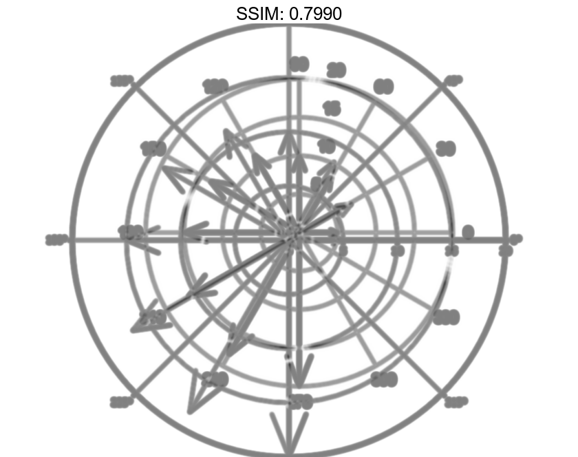
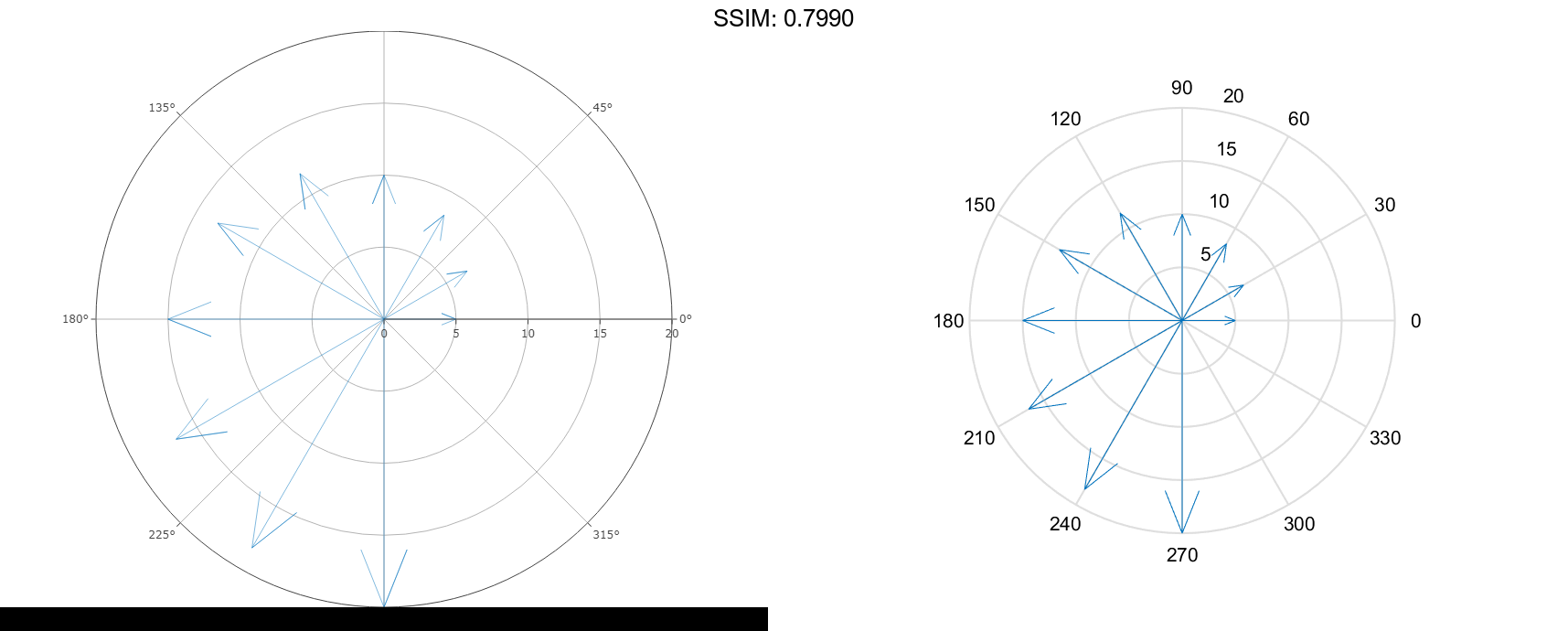
Note that 0 degrees points to the right. Rotate the theta-axis 90 degrees in a counterclockwise direction by calling view and specifying the first argument as -90. Maintain the 2-D view by specifying the second argument as 90.
view(-90,90)

fig2plotly('TreatAs', 'compass')
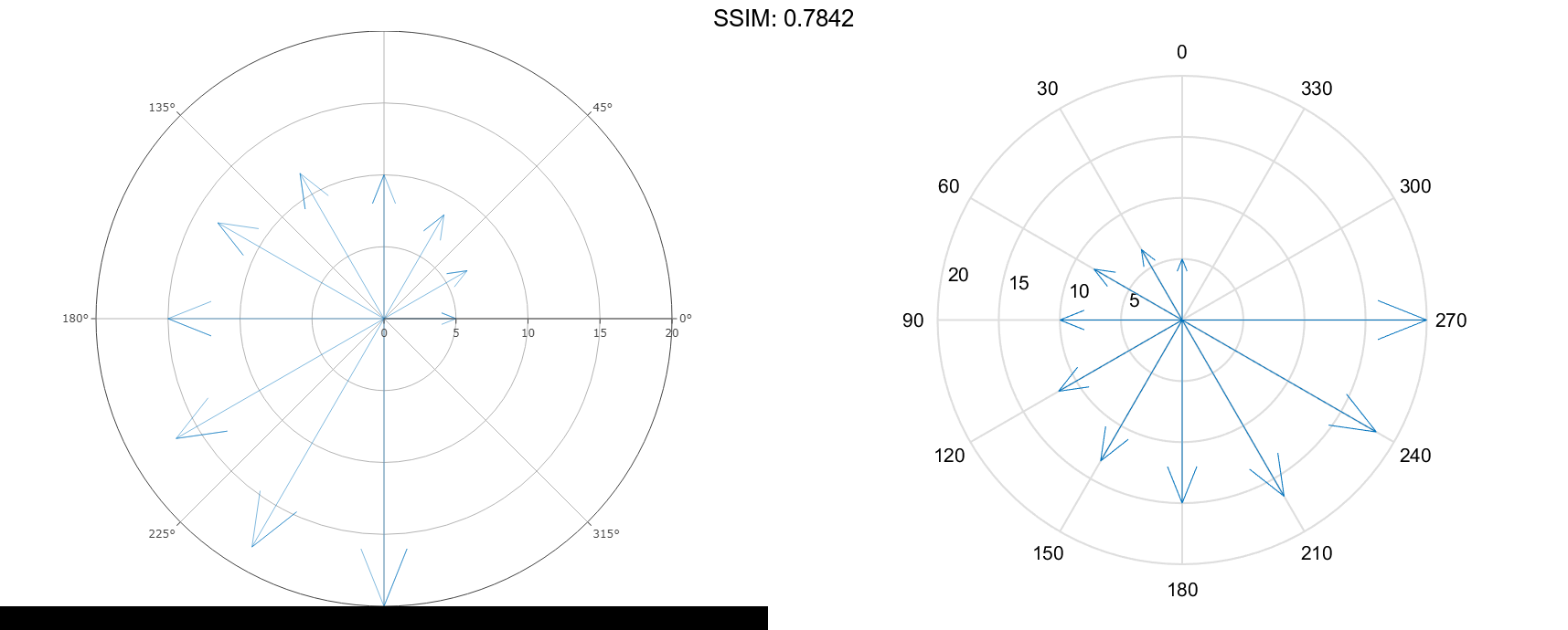
Note that 0 degrees now points up.
Specify Axes for Compass Plot
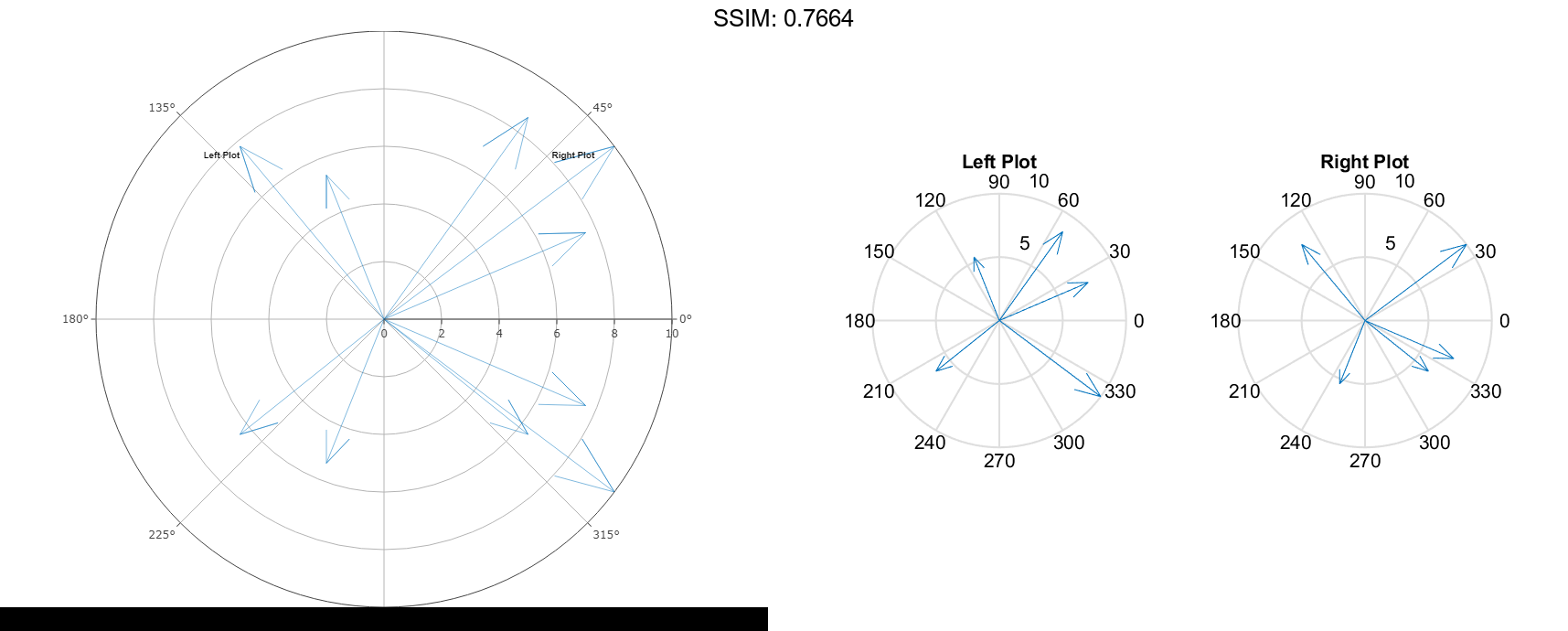
Starting in R2019b, you can display a tiling of plots using the tiledlayout and nexttile functions. Call the tiledlayout function to create a 1-by-2 tiled chart layout. Call the nexttile function to create an axes object and return the object as ax1. Create the left plot by passing ax1 to the compass function. Add a title to the plot by passing the axes to the title function. Repeat the process to create the right plot.
u = [7 5 -2 -5 8];
tiledlayout(1,2)

% Left plot
ax1 = nexttile;
v1 = [3 7 5 -4 -6];
compass(ax1,u,v1)
title(ax1,'Left Plot')

% Right plot
ax2 = nexttile;
v2 = [-3 -4 -5 6 6];
compass(ax2,u,v2)
title(ax2,'Right Plot')

fig2plotly('TreatAs', 'compass')
