
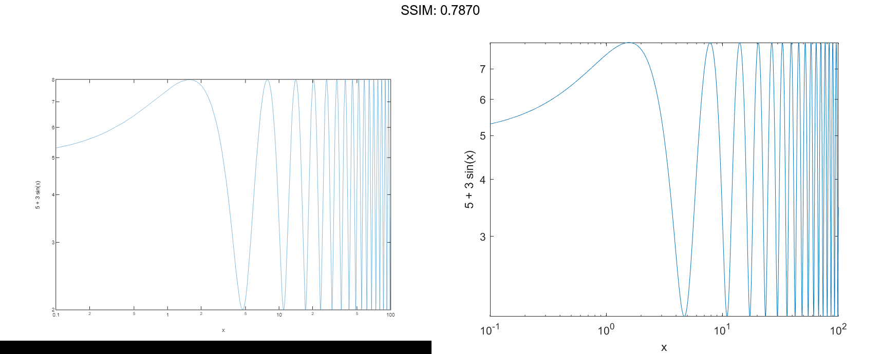
MATLAB loglog in MATLAB®
Learn how to make 8 loglog charts in MATLAB, then publish them to the Web with Plotly.
Plot One Line
Define x as a vector of 50 logarithmically spaced numbers on the interval [10-1,102]. Define y as 2x. Then plot x and y, and call the grid function to show the grid lines.
x = logspace(-1,2);
y = 2.^x;
loglog(x,y)
grid on

fig2plotly()
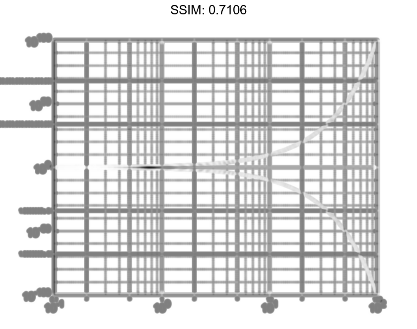
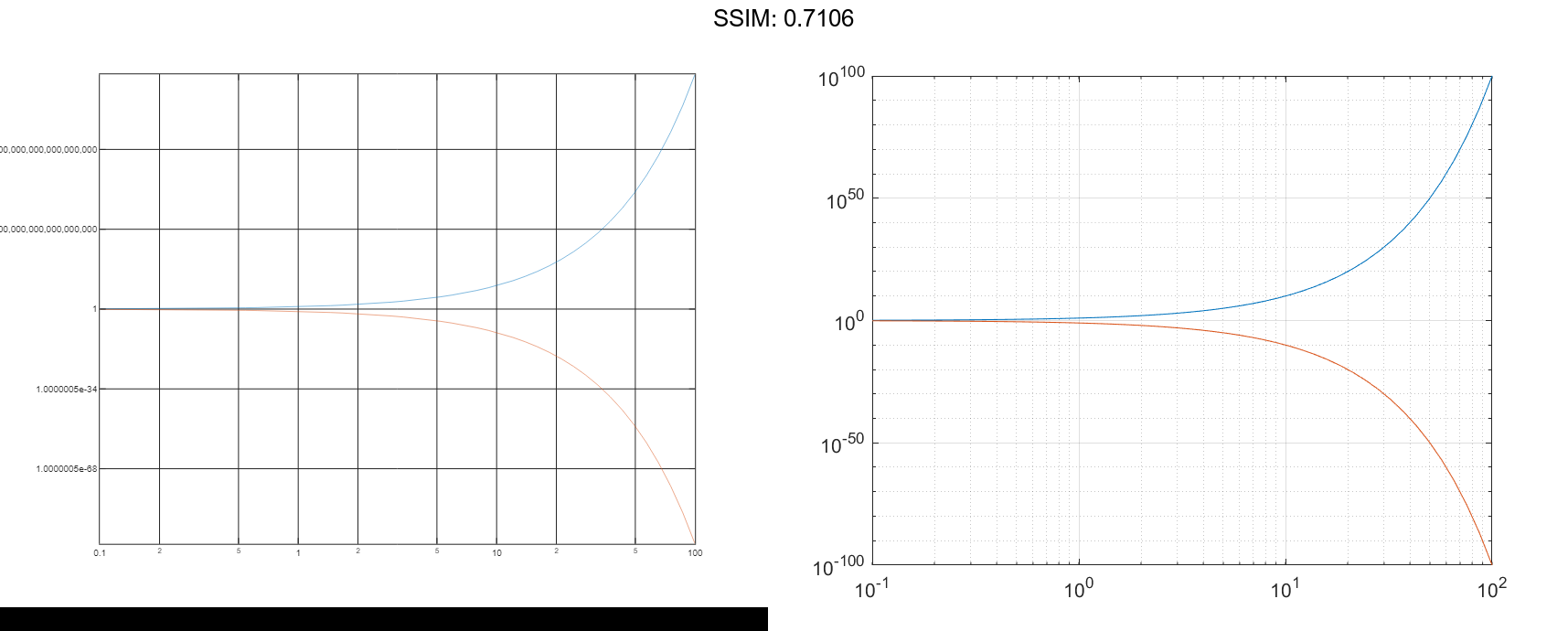
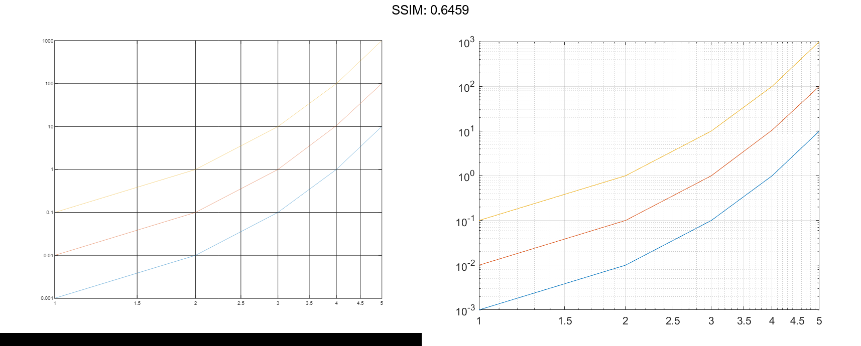
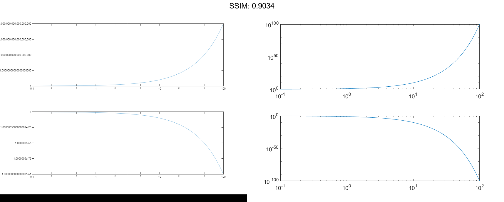
Plot Multiple Lines
Create a vector of x-coordinates and two vectors of y-coordinates. Plot two lines by passing comma-separated x-y pairs to loglog.
x = logspace(-1,2);
y1 = 10.^x;
y2 = 1./10.^x;
loglog(x,y1,x,y2)
grid on

fig2plotly()
Alternatively, you can create the same plot with one x-y pair by specifying y as a matrix: loglog(x,[y1;y2]).
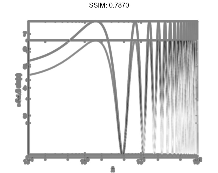
Specify Axis Labels and Tick Values
Create a set of x- and y-coordinates and display them in a log-log plot.
x = logspace(-1,2,10000);
y = 5 + 3*sin(x);
loglog(x,y)

fig2plotly()
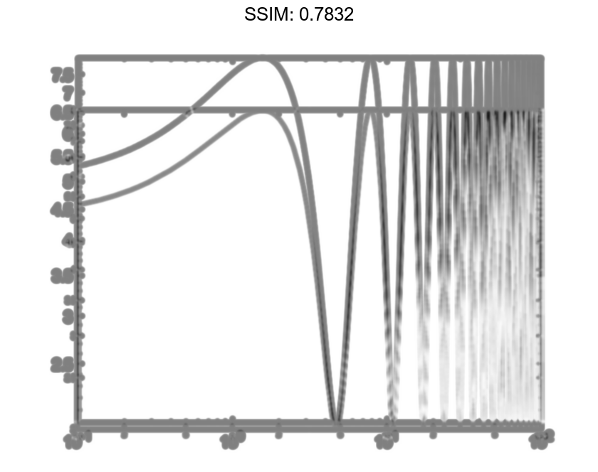
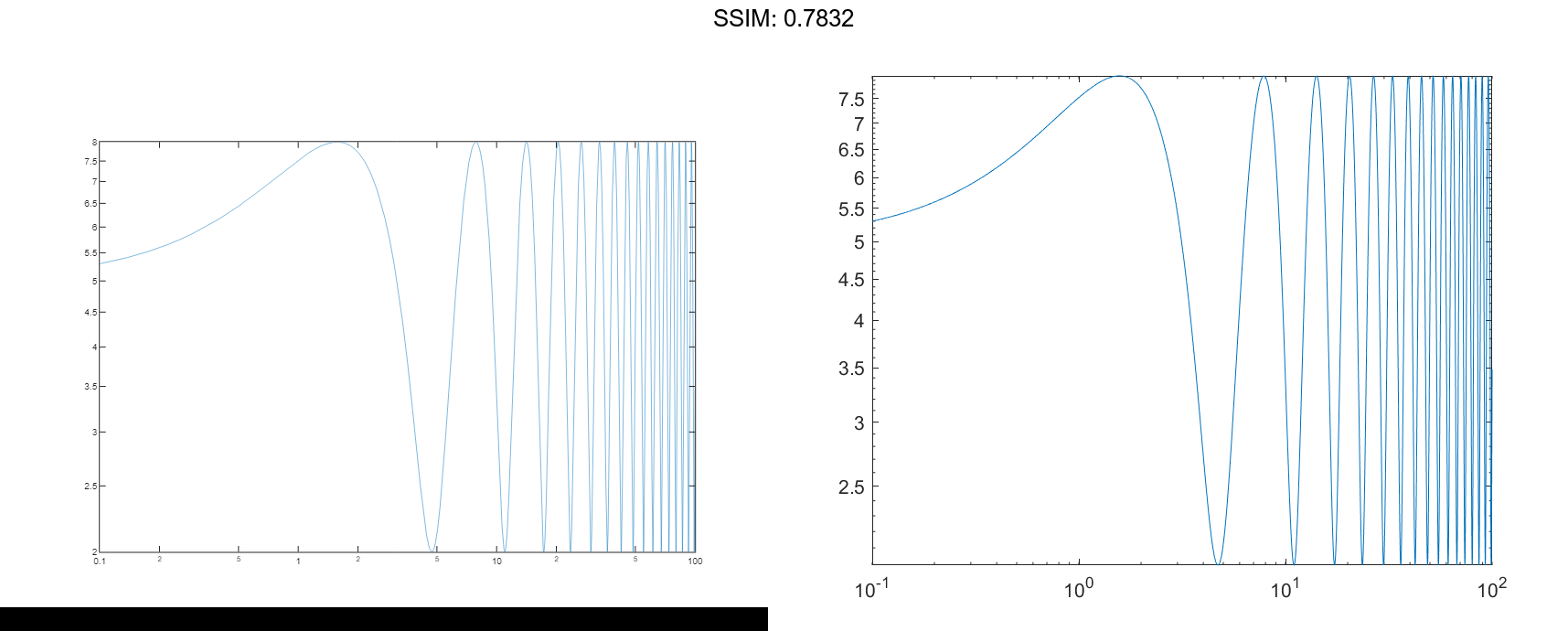
Call the yticks function to position the y-axis tick values at whole number increments along the y-axis. Then create x- and y-axis labels by calling the xlabel and ylabel functions.
yticks([3 4 5 6 7])
xlabel('x')
ylabel('5 + 3 sin(x)')

fig2plotly()
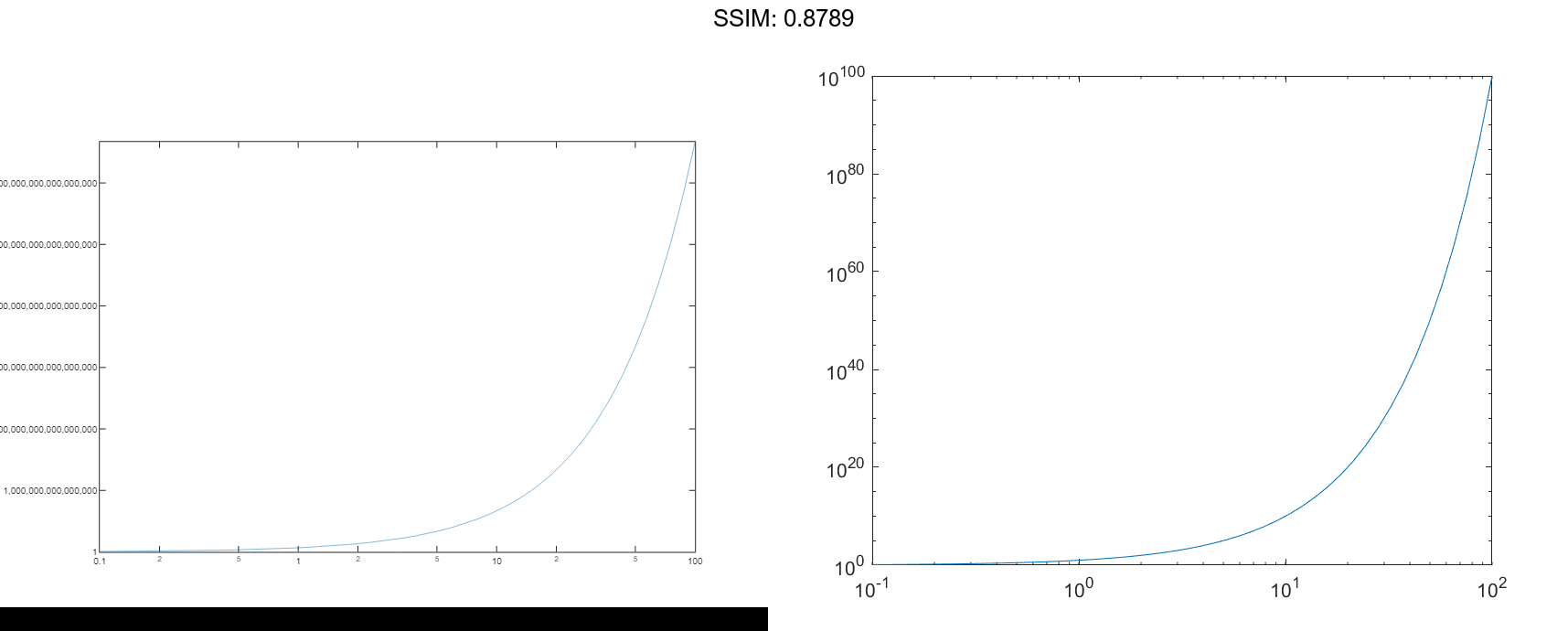
Plot Points as Markers Without Lines
Create a set of x- and y-coordinates and display them in a log-log plot. Specify the line style as 's' to display square markers without connecting lines. Specify the marker fill color as the RGB triplet [0 0.447 0.741], which corresponds to a dark shade of blue.
x = logspace(-1,2,20);
y = 10.^x;
loglog(x,y,'s','MarkerFaceColor',[0 0.447 0.741])
grid on

fig2plotly()
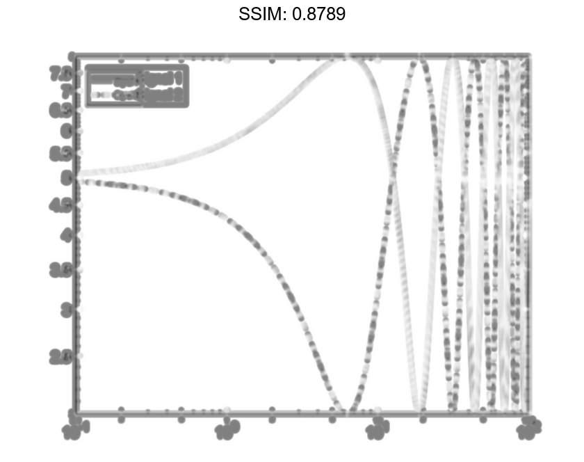
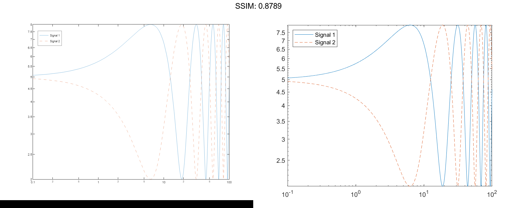
Add a Legend
Create two sets of x- and y-coordinates and display them in a log-log plot. Display a legend in the upper left corner of the plot by calling the legend function and specifying the location as 'northwest'.
x = logspace(-1,2,10000);
y1 = 5 + 3*sin(x/4);
y2 = 5 - 3*sin(x/4);
loglog(x,y1,x,y2,'--')
legend('Signal 1','Signal 2','Location','northwest')

fig2plotly()
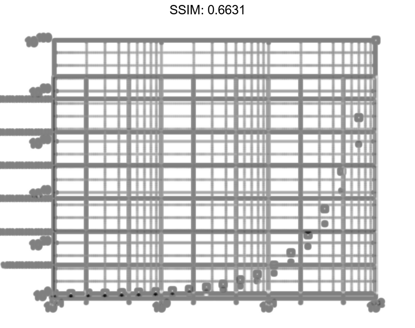
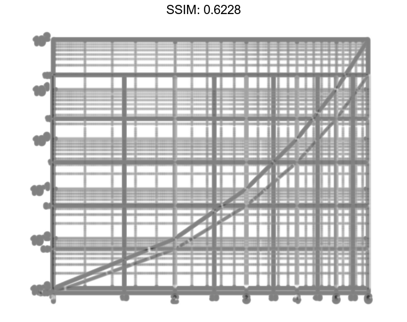
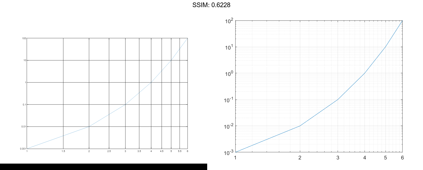
Specify y-Coordinates Only
When you specify only one coordinate vector, loglog plots those coordinates against the values 1:length(y). For example, define y as a vector of 6 values between 0.001 and 100. Create a log-log plot of y.
y = [0.001 0.01 0.1 1 10 100];
loglog(y)
grid on

fig2plotly()
If you specify y as a matrix, the columns of y are plotted against the values 1:size(y,1). For example, define y as a 5-by-3 matrix and pass it to the loglog function. The resulting plot contains 3 lines, each of which has x-coordinates that range from 1 to 5.
y = [0.0010    0.0100    0.1000
     0.0100    0.1000    1.0000
     0.1000    1.0000   10.0000
     1.0000   10.5000  100.0000
    10.0000  100.0000 1000.0000];

loglog(y)
grid on

fig2plotly()
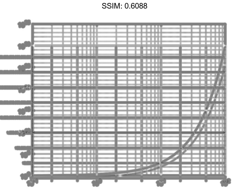
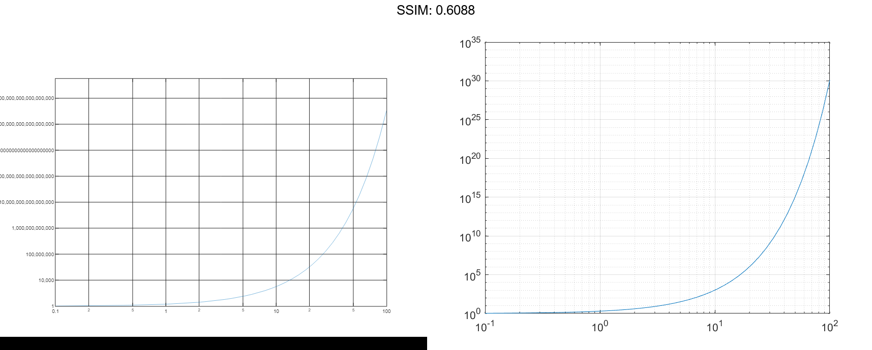
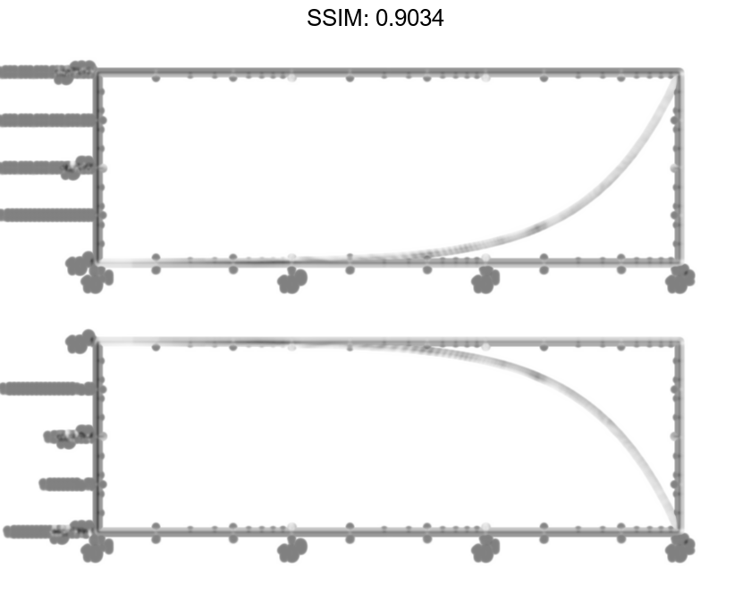
Specify Target Axes
Create a tiled chart layout in the 'flow' tile arrangement, so that the axes fill the available space in the layout. Next, call the nexttile function to create an axes object and return it as ax1. Then display a log-log plot by passing ax1 to the loglog function.
tiledlayout('flow')
ax1 = nexttile;
x = logspace(-1,2);
y1 = 10.^x;
loglog(ax1,x,y1)

fig2plotly()
Repeat the process to create a second axes object and a second log-log plot.
ax2 = nexttile;
y2 = 1./10.^x;
loglog(ax2,x,y2)

fig2plotly()
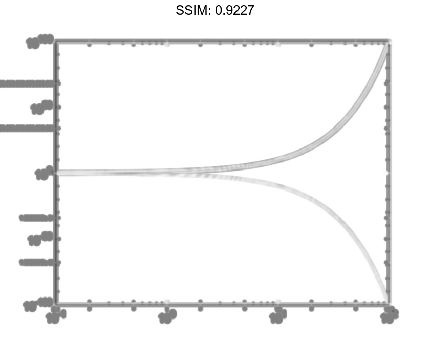
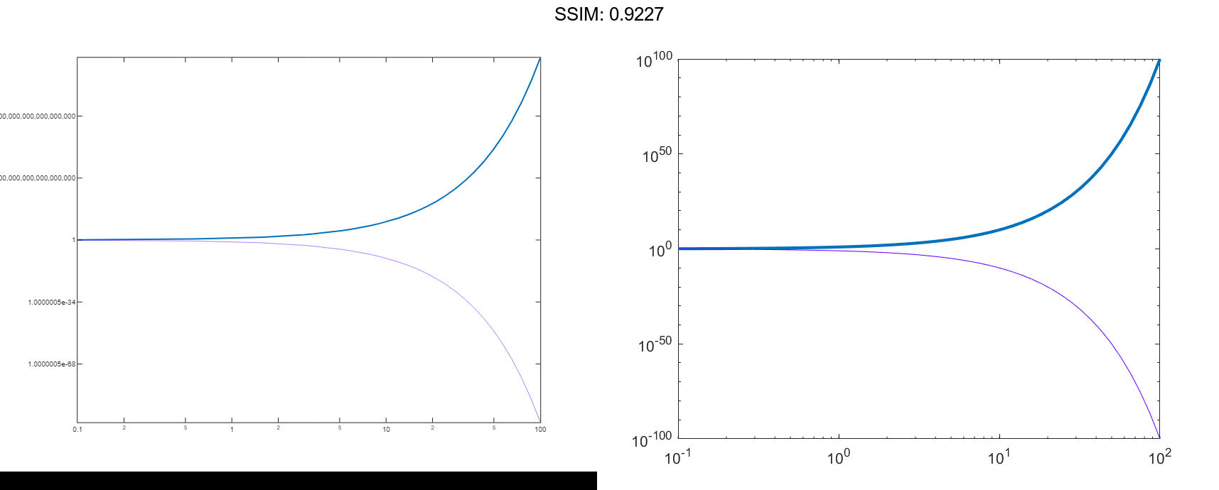
Change Line Characteristics After Plotting
Create a log-log plot containing two lines, and return the line objects in the variable lg.
x = logspace(-1,2); y1 = 10.^x; y2 = 1./10.^x; lg = loglog(x,y1,x,y2);
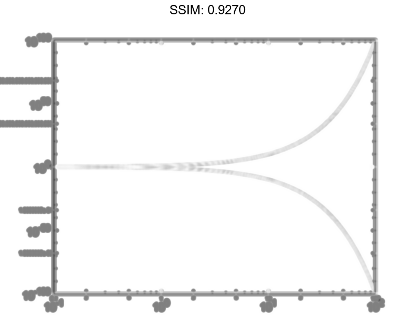

Change the width of the first line to 2, and change the color of the second line to purple.
lg(1).LineWidth = 2;
lg(2).Color = [0.4 0 1];

fig2plotly()