MATLAB stem in MATLAB®
Learn how to make 12 stem charts in MATLAB, then publish them to the Web with Plotly.
Plot Single Data Series
Create a stem plot of 50 data values between -2π and 2π.
figure
Y = linspace(-2*pi,2*pi,50);
stem(Y)

fig2plotly()

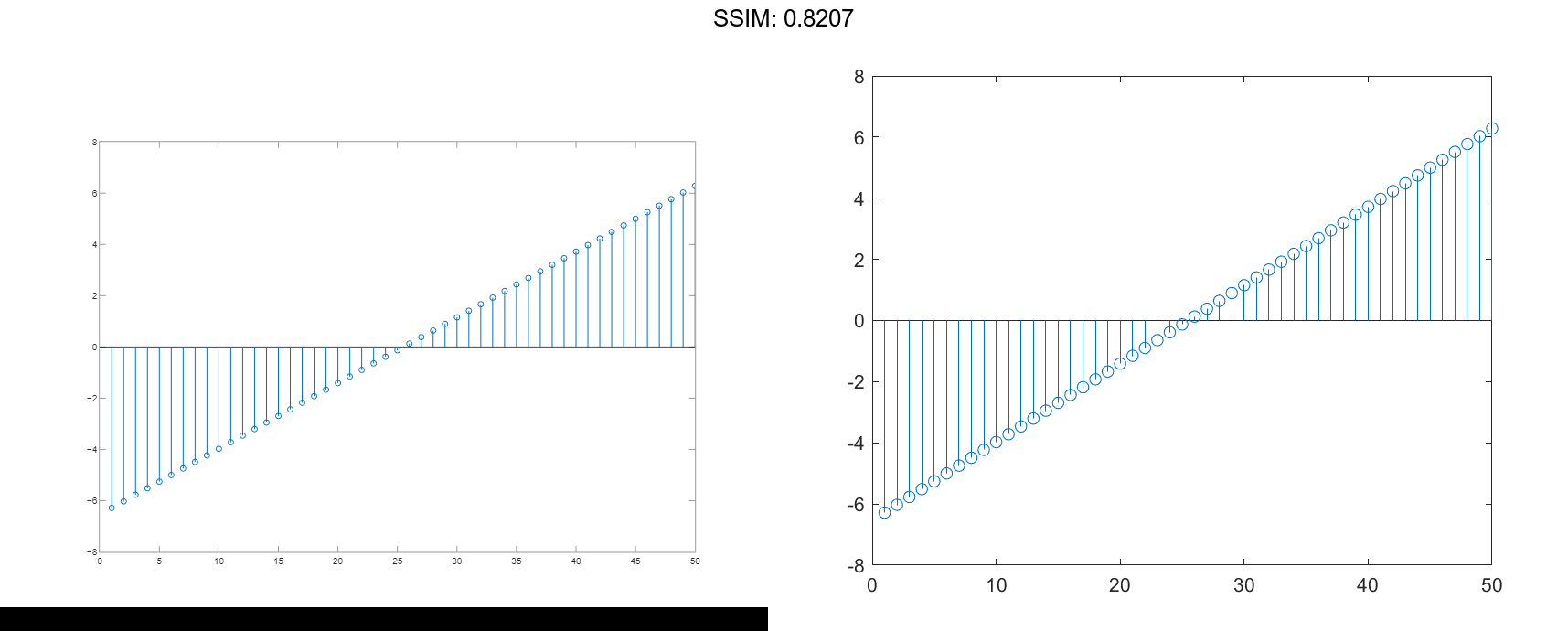
Data values are plotted as stems extending from the baseline and terminating at the data value. The length of Y automatically determines the position of each stem on the x-axis.
Plot Multiple Data Series
Plot two data series using a two-column matrix.
figure
X = linspace(0,2*pi,50)';
Y = [cos(X), 0.5*sin(X)];
stem(Y)

fig2plotly()


Each column of Y is plotted as a separate series, and entries in the same row of Y are plotted against the same x value. The number of rows in Y automatically generates the position of each stem on the x-axis.
Plot Single Data Series at Specified x values
Plot 50 data values of cosine evaluated between 0 and 2π and specify the set of x values for the stem plot.
figure
X = linspace(0,2*pi,50)';
Y = cos(X);
stem(X,Y)

fig2plotly()


The first vector input determines the position of each stem on the x-axis.
Plot Multiple Data Series at Specified x values
Plot 50 data values of sine and cosine evaluated between 0 and 2π and specify the set of x values for the stem plot.
figure
X = linspace(0,2*pi,50)';
Y = [cos(X), 0.5*sin(X)];
stem(X,Y)

fig2plotly()


The vector input determines the x-axis positions for both data series.
Plot Multiple Data Series at Unique Sets of x values
Plot 50 data values of sine and cosine evaluated at different sets of x values. Specify the corresponding sets of x values for each series.
figure
x1 = linspace(0,2*pi,50)';
x2 = linspace(pi,3*pi,50)';
X = [x1, x2];
Y = [cos(x1), 0.5*sin(x2)];
stem(X,Y)

fig2plotly()


Each column of X is plotted against the corresponding column of Y.
Fill in Plot Markers
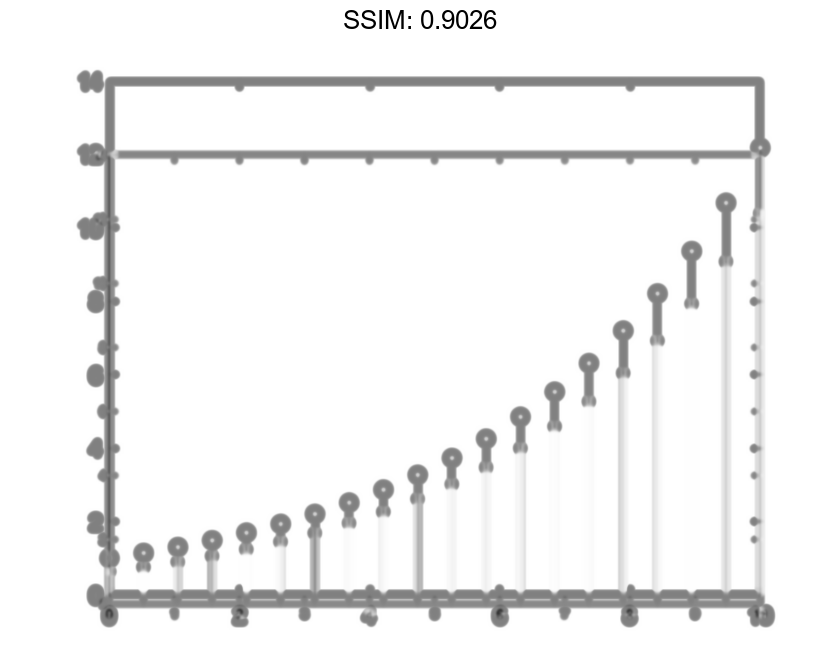
Create a stem plot and fill in the circles that terminate each stem.
X = linspace(0,10,20)';
Y = (exp(0.25*X));
stem(X,Y,'filled')

fig2plotly()

Specify Stem and Marker Options
Create a stem plot and set the line style to a dotted line, the marker symbols to diamonds, and the color to red using the LineSpec option.
figure
X = linspace(0,2*pi,50)';
Y = (exp(X).*sin(X));
stem(X,Y,':diamondr')

fig2plotly()

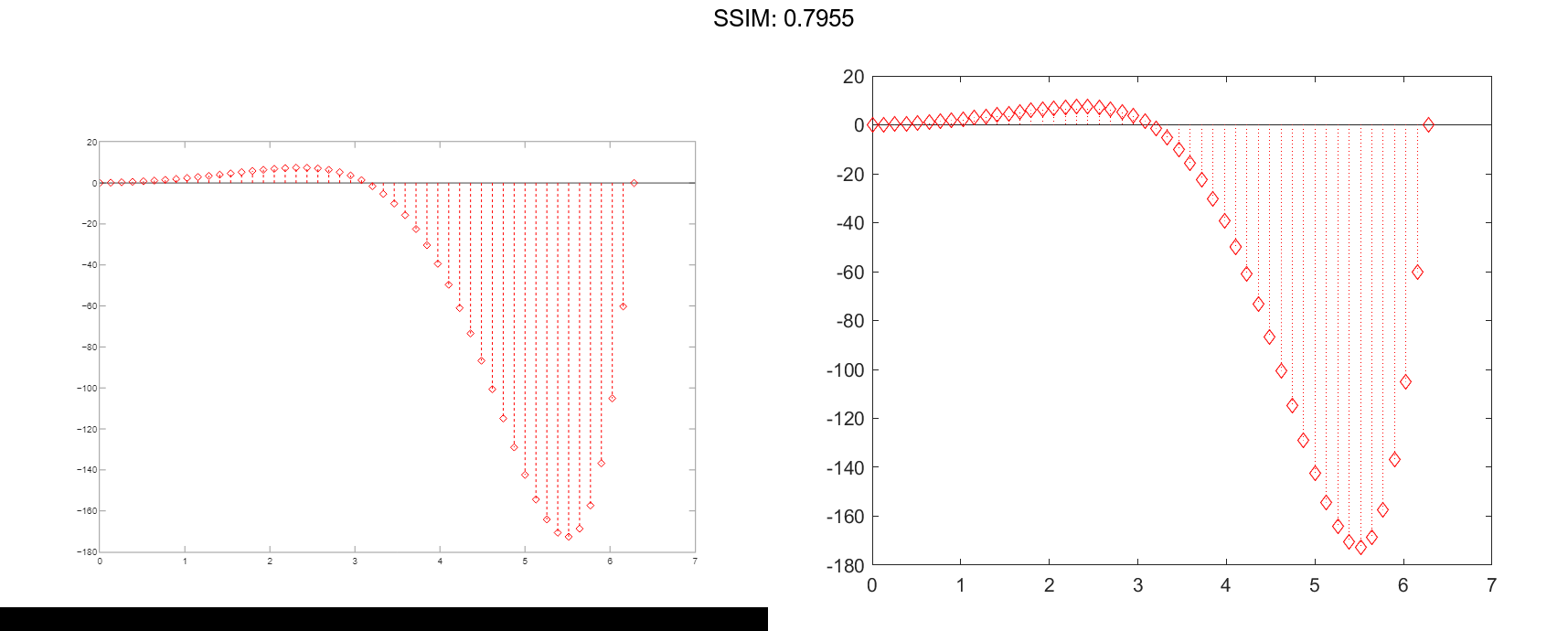
To color the inside of the diamonds, use the 'fill' option.
Specify Additional Stem and Marker Options
Create a stem plot and set the line style to a dot-dashed line, the marker face color to red, and the marker edge color to green using Name,Value pair arguments.
figure
X = linspace(0,2*pi,25)';
Y = (cos(2*X));
stem(X,Y,'LineStyle','-.',...
     'MarkerFaceColor','red',...
     'MarkerEdgeColor','green')

fig2plotly()

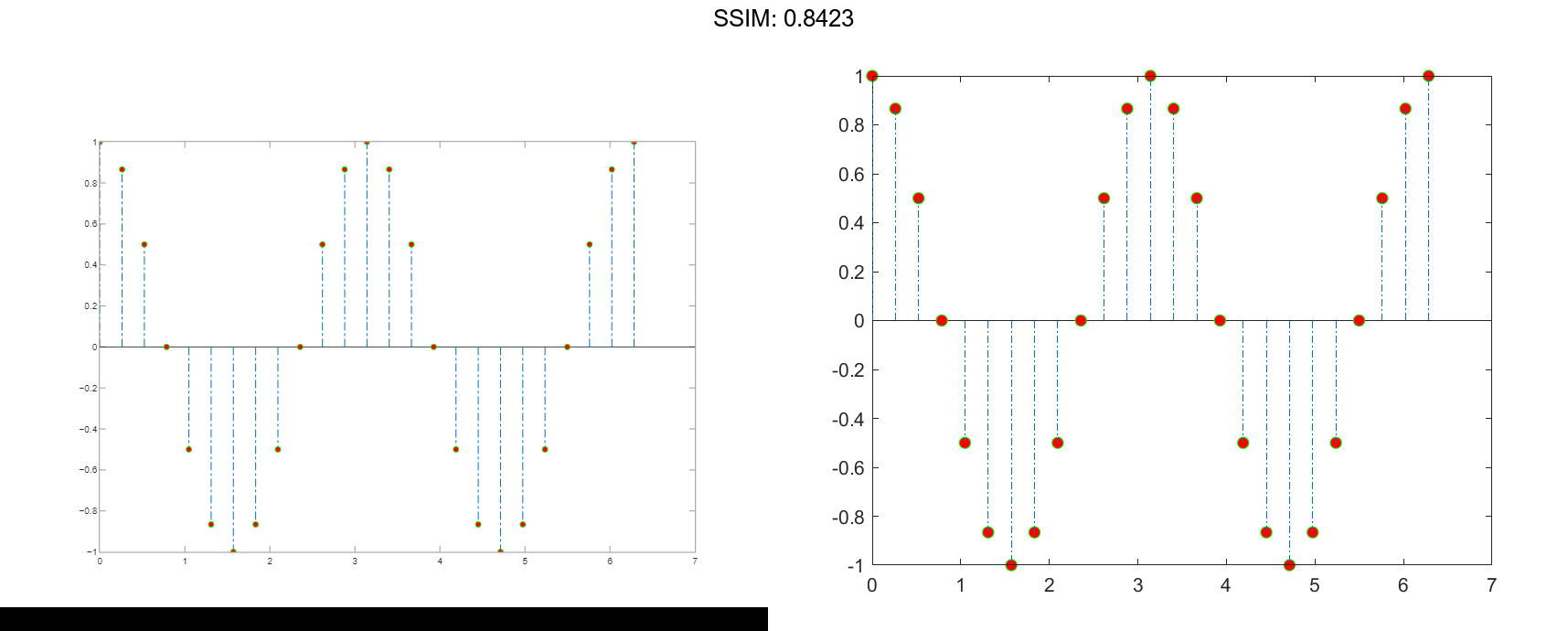
The stem remains the default color.
Specify Axes for Stem Plot
Starting in R2019b, you can display a tiling of plots using the tiledlayout and nexttile functions. Call the tiledlayout function to create a 2-by-1 tiled chart layout. Call the nexttile function to create the axes objects ax1 and ax2. Create separate stem plots in the axes by specifying the axes object as the first argument to stem.
x = 0:25;
y1 = exp(0.1*x);
y2 = -exp(.05*x);
tiledlayout(2,1)

% Top plot
ax1 = nexttile;
stem(ax1,x,y1)

% Bottom plot
ax2 = nexttile;
stem(ax2,x,y2)

fig2plotly()


Modify Stem Series After Creation
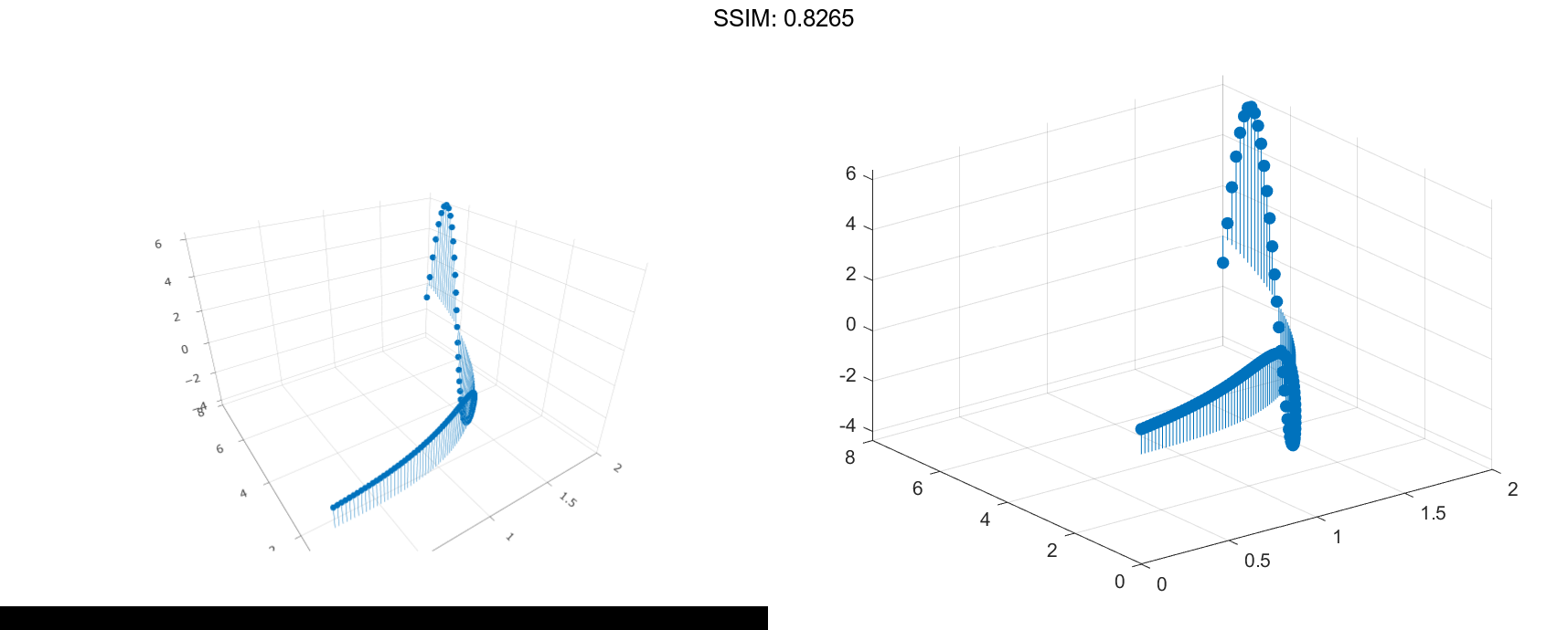
Create a 3-D stem plot and return the stem series object.
X = linspace(0,2); Y = X.^3; Z = exp(X).*cos(Y); h = stem3(X,Y,Z,'filled');

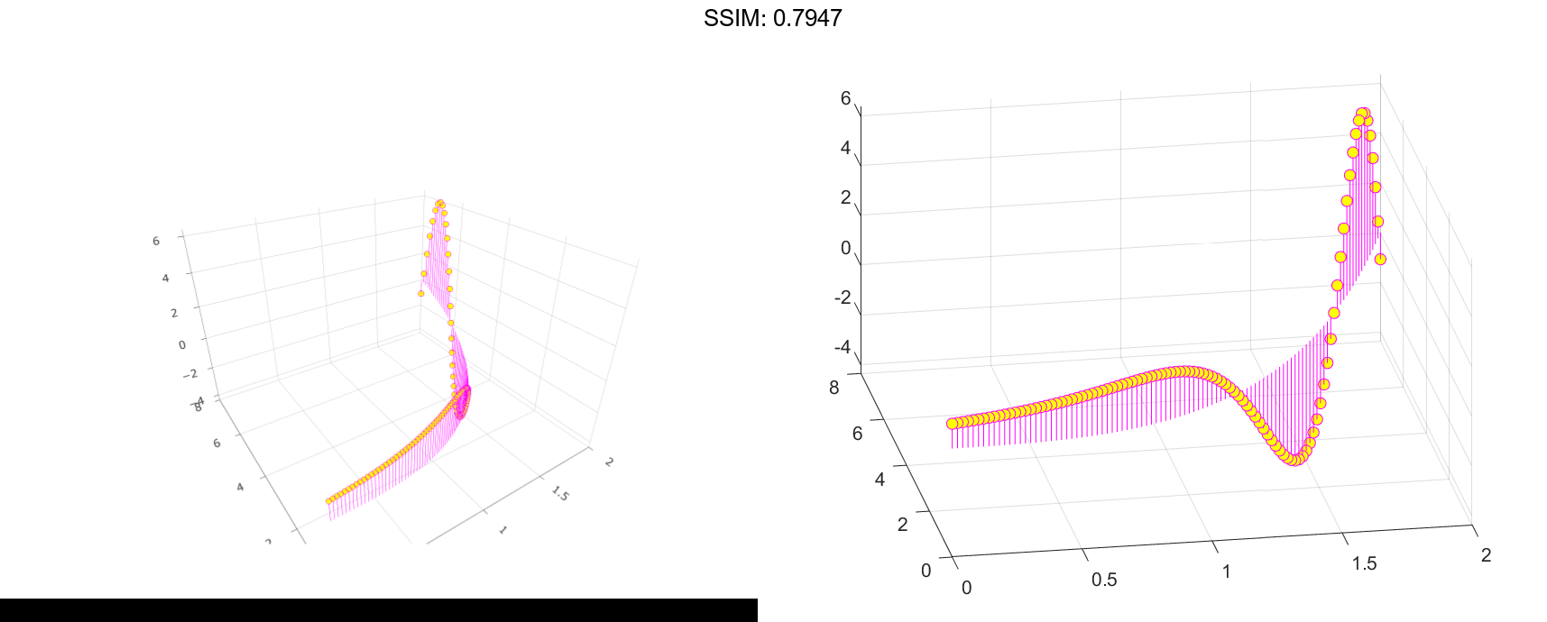
Change the color to magenta and set the marker face color to yellow. Use view to adjust the angle of the axes in the figure. Use dot notation to set properties.
h.Color = 'm';
h.MarkerFaceColor = 'y';
view(-10,35)

fig2plotly()

Adjust Baseline Properties
Create a stem plot and change properties of the baseline.
X = linspace(0,2pi,50); Y = exp(0.3X).sin(3X); h = stem(X,Y);


Change the line style of the baseline. Use dot notation to set properties.
hbase = h.BaseLine;
hbase.LineStyle = '--';

fig2plotly()


Hide the baseline by setting its Visible property to 'off' .
hbase.Visible = 'off';
Change Baseline Level
Create a stem plot with a baseline level at 2.
X = linspace(0,2*pi,50)';
Y = (exp(0.3*X).*sin(3*X));
stem(X,Y,'BaseValue',2);

fig2plotly()


