MATLAB barh in MATLAB®
Learn how to make 10 barh charts in MATLAB, then publish them to the Web with Plotly.
Display One Series of Bars
Create a vector of four values. Display the values in a bar graph with one horizontal bar for each value.
y = [10 20 30 41];
barh(y)

fig2plotly()

Display Four Series of Bars with Axis Labels and Legend
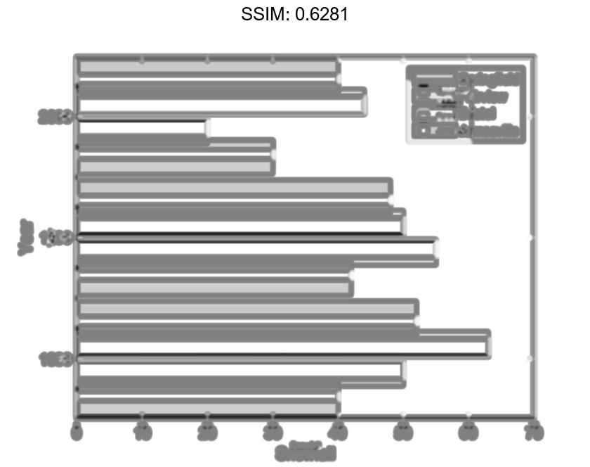
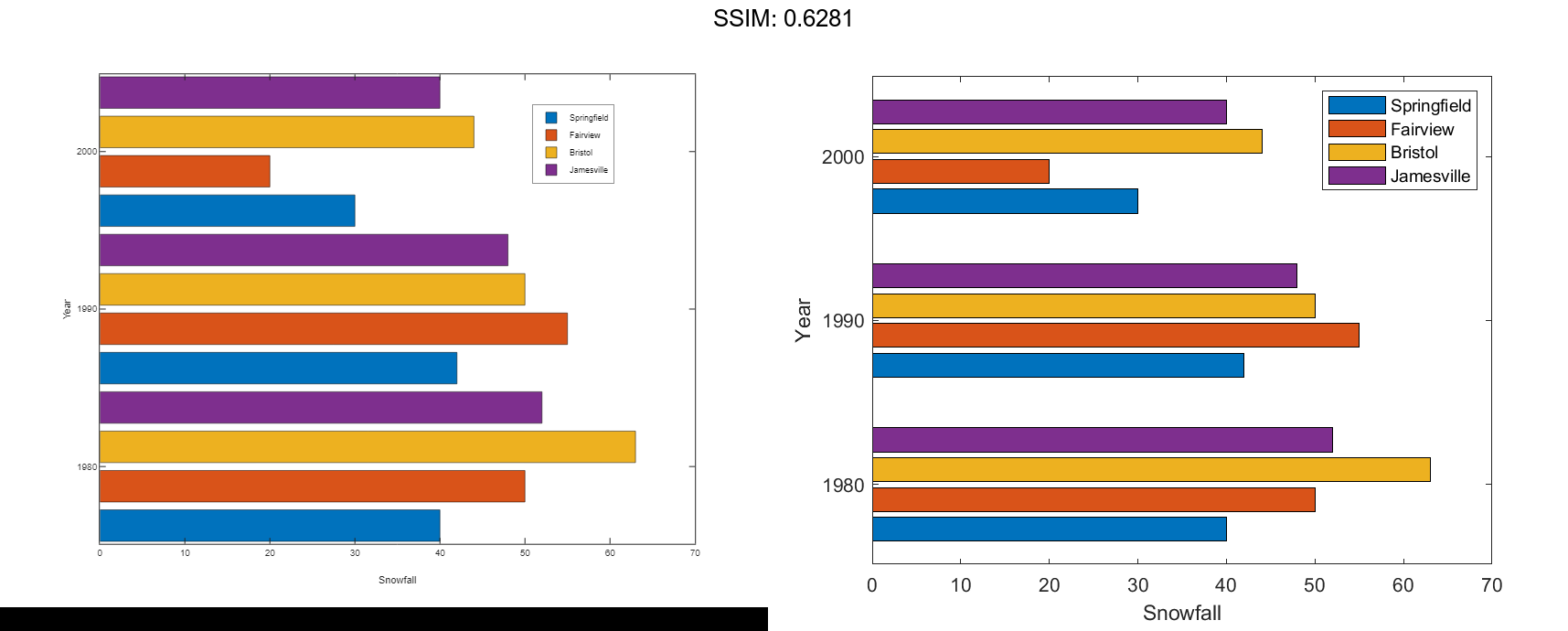
Define x as a matrix of three year values. Define y as a matrix containing snowfall data for four cities. Display the four series of bars in groups for each year. Then add the axis labels and a legend.
x = [1980 1990 2000];
y = [40 50 63 52; 42 55 50 48; 30 20 44 40];
barh(x,y)
xlabel('Snowfall')
ylabel('Year')
legend({'Springfield','Fairview','Bristol','Jamesville'})

fig2plotly()
Change Baseline Value
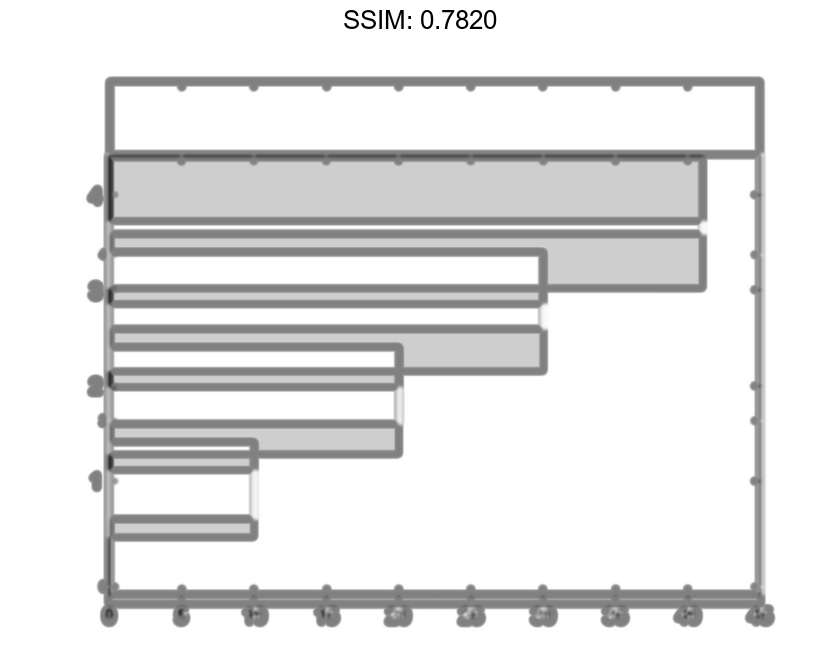
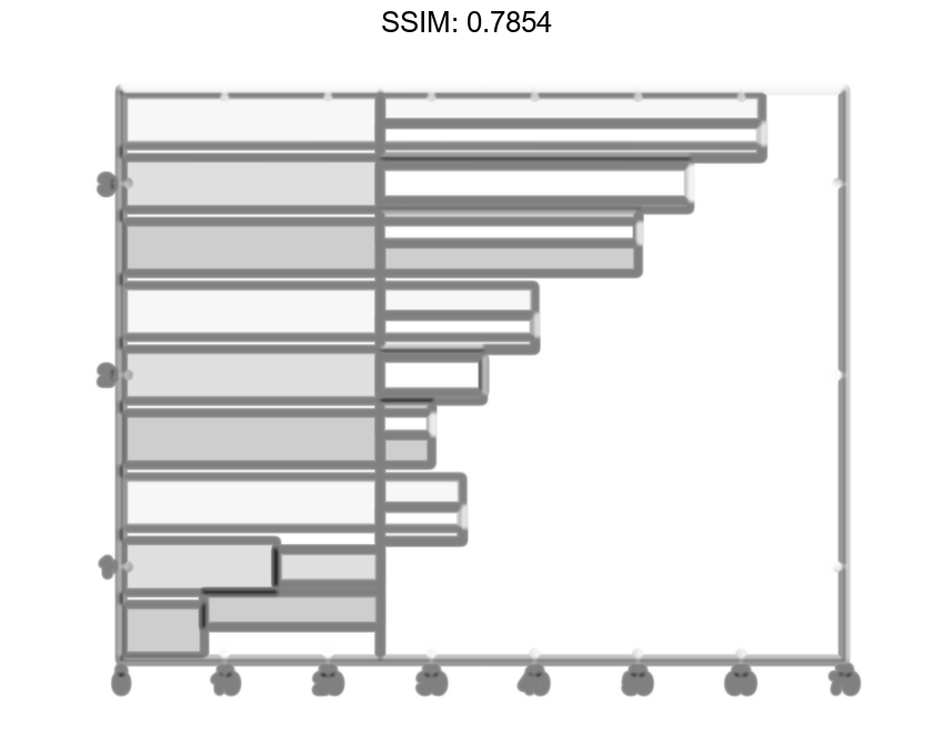
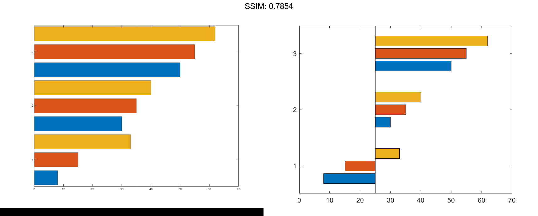
Create matrix y. Then display the values of y in a bar graph with a baseline value of 25. Values that are less than 25 display on the left side of the baseline.
y = [8 15 33; 30 35 40; 50 55 62];
barh(y,'BaseValue',25)

fig2plotly()
Display Stacked Bars with Negative Data
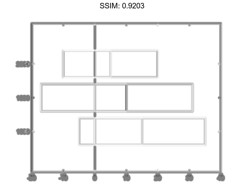
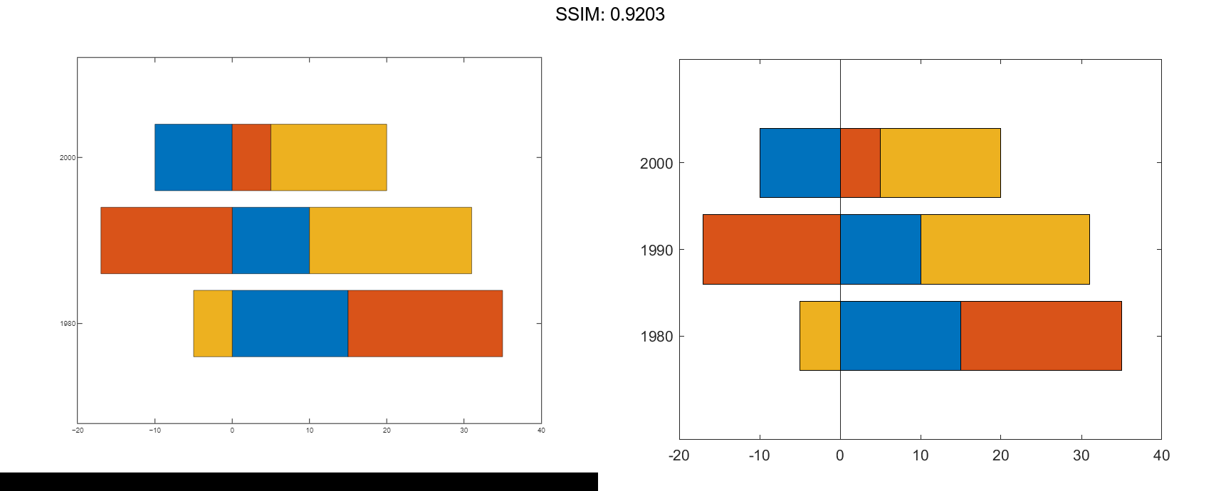
Define x as a vector of three year values. Define y as a matrix that contains a combination of negative and positive values. Display the values in a stacked horizontal bar graph.
x = [1980 1990 2000];
y = [15 20 -5; 10 -17 21; -10 5 15];
barh(x,y,'stacked')

fig2plotly()
Customize Vertical Axis Tick Labels
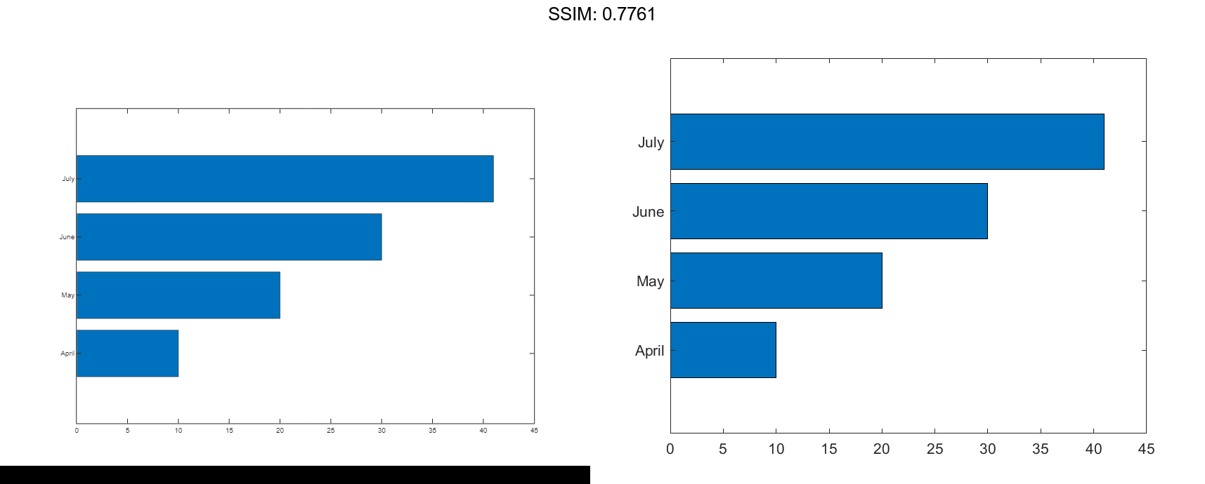
Define y as a vector of four values, and display the values in a horizontal bar graph. Then call the yticklabels function to change the tick labels on the vertical axis.
y = [10 20 30 41];
barh(y)
yticklabels({'April','May','June','July'})

fig2plotly()
Specify Categorical Data
One way to indicate categories for your bars is to specify X as a categorical array. The barh function uses a sorted list of the categories, so the bars might display in a different order than you expect. To preserve the order, call the reordercats function.
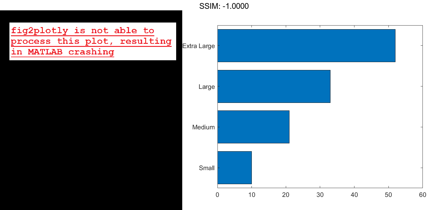
Define X as categorical array, and call the reordercats function to specify the order for the bars. Then define Y as a vector of bar lengths and display the bar graph.
X = categorical({'Small','Medium','Large','Extra Large'});
X = reordercats(X,{'Small','Medium','Large','Extra Large'});
Y = [10 21 33 52];
barh(X,Y)

fig2plotly()

Add Labels to the Ends of Bars
Define vals as a matrix containing two series of data. Display the data in a horizontal bar graph and specify an output argument. Since there are two series, barh returns a vector of two Bar objects.
x = [1 2 3]; vals = [2 3 6; 11 23 26]; b = barh(x,vals);
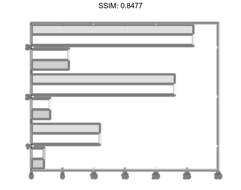

Display the values as labels at the tips of the first series of bars. To do this, get the coordinates of the tips of the bars by getting the XEndPoints and YEndPoints properties of the first Bar object. Since horizontal bar graphs have rotated axes, you must switch the values of XEndPoints and YEndPoints before passing them to the text function. Add a padding value of 0.3 to YEndpoints so that the text does not touch the edges of the bars. Then call the text function to display the labels.
xtips1 = b(1).YEndPoints + 0.3;
ytips1 = b(1).XEndPoints;
labels1 = string(b(1).YData);
text(xtips1,ytips1,labels1,'VerticalAlignment','middle')

fig2plotly()
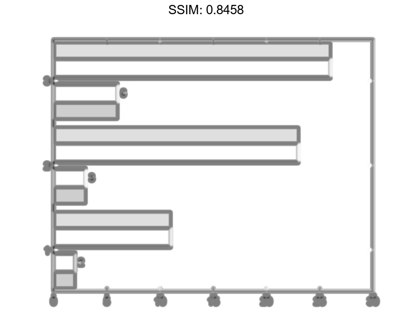
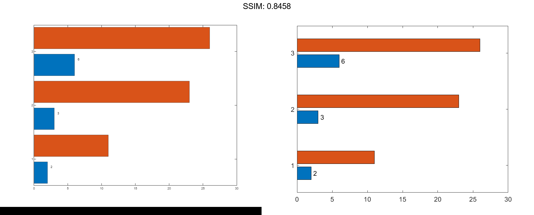
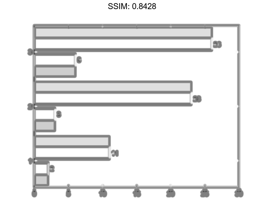
Next, follow the same steps to display the labels at the tips of the second series of bars.
xtips2 = b(2).YEndPoints + 0.3;
ytips2 = b(2).XEndPoints;
labels2 = string(b(2).YData);
text(xtips2,ytips2,labels2,'VerticalAlignment','middle')

fig2plotly()

Specify Bar Thickness and Color
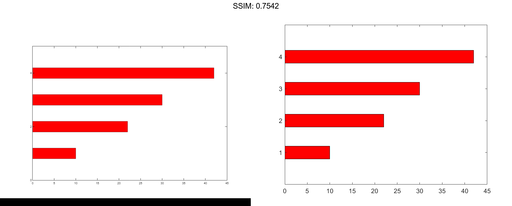
Create and display data in a horizontal bar graph that has red bars with a thickness of 0.4.
y = [10 22 30 42];
width = 0.4;
barh(y,width,'red');

fig2plotly()
Customize One Series of Bars
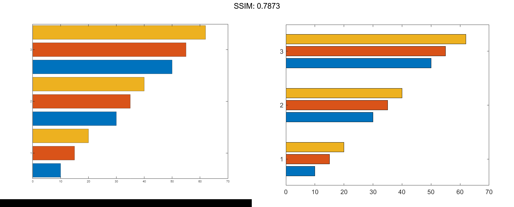
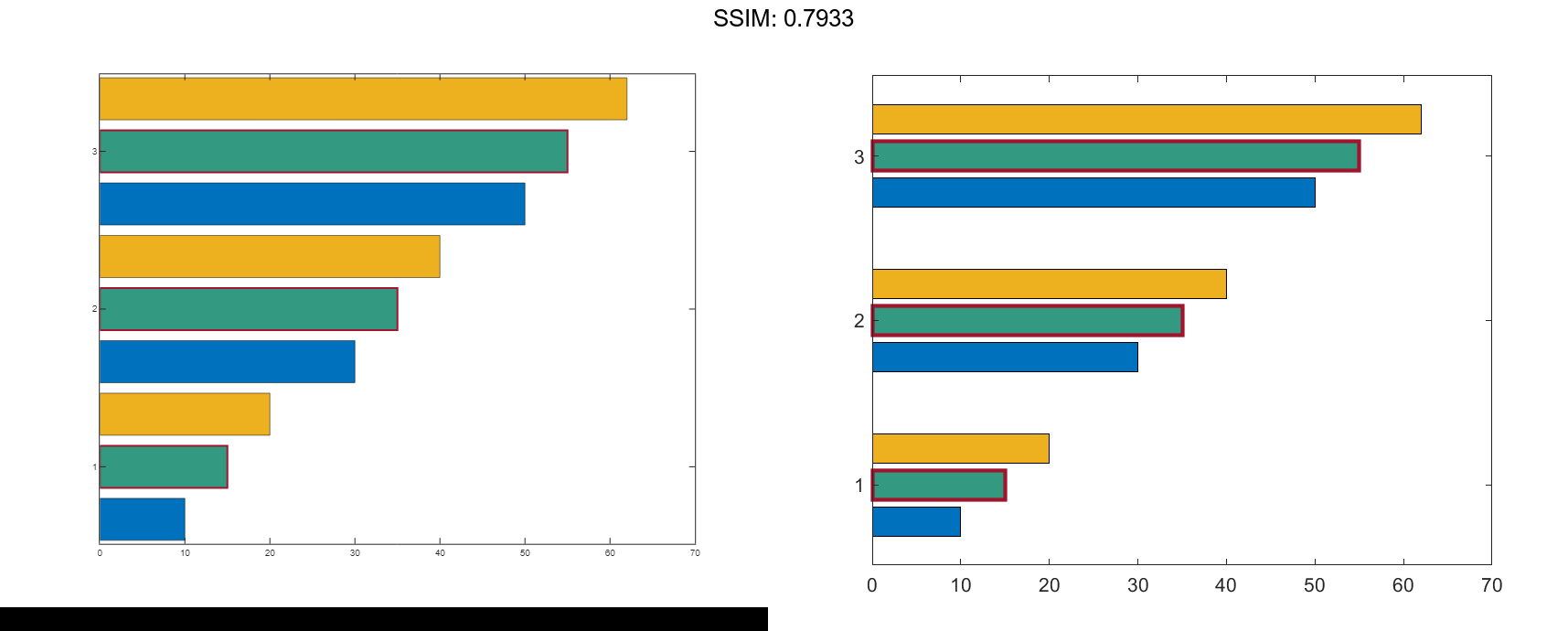
Create matrix y in which each column is a series of data. Then display the data in a bar graph, specifying an output argument when calling the barh function. In this case, barh returns a vector of three Bar objects. Each object corresponds to a different series.
y = [10 15 20; 30 35 40; 50 55 62]; b = barh(y);
Modify the second series of bars to be green with thick red edges.
b(2).FaceColor = [.2 .6 .5];
b(2).EdgeColor = [.63 .08 .18];
b(2).LineWidth = 2;

fig2plotly()
Compare Different Bar Styles
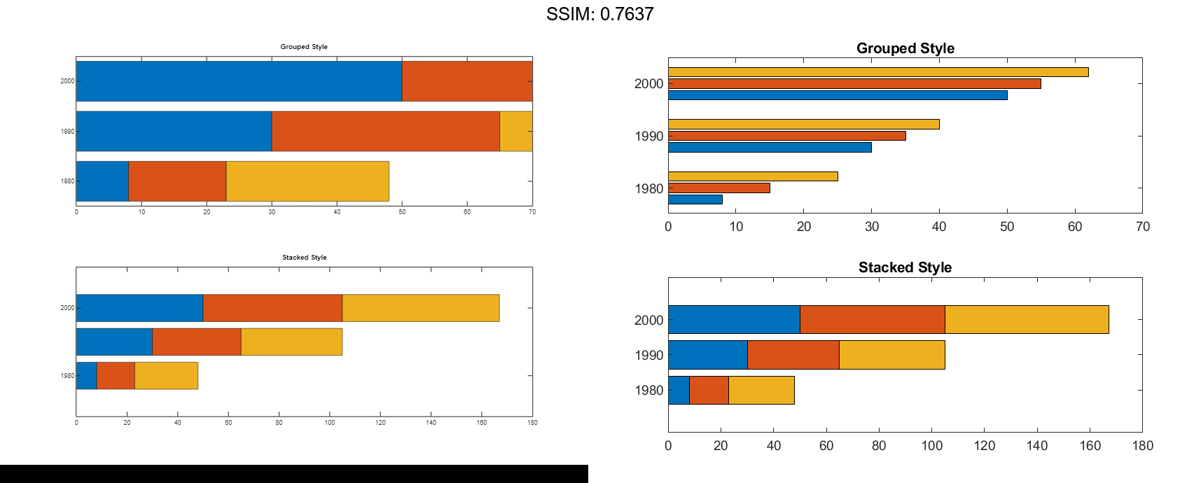
Create and display data in two different bar graphs using the default 'grouped' style and the 'stacked' style.
x = [1980 1990 2000];
y = [8 15 25; 30 35 40; 50 55 62];

% Grouped
tiledlayout(2,1);
ax1 = nexttile;
barh(ax1,x,y)
title('Grouped Style')

% Stacked
ax2 = nexttile;
barh(ax2,x,y,'stacked')
title('Stacked Style')

fig2plotly()
