MATLAB bar in MATLAB®
Learn how to make 14 bar charts in MATLAB, then publish them to the Web with Plotly.
Create Bar Graph
y = [75 91 105 123.5 131 150 179 203 226 249 281.5];
bar(y)

fig2plotly()

Specify Bar Locations
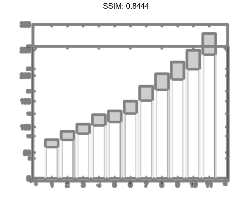
Specify the bar locations along the x-axis.
x = 1900:10:2000;
y = [75 91 105 123.5 131 150 179 203 226 249 281.5];
bar(x,y)

fig2plotly()


Specify Bar Width
Set the width of each bar to 40 percent of the total space available for each bar.
y = [75 91 105 123.5 131 150 179 203 226 249 281.5];
bar(y,0.4)

fig2plotly()


Display Groups of Bars
Display four groups of three bars.
y = [2 2 3; 2 5 6; 2 8 9; 2 11 12];
bar(y)

fig2plotly()


Display Stacked Bars
Display one bar for each row of the matrix. The height of each bar is the sum of the elements in the row.
y = [2 2 3; 2 5 6; 2 8 9; 2 11 12];
bar(y,'stacked')

fig2plotly()


Display Stacked Bars with Negative Data
Define x as a vector of three year values. Define y as a matrix that contains a combination of negative and positive values. Display the values in a bar graph.
x = [1980 1990 2000];
y = [15 20 -5; 10 -17 21; -10 5 15];
bar(x,y,'stacked')

fig2plotly()


Specify Categorical Data
One way to indicate categories for your bars is to specify X as a categorical array. The bar function uses a sorted list of the categories, so the bars might display in a different order than you expect. To preserve the order, call the reordercats function.
Define X as categorical array, and call the reordercats function to specify the order for the bars. Then define Y as a vector of bar heights and display the bar graph.
X = categorical({'Small','Medium','Large','Extra Large'});
X = reordercats(X,{'Small','Medium','Large','Extra Large'});
Y = [10 21 33 52];
bar(X,Y)

fig2plotly()

Specify Labels at the Ends of Bars
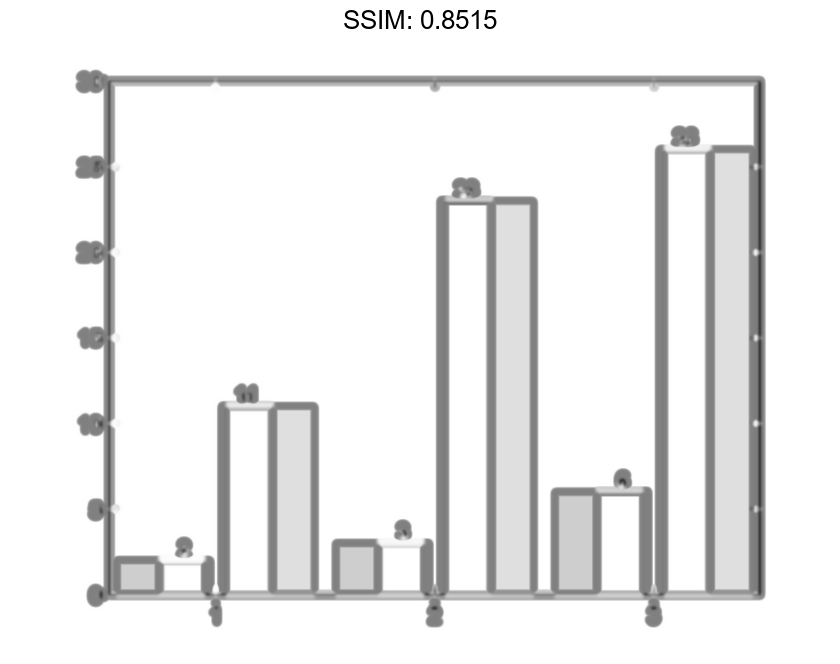
Define vals as a matrix containing the values of two data sets. Display the values in a bar graph and specify an output argument. Since there are two data sets, bar returns a vector containing two Bar objects.
x = [1 2 3]; vals = [2 3 6; 11 23 26]; b = bar(x,vals);


Display the values at the tips of the first series of bars. Get the coordinates of the tips of the bars by getting the XEndPoints and YEndPoints properties of the first Bar object. Pass those coordinates to the text function, and specify the vertical and horizontal alignment so that the values are centered above the tips of the bars.
xtips1 = b(1).XEndPoints;
ytips1 = b(1).YEndPoints;
labels1 = string(b(1).YData);
text(xtips1,ytips1,labels1,'HorizontalAlignment','center',...
    'VerticalAlignment','bottom')

fig2plotly()


Next, display the values above the tips of the second series of bars.
xtips2 = b(2).XEndPoints;
ytips2 = b(2).YEndPoints;
labels2 = string(b(2).YData);
text(xtips2,ytips2,labels2,'HorizontalAlignment','center',...
    'VerticalAlignment','bottom')

fig2plotly()

Specify Axes for Bar Graph
Starting in R2019b, you can display a tiling of bar graphs using the tiledlayout and nexttile functions. Call the tiledlayout function to create a 2-by-1 tiled chart layout. Call the nexttile function to create the axes objects ax1 and ax2. Display a bar graph in the top axes. In the bottom axes, display a stacked bar graph of the same data.
y = [1 2 3; 4 5 6];
tiledlayout(2,1)

% Top bar graph
ax1 = nexttile;
bar(ax1,y)

% Bottom bar graph
ax2 = nexttile;
bar(ax2,y,'stacked')

fig2plotly()


Specify Bar Color
Create a bar graph using red bars.
y = [75 91 105 123.5 131 150 179 203 226 249 281.5];
bar(y,'r')

fig2plotly()


Specify Bar and Outline Colors
Set the bar interior color and outline color using RGB triplets. Set the width of the bar outline.
y = [75 91 105 123.5 131 150 179 203 226 249 281.5];
bar(y,'FaceColor',[0 .5 .5],'EdgeColor',[0 .9 .9],'LineWidth',1.5)

fig2plotly()


Control Individual Bar Colors
Control individual bar colors using the CData property of the Bar object.
Create a bar chart and assign the Bar object to a variable. Set the FaceColor property of the Bar object to 'flat' so that the chart uses the colors defined in the CData property. By default, the CData property is prepopulated with a matrix of the default RGB color values. To change a particular color, change the corresponding row in the matrix. For example, change the color of the second bar.
b = bar(rand(10,1));
b.FaceColor = 'flat';
b.CData(2,:) = [.5 0 .5];

fig2plotly()


Bar Chart with Colormap Colors
Create a bar chart that uses colormap colors by setting the FaceColor property to 'flat'. Then set the CData property for each Bar object to an integer.
y = [1 3 5; 3 2 7; 3 4 2];
b = bar(y,'FaceColor','flat');
for k = 1:size(y,2)
    b(k).CData = k;
end

fig2plotly()


Customize One Series in Grouped or Stacked Bars
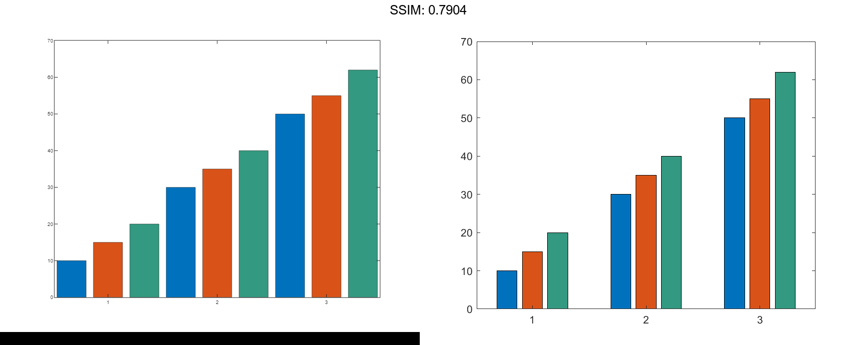
Create matrix y, where each column is a series of data. Call the bar function to display the data in a bar graph, and specify an output argument. The output is a vector of three Bar objects, where each object corresponds to a different series. This is true whether the bars are grouped or stacked.
y = [10 15 20; 30 35 40; 50 55 62]; b = bar(y);
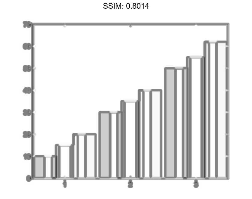

Make the third series of bars green.
b(3).FaceColor = [.2 .6 .5];

fig2plotly()

