
Create a 3-D Swarm Chart
Read the BicycleCounts.csv data set into a timetable called tbl. This data set contains bicycle traffic data over a period of time. Display the first five rows of tbl.
tbl = readtable(fullfile(matlabroot,'examples','matlab','data','BicycleCounts.csv')); tbl(1:5,:)
ans=5×5 table
         Timestamp              Day         Total    Westbound    Eastbound
    ___________________    _____________    _____    _________    _________

    2015-06-24 00:00:00    {'Wednesday'}     13          9            4
    2015-06-24 01:00:00    {'Wednesday'}      3          3            0
    2015-06-24 02:00:00    {'Wednesday'}      1          1            0
    2015-06-24 03:00:00    {'Wednesday'}      1          1            0
    2015-06-24 04:00:00    {'Wednesday'}      1          1            0
ispm = tbl.Timestamp.Hour < 12;
y = categorical;
y(ispm) = "pm";
y(~ispm) = "am";
z= tbl.Eastbound;
swarmchart3(x,y,z);

fig2plotly()

Specify Marker Size
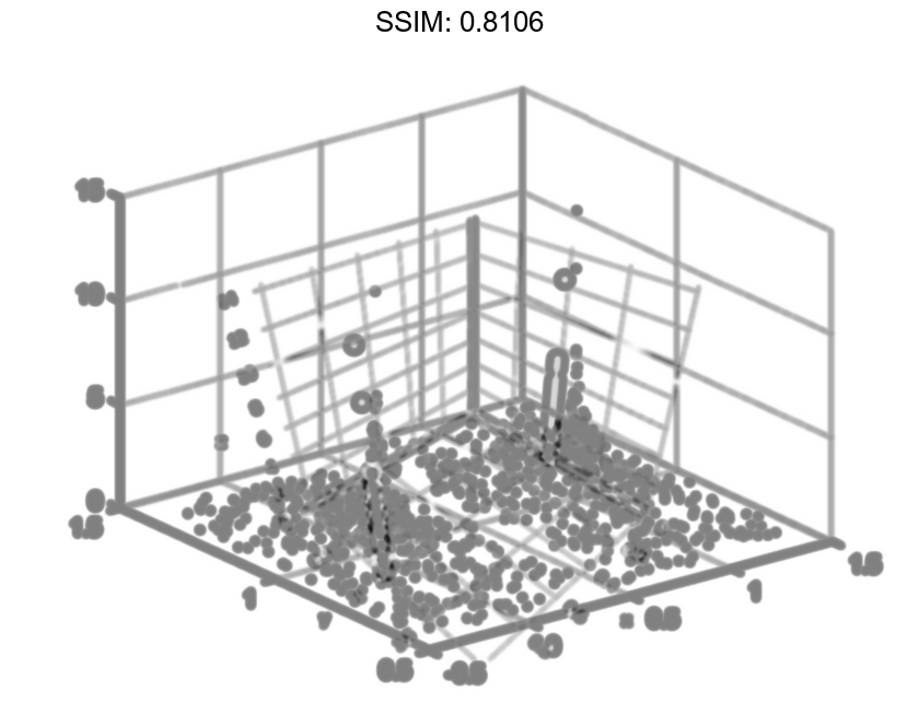
Create vector x as a combination of zeros and ones, and create y as a vector containing all ones. Create z as a vector of squared random numbers. Then create a swarm chart of x, y, and z, and specify the size marker size as 5.
x = [zeros(1,500) ones(1,500)];
y = ones(1,1000);
z = randn(1,1000).^2;
swarmchart3(x,y,z,5);

fig2plotly()
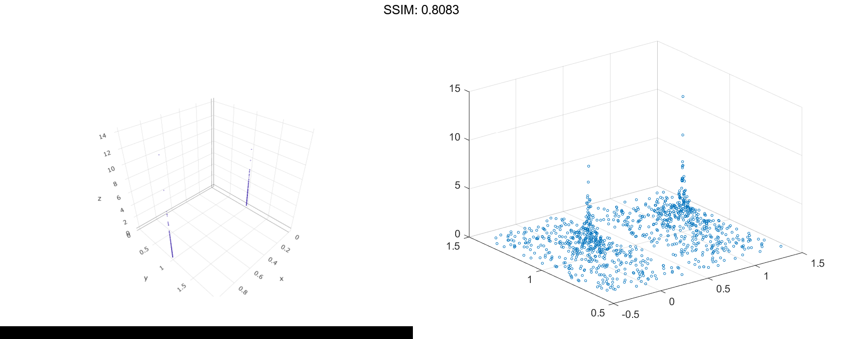
Specify Marker Symbol
Create vector x as a combination of zeros and ones, and create y as a vector containing all ones. Create z as a vector of squared random numbers. Then create a swarm chart of x, y, and z, and specify the point ('.') marker symbol.
x = [zeros(1,500) ones(1,500)];
y = ones(1,1000);
z = randn(1,1000).^2;
swarmchart3(x,y,z,'.');

fig2plotly()
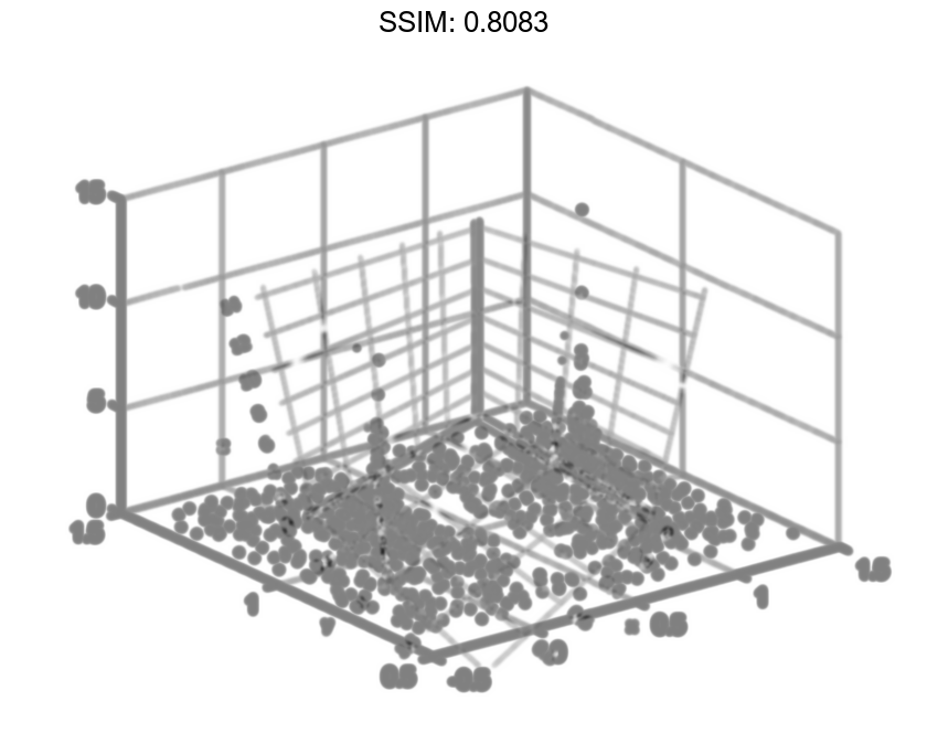
Vary Marker Color
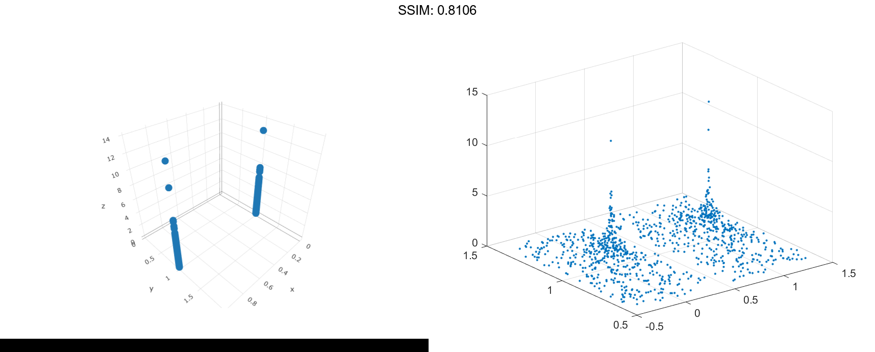
Create vector x containing a combination of zeros and ones, and create y containing a random combination of ones and twos. Create z as a vector of squared random numbers. Specify the colors for the markers by creating vector c as the square root of z. Then create a swarm chart of x, y, and z. Set the marker size to 50 and specify the colors as c. The values in c index into the figure's colormap. Use the 'filled' option to fill the markers with color instead of displaying them as hollow circles.
x = [zeros(1,500) ones(1,500)];
y = randi(2,1,1000);
z = randn(1,1000).^2;
c = sqrt(z);
swarmchart3(x,y,z,50,c,'filled');

fig2plotly()
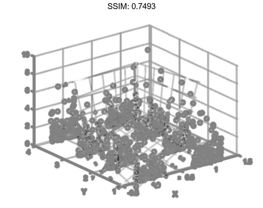
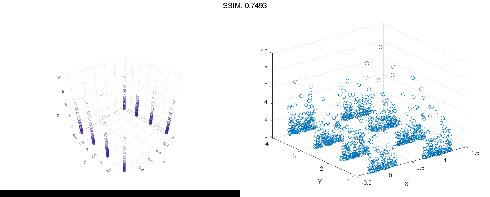
Change Jitter Type and Width
Create vector x containing a combination of zeros and ones, and create y containing a random combination of the numbers one through four. Create z as a vector of squared random numbers. Then create a swarm chart of x, y, and z by calling the swarmchart function with a return argument that stores the Scatter object. Add x- and y-axis labels so you can see the effect of changing the jitter properties in each dimension.
x = [zeros(1,500) ones(1,500)];
y = randi(4,1,1000);
z = randn(1,1000).^2;
s = swarmchart3(x,y,z);
xlabel('X')
ylabel('Y')

fig2plotly()
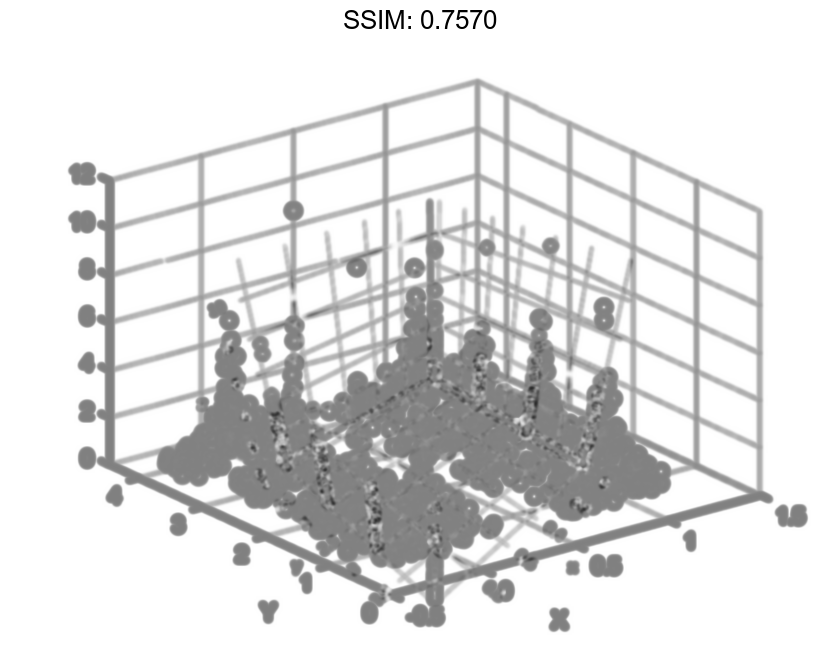
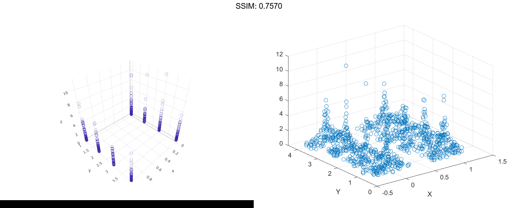
Change the shapes of the clusters of points by setting the jitter properties on the Scatter object. In the x dimension, specify uniform random jitter, and change the jitter width to 0.5 data units. In the y dimension, specify normal random jitter, and change the jitter width to 0.1 data units. The spacing between points does not exceed the jitter width you specify.
s.XJitter = 'rand';
s.XJitterWidth = 0.5;
s.YJitter = 'randn';
s.YJitterWidth = 0.1;

fig2plotly()
Specify Target Axes
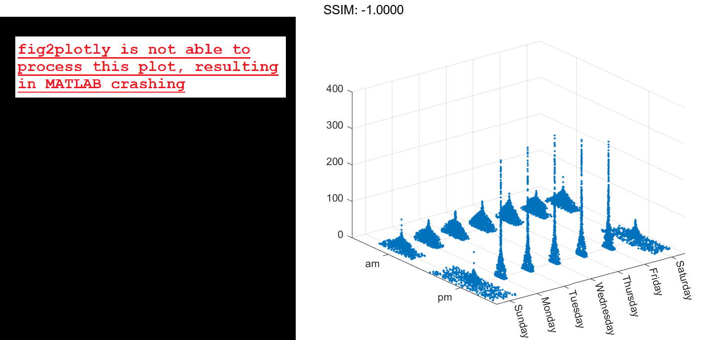
Read the BicycleCounts.csv data set into a timetable called tbl. This data set contains bicycle traffic data over a period of time. Display the first five rows of tbl.
tbl = readtable(fullfile(matlabroot,'examples','matlab','data','BicycleCounts.csv')); tbl(1:5,:)
ans=5×5 table
         Timestamp              Day         Total    Westbound    Eastbound
    ___________________    _____________    _____    _________    _________

    2015-06-24 00:00:00    {'Wednesday'}     13          9            4
    2015-06-24 01:00:00    {'Wednesday'}      3          3            0
    2015-06-24 02:00:00    {'Wednesday'}      1          1            0
    2015-06-24 03:00:00    {'Wednesday'}      1          1            0
    2015-06-24 04:00:00    {'Wednesday'}      1          1            0
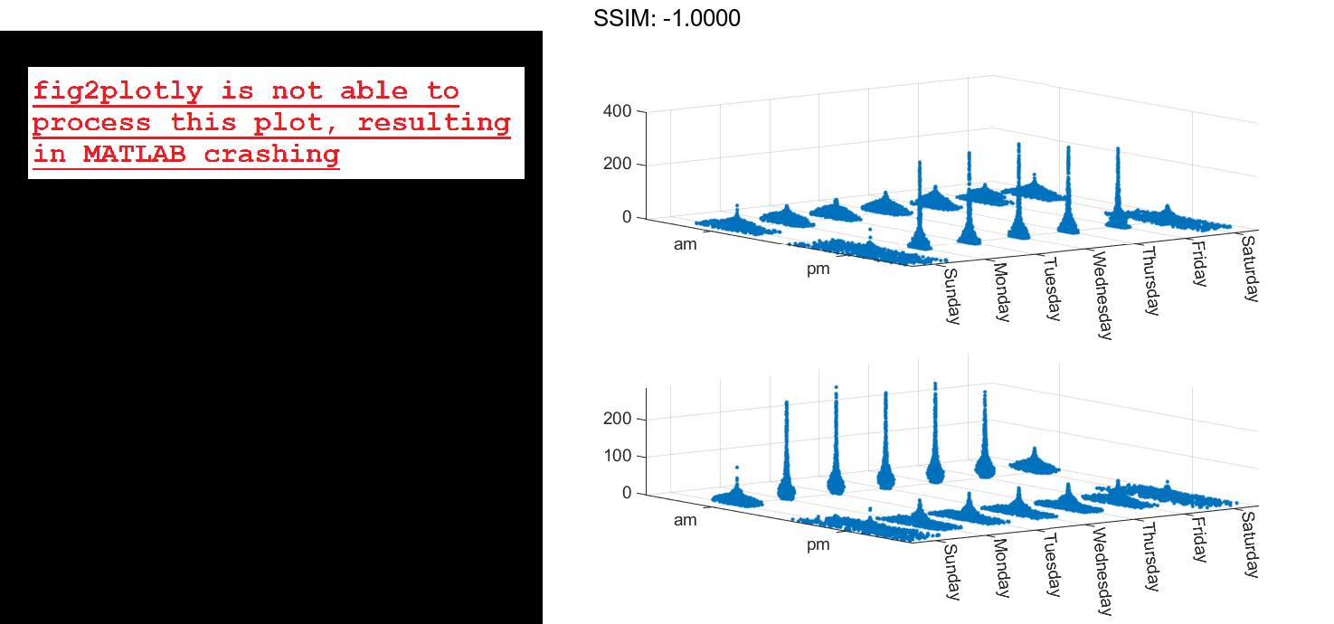
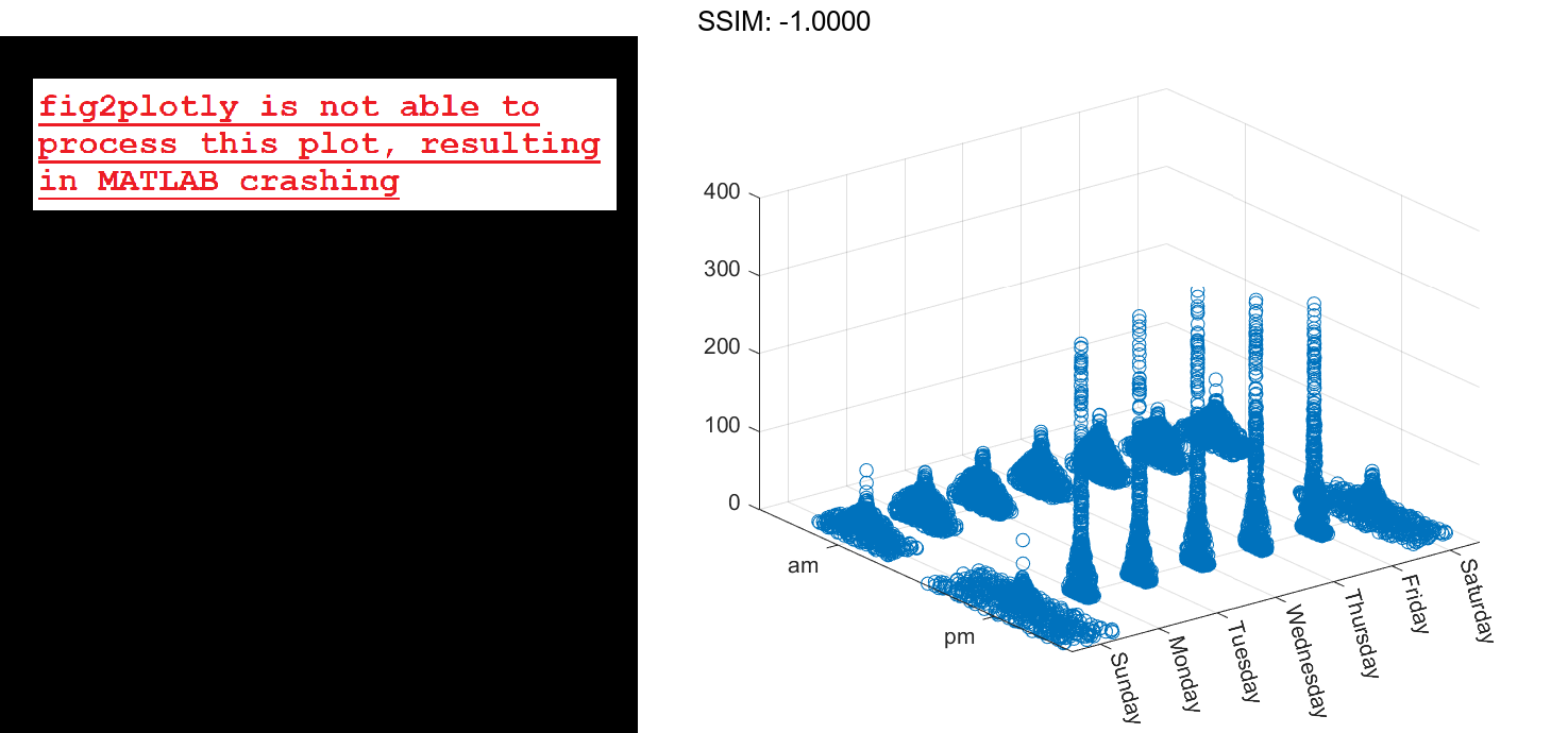
daynames = ["Sunday" "Monday" "Tuesday" "Wednesday" "Thursday" "Friday" "Saturday"];
x = categorical(tbl.Day,daynames);
ispm = tbl.Timestamp.Hour<12;
y = categorical;
y(ispm) = 'pm';
y(~ispm) = 'am';
ze = tbl.Eastbound;
zw = tbl.Westbound;

fig2plotly()
Create a tiled chart layout in the `'flow'` tile arrangement, so that the axes fill the available space in the layout. Call the `nexttile` function to create an axes object and return it as `ax1`. Then create a swarm chart of the eastbound data by passing `ax1` to the `swarmchart` function.
tiledlayout('flow')
ax1=nexttile;
swarmchart3(ax1,x,y,ze,'.');

fig2plotly()

Repeat the process to create a second axes object and a swarm chart for the westbound traffic.
ax2 = nexttile;
z = tbl.Westbound;
swarmchart3(ax2,x,y,zw,'.');

fig2plotly()