MATLAB plotmatrix in MATLAB®
Learn how to make 4 plotmatrix charts in MATLAB, then publish them to the Web with Plotly.
Create Scatter Plot Matrix with Two Matrix Inputs
Create X as a matrix of random data and Y as a matrix of integer values. Then, create a scatter plot matrix of the columns of X against the columns of Y.
X = randn(50,3);
Y = reshape(1:150,50,3);
plotmatrix(X,Y)

fig2plotly()


The subplot in the ith row, jth column of the figure is a scatter plot of the ith column of Y against the jth column of X.
Create Scatter Plot Matrix with One Matrix Input
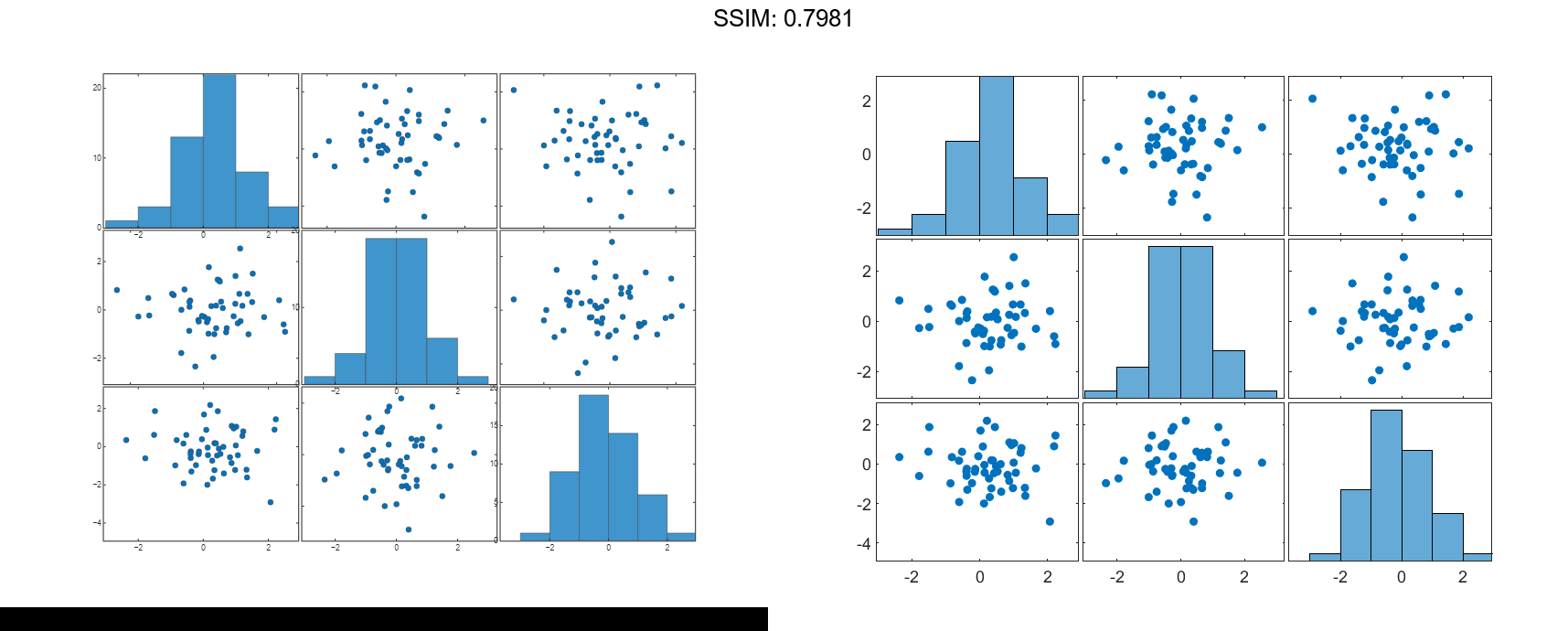
Create a scatter plot matrix of random data. The subplot in the ith row, jth column of the matrix is a scatter plot of the ith column of X against the jth column of X. Along the diagonal are histogram plots of each column of X.
X = randn(50,3);
plotmatrix(X)

fig2plotly()


Specify Marker Type and Color
Create a scatter plot matrix of random data. Specify the marker type and the color for the scatter plots.
X = randn(50,3);
plotmatrix(X,'*r')

fig2plotly()


The LineSpec option sets properties for the scatter plots. To set properties for the histogram plots, return the histogram objects.
Modify Scatter Plot Matrix After Creation
Create a scatter plot matrix of random data.
rng default X = randn(50,3); [S,AX,BigAx,H,HAx] = plotmatrix(X);


To set properties for the scatter plots, use S. To set properties for the histograms, use H. To set axes properties, use AX, BigAx, and HAx. Use dot notation to set properties.
Set the color and marker type for the scatter plot in the lower left corner of the figure. Set the color for the histogram plot in the lower right corner. Use the title command to title the figure.
S(3).Color = 'g'; S(3).Marker = '*';
H(3).EdgeColor = 'k'; H(3).FaceColor = 'g';
title(BigAx,'A Comparison of Data Sets')


