

MATLAB pie in MATLAB®
Learn how to make 8 pie charts in MATLAB, then publish them to the Web with Plotly.
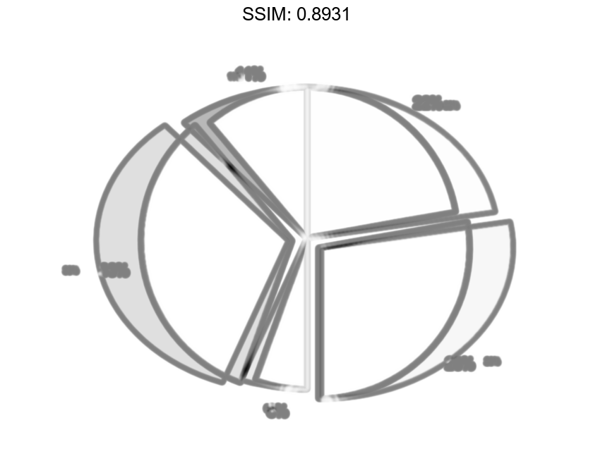
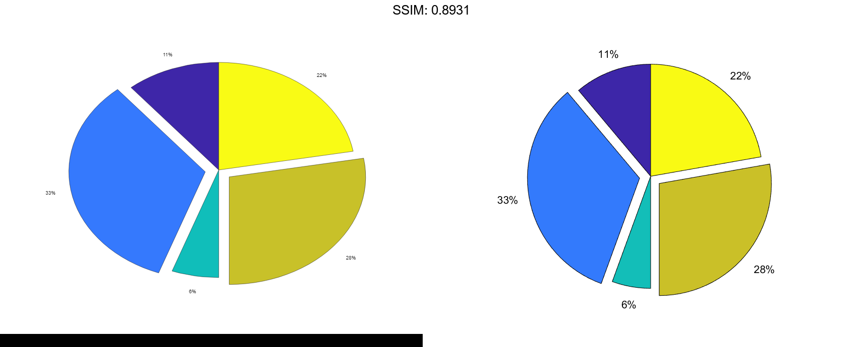
Create Pie Chart with Offset Slices
Create a pie chart of vector X.
X = [1 3 0.5 2.5 2];
pie(X)

fig2plotly()

Offset the second and fourth pie slices by setting the corresponding explode elements to 1.
explode = [0 1 0 1 0];
pie(X,explode)

fig2plotly()
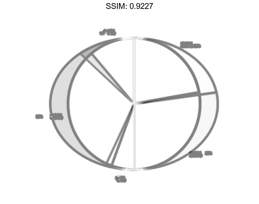
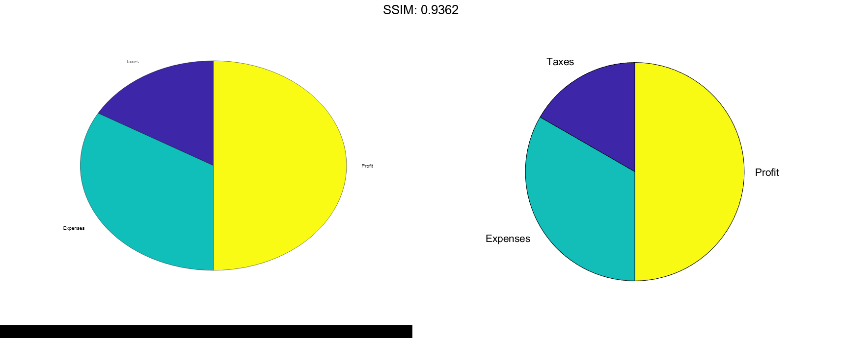
Specify Text Labels for Pie Chart
Create a pie chart of vector X and label the slices.
X = 1:3;
labels = {'Taxes','Expenses','Profit'};
pie(X,labels)

fig2plotly()
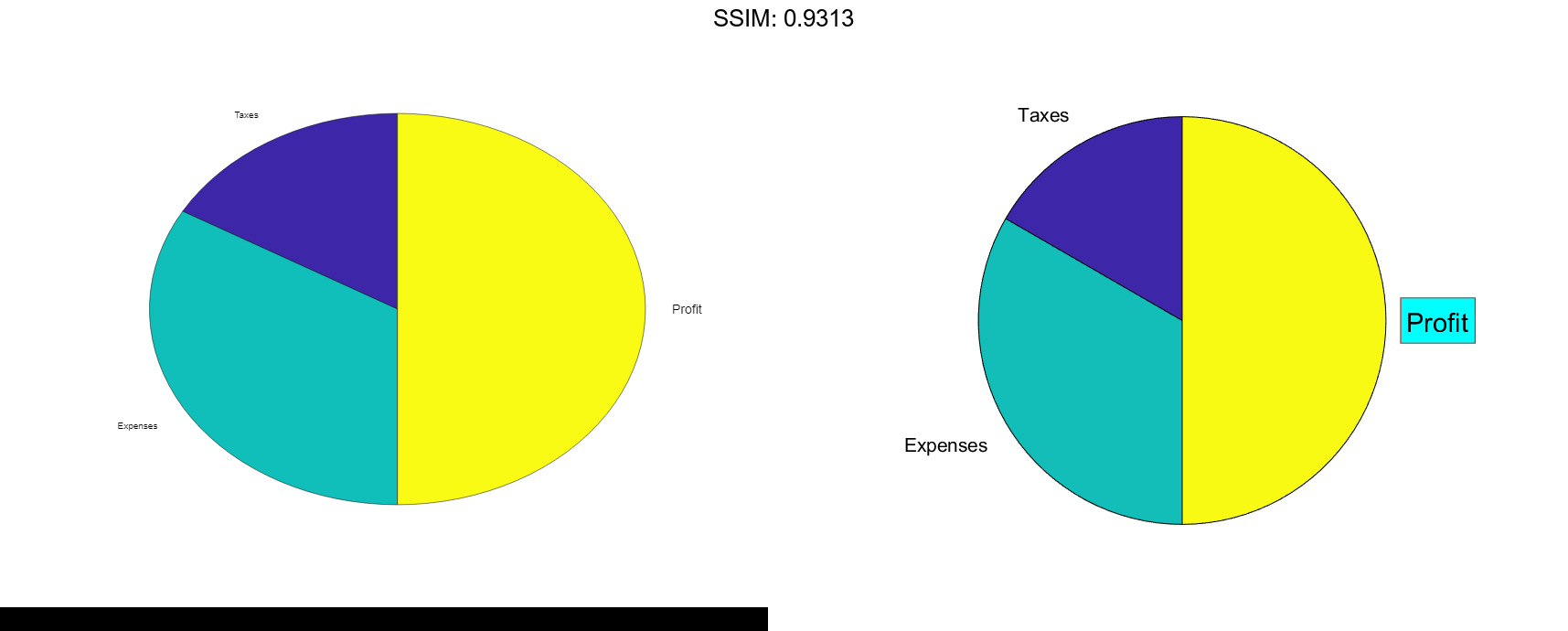
Modify Text Label for Pie Chart
Create a labeled pie chart, and then modify the color and font size of the text labels.
X = 1:3; labels = {'Taxes','Expenses','Profit'}; p = pie(X,labels)


p =
  1x6 graphics array:

    Patch    Text     Patch    Text     Patch    Text
t = p(6);
t.BackgroundColor = 'cyan';
t.EdgeColor = 'red';
t.FontSize = 14;

fig2plotly()

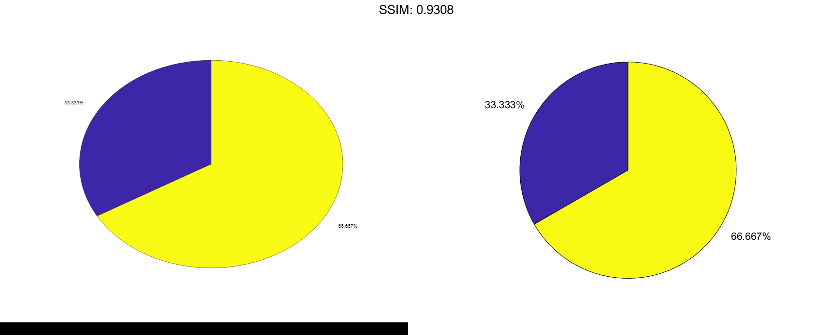
Specify Format for Percentage Labels
Create a pie chart, and specify a format expression to display each label with three digits after the decimal point. To include a percent sign in the labels, specify '%%' at the end of the expression.
X = [1/3 2/3];
pie(X,'%.3f%%')

fig2plotly()
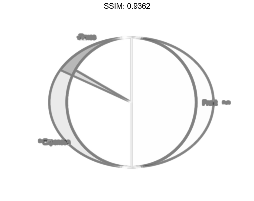
Plot Partial Pie Chart
Create a pie chart of vector X where the sum of the elements is less than 1.
X = [0.19 0.22 0.41];
pie(X)

fig2plotly()
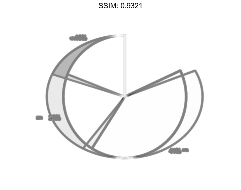
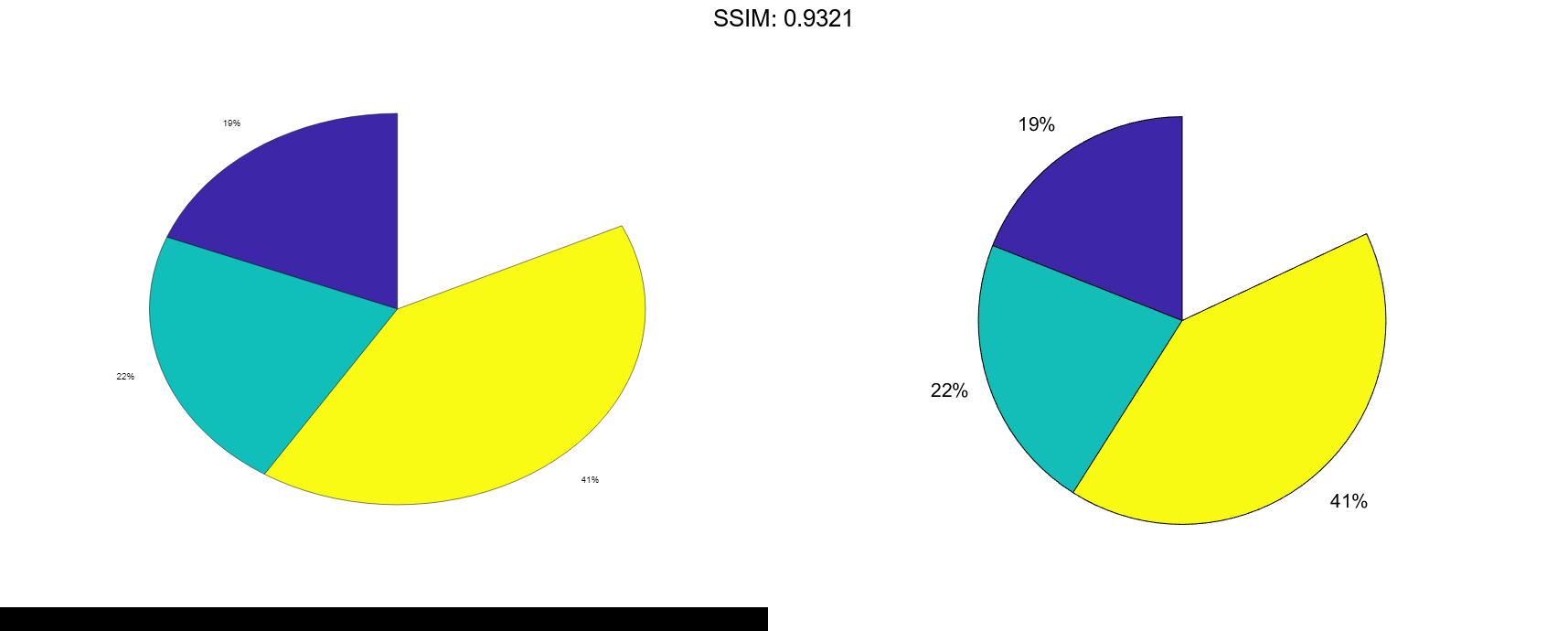
pie draws a partial pie because the sum of the elements is less than 1.
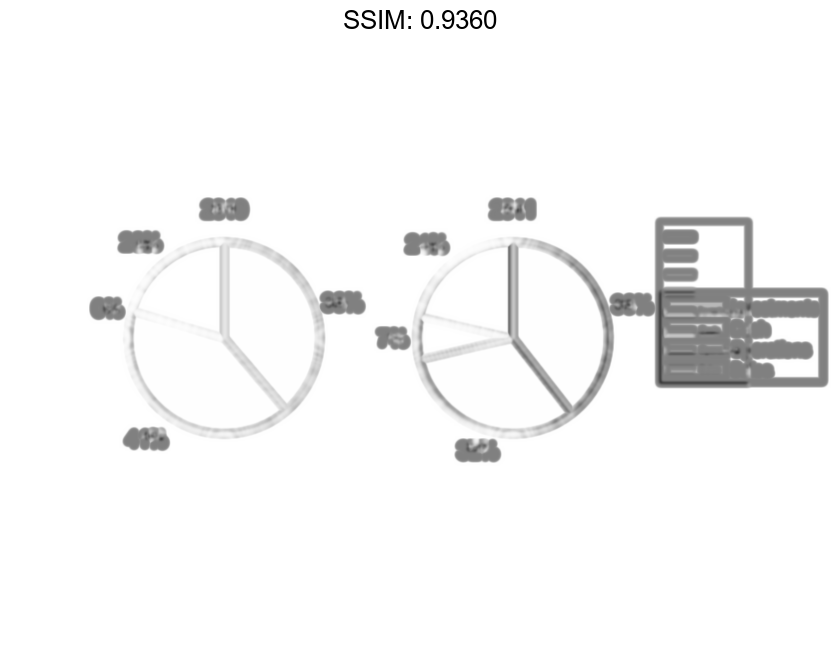
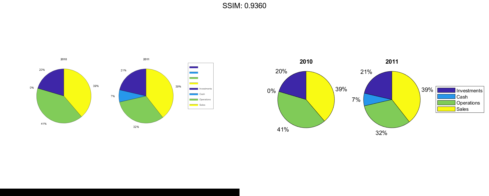
Compare Two Pie Charts
Create vectors y2010 and y2011, that contain financial data for two years. Then create a cell array containing the labels for the values.
y2010 = [50 0 100 95];
y2011 = [65 22 97 120];
labels = {'Investments','Cash','Operations','Sales'};

fig2plotly()
Create a 1-by-2 tiled chart layout, and display two pie charts that each have a title. Then display a shared legend in the east tile of the layout. To do this, call the legend function with a return argument to store the legend object. Then move the legend to the east tile by setting the Layout.Tile property to 'east'.
t = tiledlayout(1,2,'TileSpacing','compact');

% Create pie charts
ax1 = nexttile;
pie(ax1,y2010)
title('2010')

ax2 = nexttile;
pie(ax2,y2011)
title('2011')

% Create legend
lgd = legend(labels);
lgd.Layout.Tile = 'east';

fig2plotly()
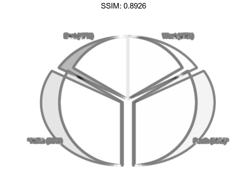
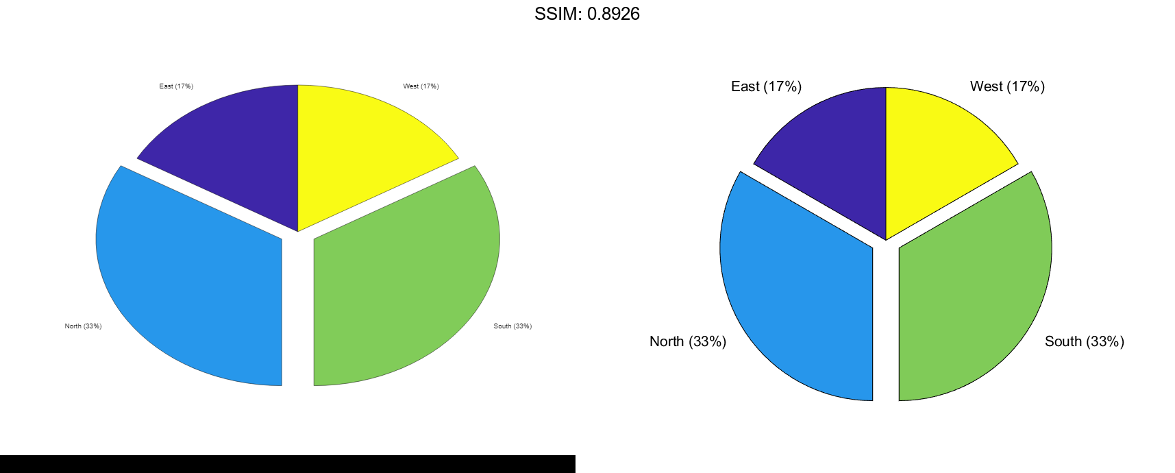
Plot Categorical Pie Chart with Offsets
Plot a categorical pie chart with offset slices corresponding to categories.
X = categorical({'North','South','North','East','South','West'});
explode = {'North','South'};
pie(X,explode)

fig2plotly()

Now, use a logical vector to offset the same slices.
explode = [0 1 1 0];
pie(X,explode)

fig2plotly()

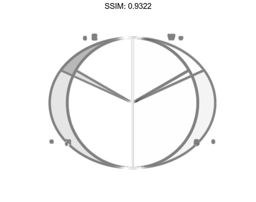
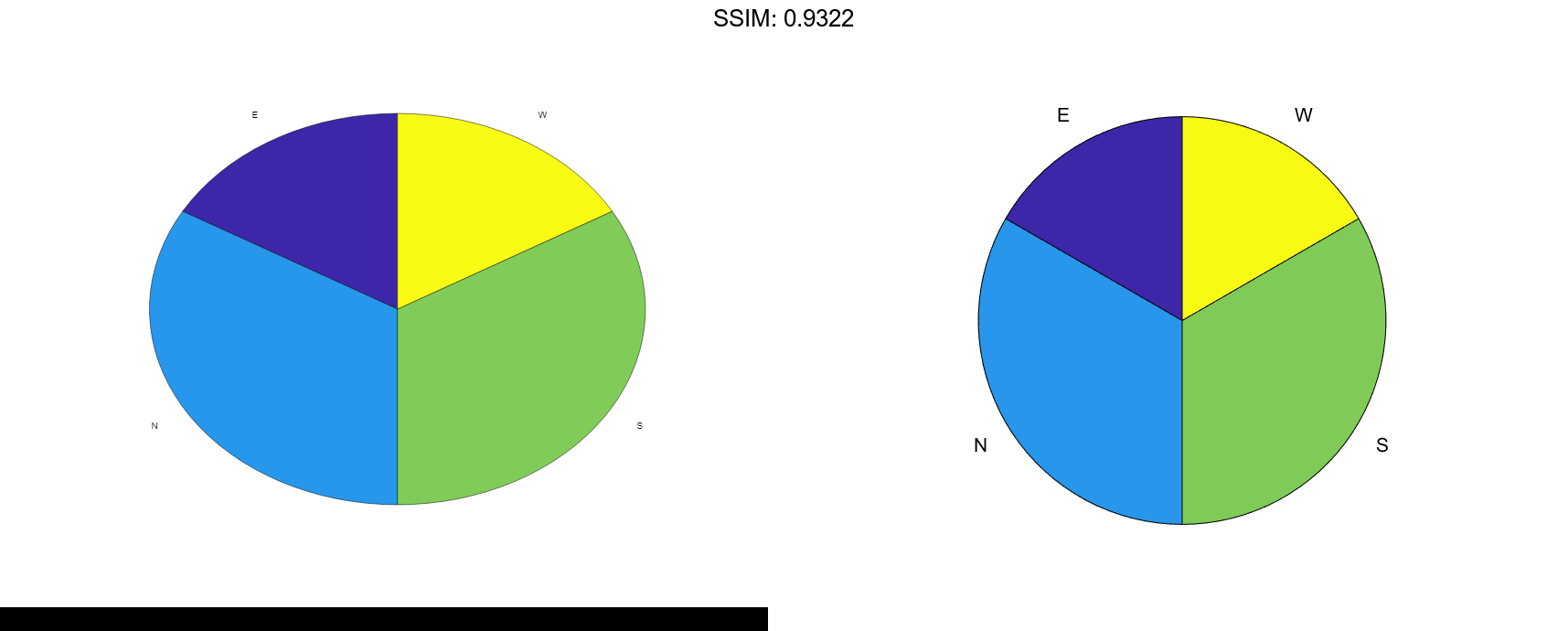
Plot Categorical Pie Chart with Labels
Plot a categorical pie chart without any offset slices and label the slices. When X is of data type categorical you must specify the input argument explode. To specify labels without any offset slices, specify explode as an empty cell array, and labels as the labels.
X = categorical({'North','South','North','East','South','West'});
explode = {};
labels = {'E','N','S','W'};
pie(X,explode,labels)

fig2plotly()
Now, offset a slice and label all slices.
X = categorical({'North','South','North','East','South','West'});
explode = {'West'};
labels = {'E','N','S','W'};
pie(X,explode,labels)

fig2plotly()

