MATLAB heatmap in MATLAB®
Learn how to make 8 heatmap charts in MATLAB, then publish them to the Web with Plotly.
Create Heatmap from Tabular Data
Create a heatmap from a table of data for medical patients.
Load the patients data set and create a table from a subset of the variables loaded into the workspace. Then create a heatmap that counts the total number of patients with the same set of Smoker and SelfAssessedHealthStatus values.
load patients tbl = table(LastName,Age,Gender,SelfAssessedHealthStatus,... Smoker,Weight,Location); h = heatmap(tbl,'Smoker','SelfAssessedHealthStatus');


Reorder Heatmap Labels
Create a heatmap and reorder the labels along the y-axis.
Load the patients data set and create a heatmap from the data. Assign the HeatmapChart object to the variable h.
load patients tbl = table(LastName,Age,Gender,SelfAssessedHealthStatus,... Smoker,Weight,Location); h = heatmap(tbl,'Smoker','SelfAssessedHealthStatus');
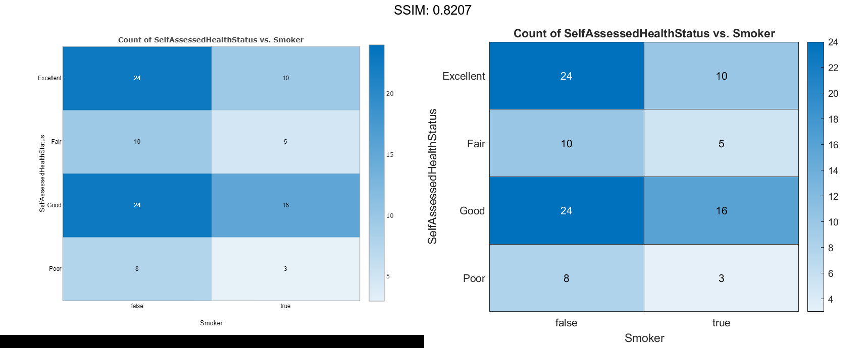
Reorder the labels along the y-axis.
h.YDisplayData = {'Excellent','Good','Fair','Poor'};

fig2plotly()
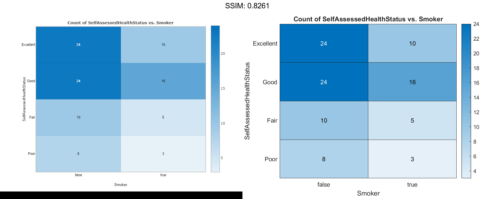
Alternatively, you can reorder the labels by changing the data to categorical data and then reordering the categories using the reordercats function. Similarly, you can add, remove, or rename the heatmap labels using the addcats, removecats, or renamecats functions, respectively.
Specify Table Variable for Heatmap Colors
Create a heatmap and specify the table variable to use when determining the heatmap cell colors.
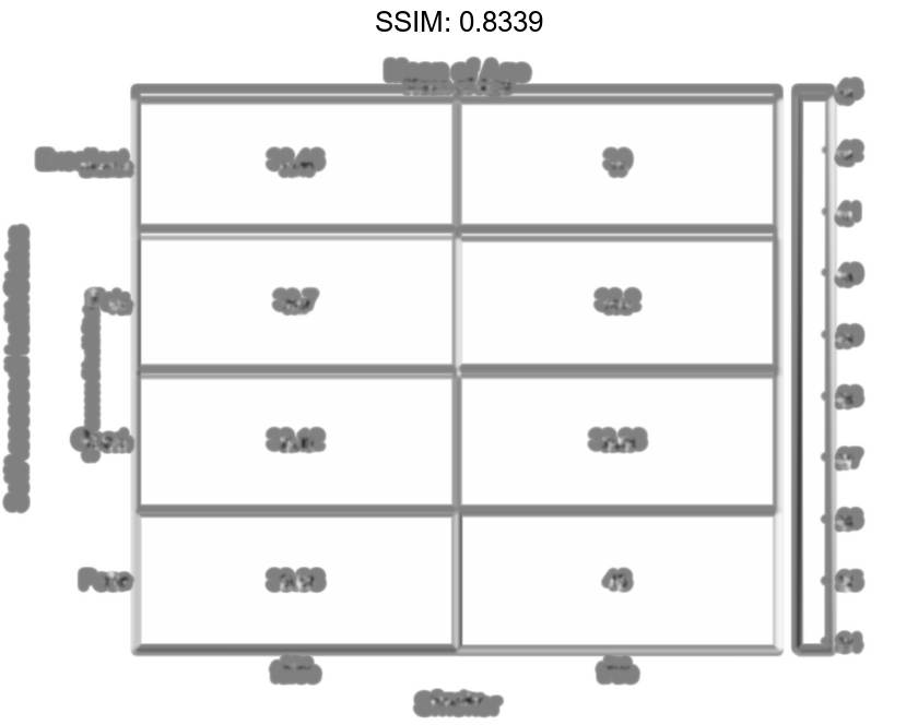
Load the patients data set and create a heatmap from the data. Color each cell using the average age of patients with a particular pair of Smoker and SelfAssessedHealthStatus values by setting the ColorVariable option to 'Age'.
load patients tbl = table(LastName,Age,Gender,SelfAssessedHealthStatus,... Smoker,Weight,Location); h = heatmap(tbl,'Smoker','SelfAssessedHealthStatus','ColorVariable','Age');

Specify Calculation Method for Color Data
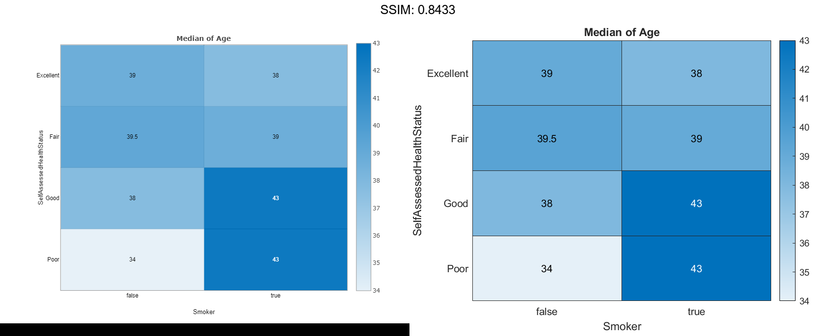
Create a heatmap and specify the table variable and calculation method to use when determining the heatmap cell colors.
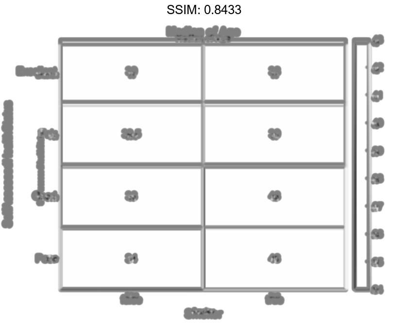
Load the patients data set and create a heatmap from the data. Color each cell using the median age of patients with a particular pair of Smoker and SelfAssessedHealthStatus values. Specify the ColorVariable option as 'Age' and the ColorMethod option as 'median'.
load patients tbl = table(LastName,Age,Gender,SelfAssessedHealthStatus,... Smoker,Weight,Location); h = heatmap(tbl,'Smoker','SelfAssessedHealthStatus','ColorVariable','Age','ColorMethod','median');
Create Heatmap from Matrix Data
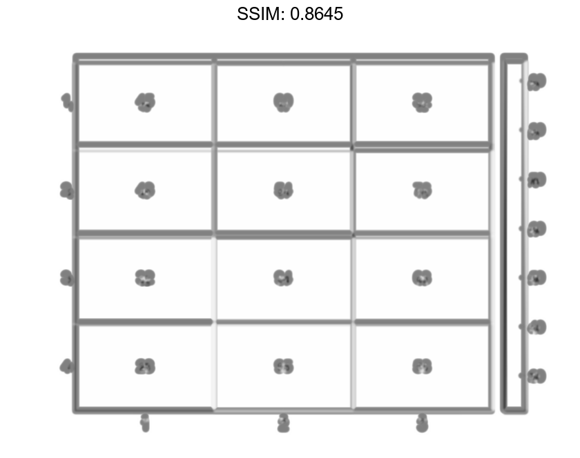
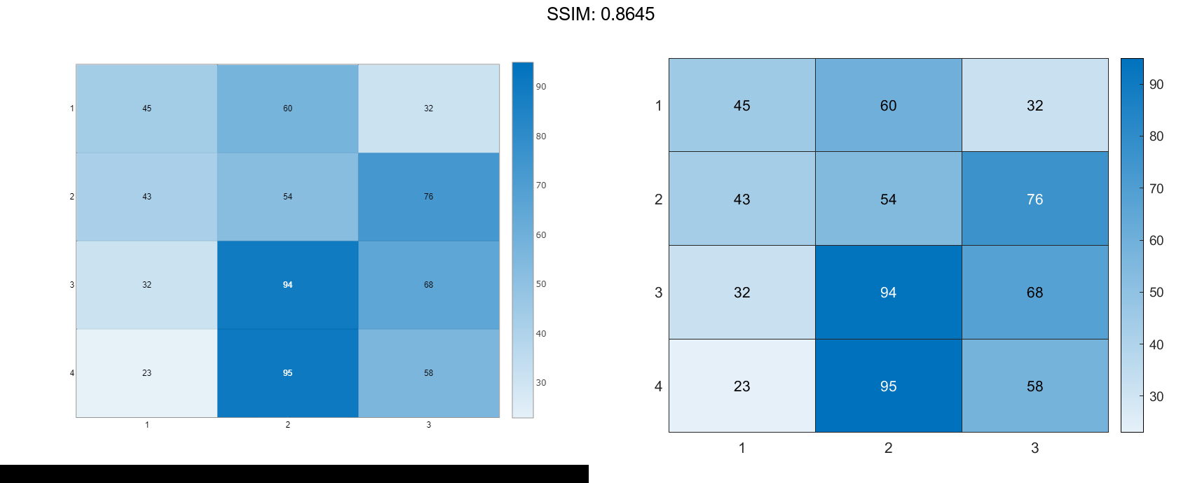
Create a matrix of data. Then create a heatmap of the matrix values. The default labels along the x-axis and y-axis appear as 1, 2, 3, and so on.
cdata = [45 60 32; 43 54 76; 32 94 68; 23 95 58]; h = heatmap(cdata);
Create Heatmap from Matrix Data Using Custom Axis Labels
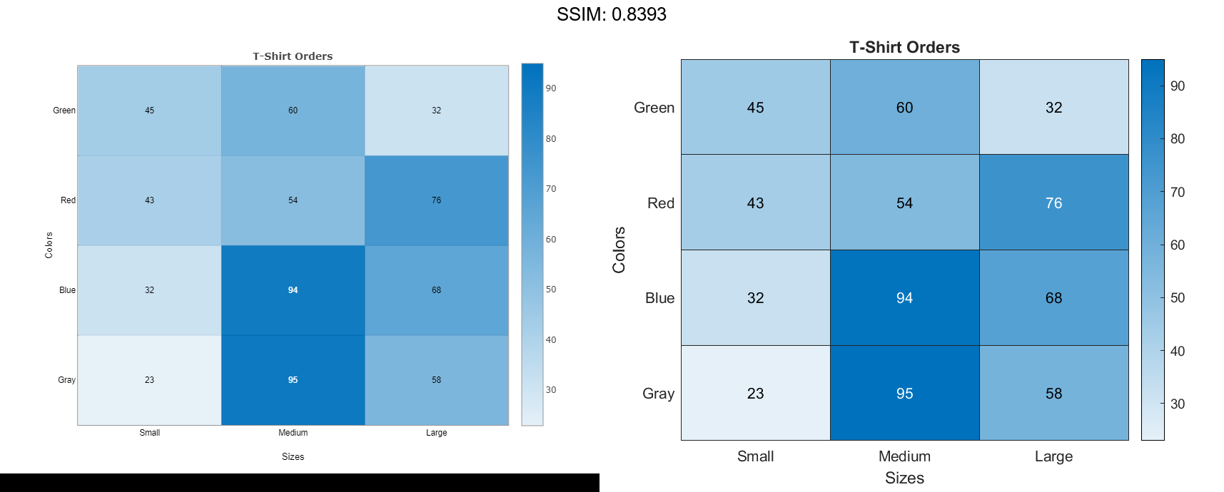
Create a matrix of data. Then create a heatmap of the matrix values. Use custom labels along the x-axis and y-axis by specifying the first two input arguments as the labels you want. Specify the title and axis labels by setting properties of the HeatmapChart object.
cdata = [45 60 32; 43 54 76; 32 94 68; 23 95 58];
xvalues = {'Small','Medium','Large'};
yvalues = {'Green','Red','Blue','Gray'};
h = heatmap(xvalues,yvalues,cdata);

h.Title = 'T-Shirt Orders';
h.XLabel = 'Sizes';
h.YLabel = 'Colors';

fig2plotly()
Normalize Colors Along Each Row or Column
Create a heatmap and normalize the colors along each column or row by setting the ColorScaling property.
Read the sample file outages.csv into a table. The sample file contains data representing electric utility outages in the Unites States. The table contains six columns: Region, OutageTime, Loss, Customers, RestorationTime, and Cause. Display the first five rows of each column.
T = readtable('outages.csv'); T(1:5,:)
ans=5×6 table
       Region           OutageTime        Loss     Customers     RestorationTime            Cause
    _____________    ________________    ______    __________    ________________    ___________________

    {'SouthWest'}    2002-02-01 12:18    458.98    1.8202e+06    2002-02-07 16:50    {'winter storm'   }
    {'SouthEast'}    2003-01-23 00:49    530.14    2.1204e+05                 NaT    {'winter storm'   }
    {'SouthEast'}    2003-02-07 21:15     289.4    1.4294e+05    2003-02-17 08:14    {'winter storm'   }
    {'West'     }    2004-04-06 05:44    434.81    3.4037e+05    2004-04-06 06:10    {'equipment fault'}
    {'MidWest'  }    2002-03-16 06:18    186.44    2.1275e+05    2002-03-18 23:23    {'severe storm'   }
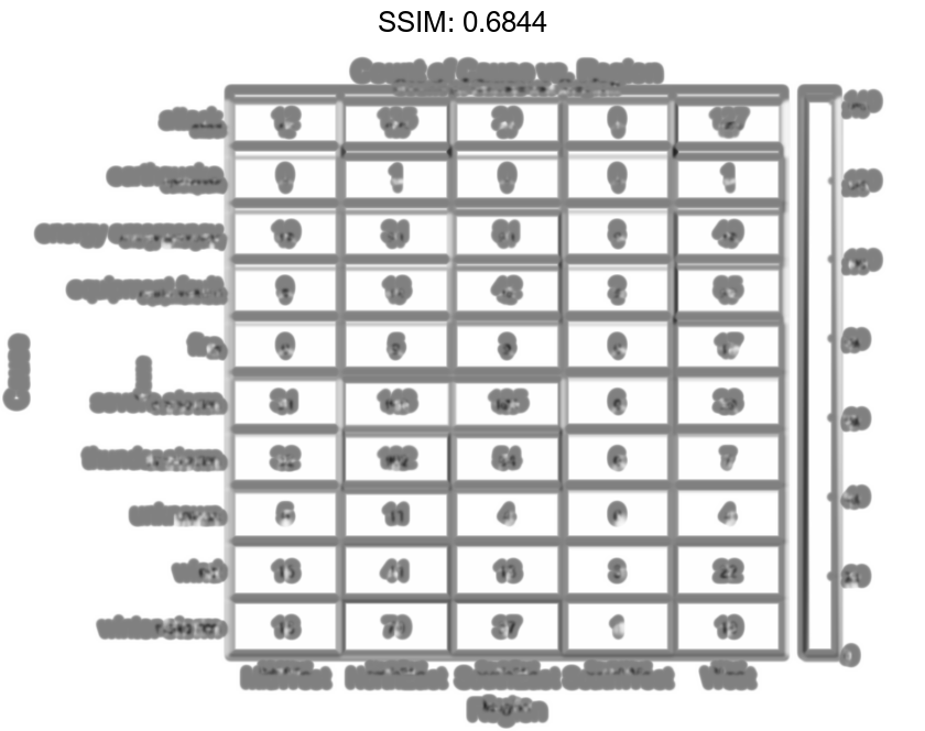
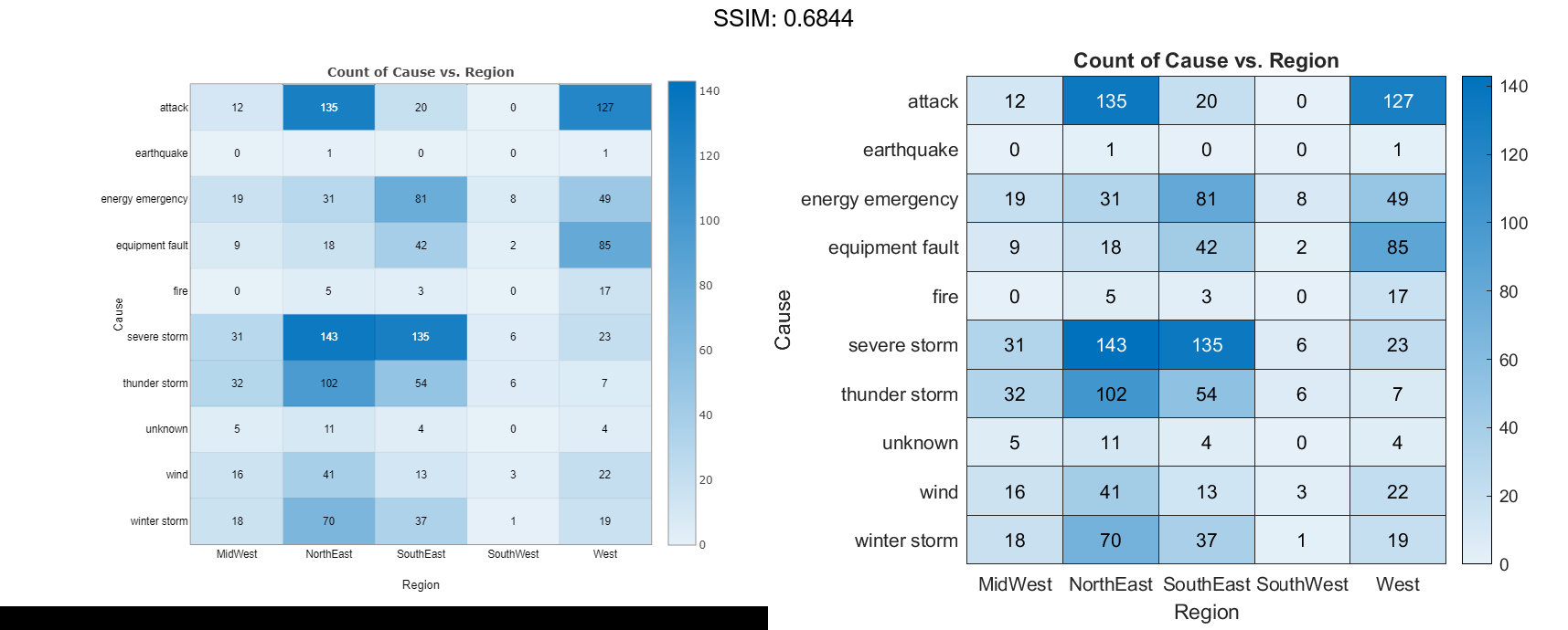
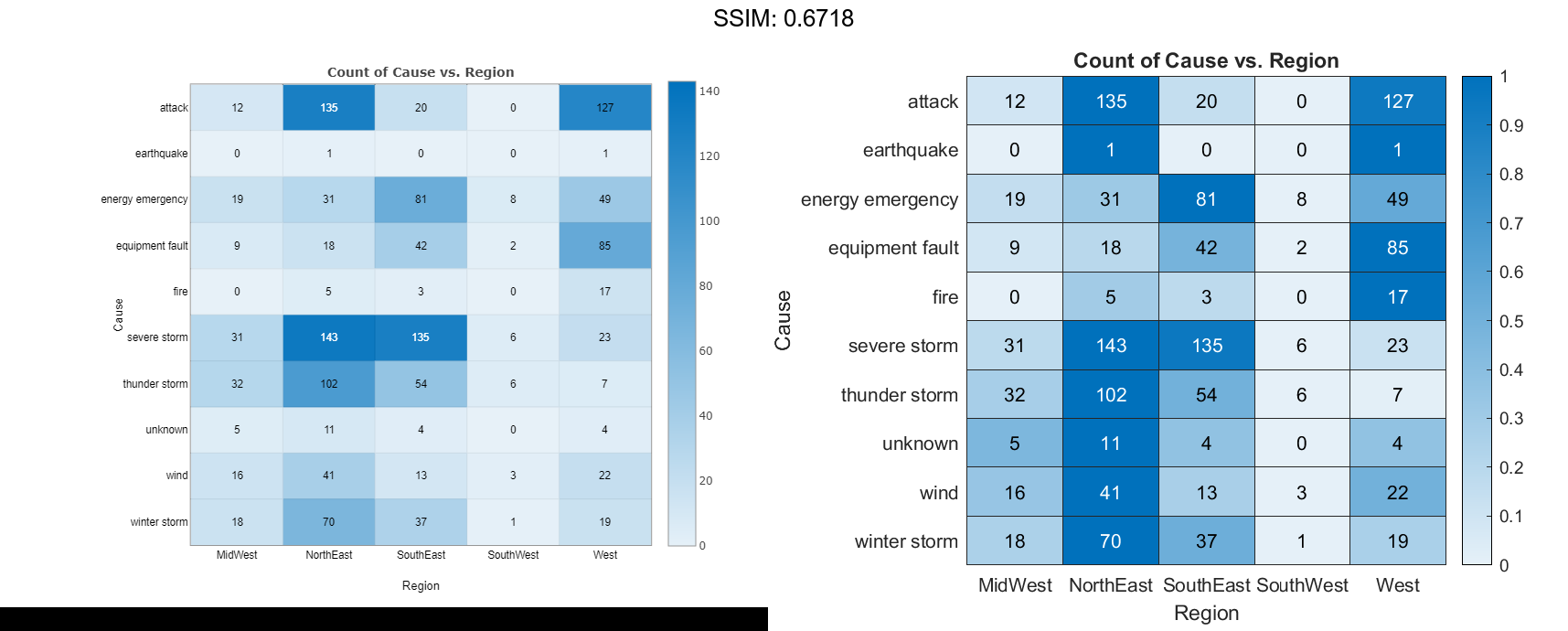
Normalize the colors along each column. The smallest value in each column maps to the first color in the colormap and the largest value maps to the last color. The last color indicates the cause that caused the most power outages for each region.
h.ColorScaling = 'scaledcolumns';

fig2plotly()
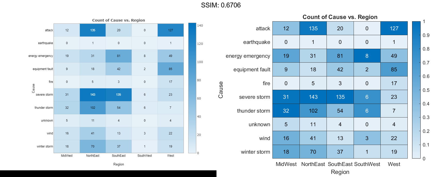
Normalize the colors along each row instead. The smallest value in each row maps to the first color in the colormap and the largest value maps to the last color. The last color indicates the region that experienced the most power outages due to each cause.
h.ColorScaling = 'scaledrows';

fig2plotly()
Compute Color Data Using Custom Aggregation Method
Create a heatmap and color the cells using data computed with a custom aggregation method. Use the accumarray function to compute the color data.
Read the sample file Temperature.csv into a table. The file contains three columns: Month, Year, and TemperatureF.
tbl = readtable('TemperatureData.csv');
Create categorical arrays from the Month and Year columns of the table. Then determine the unique months and years to use as labels along the x-axis and y-axis.
months = categorical(tbl.Month);
years = categorical(tbl.Year);
xlabels = categories(months);
ylabels = categories(years);

fig2plotly()
Determine the final size of the resulting color data based on the number of unique months and years.
nummonths = numel(xlabels);
numyears = numel(ylabels);

fig2plotly()
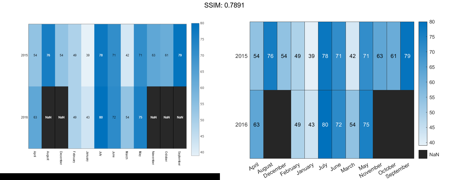
Convert the categorical months and years arrays into numeric indices to use with the accumarray function. Compute the color data as the maximum temperature for each month and year combination using the accumarray function. Use NaN for missing month and year combinations.
x = double(months); y = double(years); temps = tbl.TemperatureF; cdata = accumarray([y,x],temps,[numyears,nummonths],@max,NaN);
Create the heatmap. Label the x-axis and y-axis with the months and years, respectively. Color the heatmap cells using the computed matrix data.
h = heatmap(xlabels,ylabels,cdata);
Note: You can use the reordercats function for categorical arrays to reorder the axis labels.

