GGPLOT - stat_summary
Summarise y values at unique/binned x and then convert them with ggplotly.
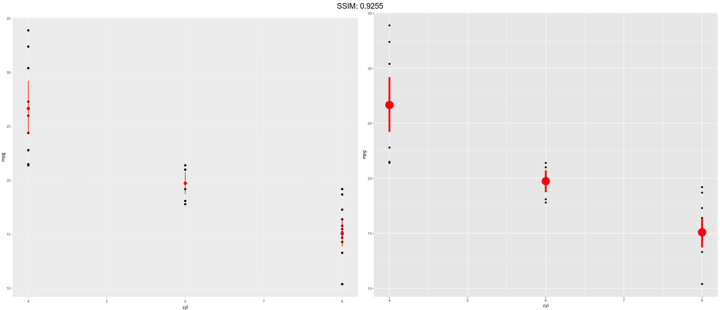
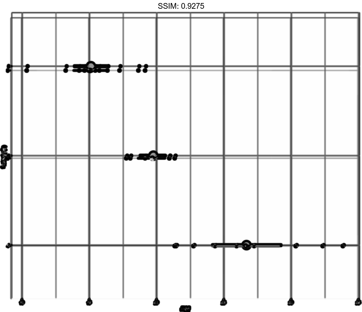
d <- ggplot(mtcars, aes(cyl, mpg)) + geom_point()
p <-  d + stat_summary(fun.data = "mean_cl_boot", colour = "red", size = 2)
plotly::ggplotly(p)

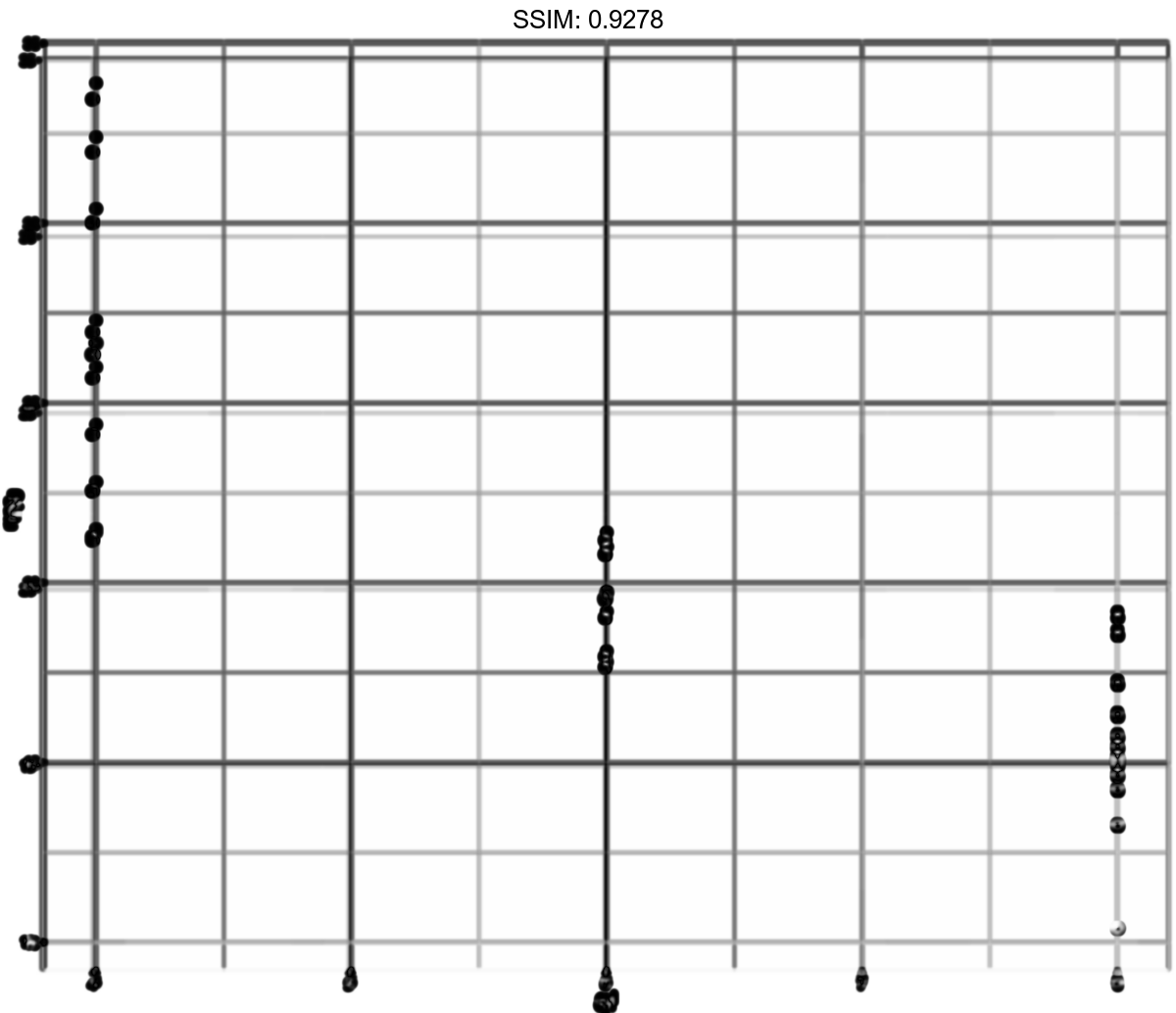
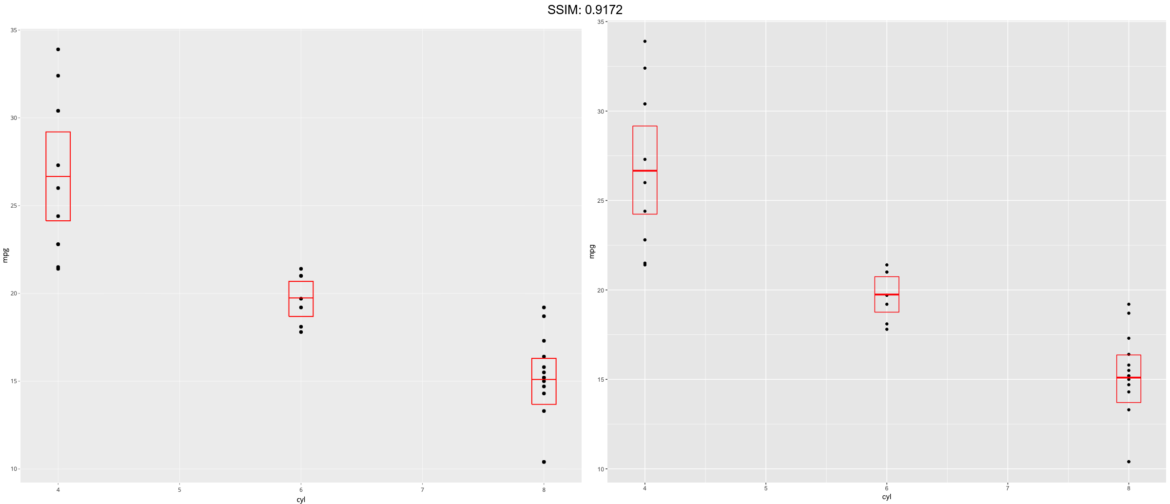
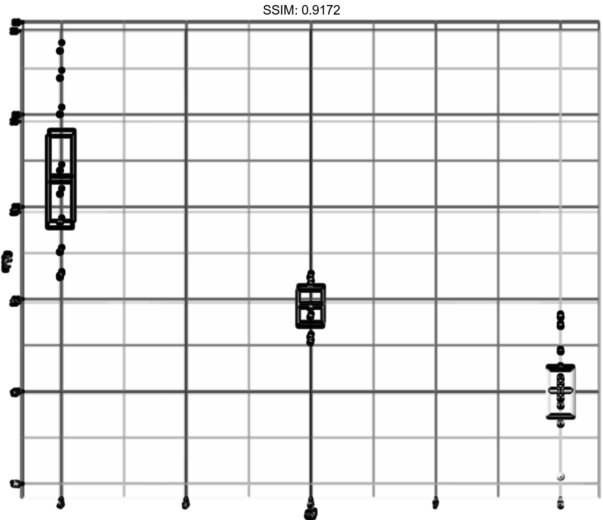
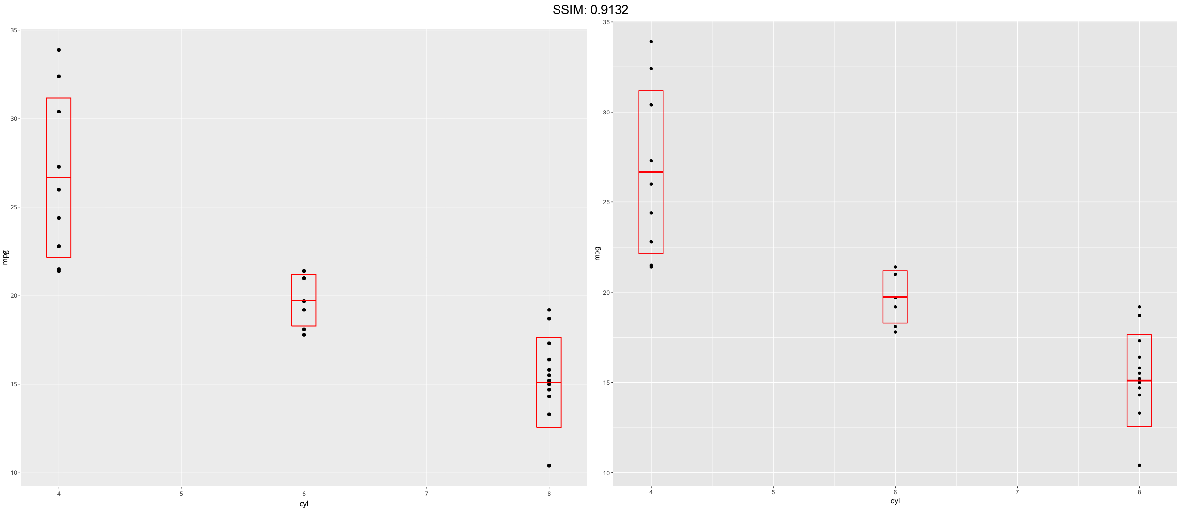
p <-
 ggplot(mtcars, aes(mpg, factor(cyl))) +
  geom_point() +
  stat_summary(fun.data = "mean_cl_boot", colour = "red", size = 2)
plotly::ggplotly(p)

d <- ggplot(mtcars, aes(cyl, mpg)) + geom_point()
p <-  d + stat_summary(fun = "median", colour = "red", size = 2, geom = "point")
plotly::ggplotly(p)

d <- ggplot(mtcars, aes(cyl, mpg)) + geom_point()
p <-  d + stat_summary(fun = "mean", colour = "red", size = 2, geom = "point")
plotly::ggplotly(p)

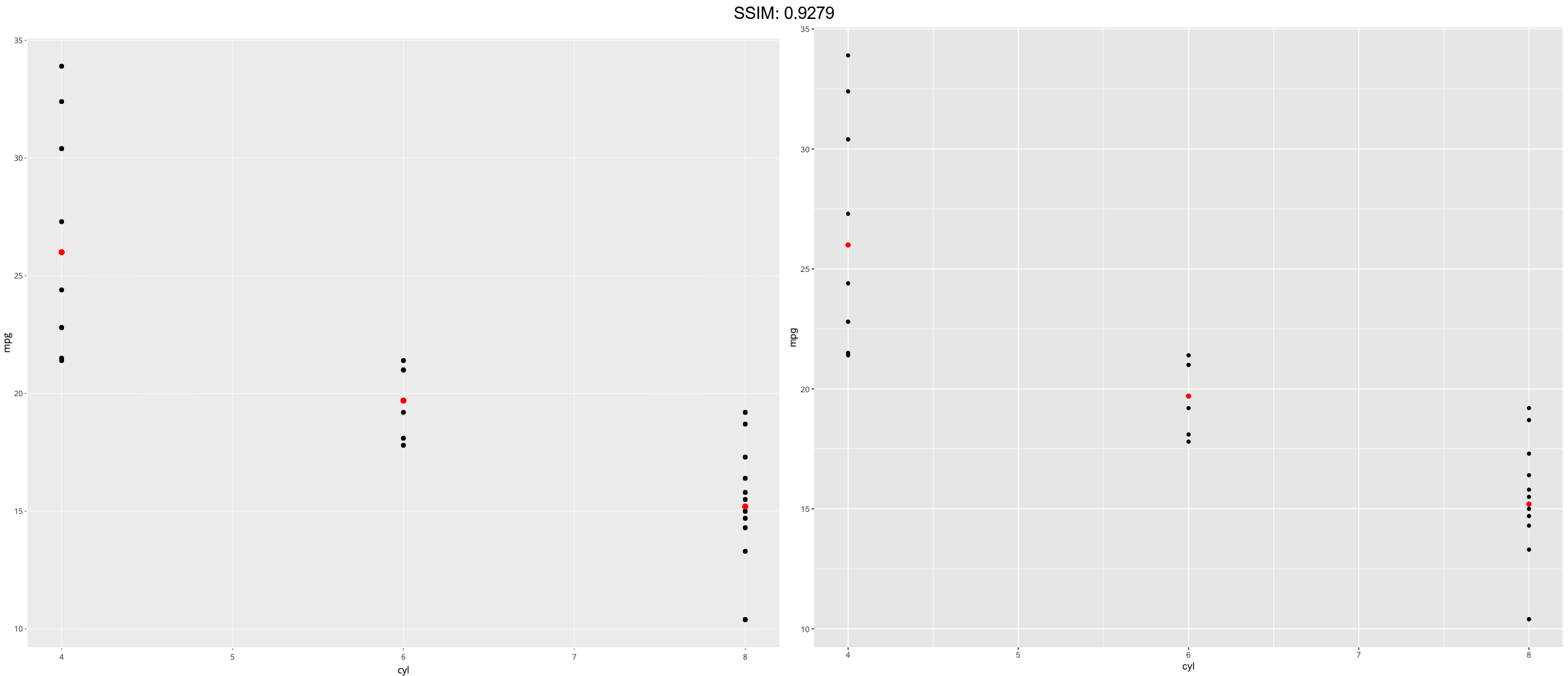
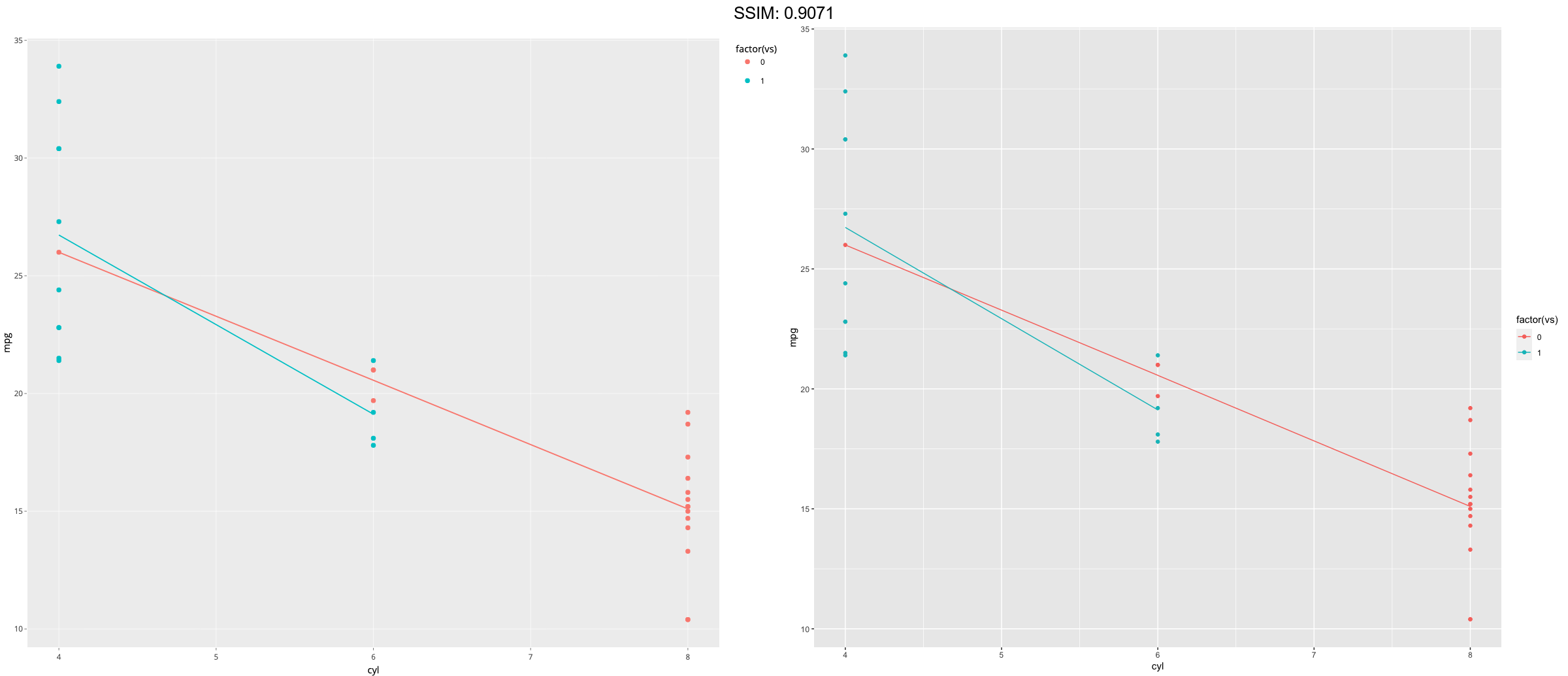
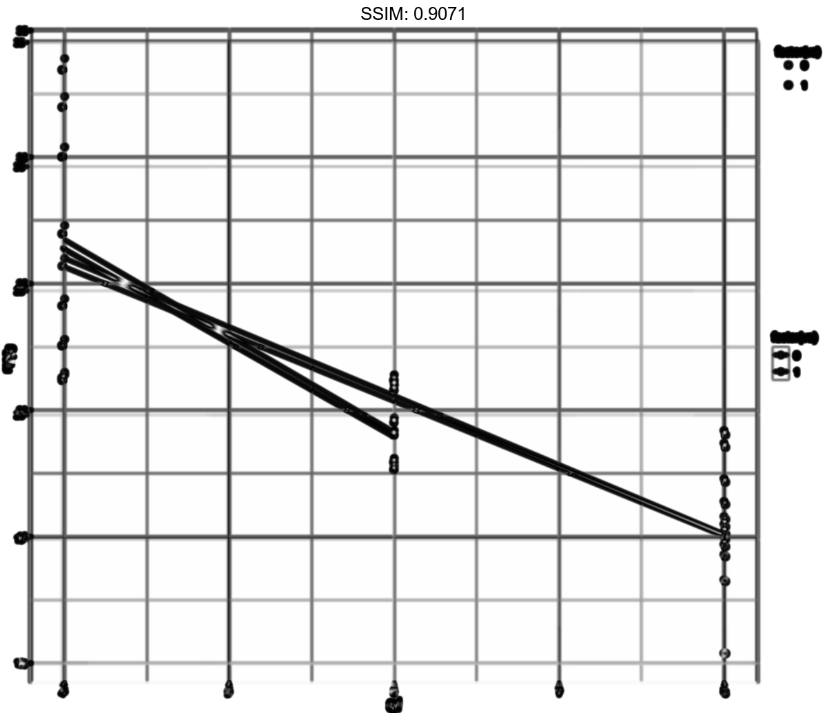
d <- ggplot(mtcars, aes(cyl, mpg)) + geom_point()
p <-  d + aes(colour = factor(vs)) + stat_summary(fun = mean, geom="line")
plotly::ggplotly(p)
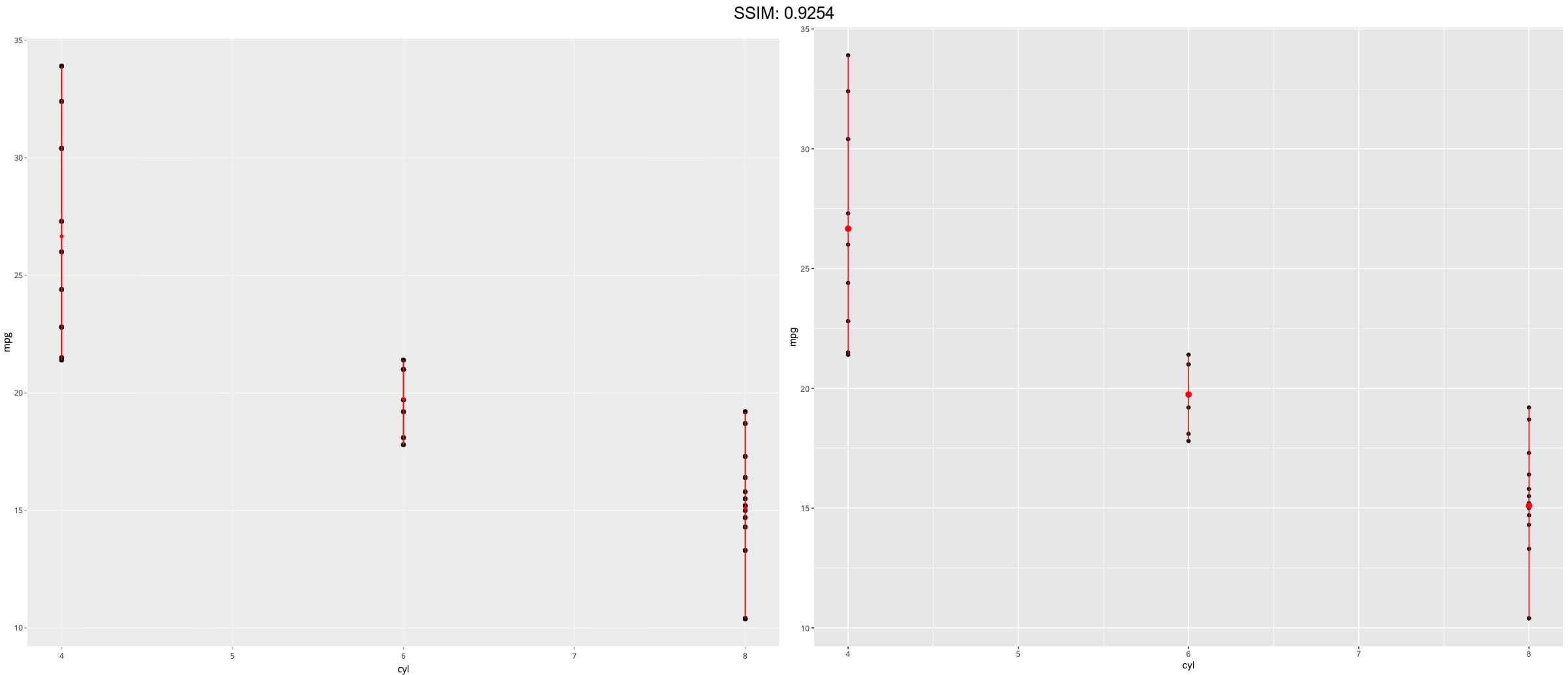
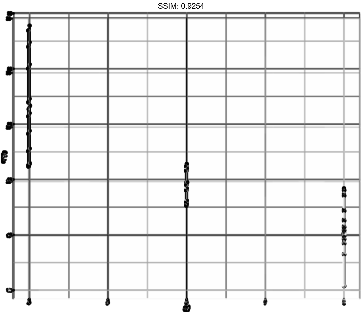
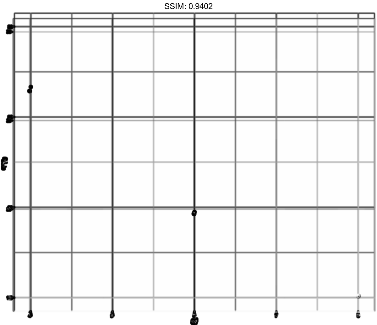
d <- ggplot(mtcars, aes(cyl, mpg)) + geom_point()
p <-  d + stat_summary(fun = mean, fun.min = min, fun.max = max, colour = "red")
plotly::ggplotly(p)
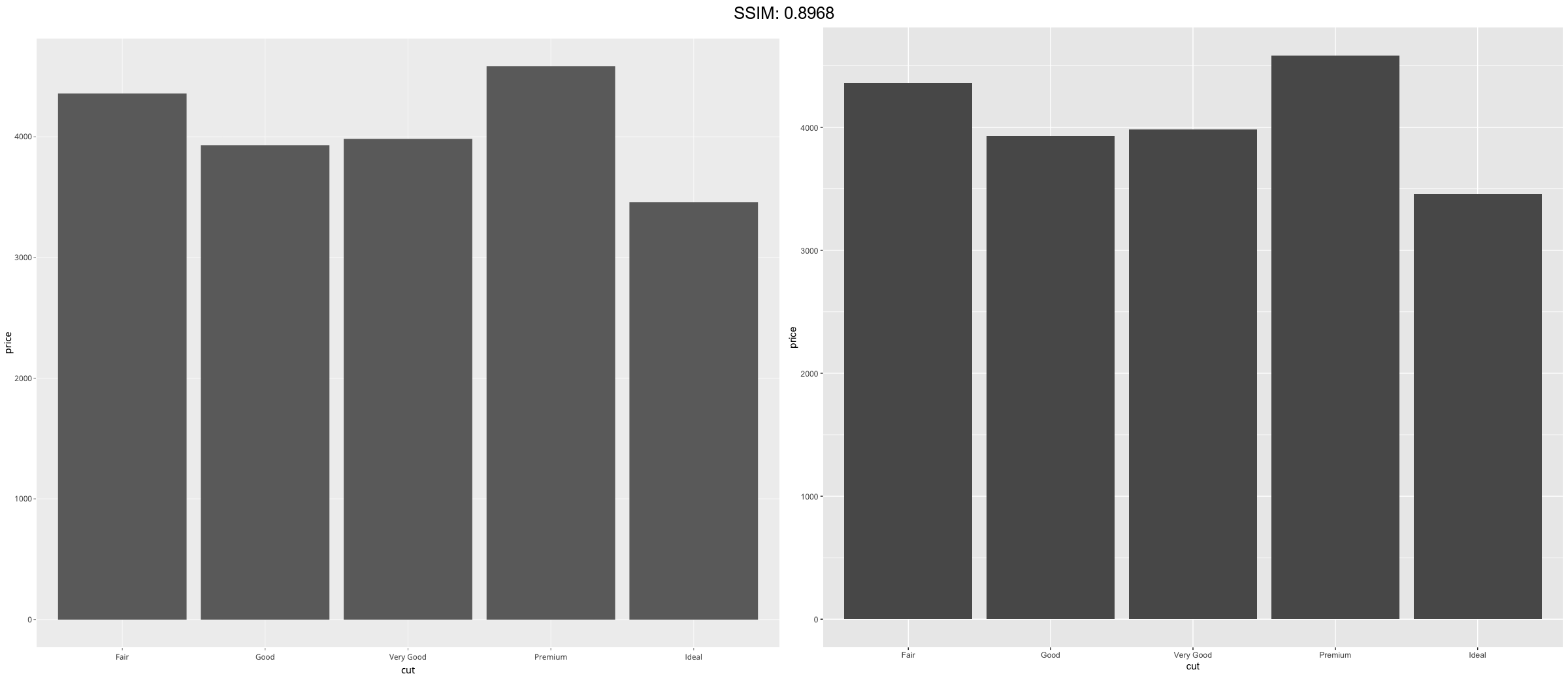
d <- ggplot(diamonds, aes(cut))
p <-  d + geom_bar()
plotly::ggplotly(p)

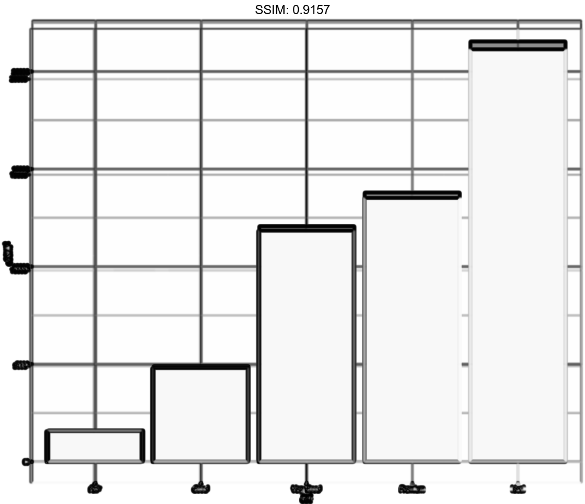
d <- ggplot(diamonds, aes(cut))
p <-  d + stat_summary(aes(y = price), fun = "mean", geom = "bar")
plotly::ggplotly(p)
p <-
 ggplot(diamonds, aes(carat, price)) +
  stat_summary_bin(fun = "mean", geom = "bar", orientation = 'y')
plotly::ggplotly(p)

p <- ggplot(mtcars, aes(cyl, mpg)) +
  stat_summary(fun = "mean", geom = "point")
plotly::ggplotly(p)

p <- ggplot(mtcars, aes(cyl, mpg)) +
  stat_summary(fun = "mean", geom = "point")
p <-  p + ylim(15, 30)
plotly::ggplotly(p)
## Warning: Removed 9 rows containing non-finite values (stat_summary).


p <- ggplot(mtcars, aes(cyl, mpg)) +
  stat_summary(fun = "mean", geom = "point")
p <-  p + coord_cartesian(ylim = c(15, 30))
plotly::ggplotly(p)

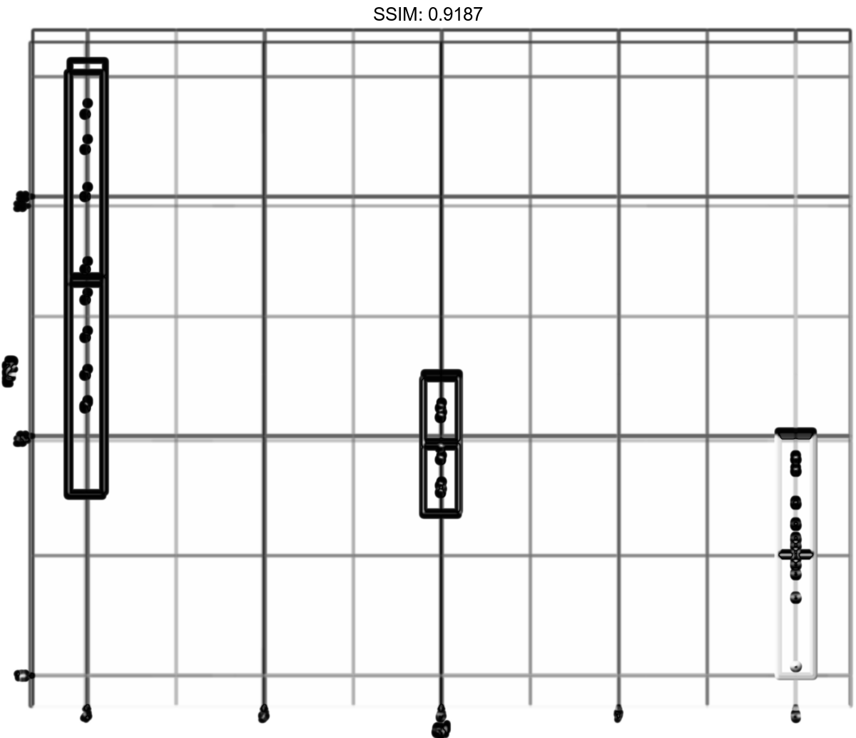
stat_sum_df <- function(fun, geom="crossbar", ...) {
stat_summary(fun.data = fun, colour = "red", geom = geom, width = 0.2, ...)
}
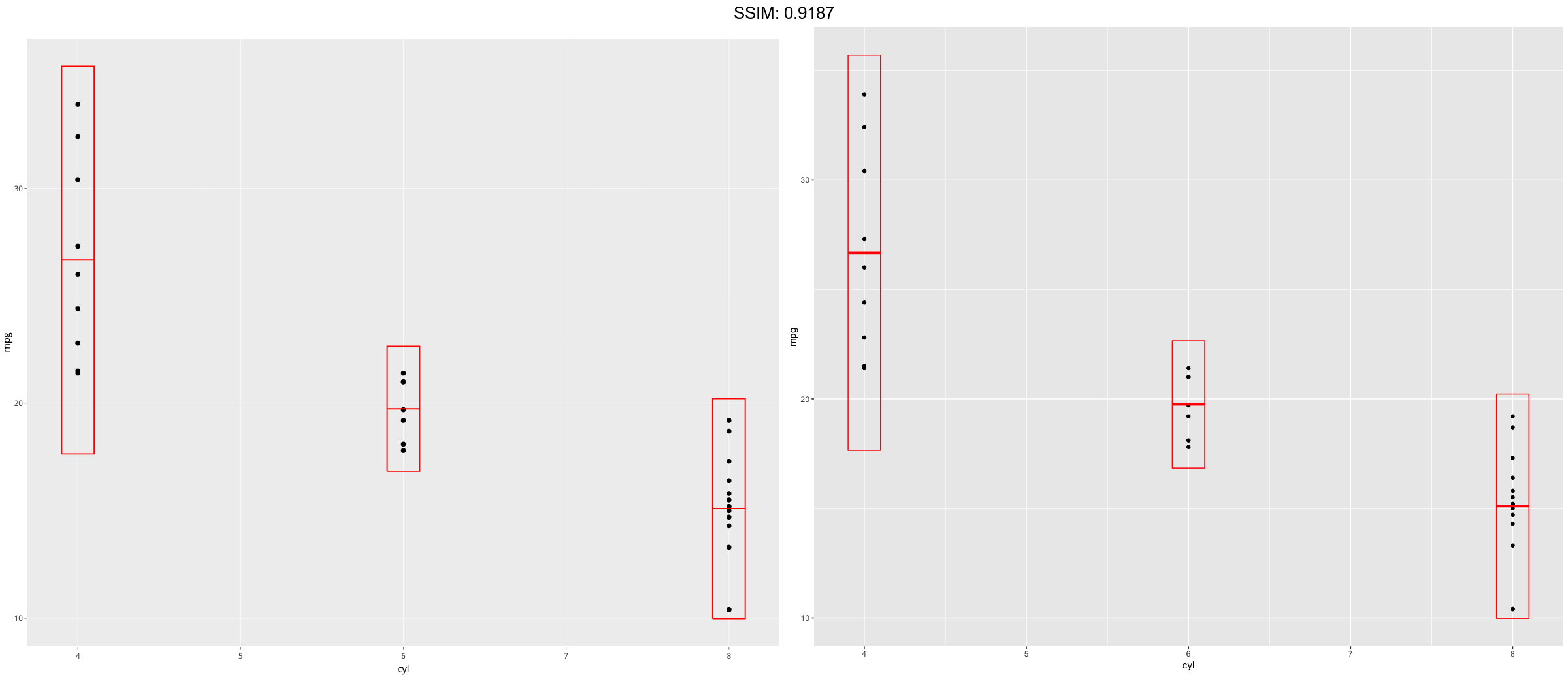
d <- ggplot(mtcars, aes(cyl, mpg)) + geom_point()
p <- d + stat_sum_df("mean_cl_boot", mapping = aes(group = cyl))
plotly::ggplotly(p)
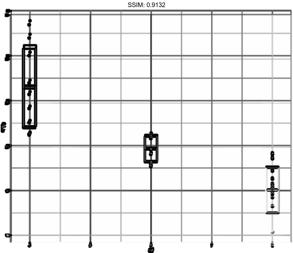
stat_sum_df <- function(fun, geom="crossbar", ...) {
  stat_summary(fun.data = fun, colour = "red", geom = geom, width = 0.2, ...)
}
d <- ggplot(mtcars, aes(cyl, mpg)) + geom_point()
p <-  d + stat_sum_df("mean_sdl", mapping = aes(group = cyl))
plotly::ggplotly(p)
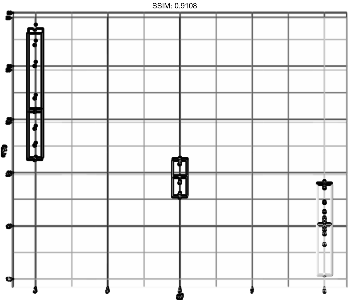
stat_sum_df <- function(fun, geom="crossbar", ...) {
  stat_summary(fun.data = fun, colour = "red", geom = geom, width = 0.2, ...)
}
d <- ggplot(mtcars, aes(cyl, mpg)) + geom_point()
p <-  d + stat_sum_df("mean_sdl", fun.args = list(mult = 1), mapping = aes(group = cyl))
plotly::ggplotly(p)
stat_sum_df <- function(fun, geom="crossbar", ...) {
  stat_summary(fun.data = fun, colour = "red", geom = geom, width = 0.2, ...)
}
d <- ggplot(mtcars, aes(cyl, mpg)) + geom_point()
p <-  d + stat_sum_df("median_hilow", mapping = aes(group = cyl))
plotly::ggplotly(p)

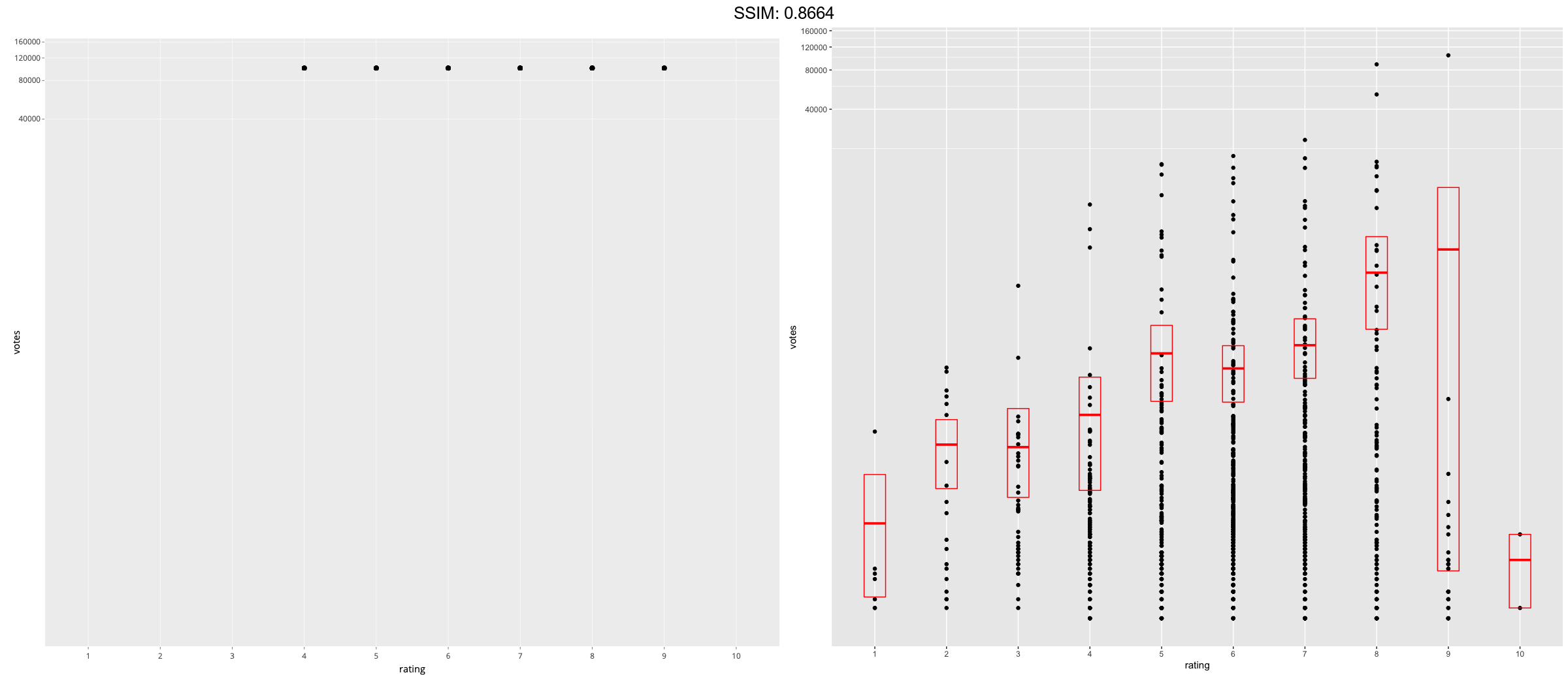
p <-
 if (require("ggplot2movies")) {
set.seed(596)
mov <- movies[sample(nrow(movies), 1000), ]
 m2 <-
   ggplot(mov, aes(x = factor(round(rating)), y = votes)) +
   geom_point()
 m2 <-
   m2 +
   stat_summary(
     fun.data = "mean_cl_boot",
     geom = "crossbar",
     colour = "red", width = 0.3
   ) +
   xlab("rating")
m2
# Notice how the overplotting skews off visual perception of the mean
# supplementing the raw data with summary statistics is _very_ important

# Next, we'll look at votes on a log scale.

# Transforming the scale means the data are transformed
# first, after which statistics are computed:
m2 + scale_y_log10()
# Transforming the coordinate system occurs after the
# statistic has been computed. This means we're calculating the summary on the raw data
# and stretching the geoms onto the log scale.  Compare the widths of the
# standard errors.
m2 + coord_trans(y="log10")
}
plotly::ggplotly(p)