1900
1920
1940
1960
1980
2000
2020
0
0.2
0.4
0.6
0.8
1
Female
Male
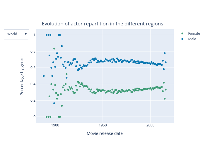
Evolution of actor repartition in the different regions
Movie release date
Percentage by genre
World
▼
plotly-logomark
Edit chart
Tuturta's interactive graph and data of "Evolution of actor repartition in the different regions" is a scatter chart, showing Female vs Male; with Movie release date in the x-axis and Percentage by genre in the y-axis.. The x-axis shows values from 1880.068880688807 to 2023.931119311193. The y-axis shows values from -0.0689102564102564 to 1.0689102564102564.