0
5000
10000
15000
20000
0
2500
5000
7500
Fair
Good
Very Good
Premium
Ideal
price
count
cut
plotly-logomark
Edit chart
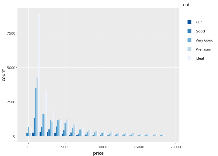
Nadhil's interactive graph and data of "count vs price" is a , showing Fair, Good, Very Good, Premium, Ideal; with price in the x-axis and count in the y-axis.. The x-axis shows values from -1500 to 20500. The y-axis shows values from -444.3 to 9330.3. This visualization has the following annotation: cut