1940
1960
1980
2000
2020
0
20
40
60
80
100
Over 60
35 to 60
20 to 35
Under 20
U.S. Age Distribution
Year
Percent
plotly-logomark
Edit chart
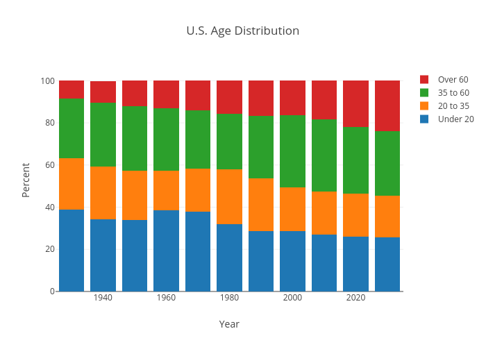
Hamiltonl87's interactive graph and data of "U.S. Age Distribution" is a stacked bar chart, showing Under 20, 20 to 35, 35 to 60, Over 60; with Year in the x-axis and Percent in the y-axis.. The x-axis shows values from 1925 to 2035. The y-axis shows values from 0 to 105.36842105263158.