2000-01
2001-02
2002-03
2003-04
2004-05
2005-06
2006-07
2007-08
2008-09
2009-10
2010-11
2011-12
2012-13
2013-14
0%
0.5%
1%
All Other Counties
Manufacturing Counties
U.S. Population Change
SOURCE: Governing calculations of Census Bureau intercensal estimates for all counties.
Manufacturing County Population Shifts
plotly-logomark
Edit chart
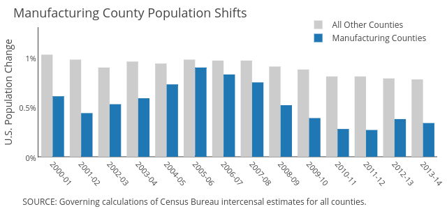
Governing's interactive graph and data of "All Other Counties vs Manufacturing Counties" is a bar chart, showing All Other Counties vs Manufacturing Counties; with U.S. Population Change in the y-axis. The x-axis shows values from -0.5 to 13.5. The y-axis shows values from 0 to 1.3. This visualization has the following annotations: SOURCE: Governing calculations of Census Bureau intercensal estimates for all counties. ; Manufacturing County Population Shifts