IT
GB
CA
BE
IE
FR
US
EQ
0
20
40
60
80
100
Elite 1%
Top 9%
Mid 40%
Bottom 50%
Country
Percentage of wealth owned
plotly-logomark
Edit chart
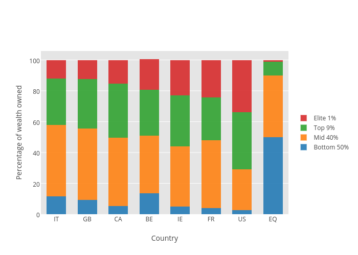
Ggplot2examples's interactive graph and data of "Percentage of wealth owned vs Country" is a stacked bar chart, showing Bottom 50%, Mid 40%, Top 9%, Elite 1%; with Country in the x-axis and Percentage of wealth owned in the y-axis.. The x-axis shows values from -0.5 to 7.5. The y-axis shows values from 0 to 105.78947368421052.