Edit chart
Loading graph
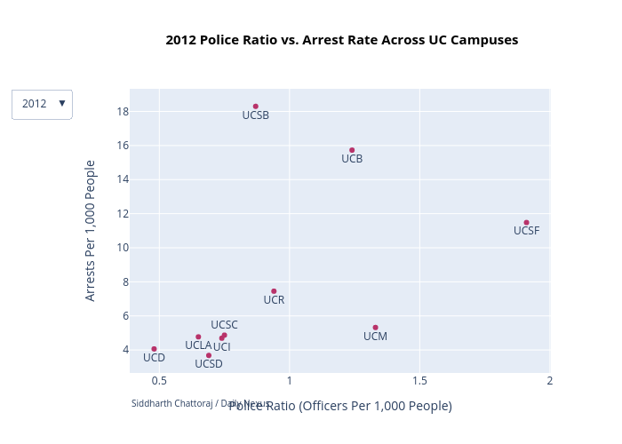
Yeahsidc's interactive graph and data of "2012 Police Ratio vs. Arrest Rate Across UC Campuses" is a , showing 2012; with Police Ratio (Officers Per 1,000 People) in the x-axis and Arrests Per 1,000 People in the y-axis.. The x-axis shows values from 0 to 0. The y-axis shows values from 0 to 0. This visualization has the following annotation: Siddharth Chattoraj / Daily Nexus