Edit chart
Loading graph
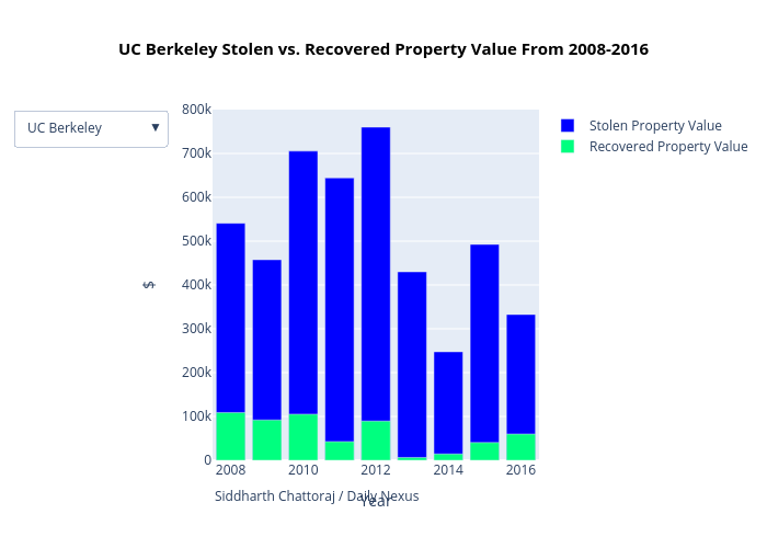
Yeahsidc's interactive graph and data of "UC Berkeley Stolen vs. Recovered Property Value From 2008-2016" is a overlaid bar chart, showing Stolen Property Value vs Recovered Property Value; with Year in the x-axis and $ in the y-axis.. The x-axis shows values from 0 to 0. The y-axis shows values from 0 to 0. This visualization has the following annotation: Siddharth Chattoraj / Daily Nexus