Edit chart
Loading graph
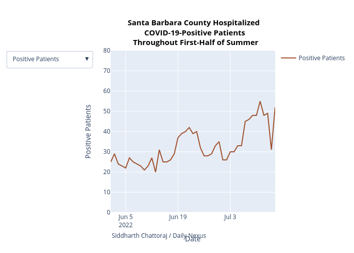
Yeahsidc's interactive graph and data of "Santa Barbara County Hospitalized COVID-19-Positive Patients Throughout First-Half of Summer" is a scatter chart, showing Positive Patients; with Date in the x-axis and Positive Patients in the y-axis.. The x-axis shows values from 0 to 0. The y-axis shows values from 0 to 80. This visualization has the following annotation: Siddharth Chattoraj / Daily Nexus