Edit chart
Loading graph
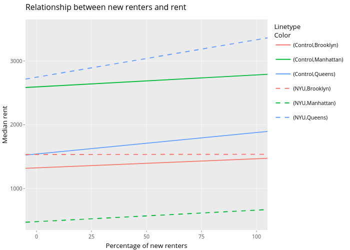
Utnosmas's interactive graph and data of "Relationship between new renters and rent" is a line chart, showing (Control,Brooklyn), (Control,Manhattan), (Control,Queens), (NYU,Brooklyn), (NYU,Manhattan), (NYU,Queens); with Percentage of new renters in the x-axis and Median rent in the y-axis.. The x-axis shows values from -5 to 105. The y-axis shows values from 350 to 3650.